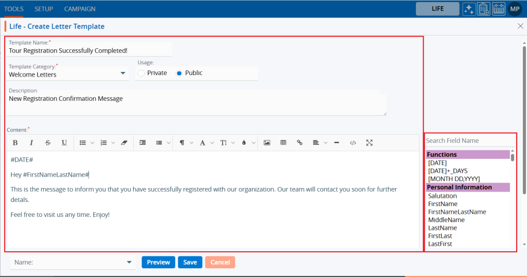
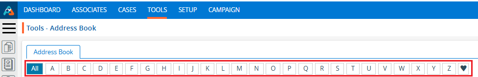
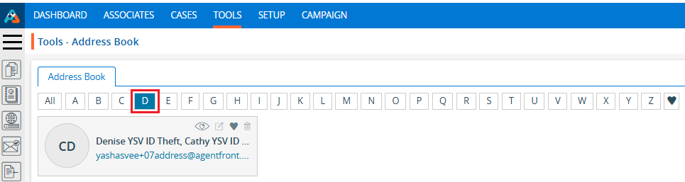
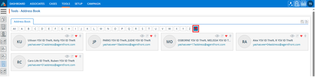
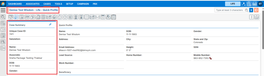
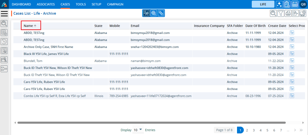
A campaign report is a detailed analysis that displays the performance of a campaign based on the communication methods used.
Sign in to AgentFront CRM.
From the top menu, choose Campaign.
Campaign dashboard will open with multiple options (Based on the access rights).
Click on Report.
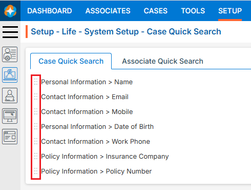
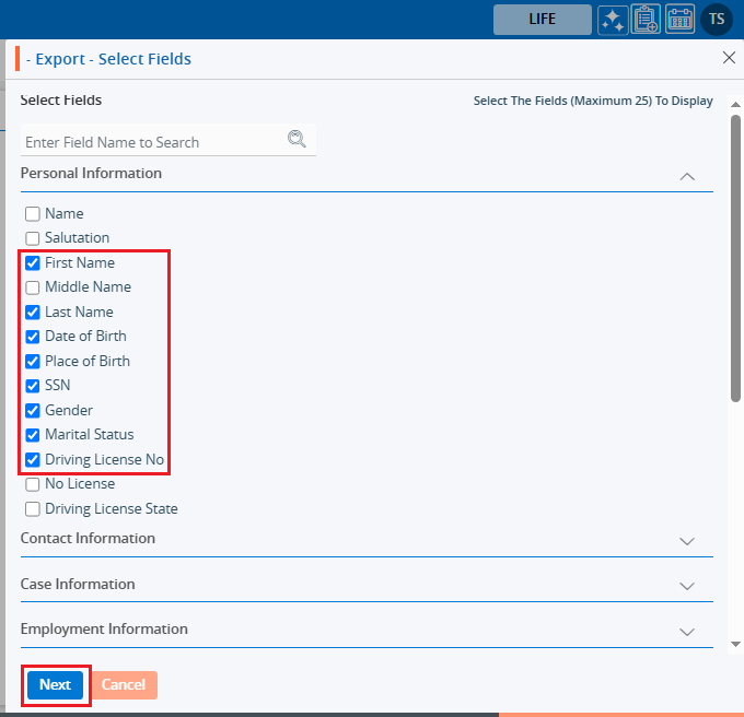
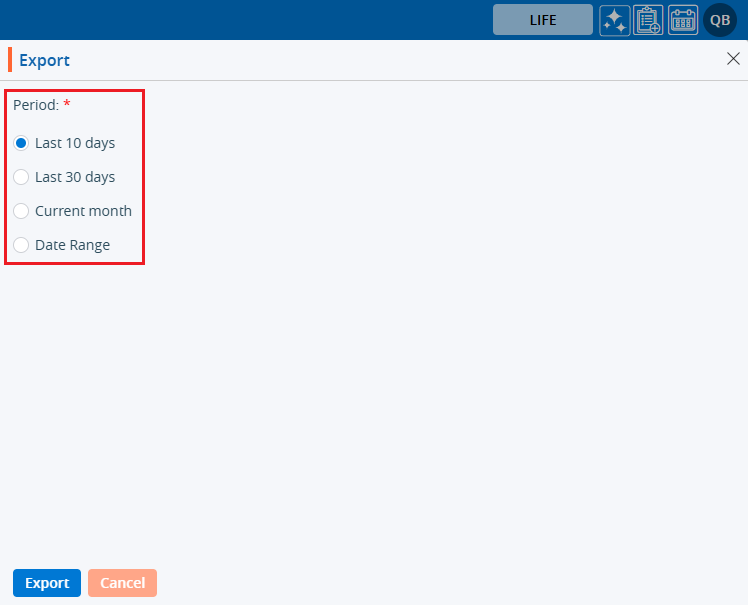
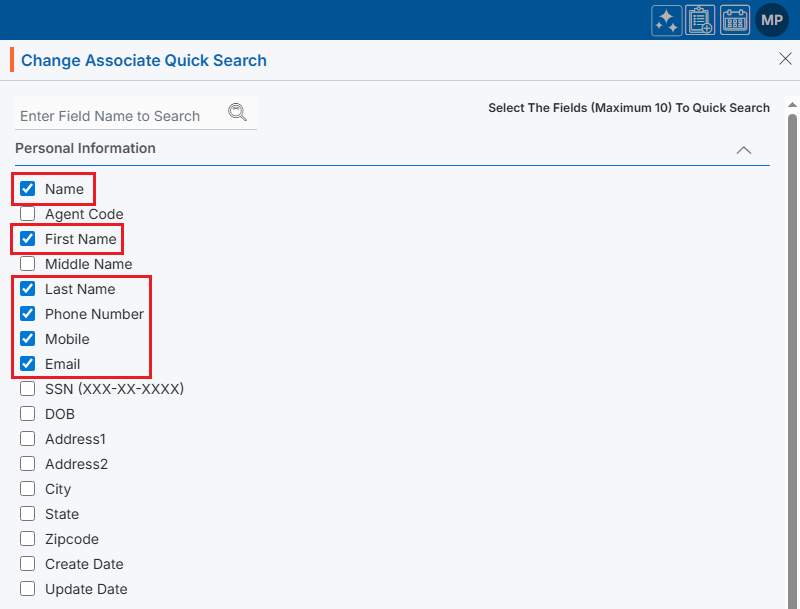
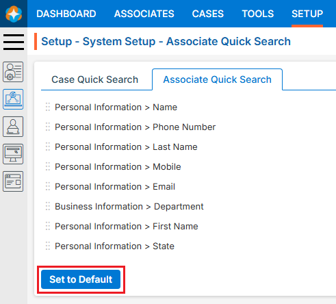
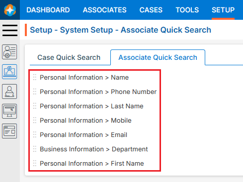
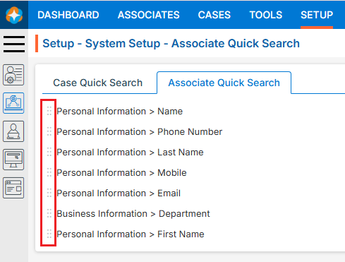
It displays the report page, which covers the following fields:
Contact Methods
Campaign Type
Campaign Status
Campaign Name
Group Name
Period
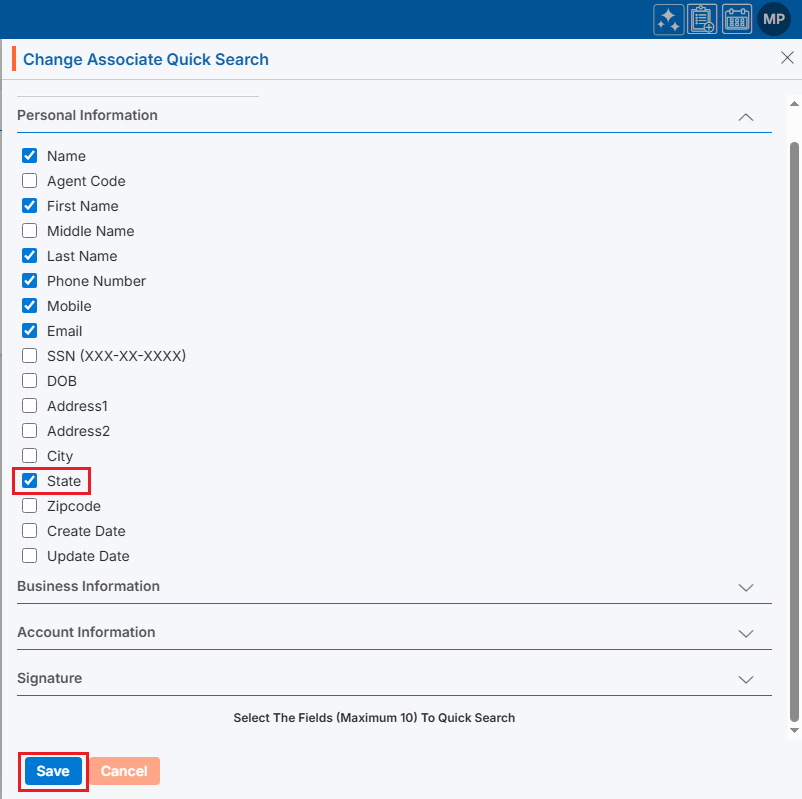
Select the required fields and click on View Report.
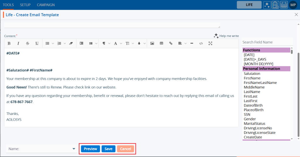
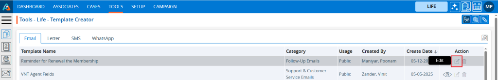
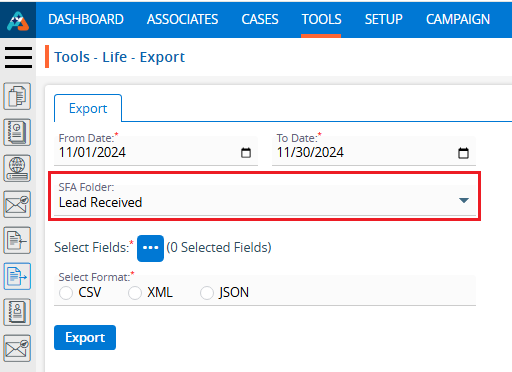
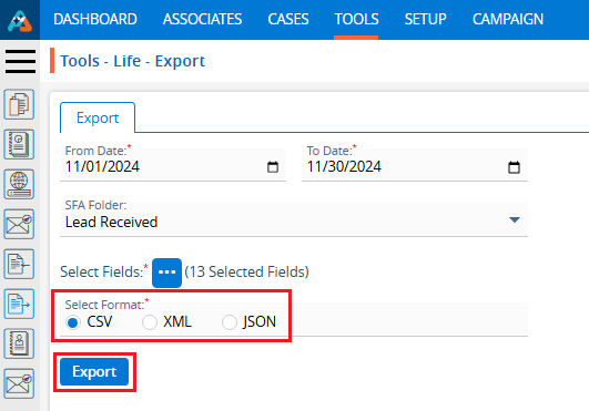
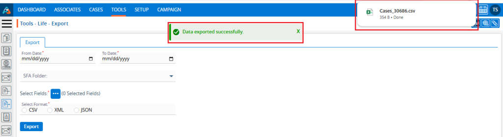
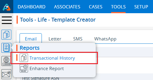
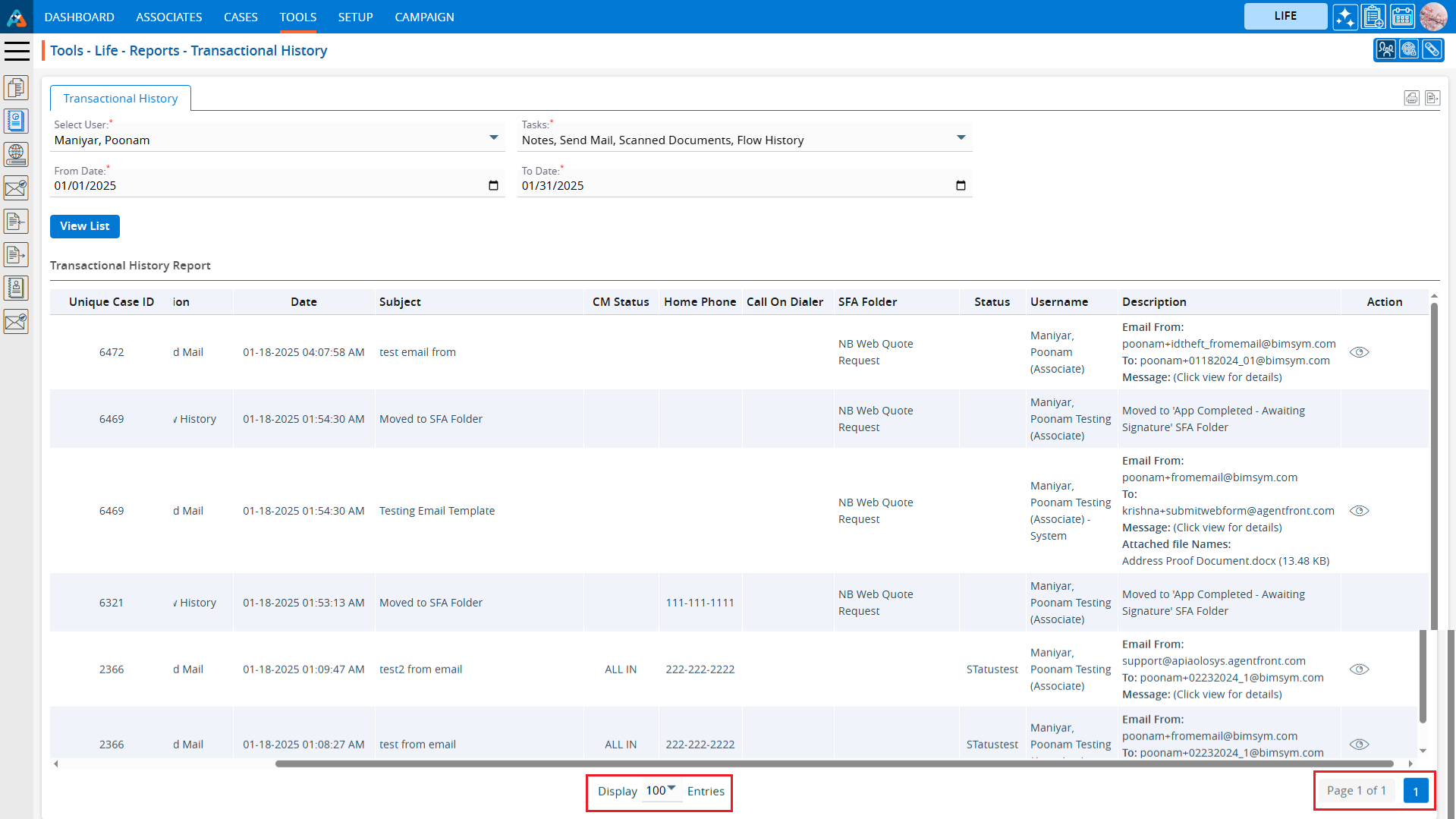
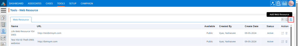
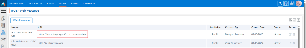
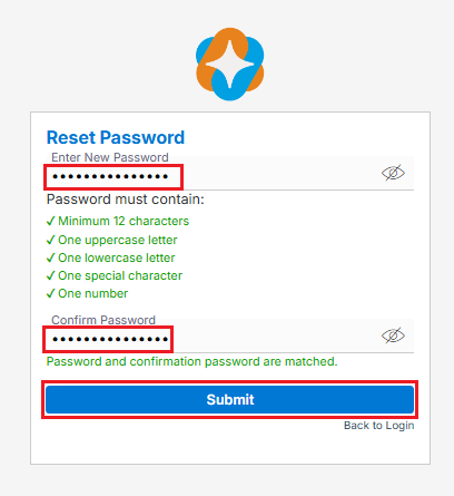
Based on the selected fields the campaign report results will be displayed, and Export button will be enabled on the right pane once report is generated. Below prints screen displays the details of the campaign.Below prints screens will display the stages of the campaign.
View Report Chart
Click on the chart icon to view the report chart.
Clicking on chart will open popup window for selected campaign status.
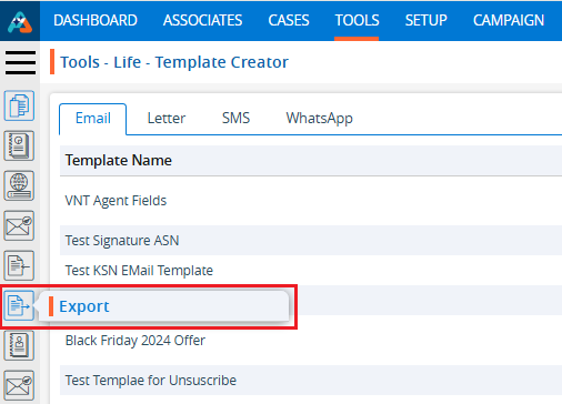
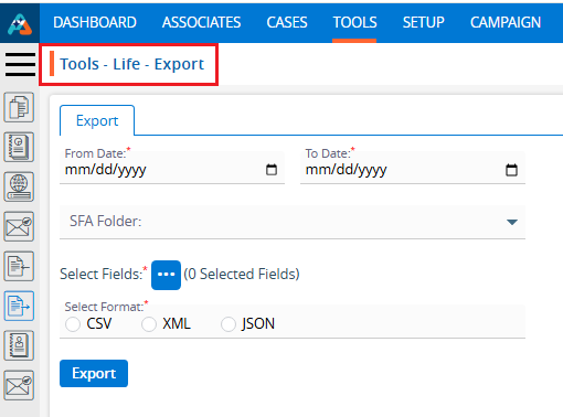
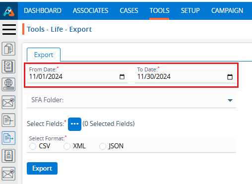
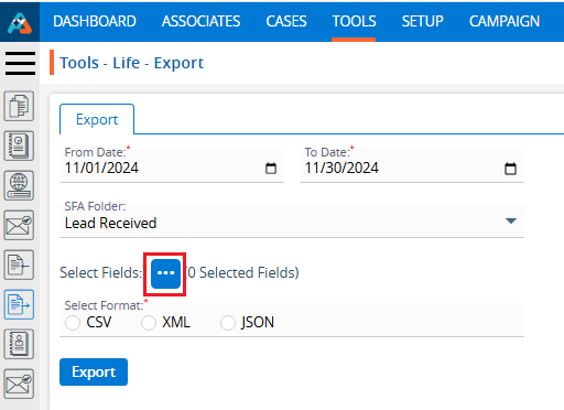
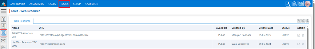
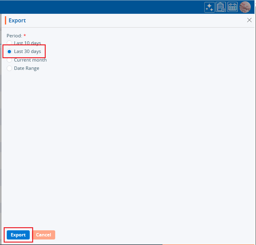
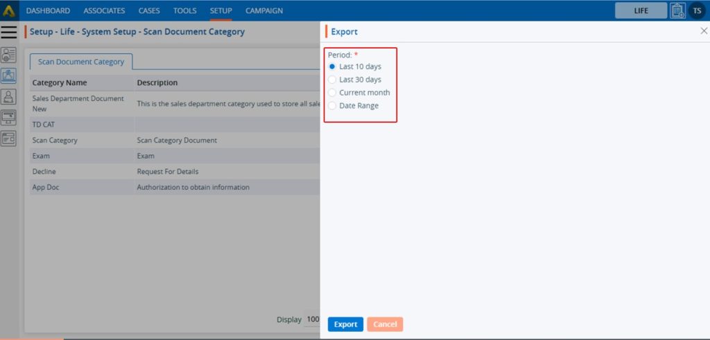
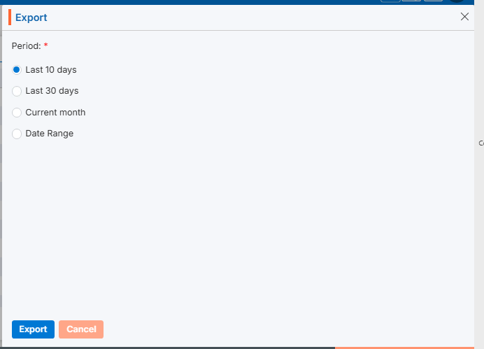
Export Report
Click the Export button to export the report data. Clicking on ‘Export‘ will download the report for selected campaign criteria.
Custom fields in the Campaign tab of a system are additional user-defined fields. Using these fields, the user can import specific data for business needs.
Create Custom Fields
Sign in to AgentFront CRM.
From the top menu, choose Campaign.
Campaign dashboard will open with multiple options (Based on the access rights).
Click on Custom Fields.
This will open with 2 tabs (Default will be Custom Fields):
Custom Fields
Reserved Fields
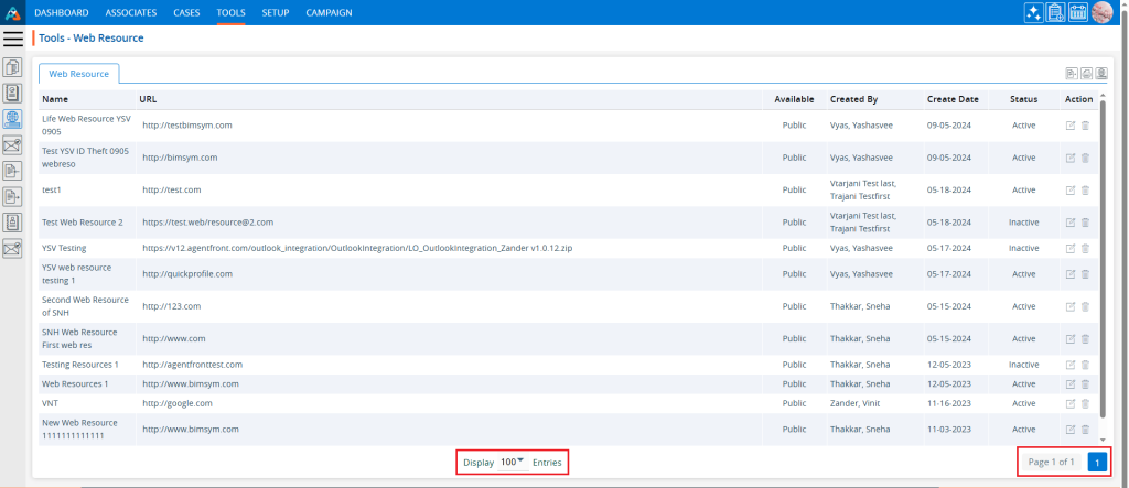
Custom Fields displays the list of available/created fields.
Click on ‘Add’ icon from the Top Right side of the list.
Add Custom Field
It will open page to add field with title Add Custom Field.
To add custom field, enter the following details:
First Field?: Select this option if you want this field to appear first in the display. When this checkbox is selected, field 2-b (After) will become uneditable.
After: To select a value for this field, the “First Field” checkbox must not be selected. Choose a value from the drop-down list to set the display order of the field.
Name: Enter a clear, descriptive name. This is what users will see while importing contacts to the campaign group.
Type: Choose an option from the drop-down list to set validation rules for this field.
Click Save. The custom field will now appear in the list.
Update Custom Field
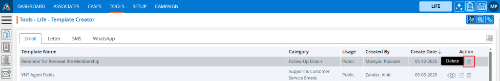
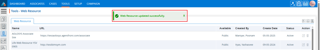
To update the existing field from the available list, click on Edit () icon from the Action Column for the field you want to edit/change. Note: If any field is used/assigned, editing and deleting options will not be enable for those fields.
Clicking the Edit icon will open the selected Custom Field in edit mode with title Edit Custom Field.
You can make the required editing in the below field’s values of the open Custom Field.
First Field?: Update this option if you want this field to appear first in the display. When this checkbox is selected, field 3-b (After) will become uneditable.
After: To select a value for this field, the “First Field” checkbox must not be selected. Choose a value from the drop-down list to set the display order of the field.
Name: Enter a clear, descriptive name. This is what users will see while importing contacts to the campaign group.
Type: Update an option from the drop-down list to set validation rules for this field.
Click Save. The custom field will now appear in the list.
Delete Custom Field
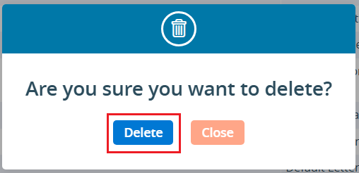
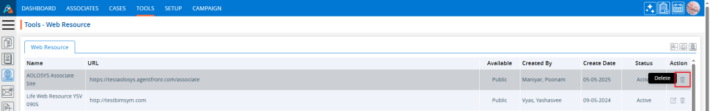
To delete the existing field from the available list, click on Delete () icon from the Action Column for the filed you want to delete.
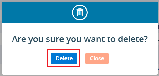
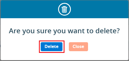
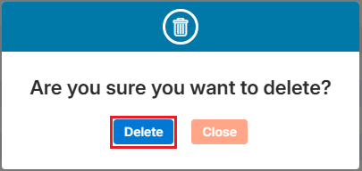
It will ask for confirmation popup, click on Deleted button to delete field otherwise click on Close button.
Reserved Fields
These fields are system generated fields and non-editable. These fields will be available in the drop down of the Campaign > Group > Import Contacts.
Multi-Product tip
If your login has access to multiple products, be sure to select the correct product from the product icons in the top-right corner before adding, editing, or deleting custom field.
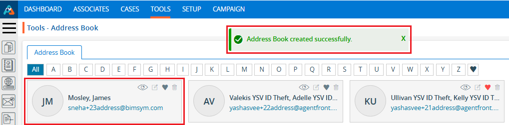
A Campaign Group allows you to organize multiple contacts into a single, manageable group. Once the group is created and contacts are imported, it can be used to launch multiple campaigns efficiently. Campaign Groups can be created for individual contacts or based on existing cases in the CRM, enabling more targeted and organized campaign management.
Create Campaign Group
Sign in to AgentFront CRM.
From the top menu, choose Campaign.
Campaign dashboard will open with multiple options (Based on the access rights).
Click on Group.
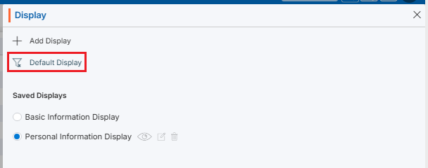
It displays the list of available/created Groups.
There is an Add button to add new group above the Action Column on the right pane.
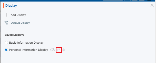
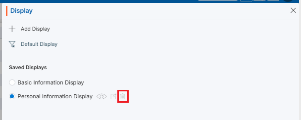
Also, there are options to Edit (), Delete (), and View () the existing group and option to Import Contacts to the group under the Action Column on the right pane.
Add Campaign Group
Click the ‘Add’ button at the top right of the list.
It will open page to create new Campaign Group with title Add Group.
To add group, enter the following details:
Group Name: Enter the clear, descriptive name. This is what users will see when they select a group while creating campaign.
Description: Optional explanation of the group’s purpose.
Do you want to create this campaign group for the existing cases: Select Yes/No. If you want to create a group for the existing cases, select ‘Yes’. When ‘Yes’ is selected, the d and e options will not be available. Default option will be selected as ‘No’.
Would you like to filter out duplicate records in this campaign: Select Yes/No. When ‘Yes’ is selected, duplicate records will be filtered out while importing contacts into this group. Default option will be selected as ‘Yes’.
Please select the field you want to use for duplicate checking: Choose from the drop-down list (Default will be Email). Duplicate records will be filtered out based on selected field from drop-down and will remove those duplicate records while importing contacts into this group.
Click Save. The group is now listed and ready for use.
Update Campaign Group
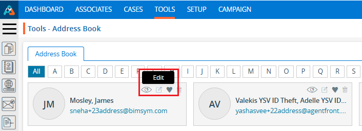
To update the existing group from the available list, click on Edit () icon from the Action Column for the group you want to edit/change.
Clicking the Edit () icon will restrict editing if the group is referenced elsewhere (e.g., in a campaign), and the system will display appropriate popup message.
Clicking the Edit () icon will open the selected Campaign Group in edit mode with title Edit Group if the group is not referenced elsewhere.
You can make the required editing in the below field’s values of the open group.
Group Name: Enter the clear, descriptive name. This is what users will see when they select a group while creating campaign.
Description: Optional explanation of the group’s purpose.
Do you want to create this campaign group for the existing cases: Update Yes/No.When ‘Yes’ is selected, the d and e options will be disabled.
Would you like to filter out duplicate records in this campaign: Update Yes/No. When ‘Yes’ is selected, duplicate records will be filtered out while importing contacts into this group.
Please select the field you want to use for duplicate checking: Update from the drop-down list. Duplicate records will be filtered out based on selected field from drop-down and will remove those duplicate records while importing contacts into this group.
Click Save. The group is now updated.
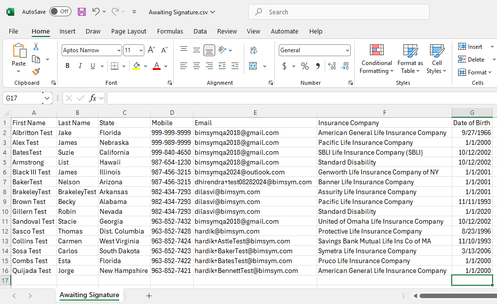
Import Contacts in Group:
To import contact to the existing group from the available list, click on Import Contacts icon from the Action Column for the group you want to import contacts.
It will open the Import Contacts page for selected Campaign Group.
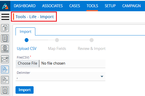
There will be 3 steps to Import Contacts:
Upload CSV
Map Fields
Review & Import
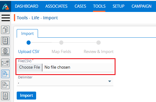
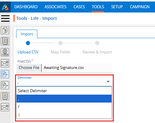
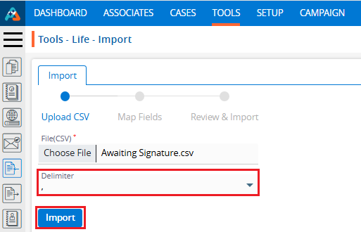
Upload CSV:
Choose File of the contacts which you want to import to this group.
Select Delimiter option from the drop-down. (The selected file format must match the selected delimiter option.)
If you want to remove all existing contacts from the Group, select the check box ‘Select this, if you want to remove all existing contacts in this group. Otherwise, new contacts will be added to this group keeping any available contacts.
You need to read all the bullets on this page to import contacts.
Click Import to add contacts in this group.
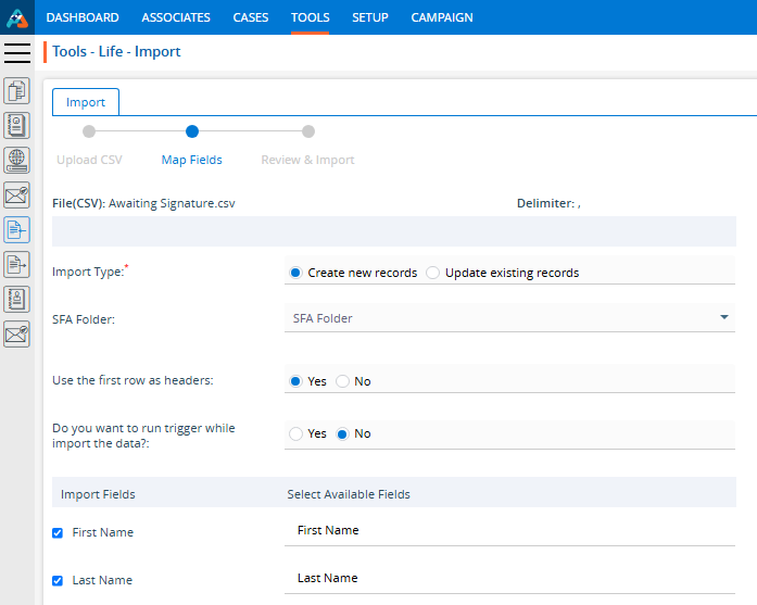
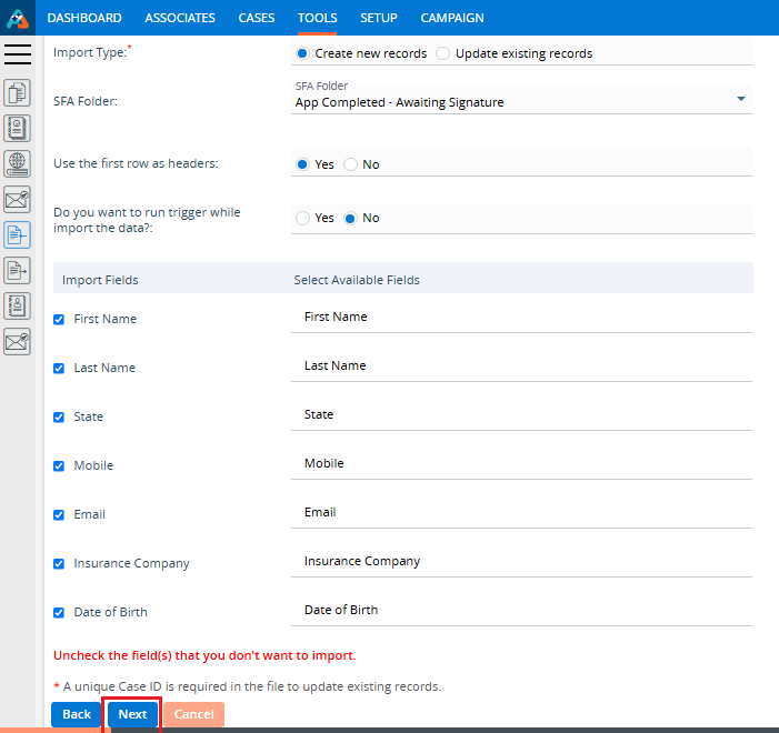
Map Fields:
On the same page next step is for Map Fields.
Under “Import Fields” on the left panel, the system shows the header row from the uploaded CSV file.
The “Available Fields” section displays all fields defined under Campaign > Custom Fields, including both Custom and Reserved fields.
You can deselect unwanted fields. (Here, we have deselected fields No.)
Map the appropriate fields for each field from the dropdown. (Unique Case ID field is required if you selected ‘Yes’ in field ‘Do you want to create this campaign group for the existing cases’ while creating Group)
Click Next.
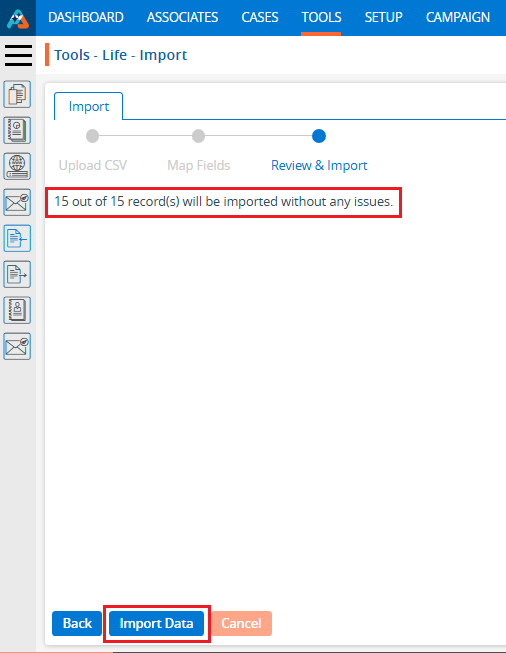
Review & Import:
On the same page next step is for Review & Import the contacts.
Review page will display the counts of contacts with issues and without issues.
The system generates a CSV file link containing the records with issues. Click “Click here” to download and review the file.
System will check contacts with following criteria and display issue message in Column A:
Validation Check: Validation will be checked based on the settings configured under the Custom Fields tab for each field mapped in Step 2.
Duplicate Contacts: Duplicate contacts will be checked in the selected group and within the selected csv file and those records will be filtered out as issue. (This will apply only if ‘Yes’ is selected in field ‘Would you like to filter out duplicate records in this campaign’ while creating Group)
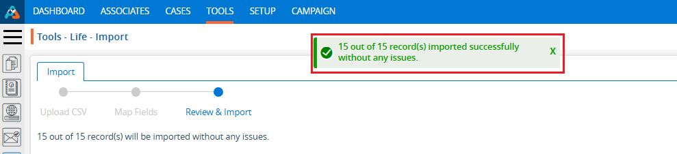
Click Import Data. Contacts without issues will be imported and shown in the selected group.
View Contacts
Contact counts will be shown for the selected Group in Group list.
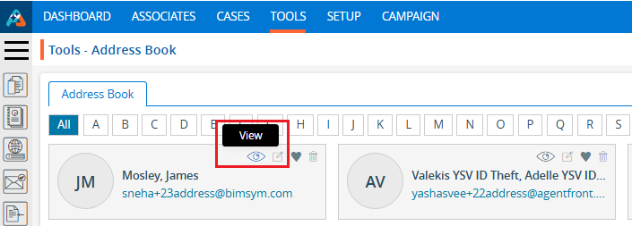
Click View Contacts() icon from the Action Column for the group you want to view details of contacts.
Clicking on View() icon, New page will open with all contact which were successfully imported.
Clicking on View() icon system will generate popup message if any contact is not available for selected group.
Contact can be Add, Viewed, Edited or Deleted from this page.
Delete Campaign Group
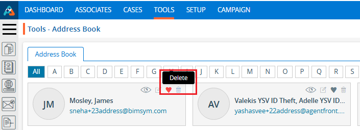
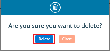
To delete the existing group from the available list, click on Delete() icon from the Action Column for the group you want to delete.
It will ask for confirmation popup, click on Deleted button to delete group otherwise click on Close button. Note: If the group is referenced elsewhere (for example, in a campaign), deletion is restricted until those referenced are removed.
A campaign is a planned marketing effort or communication initiative aimed at reaching a specific group of customers or leads through channels such as email, SMS, or social media. Using this module, users can create multiple groups, set up various campaigns, and view reports for each one.
Sign in to AgentFront CRM.
From the top menu, choose Campaign.
Campaign dashboard will open with multiple options (Based on the access rights).
Click on Campaign.
It displays the list of available/created Campaign.
There is an Add button above the Action Column on the right pane to add new Campaign.
Also, there are options to Edit (), Delete (), and View () the existing campaign under the Action Column on the right pane.Note: If any campaign is used or implemented, the editing and deleting options will be locked for that campaign, meaning it cannot be edited or deleted.
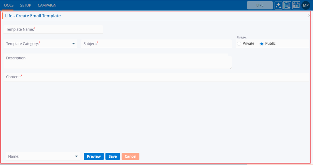
Add Campaign
Click the ‘Add’ button at the top right of the list to add new campaign.
It will open page to add new Campaign with title Add Campaign.
Email Campaign
To add Email Campaign, enter the following details:
Name: Enter the clear, descriptive name. This is what users can identify the purpose of the campaign.
Type: Choose option from the Drop-Down. This option is for the purpose for which the campaign needs to be created.
Contact Methods: Choose Email option from the Drop-Down. This option is for the methods through which this campaign needs to be implemented.
Group: Choose group name from Drop-Down. This drop-down will list the groups created under ‘Campaign’ > ‘Group’. (Contacts must be available for selected group)
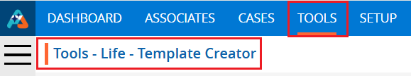
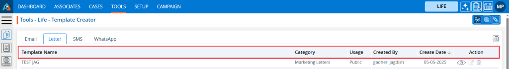
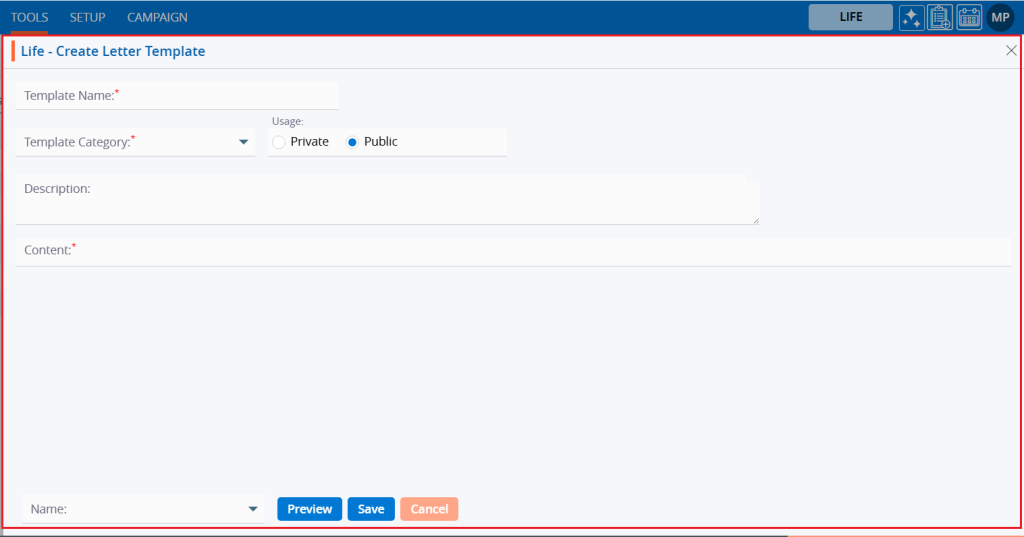
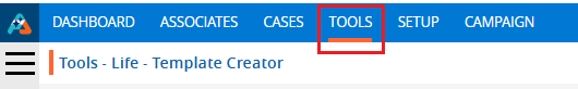
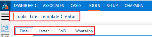
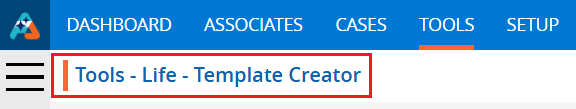
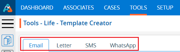
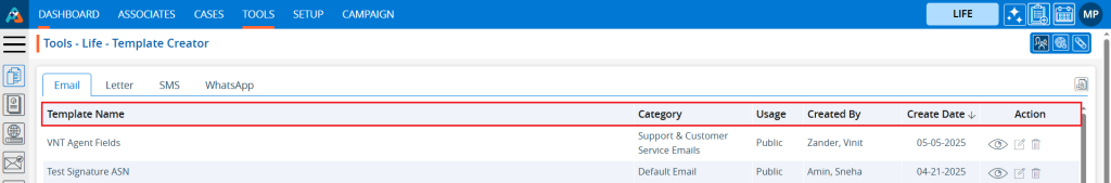
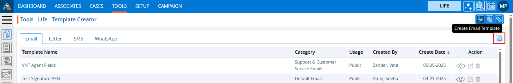
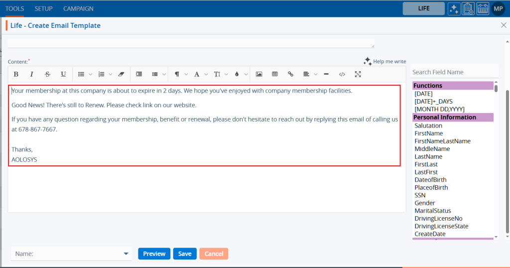
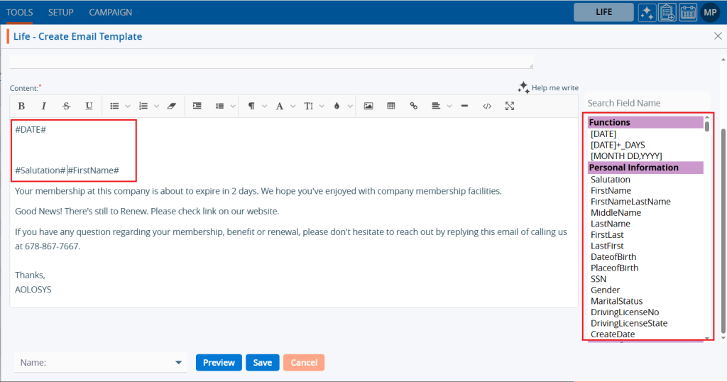
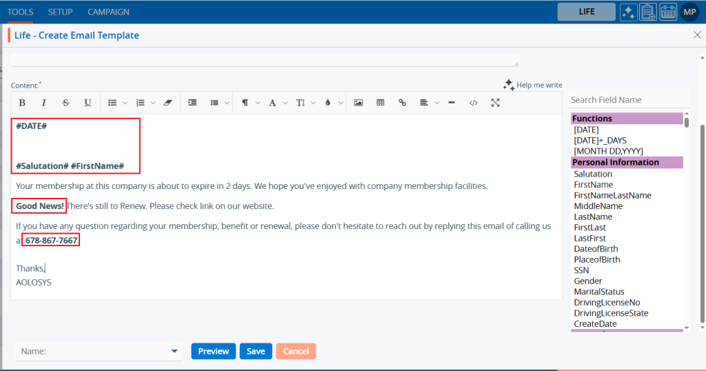
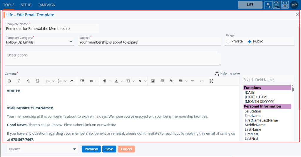
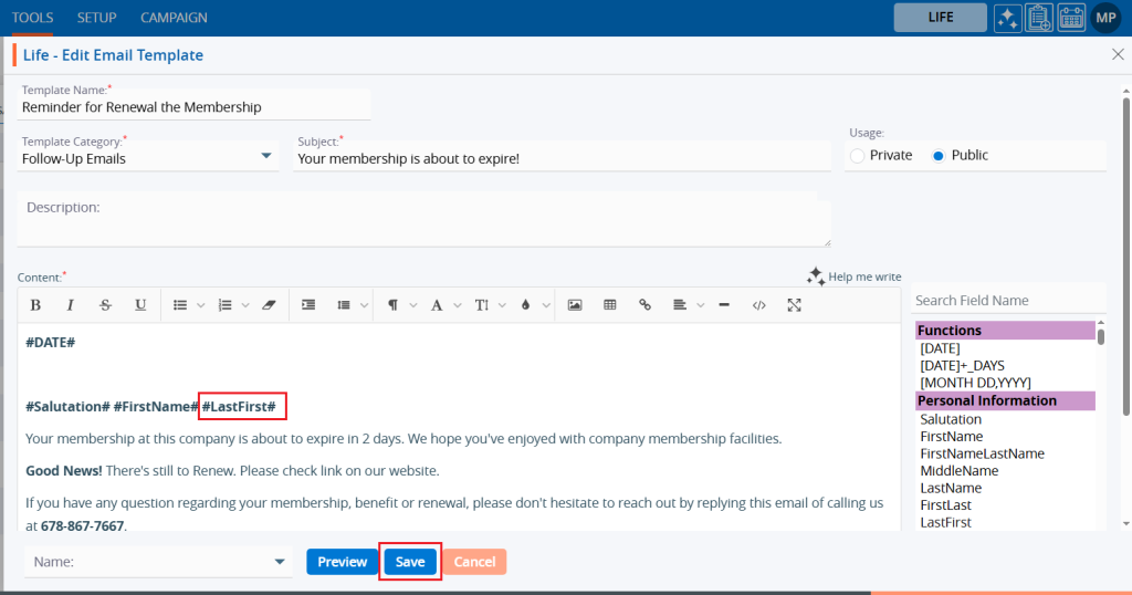
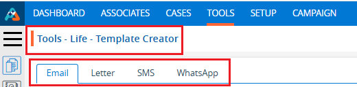
Template: Choose template from the drop-down list. The options in this drop-down will be enabled based on the selected Contact Methods: Email, SMS, and WhatsApp. You can view templates for each category as available in ‘Tools’ > ‘Template Creator’. This field will not be available if ‘Phone Call’ is selected as the Contact Method.
Click Save and Next.
On the same page next step will display the details of the campaign created for Template Name, Group Name and Contact Method.
Click Save and Next.
On the same page next step is for setup of selected Contact Methods. Template Name, Group Name and Contact Methods will display on the top of the page as per selected on first step.
Select the “From” and “To” email addresses from the dropdown.
Select the date for “Scheduled Delivery on”. The email will be sent on this date.
Set the Time. The email will be sent according to the time set in this field.
Preview and Test the setup:
You can preview the email and test before sending it.
You can also send a sample email to check how it looks.
Click “Save” once the setup is complete. The campaign is now listed and ready for use.
SMS Campaign
To add SMS Campaign, enter the following details:
Name: Enter the clear, descriptive name. This is what users can identify the purpose of the campaign.
Type: Choose option from the Drop-Down. This option is for the purpose for which the campaign needs to be created.
Contact Methods: Choose SMS option from the Drop-Down. This option is for the methods through which this campaign needs to be implemented.
Group: Choose group name from Drop-Down. This drop-down will list the groups created under ‘Campaign’ > ‘Group’. (Contacts must be available for selected group)
Template: Choose template from the drop-down list. The options in this drop-down will be enabled based on the selected Contact Methods: Email, SMS, and WhatsApp. You can view templates for each category as available in ‘Tools’ > ‘Template Creator’. This field will not be available if ‘Phone Call’ is selected as the Contact Method.
Country Code: Choose option from the drop-down list. This field will be enabled if the Contact Method selected is SMS, WhatsApp, or Phone Call. Default option will be +1 (US).
Click Save and Next.
On the same page next step will display the details of the campaign created for Template Name, Group Name and Contact Method.
Select the template mapping fields from your imported contacts.
The fields from the selected template will be displayed on the left side of the page.
The options for selecting the mapping will be displayed on the right side of the page:
Static Value: Select an option from the drop-down menu—either Dynamic or Static.
Imported Fields: With the Dynamic option, you can map the template field to the imported field. With the Static option, you must map a static value to the template field for all records.
Click Save and Next.
On the same page next step is for setup of selected Contact Methods. Template Name, Group Name and Contact Methods will display on the top of the page as per selected on first step.
Select the “From” and “To” contact from the dropdown.
Select the date for “Scheduled Delivery on”. The SMS will be sent on this date.
Set the Time. The SMS will be sent according to the time set in this field.
Preview and Test the setup:
You can preview the SMS and test before sending it.
You can also send a sample SMS to check how it looks. Select the country code and phone to send sample SMS.
Click “Save” once the setup is complete. The campaign is now listed and ready for use.
WhatsApp Campaign
To add WhatsApp Campaign, enter the following details:
Name: Enter the clear, descriptive name. This is what users can identify the purpose of the campaign.
Type: Choose option from the Drop-Down. This option is for the purpose for which the campaign needs to be created.
Contact Methods: Choose WhatsApp option from Drop-Down. This option is for the methods through which this campaign needs to be implemented.
Group: Choose group name from Drop-Down. This drop-down will list the groups created under ‘Campaign’ > ‘Group’. (Contacts must be available for selected group)
Template: Choose template from the drop-down list. The options in this drop-down will be enabled based on the selected Contact Methods: Email, SMS, and WhatsApp. You can view templates for each category as available in ‘Tools’ > ‘Template Creator’. This field will not be available if ‘Phone Call’ is selected as the Contact Method.
Country Code: Choose option from the drop-down list. This field will be enabled if the Contact Method selected is SMS, WhatsApp, or Phone Call. Default option will be +1 (US).
Click Save and Next.
On the same page next step will display the details of the campaign created for Template Name, Group Name and Contact Method.
Select the template mapping fields from your imported contacts.
The fields from the selected template will be displayed on the left side of the page.
The options for selecting the mapping will be displayed on the right side of the page:
Static Value: Select an option from the drop-down menu—either Dynamic or Static.
Imported Fields: With the Dynamic option, you can map the template field to the imported field. With the Static option, you must map a static value to the template field for all records.
Click Save and Next.
On the same page next step is for setup of selected Contact Methods. Template Name, Group Name and Contact Methods will display on the top of the page as per selected on first step.
Select the “From” and “To” contact from the dropdown.
Select the date for “Scheduled Delivery on”. WhatsApp will be sent on this date.
Set the Time. WhatsApp will be sent according to the time set in this field.
Preview and Test the setup:
You can preview the WhatsApp and test before sending it.
You can also send a sample WhatsApp to check how it looks. Select the country code and phone to send sample WhatsApp.
Click “Save” once the setup is complete. The campaign is now listed and ready for use.
PhoneCall Campaign
To add PhoneCall Campaign, enter the following details:
Name: Enter the clear, descriptive name. This is what users can identify the purpose of the campaign.
Type: Choose option from the Drop-Down. This option is for the purpose for which the campaign needs to be created.
Contact Methods: Choose PhoneCall option from the Drop-Down. This option is for the methods through which this campaign needs to be implemented.
Group: Choose group name from Drop-Down. This drop-down will list the groups created under ‘Campaign’ > ‘Group’. (Contacts must be available for selected group)
Country Code: Choose option from the drop-down list. This field will be enabled if the Contact Method selected is SMS, WhatsApp, or Phone Call. Default option will be +1 (US).
Call Log Question: Would you like to display the call log in existing cases based on the phone number associated with the cases? Select Yes or No. This option is enabled only when ‘Phone Call‘ is selected as the Contact Method. (Default option will be NO)
Click Save and Next.
On the same page next step is for setup of selected Contact Methods. Group Name and Contact Methods will display on the top of the page as per selected on first step.
Select the “From” and “To” contact from the dropdown.
Click “Save” once the setup is complete. The campaign is now listed and ready for use.
View Campaign
Click View Contacts()icon from the Action Column for the group you want to view details of Contact.
Clicking on View() icon, New page will open with all details of Campaign.
Update Campaign
To update the existing campaign from the available list, click on Edit () icon from the Action Column for the campaign you want to edit/change.
Edit () icon will restrict editing if the group is used/implemented.
Clicking the Edit () icon will open the selected Campaign in edit mode with title Edit Campaign if the campaign is not used/implemented.
Update the required details and click Save.
Delete Campaign
To delete the existing campaign from the available list, click on Delete() icon from the Action Column for the campaign you want to delete.
It will ask for confirmation popup, click on Deleted button to delete campaign otherwise click on Close button. Note: If the campaign is referenced elsewhere deletion is restricted until those referenced are removed.
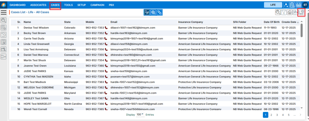
Add cases refers to the process of entering new records into the system. This process ensures that all required information is accurately captured, properly validated, and securely stored.
Sign in to AgentFront CRM.
From the top menu, select CASES.
In the left-side panel, click Add Case to view all available forms for creating a new case.
Select an option such as Start Interview to begin the process of creating a new case.
A new pop-up window will open, displaying a form that must be completed to create the case.
Some fields are mandatory and must be filled in, such as First Name and Last Name.
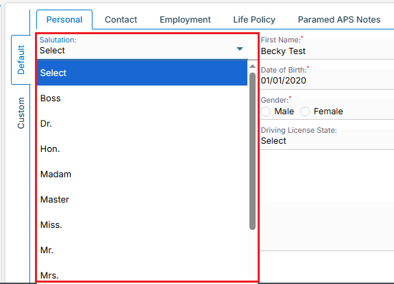
Certain fields provide drop-down menus, requiring the user to select predefined options, such as Salutation and State.
The Date of Birth field includes a calendar picker, enabling the user to select the date easily.
All remaining fields provide standard text boxes, where the user can manually enter the required information.
All remaining fields provide standard text boxes, where the user can manually enter the required information.
Once the information is saved successfully, the case will be securely stored in the system and will appear in the Cases List and click on it to open the case details for review, updates, or further actions as needed.
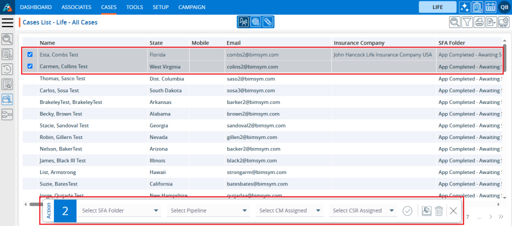
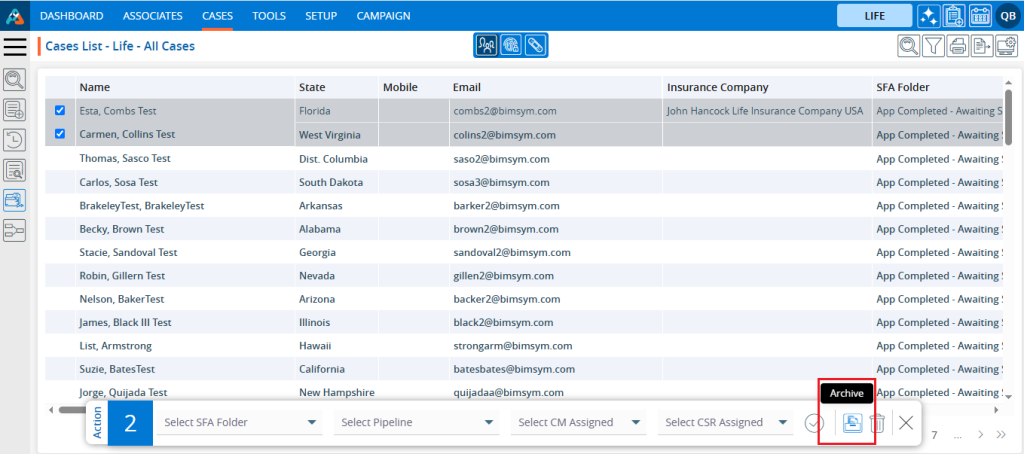
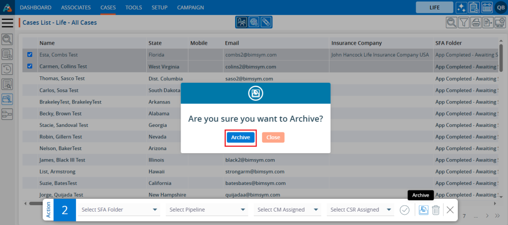
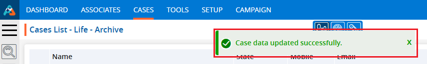
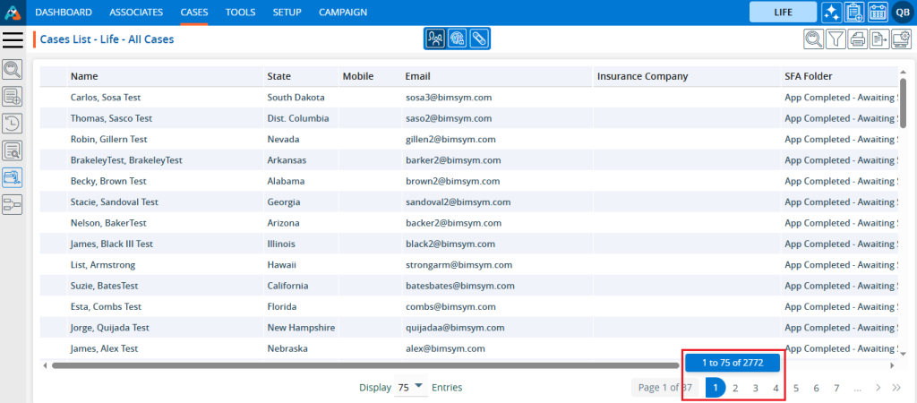
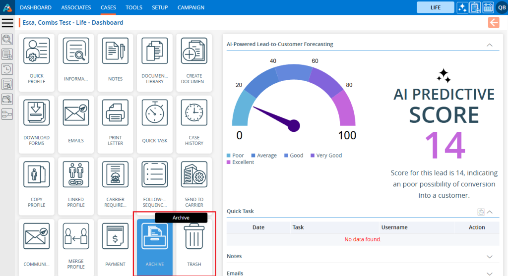
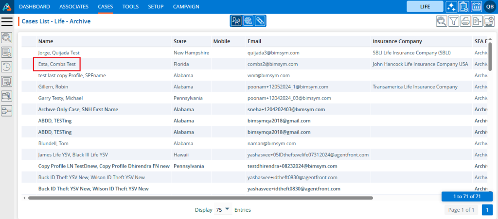
Using the Quick Action Menu the user can perform mass action on single or multiple profiles at a time. It enables the user to change the SFA Folder status or move single or multiple cases from one SFA Folder to another SFA Folder simultaneously.
Sign in to AgentFront CRM
From the top menu, choose Cases
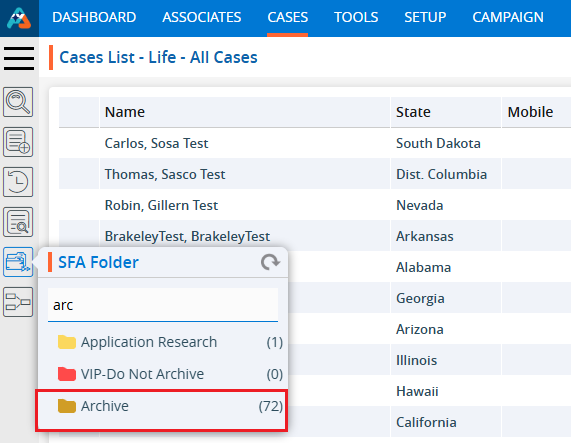
In the left-side panel, select SFA Folder
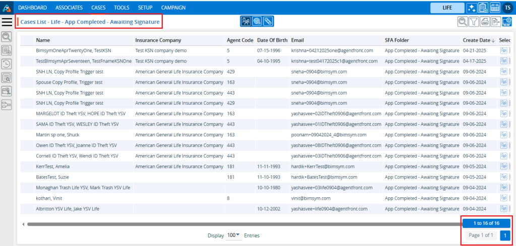
Select the desired SFA Folder. For example, here we have selected ‘Health SFA’ SFA Folder and there are 18 cases available in this SFA Folder
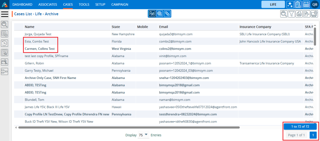
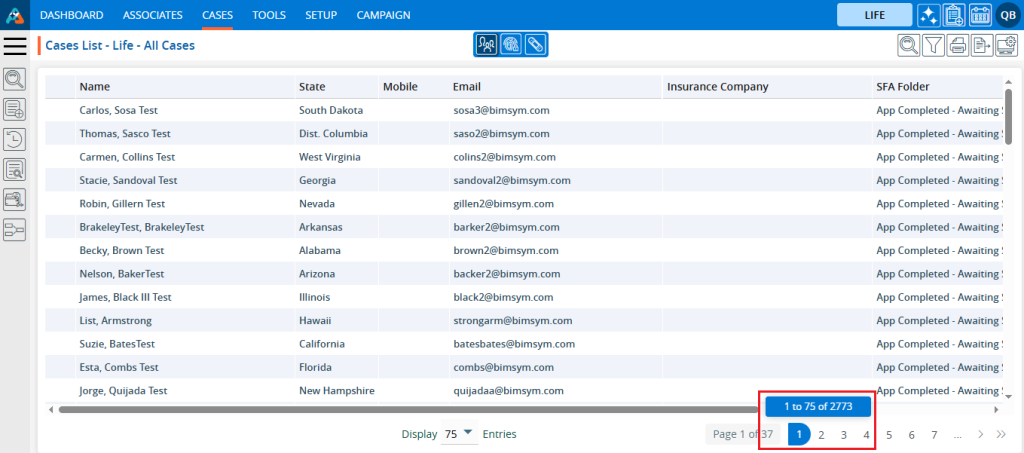
A new page will open for the ‘Health SFA’ SFA Folder, displaying the available cases within it
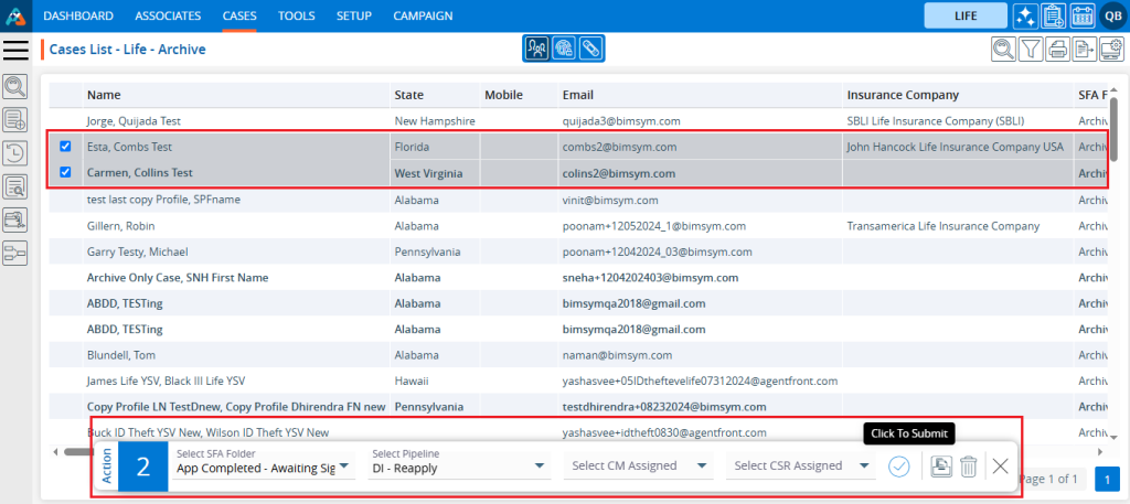
Select the case(s)
After selecting the case(s) action menu will be enabled
Select the another SFA Folder from the drop-down menu. Here we have selected ‘Application Received’ SFA Folder from the drop-down menu
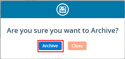
Click on Submit () icon
The selected case(s) will be moved from the current SFA Folder to the selected SFA Folder from the dropdown menu
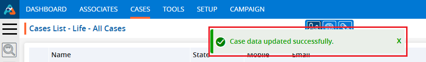
User can see the number of cases will be updated in SFA Folder on cases tab.We have moved cases from the ‘Health SFA’ SFA Folder to the ‘Application Received’ SFA Folder. As a result, 18 cases were transferred to ‘Application Received’, updating its count from 0 to 18, while the count for the ‘Health SFA’ SFA Folder are updated from 18 to 0.
Using the Quick Action Menu the user can perform mass action on single or multiple profiles at a time. It enables the user to change the Pipeline status or move single or multiple cases from one pipeline to another pipeline simultaneously.
Sign in to AgentFront CRM
From the top menu, choose Cases
In the left-side panel, select Pipeline
Select the desired Pipeline. For example, here we have selected ‘DI GRADED’ pipeline and there are 17 cases available in this pipeline
A new page will open for the DI GRADED pipeline, displaying the available cases within it
Select the case(s)
After selecting the case(s) action menu will be enabled
Select the another pipeline from the drop-down menu. Here we have selected ‘HEALTH HUMANA ONE’ pipeline from the drop-down menu
Click on Submit icon
The selected case(s) will be moved from the current pipeline to the selected pipeline from the drop-down menu
User can see the number of cases will be updated in Pipeline on cases tab. We have moved cases from the ‘DI GRADED’ pipeline to the ‘HEALTH HUMANA ONE’ pipeline. As a result, 17 cases were transferred to ‘HEALTH HUMANA ONE’, updating its count from 0 to 17, while the count for the ‘DI GRADED’ pipeline are updated from 17 to 0.
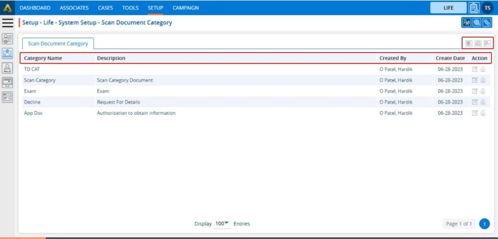
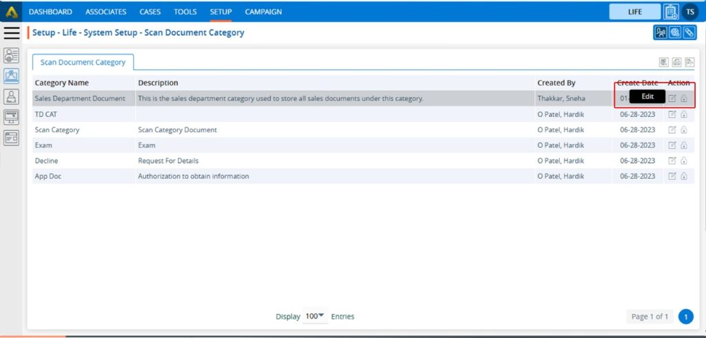
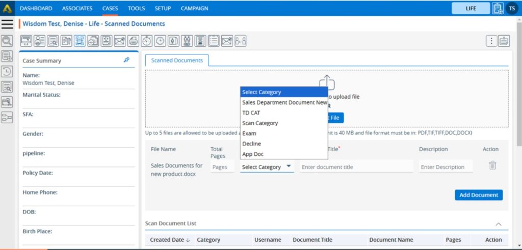
The Document Type refers to the specific classification or category of a document based on its purpose or content. It helps in organizing, managing, and processing documents efficiently.
The following are the steps to manage a Document Type in the system:
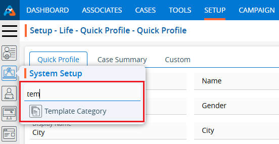
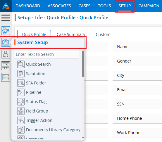
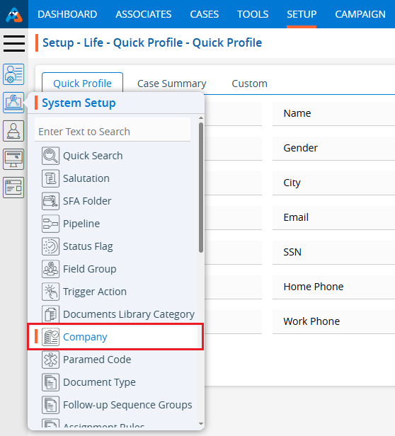
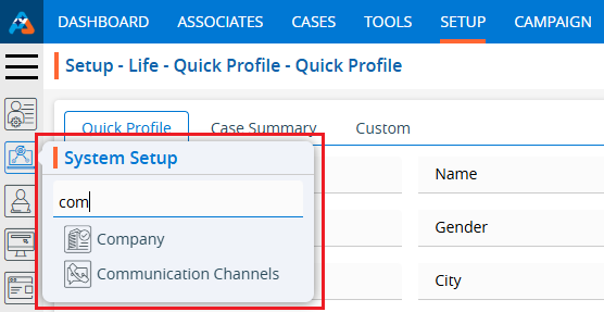
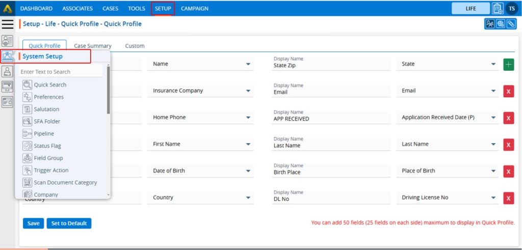
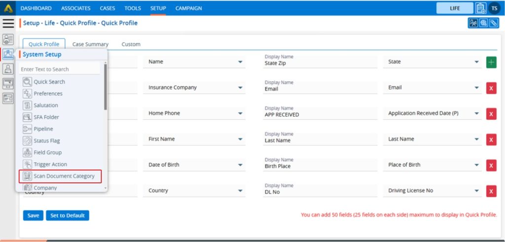
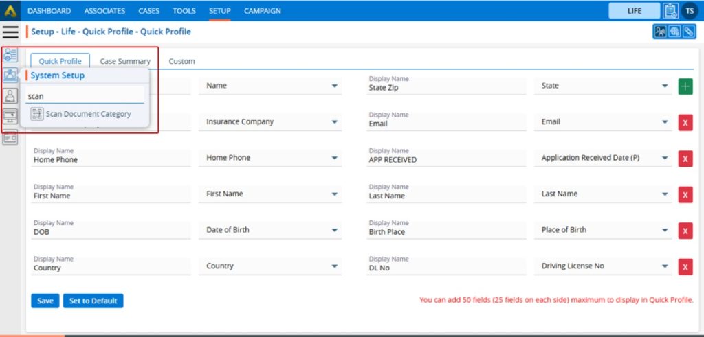
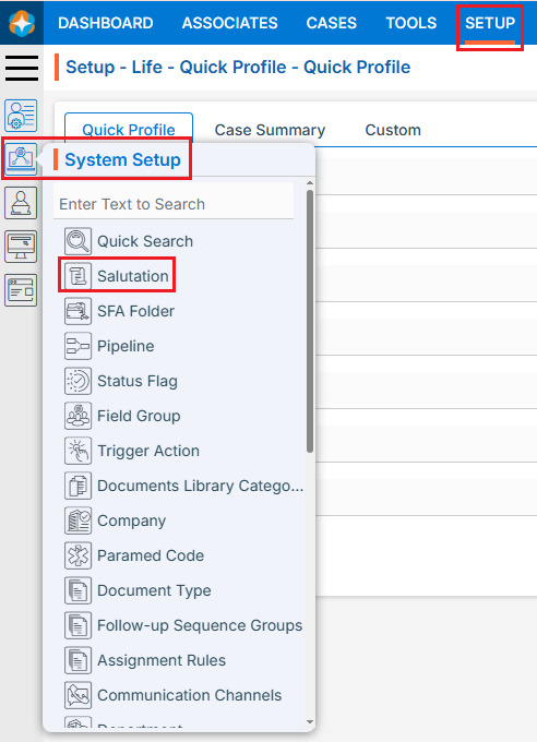
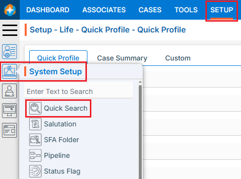
1.Navigate to the ‘SETUP’ tab.
2. Click on ‘System Setup’ in the left-side panel.
3. Click on the ‘Document Type’ option in the System Setup menu.
4. The User can search for the Document Type option by typing in the search area.
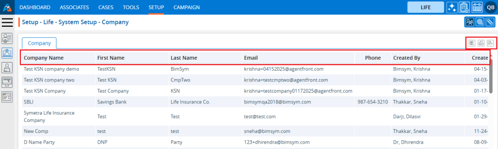
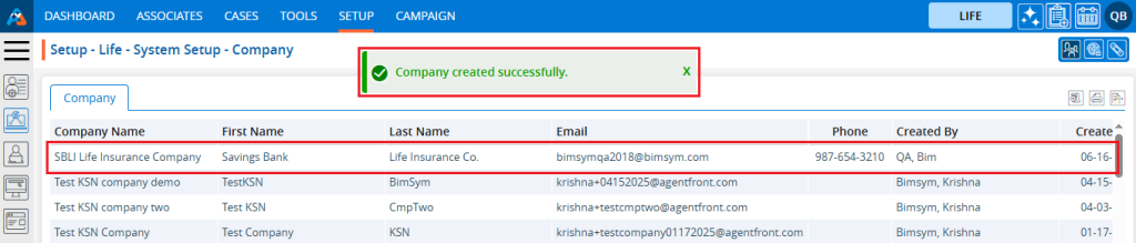
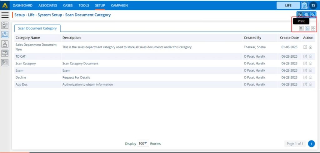
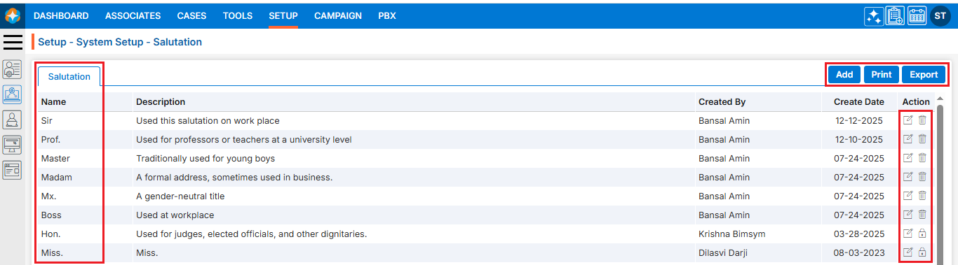
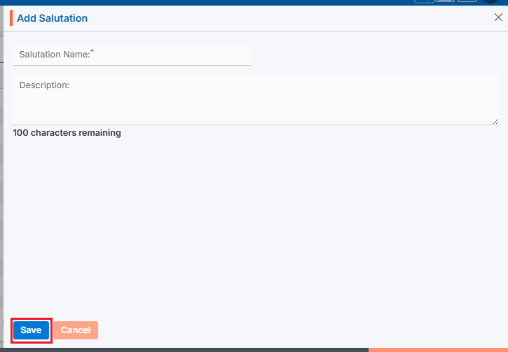
5. The ‘Setup – Life – System Setup – Document Type’ page will open, displaying existing Document Types along with fields including the Document Type, Title, Status, Description, Created By, Create Date and Action under the ‘Document Type’ tab. There are three available options: Add, Print, and Export.
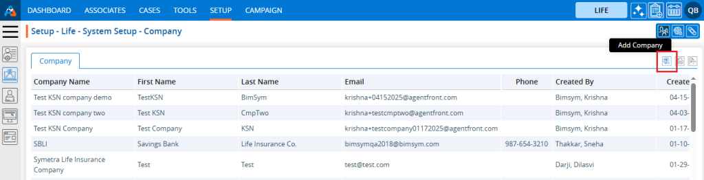
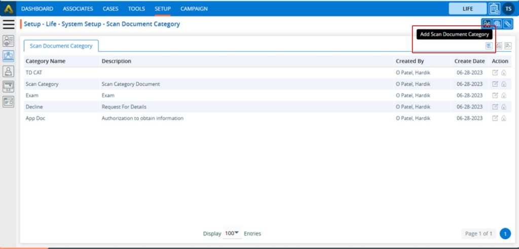
6. Click the ‘Add Document Type’ icon to add a new Document Type.
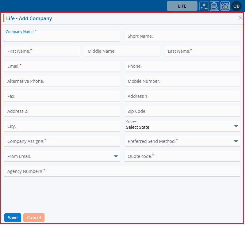
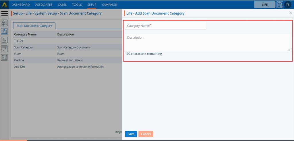
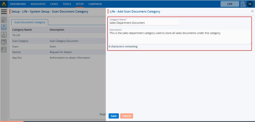
7. The pop-up window ‘Life – Add Document Type’ will open, containing fields for Document Type details and ‘Save’ and ‘Cancel’ options at the bottom. Fields marked with an asterisk are mandatory. ● *Document Type: Enter the Document Type Name. ● *Title: Enter the value for Title for the Document Type. ● *Status: Select a status for the Document Type ● Description: Enter the value for Description for the Document Type.
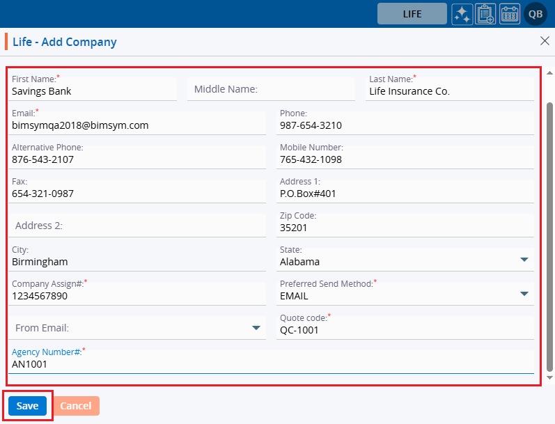
8. Fill in the details and click the ‘Save’ button to continue.
9. A confirmation message will appear, and the newly added Document Type will be available on the list.
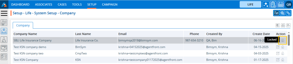
10. There are two options available for each Document Type under the Action heading: Edit and Delete or Lock. For newly created Document Types, the Edit and Delete options will be available by default. ● Edit: By clicking on the Edit icon, the user can edit the details of the selected Document Type. ● Delete or Lock: By clicking on Delete, the user can remove the selected Document Type. However, once the Document Type is assigned to any profile, the option will change from Delete to Lock. The Delete option will remain available until the Document Type is assigned to a profile.
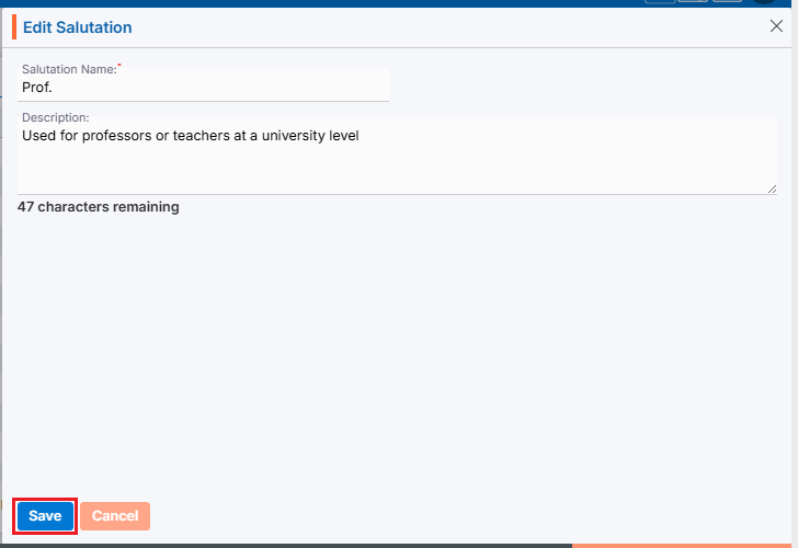
11. The User can update the values for the created Document Type by clicking on the edit icon for the selected Document Type.
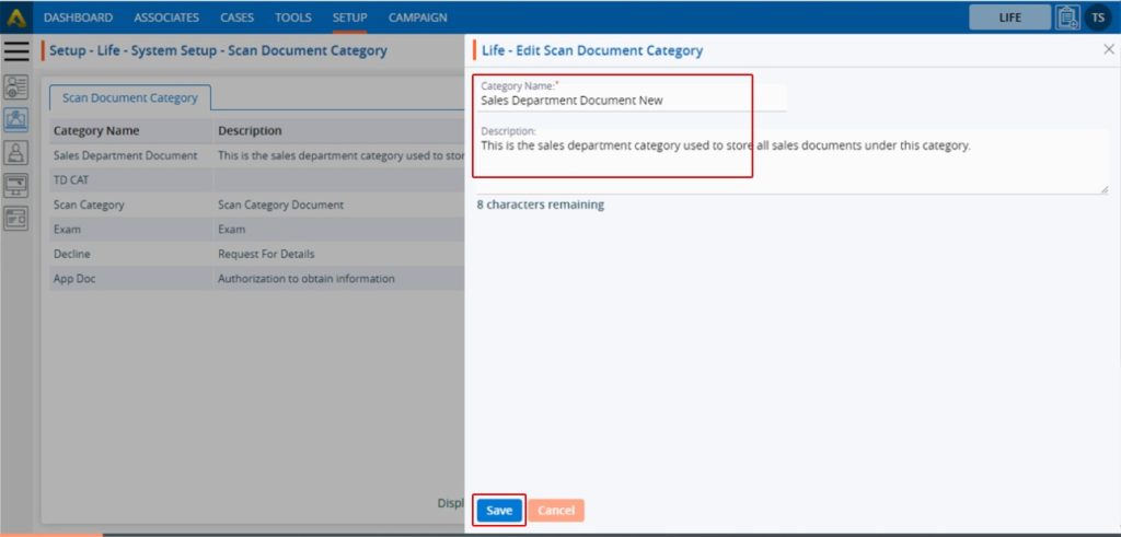
12. A pop-up window titled ‘ Life – Edit Document Type’ will open with the existing field values.
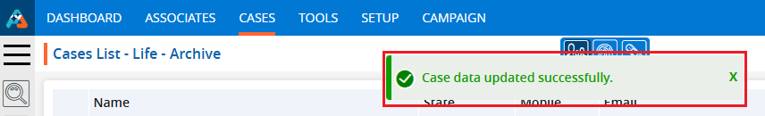
13. Update the values for the Document Type details In this case, we are updating the Title. Once the Title is updated, click on Save button.
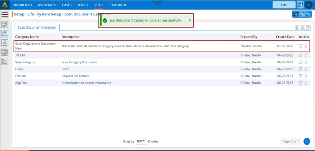
14. The system will generate a confirmation message saying that the ‘Document Type updated Successfully’ and the updated name will be displayed in the listing.
15. To remove the existing Document Type, click on the Delete icon.
16. After Clicking on Delete, the system will ask for confirmation before deleting. Click on Delete to remove the Document Type.
17. The system will generate a confirmation message, and the Document Type will be removed from the list.
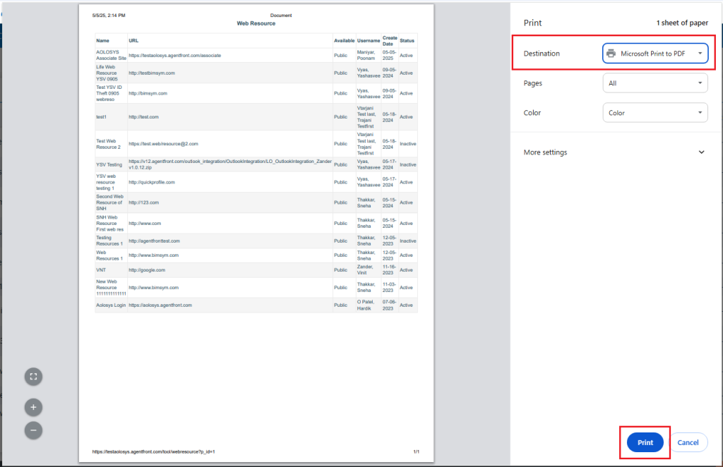
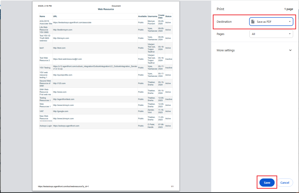
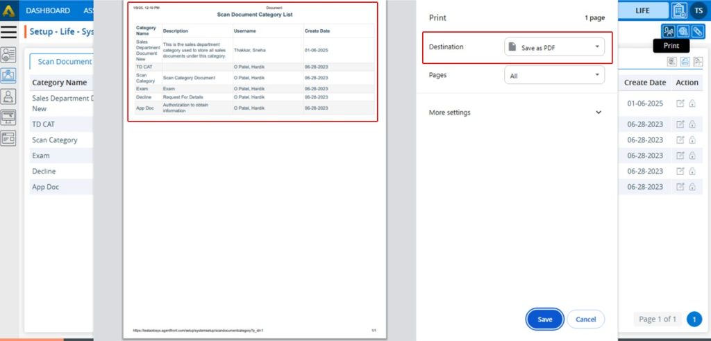
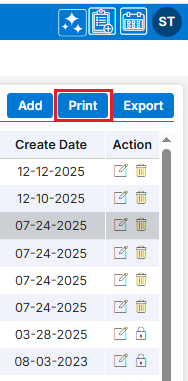
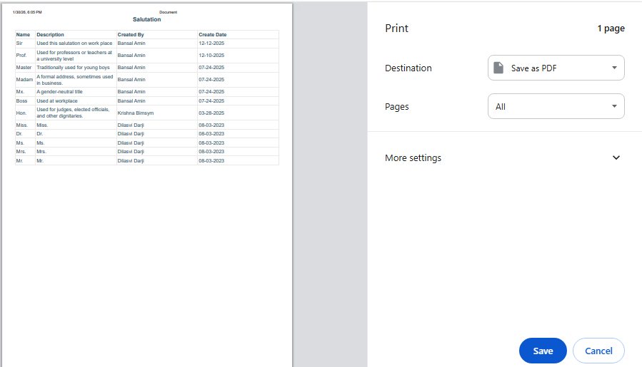
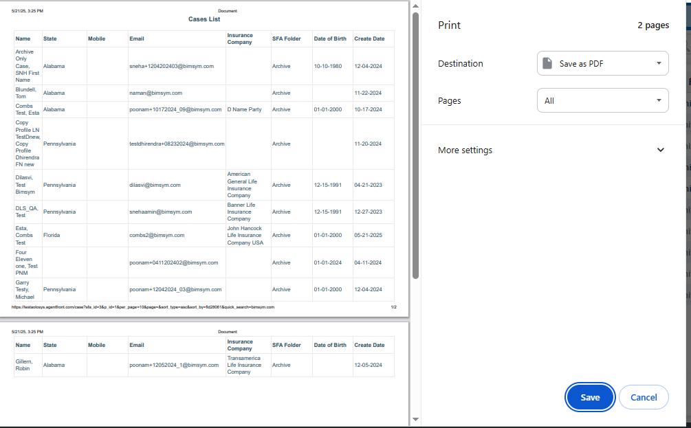
18. To print the list of available Document Types, click on the Print icon.
19. After clicking on the Print icon, a page will open with the print window containing the list of available Document Types. The user can print the data using the desired options.
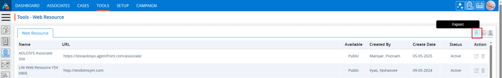
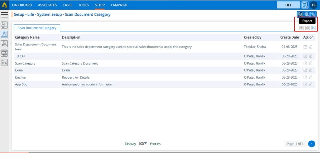
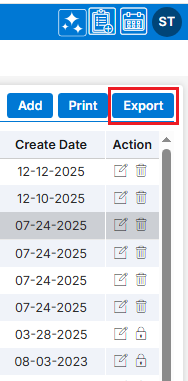
20. To export the list of available Document Types, click on the Export icon.
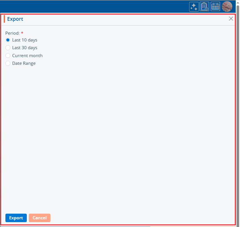
21. By clicking on the Export icon, a pop-up window will open with different options. The user can export the data using the desired options.
22. The Document Types will be exported according to the selected option, and the CSV file will be saved in the designated location.
The following are the steps to add/edit/delete Department in the system:
1.Navigate to the ‘SETUP’ tab and click on ‘System Setup’ in the left-side panel.
2. Click on the ‘Department’ option in the System Setup menu.
3. Users can search for a specific Department by typing in the search area.
4. The page ‘Setup – Life – System Setup – Department’ will open, displaying existing Department along with details including Name, Description, Created By, Create Date and Action under the ‘Department’ tab.
5. Click the ‘Add Department’ icon to add a new Department.
6. A pop-up window titled ‘Life – Add Status Flag’ will open, containing fields for ‘Initial Status Flag,’ ‘Add Status Flag After,’ ‘Status Flag Name,’ and ‘Description’.
Fields with an asterisk* are mandatory. In this case, Status Flag Name and Description are mandatory fields. ● Initial Status Flag Checkbox – By checking this checkbox, the status flag will remain at the top of the listing. ● Add Status Flag After: The user can select the Status Flag from the drop-down menu, after which the Status Flag will be placed in the desired sequence. ● Name: Enter the desired Status Flag name. (Limit is a maximum of 100 characters) ● Description: A description for the Status Flag needs to be added in accordance with the Status Flag name. (Limit is a maximum of 100 characters)
7. Fill in the details and click the ‘Save’ button to continue.
8. A confirmation message will appear on the page, and the newly added Status Flag will be available in the list.
9. There are three options available for each Status Flag under the Action heading: View, Edit, and Delete. ● View: By clicking on the view icon, the user can view the details of the selected Status Flag. ● Edit: With this option, the user can update the details of the selected Status Flag. ● Delete: By clicking on Delete, the user can remove the selected Status Flag.
10. By clicking on the view icon, a pop-up window “Life – View Status Flag” will open, displaying the details of the selected Status Flag.
11. The newly added Status Flag will be displayed in Status Flag drop down in the following two places: ● Cases tab > Case Profile > Quick Profile > Life tab ● Cases tab > Case Profile > Quick Profile > Action tab
12. Users can update the values for a created Status Flag by clicking on the edit icon for the Status Flag.
13. A pop-up window ‘Life – Edit Status Flag’ will open with the field values. Update the values for the Status Flag.
For example, we are updating the sequence of the Status Flag: remove the value from the “Add Status Flag After” drop-down and select the checkbox for “Initial Status Flag” and click on Save.
14. The sequence of the Status Flag will be updated and displayed at the top of the listing.
15. Updated sequences will also be changed in Status Flag drop down in the following two places:
● Cases tab > Case Profile > Quick Profile > Life tab ● Cases tab > Case Profile > Quick Profile > Action tab
16. To remove the existing Status Flag, click on the Delete icon. (The delete button will not be enabled if a status flag has already been assigned to any case.)
17. After clicking on Delete, the system will ask to confirm before deleting.
18. Click on Delete to remove this Status Flag.
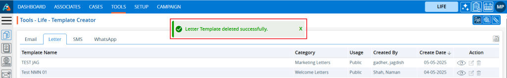
19. The system will confirm, “Status Flag deleted successfully” and the Status Flag will be removed from the list.
20. The Status Flag will no longer be displayed in the Status Flag drop down in the following two places: ● Cases tab > Case Profile > Quick Profile > Life tab ● Cases tab > Case Profile > Quick Profile > Action tab
Form Creator is a feature that allows users to design and build custom forms. These forms are typically used by the sales or support teams to enter information into the CRM system manually.
The following are the steps to utilizing the Form Creator feature:
1. Navigate to the ‘SETUP’ tab and click on ‘System Setup’ in the left-side panel.
2. Click on the ‘Form Creator’ option in the System Setup menu.
3. Users can also search for the ‘Form Creator’ option by typing in the search bar.
4. A new page ‘Setup – Life – System Setup – Form Creator’ displaying the existing Forms with field details including Form Name, Title, Description, Created By, Status, Create Date and Action under the ‘Form Creator’ tab will open.
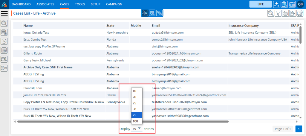
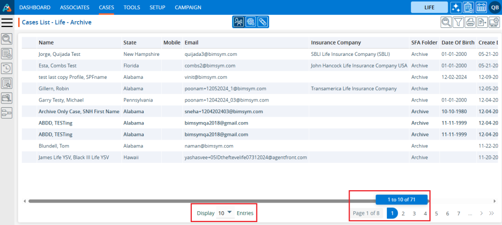
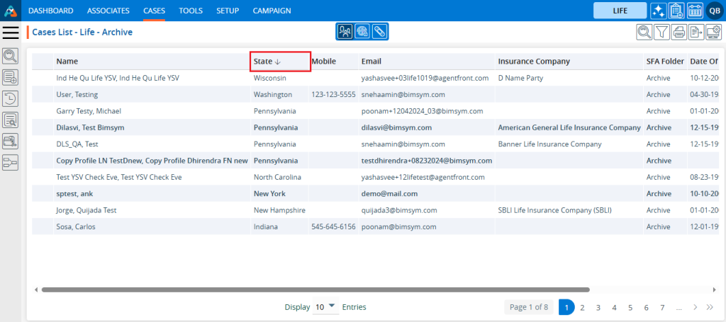
5. Pagination and sorting features are available on this page. ● Users can set the view to display 10, 20, 25, 50, 75, or 100 forms per page, as needed. ● Sorting features are available on the Form Name, Title, Description, Created By and Created Date fields. Users can set the form listing in ascending or descending order by clicking on the field names. By default, this listing is sorted in ascending order by Create Date.
6. Click the ‘Create Form’ icon to add a new Form.
7. A pop-up window ‘Life – Add Form’ will open, containing four steps ‘Add Form’, ’Add Fields’, ‘Set Sequence’, and ‘Add Separator’. ● The first step of the ‘Add Form’ contains the following fields: Form Title, Description, Form For, Select Default SFA (dropdown), Select Default Pipeline (dropdown), Form Status, In Column, and Show This Form. ● Fields marked with an asterisk are mandatory. In this case, the mandatory fields are Form Title, Form For, Form Status, In Column, and Show This Form.
8. Complete the details on the pop-up page: ● Form Title: Enter the desired Form Title. This field allows alphabetical, numerical, spaces and special characters except html tags (< and >). (Limit is a maximum of 35 characters). ● Description: A description for the Form needs to be added in accordance with the Form Title. (Limit is a maximum of 500 characters) ● Form For: This field has three options—Add, Edit, and View. Each option functions separately. The Add option is selected by default and remains selected. i. If the form is created using the ‘Add’ option, the Form Number will begin with ‘CF’. Additionally, once the form is created using this option, it will be placed according to the selection made in the ‘Show This Form’ drop-down menu. ii. If the form is created using the ‘Edit’ option, the Form Number will begin with ‘UF’. Additionally, when the form is created using this option, the user can add and update details for the form, regardless of where it is placed, based on the selection made in the ‘Show This Form’ drop-down option. iii. If the form is created using the ‘View’ option, the Form Number will begin with ‘VF’. Additionally, when the form is created using this option, the user can only view the details for the form, regardless of where it is placed, based on the selection made in the ‘Show This Form’ drop-down option. ● Default SFA: This field will only be enabled when the ‘Add’ option is selected for the ‘Form For’ field. Select the SFA name from the dropdown menu. When a profile is generated using the ‘Add Case’ or ‘Web Form’ option, that profile will be moved to the selected SFA folder. ● Default Pipeline: This field will only be enabled when the ‘Add’ option is selected for the ‘Form For’ field. Select the Pipeline name from the dropdown menu. When a profile is generated using the ‘Add Case’ or ‘Web Form’ option, that profile will be moved to the selected Pipeline. ● Form Status: This field has two options: Active and Inactive. When the Active option is selected, the form will be available in the locations as per the setup. With the Inactive option selected, the form will not be applicable anywhere. Select the desired option. ● In Columns: This field has three options: 1, 2, and 3. The form will be generated in the column corresponding to the selected option. Select the desired option. ● Show This Form: i. If the ‘Add’ option is selected for the field ‘Form For’, the following three options will be enabled in this drop-down: None, Add Case, and Web Form. a. With the None option, the form will not be applicable anywhere. b. With the Add Case option, the form will be available under the CASES > Left side Add Case menu. c. With the Web Form option, the form will be available under SETUP > Lead Generation > Web Forms > Add Web Form page. ii. If the ‘Edit’ or ‘View’ option is selected for the field ‘Form For’, the following four options will be enabled in this drop-down: None, Quick Profile > Tabs, Quick Profile > Top right sub header and Information Tab. With the Edit option, the form will be editable, and with the View option, the form will not be editable. a. With the None option, the form will not be applicable anywhere. b. With Quick Profile > Tabs option the form will be available under the Cases > Any case’s Quick Profile. c. With Quick Profile > Top right sub header option the form will be available under the Cases > Any case’s Header Menu > Top right sub header d. With Information Tab the form will be available under the Cases > Any case’s Information Tab. For example, the form here is created with the following options: ● Form For with Add option ● Active Status ● 3 Columns ● Show this form with Add Case option
9. Once all details are entered and options selected from the dropdown, click on the Next button.
10. After clicking on Next, the system will generate a confirmation message that the form has created successfully. The form will then be available in the listing, and the system will redirect to the next step to add fields to the form.
● Here, the form is created using the ‘Add’ option, the Form Number starts with ‘CF’.
11. The system will display a list of available fields in the next step to add fields to the form. The user can view the list of fields by clicking on the down arrow for any field group. Click on the down arrow to reveal the fields for selection then select the required fields and click on the Next button.
12. After selecting the required fields and clicking the ‘Next’ button, the system will redirect to the next step to set the sequence of the fields. By selecting the six-dot icon before the field name, the user can rearrange the sequence of the fields as needed.
13. The user can set the mandatory fields at this step. By default, First Name, Last Name, and Email are required fields under the ‘Value Required’ section. These three fields cannot be changed to optional; therefore, the checkboxes for these fields are selected by default and are uneditable. The user can add more fields as mandatory from the remaining available fields. ● Here, the checkboxes for Date of Birth and Gender are selected under the ‘Value Required’ section, making both fields mandatory. This brings the total to 5 mandatory fields for the form. These two fields are optional to set as mandatory, and their checkboxes are blue and editable
14. After selecting the mandatory fields and arranging the sequence, click on the ‘Next’ button.
15. After clicking the ‘Next’ button, the system will display a confirmation message stating, ‘Form fields updated successfully,’ and the page will redirect to the next step to add a separator and review the form preview.
16. On this page, the user can create different sections of fields by selecting a field from the dropdown. For example, if Date of Birth is selected from the Add Separator Before fields drop down, the system will divide the fields into two sections: the first section includes the fields before Date of Birth, and the second section includes the fields on or after Date of Birth.
17. After selecting the field to separate the sections, enter a separator name. The section of fields separated by the Date of Birth will display the header entered in the separator title field. Next, select the column in which the user wants to divide the next section. These selections will apply only to the next section that is separated by the Date of Birth. After completing the selection and adding values in the fields, click the ‘Add’ button.
18. After clicking the ‘Add’ button, the system will display a confirmation message stating, ‘Feature Forms created successfully’. The form will then be added to the listing on the same page, with details including Separator Before, Separator Title, Columns, and Action.
19. Users can add multiple separators for the same form. In this case, an additional separator is created with the ‘Gender’ field. As a result, the form will be divided into three sections based on the selections. The first section will begin with the ‘First Name’ field, the second section will start with the ‘Date of Birth’ field, and the third section will begin with the ‘Gender’ field.
20. For each separator, there are two options under the ‘Action’ header: Edit and Delete. The user can update the separator details by using the ‘Edit’ button. Click on the ‘Edit’ button to update the separator details.
21. Once the separator details are updated, the system will generate a confirmation message stating that the Feature Forms have been updated successfully. ● In this case, we have updated the field from ‘Gender’ to ‘SSN’ for the second separator.
22. By clicking the Delete button, the user can remove the unwanted separator. Click the Delete button to delete the separator.
23. After clicking on Delete, the system will prompt for confirmation before deleting.
24. Click Delete to remove the selected separator.
25. The system will generate a confirmation message stating that, ‘Feature Forms deleted successfully,’ and the separator will be removed from the list.
26. There is an option called ‘Preview’ on the same page. With this option, the user can review the created form and apply any required changes before finalizing it.
27. Click the Preview button to review the created form.
28. After clicking the Preview button, a new page will open, and the form will be displayed with all settings according to the user’s selection of fields, field sequence arrangement, and addition of separators.
29. As per the criteria set during the form creation, the option ‘Add Case’ is selected from the ‘Show This Form’ dropdown, so this form is available under the CASES > Add Case menu.
30. If the ‘Edit’ or ‘View’ option is selected for the ‘Form For’ field, and ‘Quick Profile > Tabs option is selected from the ‘Show This Form’ dropdown, the form will be available under Cases > Any case’s Quick Profile.
31. If the ‘Edit’ or ‘View’ option is selected for the ‘Form For’ field, and ‘Quick Profile > Top right sub header’ option is selected from the ‘Show This Form’ dropdown, the form will be available under Cases > Any case’s Header Menu > Top right sub header.
32. If the ‘Edit’ or ‘View’ option is selected for the ‘Form For’ field, and ‘Information Tab’ option is selected from the ‘Show This Form’ dropdown, the form will be available under Cases > Any case’s Information Tab.
33. Once the form is created, it will be available under the ‘Form Creator’ tab. There will be four options available: Preview, View, Edit, and Delete. To preview the form, click on the Preview button.
34. After clicking the Preview button, a pop-up window will open, and the user can preview the created form view.
35. To view the setup of the form, click on the View button.
36. After clicking the View button, a pop-up window will open, and the user will only be able to view the setup of the created form for form details, fields, sequence and separator.
37. To edit the setup of an existing form, click on the Edit button.
38. After clicking the Edit button, a pop-up page will open, and the user can update the setup of the selected form. The user can update the form details, fields, sequence and separator also.
39. Update the value for any field. For example, here we have updated the place for this form by changing the value in the ‘Show this Form’ dropdown from ‘Add Case’ to ‘Web Form’. Then, click the Next button.
40. After clicking on the Next button, the system will generate a confirmation message stating that the Forms updated successfully, and the page will be redirected to the next step to edit the fields. The user can edit the fields, sequence, and separator as required and apply the necessary changes. Here, we have only changed the place for this form.
41. Now the place will be changed, and this form will be available under Setup > Lead Generation > Web Forms.
42. Locate the Setup > Lead Generation section and click on Web Form. The form will be available under the ‘From’ dropdown.
43. To remove the existing Form, click the Delete icon on the right hand side of the window.
44. After clicking Delete, the system will prompt for confirmation before deleting.
45. Click Delete to remove the selected Form.
46. The system will generate the confirmation message ‘Forms deleted successfully,’ and the Form will be removed from the list.
Trigger Action –A trigger action refers to an event or condition that causes a specific action to occur automatically. These triggers are typically used to automate processes or workflows based on certain criteria.
The following are the steps to manage Trigger Action:
1. Navigate to the ‘SETUP’ tab and click on ‘System Setup’ in the left-side panel.
2. Click on the ‘Trigger Action’ option in the System Setup menu.
3. Users can search for the Trigger Action option by typing in the search area.
4. A new page titled ‘Setup – Life – System Setup – Trigger Action’ will open, displaying the existing Triggers along with field details such as Trigger Name, Created Date, Created By, Activation Date and Actions under the ‘Trigger Action’ tab.
5. Click the ‘Add Trigger Action’ icon on the right side of the window to add a new Trigger Action.
6. A pop-up window titled ‘Life – Add Trigger’ will open, containing fields for ‘Name’ and ‘Description’, along with sections for ‘Criteria’ and ‘Action’. The Save and Cancel buttons are also available on the same page. ● Fields with an ‘*’ sign are mandatory. In this case, Trigger Name, Description, all fields of Criteria section and all fields of Action section are mandatory fields.
7. Please fill in the details on the pop-up page. ● Name: Enter the desired Trigger Action name. [Trigger Name field allows alphabet, number, space and following symbol: -_’& only] and (Limit is a maximum of 50 characters) ● Description: A description for the Trigger Action needs to be added in accordance with the Trigger Action name. (Limit is a maximum of 500 characters)
8. Users need to set criteria for the trigger. ● Criteria are the conditions that define when and how the trigger should be activated. These conditions can be based on predefined events or data. ● There is a separate section under the header ‘When this happens’, which includes different fields such as: i. First Drop Down: This dropdown will display a list of available fields in the system from the parent forms under both tabs in Cases: Information > Default and Information > Custom Fields. (This dropdown will not include the fields of parent forms through which more than one entry of data can be saved). [If a non-date-related field is selected from the first dropdown, two additional options need to be selected from the second and third/fourth dropdowns. If a date-related field is selected, three additional options must be selected from the second, third, and third/fourth dropdowns.] ii. Second Drop Down: This dropdown will display the options to set criteria based on the selected fields from the first dropdown, which include ‘Changed From’, ‘Changed To’, ‘Changed’, and ‘Received/Value Added’. iii. Third Drop Down: This dropdown will be enabled only if a date-related field is selected from the first dropdown. It will then display options to set criteria, including ‘Today + Days’, ‘Today – Days’, ‘Fixed Date’, and ‘Other Fields’. iv. Third/Fourth Drop Down or Text Field: This option will be enabled based on the selections made in the first, second, and third (if enabled) dropdowns. For this option, the user is required to either select an option from the dropdown or enter specific values in the text box, depending on the available options.
● For example, a trigger is created based on Gender. When the Gender value is changed from ‘Female’ to ‘Male’, this trigger will be executed. ● Please select ‘Gender’ from the Personal Information parent form fields from the first drop down.
● If a non-date-related field is selected in the first dropdown, the date-specific option dropdown will not be enabled. ● Since a non-date-related field is selected, only two fields are required to set the trigger. ● Please select the ‘Changed From’ option from the second dropdown menu.
● Then, please select the value ‘Female’ from the last dropdown menu.
● The first criteria setup is completed as follows: o When the gender is changed from Female. ● There is an option to set multiple criteria for the same trigger action. ● To add multiple criteria, click the + sign, and a new row will appear with the same fields under the “AND” header. ● If needed, the user can define the criteria in this new row, and both criteria will be applied to the trigger when it runs. ● So, by using the + sign, the user can set multiple criteria, and all criteria will be applied with an AND condition.
After completing the field selection under the criteria section, the action must now be set. ● Action: Actions are tasks or operations that are automatically executed once the specified criteria or conditions are met. When the conditions are fulfilled, the action is “triggered” and carried out without the need for manual intervention. ● There is a separate section under the header ‘Then do this’, which includes different fields such as: i. First Drop Down: This dropdown will display a list of available fields in the system from the parent forms under both tabs in Cases: Information > Default and Information > Custom Fields. (This dropdown will not include the fields of parent forms through which more than one entry of data can be saved). ii. Second Drop Down: This dropdown will display the options ‘Equals’ or ‘Equals and Remove Fields Value’ based on the field selected in the first dropdown. The user needs to select one of these options from the dropdown. [If the user selects the ‘Equals’ option, the third and fourth dropdowns will be enabled. If the user selects the ‘Remove Fields Value’ option, the third and fourth dropdowns will not be enabled.] iii. Third Drop Down (if enabled): If a date-related field is selected from the first dropdown, this dropdown will display options to set criteria, including ‘Today + Days’, ‘Today – Days’, ‘Fixed Date’, and ‘Other Fields’. If a non-date-related field is selected, the dropdown will display options to set criteria, including ‘Fixed Value’ and ‘Other Fields’. The user needs to select one of these options from the dropdown. iv. Fourth Drop Down or Text Field (if enabled): For this option, the user is required to either select an option from the dropdown or enter specific values in the text box, depending on the available options. ● For example, a trigger is created based on Gender. When the Gender value changes from ‘Female’, this trigger will be executed, and the case will be moved to the specified SFA folder. ● Please select the ‘SFA Folder’ field from the first dropdown.
● The next dropdown will display options based on the field selected in the first dropdown. ● Select the ‘Equal’ option from the second dropdown.
● The next dropdown will display options based on the field selected in the first and second dropdowns. ● Select the ‘Fix Value’ option from the third dropdown.
● The next dropdown will display options based on the fields selected in the first, second and third dropdowns. ● Select the specific SFA Folder name from the fourth dropdown.
● The ‘Rerate To Mail’ SFA folder name is selected.
● The first action is set as follows: o Based on the set criteria, when the gender is changed from Female for a particular case, the action will be triggered, and that case will be moved to the “Rerate To Mail” SFA Folder. ● Similarly, multiple criteria can be set, and multiple actions can also be defined for the same trigger action. ● To add multiple actions, click the ‘+’ sign, and a new row will appear below the first action row with the same fields. ● By clicking the ‘+’ sign, multiple actions can be configured to run with the trigger. ● If needed, the user can define the action in this new row, and all actions will be applied when the trigger runs. ● Using the ‘+’ sign, the user can set multiple actions, and all actions will be applied with an AND condition. ● After completing the criteria selection and setting the actions, click on Save button.
9. The system will generate a confirmation message indicating that the Trigger created successfully, and the newly created Trigger Action will now be available on the list.
10. There are four options available for each Trigger Action under the Action heading: Toggle to Disable/Enable, Edit, Copy, and Delete. ● Toggle to Disable/Enable: The newly added trigger will have a disabled status by default. Click the toggle to enable the trigger, and the color will change to green. Until the status is enabled, the trigger will not execute. ● Edit: The user can update the details, reset the criteria, or reset the action of the selected trigger action. ● Copy: The user can create a duplicate trigger with a different name. ● Delete: By clicking on Delete, the user will remove the selected trigger.
11. Click the Enable/Disable toggle to enable the trigger.
12. The system will generate a confirmation message to enable this trigger. Click on Enable.
13. The system will generate a confirmation message indicating that the trigger is enabled successfully, and the color is changed to green for that trigger.
14. Go to the Cases tab and select any profile. Currently, no SFA is assigned to this profile.
15. Open the Information tab for the selected profile and check the current value of the gender field is Female.
16. Change the gender value from Female to Male and click Save.
17. The system will generate a confirmation message indicating that the information has been updated successfully.
18. The trigger has run, and the selected case has been moved to the ‘Rerate To Mail’ SFA folder as set in the trigger.
19. Users can update the criteria and action for a created Trigger Action by clicking the edit icon next to the Trigger Action on the right hand side.
20. A pop-up window titled ‘Life – Edit Trigger’ will open, displaying the existing field values for criteria and action. Update the values as needed. For example, in this case, we are updating the SFA folder name under the Action section: change the SFA folder value from ‘Rerate to Mail’ to ‘Rerate – Send Close’ and click Save. Now, when the user updates the gender value from Female, the case will be moved to ‘Rerate – Send Close’ instead of ‘Rerate to Mail’.
21. Change the option for the SFA Folder and click Save.
22. The system will generate a confirmation message that the trigger has been updated successfully.
23. To create a duplicate trigger, click on ‘Copy’ for the trigger the user wants to duplicate.
24. A pop-up window titled ‘Life – Copy Trigger’ will open, pre-filled with the same criteria and action settings from the selected trigger. The description will also remain the same as the selected trigger, but the Name field will be blank.
25. Enter the new Trigger name and click on Save. (User can update the criteria and actions as needed)
26. The system will display a confirmation message indicating that the trigger has been created successfully and the newly created Trigger Action will now be available on the list.
27. To remove the existing trigger, click the Delete icon on the right hand side of the window.
28. After clicking on Delete, the system will prompt for confirmation before deleting.
29. Click Delete to remove the selected Trigger.
30. The system will generate a confirmation message saying, ‘Trigger deleted successfully,’ and the trigger will be removed from the list.
31. Additionally, pagination and sorting features are available on this page. ● Users can set the view to display 10, 20, 25, 50, 75, or 100 triggers per page, as needed. ● Sorting features are available on the Trigger Name field. Users can set the trigger sequence in ascending or descending order by Trigger Name.
The WhatsApp Template category is used to categorize WhatsApp messages such as business communications, sales support, customer support, updates, seasonal greetings, personal messages, and networking.
The following are the steps to manage the WhatsApp Template Categories:
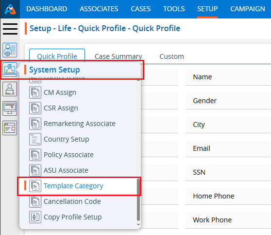
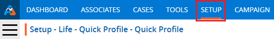
1. Navigate to the ‘SETUP’ tab.
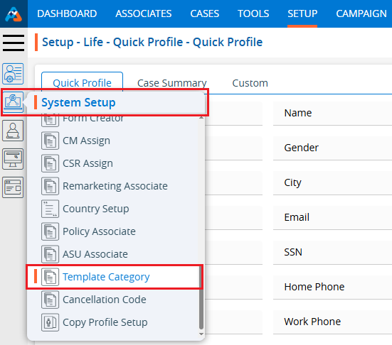
2. Select ‘System Setup’ from the left-hand panel and a pop-up window will appear.
3. Select the ‘Template Category’ option.
4. The user can search for the ‘Template Category’ setup by entering keywords in the search field.
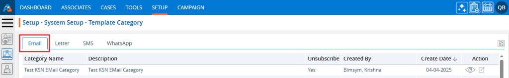
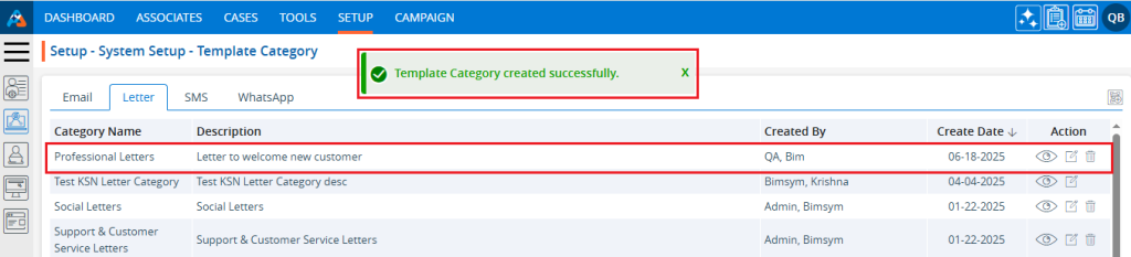
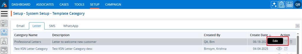
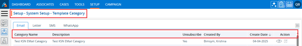
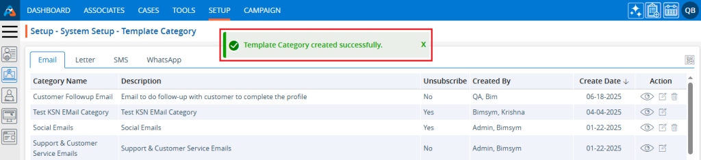
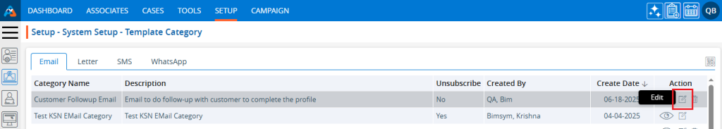
5. A new page titled ‘Setup – System Setup – Template Category’ will open, displaying the WhatsApp Template Category by default.
6. This page will show fields including Category Name, Description, Created By, Creation Date, and Action.
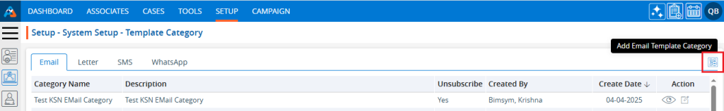
7. Click the ‘Add WhatsApp Template Category’ icon on the right side of the window to add a new WhatsApp template category.
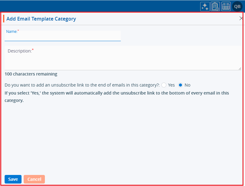
8. A pop-up window titled ‘Add WhatsApp Template Category’ will open, containing fields such as ‘Name’, ‘Description’, and ‘Do you want to add an unsubscribe link to the end of the SMS in this category?’ along with ‘Save’ and ‘Close’ options at the bottom. ● Fields marked with an asterisk are mandatory. ‘Name’ and ‘Description’ are required fields.
9. Fill in the fields and click the ‘Save’ button: ● Name: Enter the desired name for the WhatsApp Template Category. The maximum length is 30 characters. ● Description: Provide a description for the WhatsApp Template Category that aligns with its name. The maximum length is 100 characters.
10. The system will display a confirmation message indicating that the WhatsApp Template Category was created successfully, and the newly created category will appear in the list.
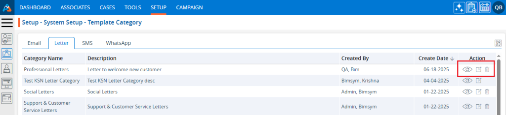
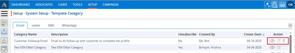
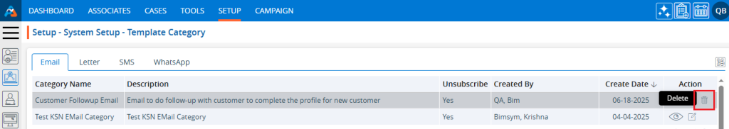
11. Under the ‘Action’ heading, three options are available for each WhatsApp Template Category: View, Edit, and Delete. ● View: The user can see the details of the selected WhatsApp Template Category. ● Edit: The user can modify the selected WhatsApp Template Category. ● Delete: By clicking ‘Delete’, the user can remove the selected WhatsApp Template Category. The Delete option is only available for categories which are not used.
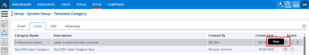
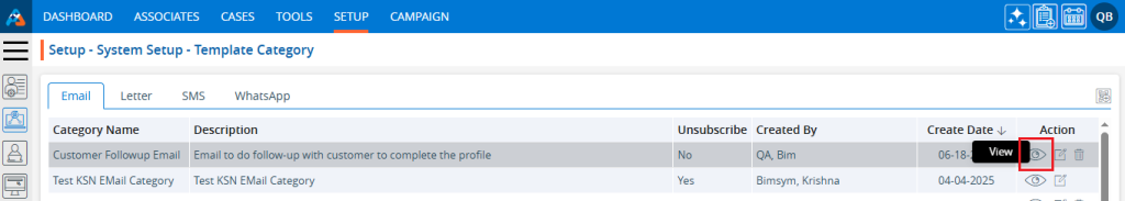
12. Click the ‘View’ icon to see the details of the selected WhatsApp Template Category.
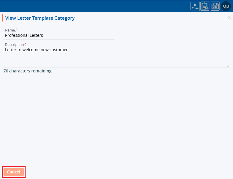
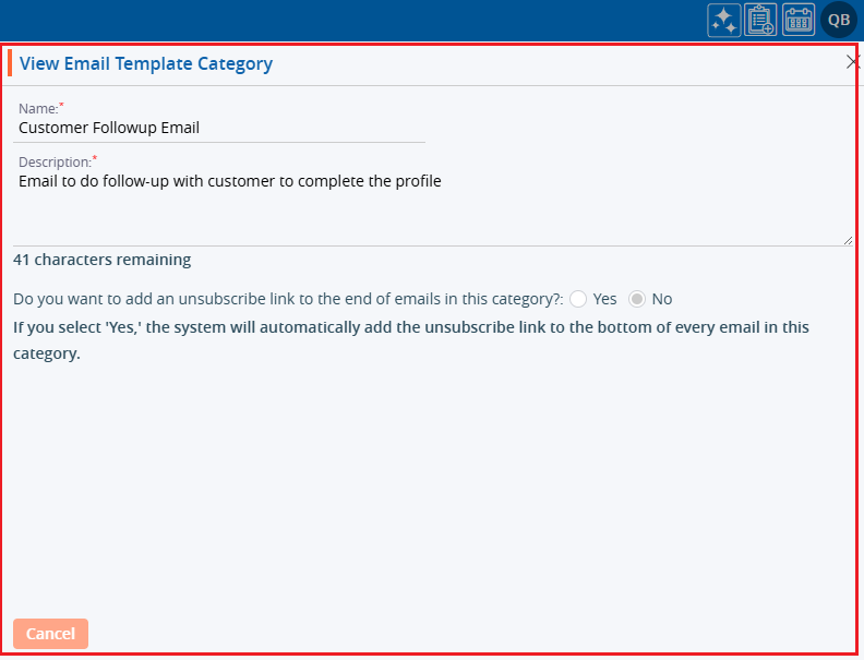
13. A pop-up window will appear where all the fields are read-only, allowing the user to view the details without making any changes. After viewing the information, click the ‘Cancel’ button to close the pop-up.
14. Click the ‘Edit’ icon, the second option in the Action column on the right side of the WhatsApp Template Category (highlighted by a red box), to modify the details of the WhatsApp Template Category.
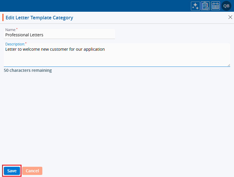
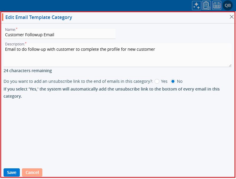
15. A pop-up window titled ‘Edit WhatsApp Template Category’ will appear, allowing the user to update the details of the WhatsApp Template Category.
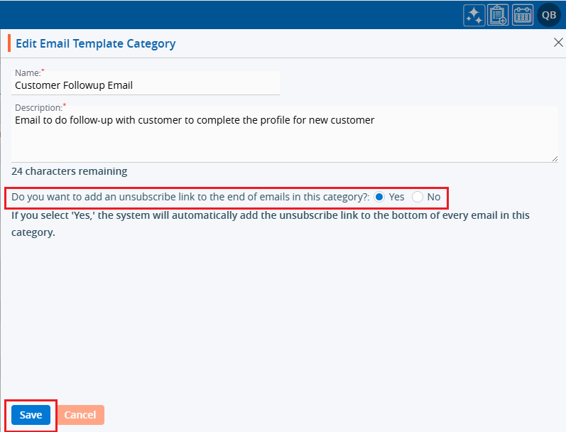
16. Update the details as needed. For example, change the ‘Description’ and click the ‘Save’ button.
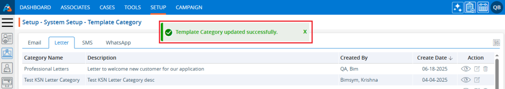
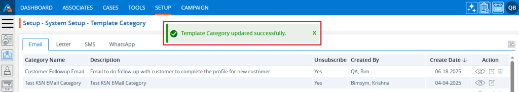
17. A confirmation message will appear, indicating that the WhatsApp Template Category has been updated successfully.
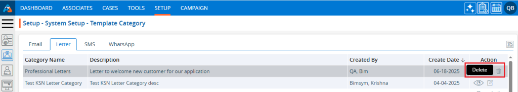
18. The user can remove the WhatsApp Template Category by ‘Delete’ option. The Delete icon is only available for categories which are not used. Click the ‘Delete’ icon, the last option in the Action column on the right side of the WhatsApp Template Category (highlighted by a red box), to remove the WhatsApp Template Category from the list.
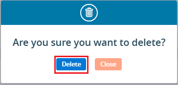
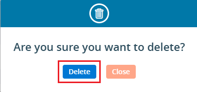
19. Click the ‘Delete’ option in the confirmation message to proceed with removing the WhatsApp Template Category from the list.
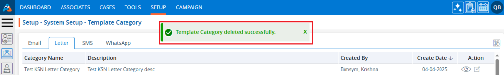
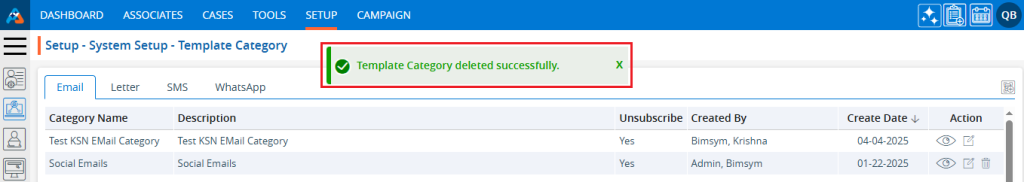
20. A confirmation message will appear, indicating that the WhatsApp Template Category has been deleted and is no longer available on the list.
The SMS Template category is used to categorize SMS such as business communications, sales support, customer support, updates, seasonal greetings, personal messages, and networking.
The following are the steps to managing the SMS Template Categories :
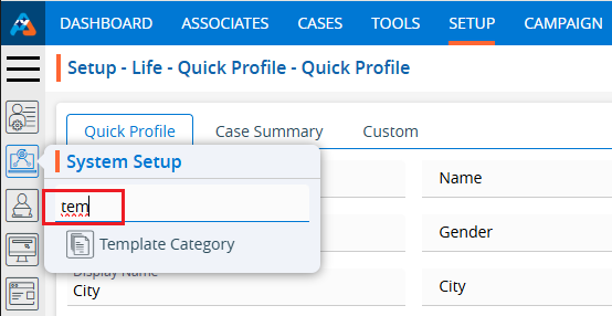
1. Navigate to the ‘SETUP’ tab.
2. Select ‘System Setup’ from the left-hand panel and a pop-up window will appear.
3. Select the ‘Template Category’ option.
4. The user can search for the ‘Template Category’ setup by entering keywords in the search field.
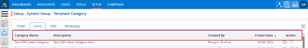
5. A new page titled ‘Setup – System Setup – Template Category’ will open, displaying the SMS Template Category by default. Click on the SMS tab.
6. A new page will open showing the SMS Template Categories. This page will show fields including Category Name, Description, Created By, Creation Date, and Action.
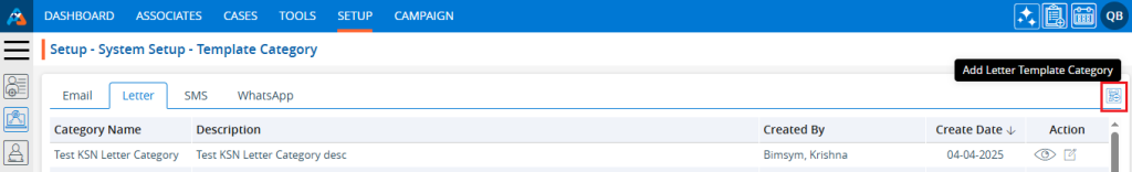
7. Click the ‘Add SMS Template Category’ icon on the right side of the window to add a new SMS template category.
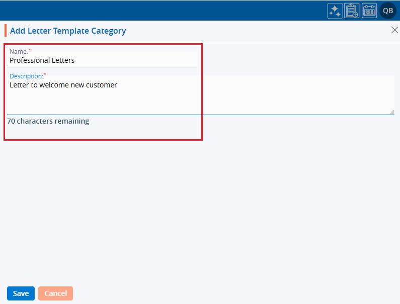
8. A pop-up window titled ‘Add SMS Template Category’ will open, containing fields such as ‘Name’, ‘Description’, and ‘Do you want to add an unsubscribe link to the end of the SMS in this category?’ along with ‘Save’ and ‘Close’ options at the bottom. ● Fields marked with an asterisk are mandatory. ‘Name’ and ‘Description’ are required fields.
9. Fill in the fields and click the ‘Save’ button:
● Name: Enter the desired name for the SMS Template Category. The maximum length is 30 characters. ● Description: Provide a description for the SMS Template Category that aligns with its name. The maximum length is 100 characters.
10. The system will display a confirmation message indicating that the SMS Template Category was created successfully, and the newly created category will appear in the list.
11. Under the ‘Action’ heading, three options are available for each SMS Template Category: Disable/Enable, Edit, and Delete.
● View: By clicking ‘View’, the user can see the details of the selected SMS Template Category. ● Edit: By clicking ‘Edit’, the user can modify the selected SMS Template Category. ● Delete: By clicking ‘Delete’, the user can remove the selected SMS Template Category. The Delete option is only available for categories which are not used.
12. Click the ‘View’ icon to see the details of the selected SMS Template Category.
13. A pop-up window will appear where all the fields are read-only, allowing the user to view the details without making any changes. After viewing the information, click the ‘Cancel’ button to close the pop-up.
14. Click the ‘Edit’ icon, the second option in the Action column on the right side of the SMS Template Category (highlighted by a red box), to modify the details of the SMS Template Category.
15. A pop-up window titled ‘Edit SMS Template Category’ will appear, allowing the user to update the details of the SMS Template Category.
16. Update the details as needed. For example, change the ‘Description’ and click the ‘Save’ button.
17. A confirmation message will appear, indicating that the SMS Template Category has been updated successfully.
18. The user can remove the SMS Template Category by ‘Delete’ option. The Delete icon is only available for categories which are not used. Click the ‘Delete’ icon, the last option in the Action column on the right side of the SMS Template Category (highlighted by a red box), to remove the SMS Template Category from the list.
19. Click the ‘Delete’ option in the confirmation message to proceed with removing the SMS Template Category from the list.
20. A confirmation message will appear, indicating that the SMS Template Category has been deleted and is no longer available on the list.
The Documents Library Category helps organize and classify documents based on their content or purpose.
The following are the steps to manage the Documents Library:
1. Navigate to the ‘SETUP’ tab and click on ‘System Setup’ in the left-side panel.
2. Click on the ‘Documents Library Category’ option in the System Setup menu.
3. Users can search for the Documents Library Category option by typing in the search area.
4. A new page titled ‘Setup – Life – System Setup – Documents Library Category’ will open, displaying the existing Document Library Categories along with details of fields such as Category name, Description, Created By, Create Date and Action under the ‘Documents Library Category’ tab. There are three available options: Add, Print, and Export.
5. Click the ‘Add Documents Library Category’ icon to add a new Documents Library Category.
6. A pop-up window titled ‘Life – Add Documents Library Category’ will open, containing fields for ‘Category Name’ and ‘Description’, additionally ‘Save’ and ‘Cancel’ options available at the bottom.
Fields with an ‘*’ sign are mandatory. In this case, Category Name is a mandatory field. ● Category Name: Enter the desired Category Name. (Limit is a maximum of 100 characters) (This field allows to enter alphabet, space and single quote only) ● Description: A description for the Documents Library Category needs to be added in accordance with the Category name. (Limit is a maximum of 100 characters)
7. Fill in the details and click the ‘Save’ button to continue.
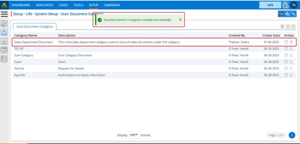
8. The system will generate a confirmation message saying ‘Document Library Category created Successfully’ and the newly added Documents Library Category will now be available on the list.
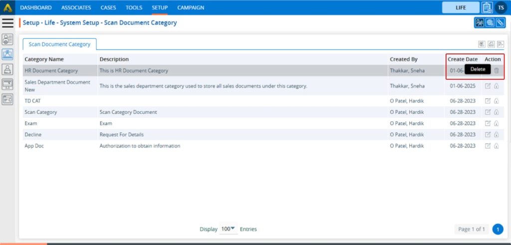
9. There are two options available for each Category under the Action heading: Edit and Delete or Lock. For newly created categories, the Edit and Delete options will be available by default. ● Edit: By clicking on the Edit icon, the user can edit the details of the selected Category. ● Delete or Lock: By clicking on Delete, the user can remove the selected category. However, once the category is assigned to any document, the option will change from Delete to Lock. The Delete option will remain available until the category is assigned to any document.
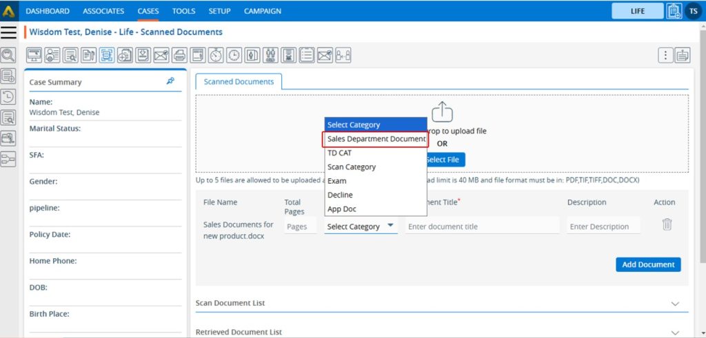
10. The newly added Category will be available on the CASES tab > Case > Documents Library > Document Category Drop down.
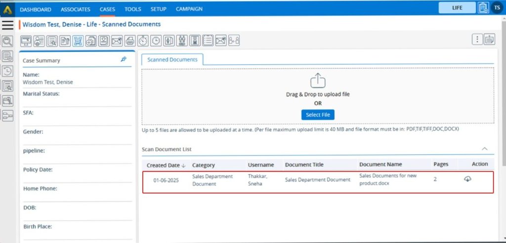
11. The user can save a Document under this newly added Document Library Category.
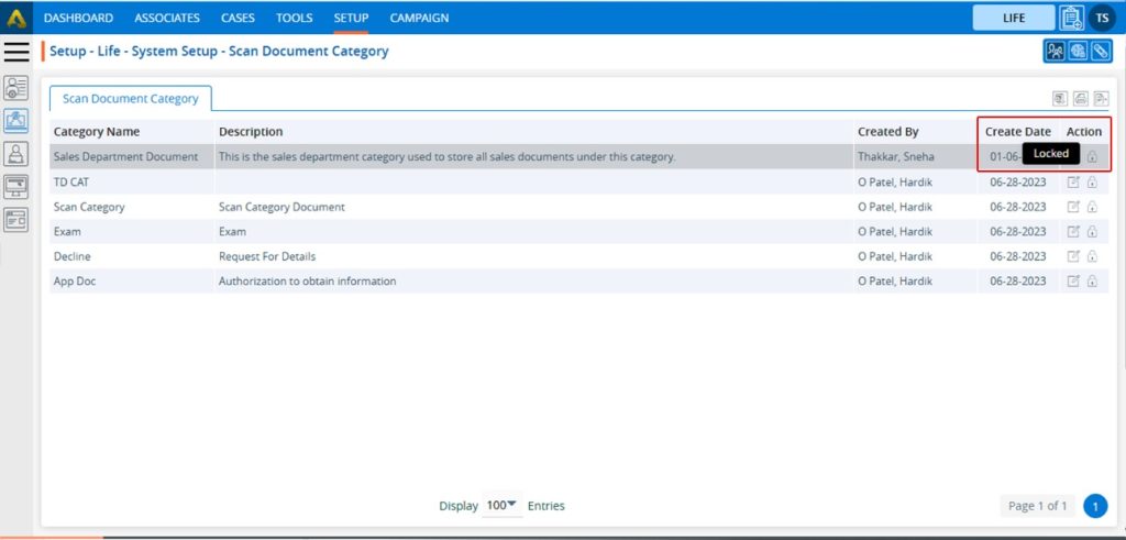
12. Once the category is assigned to any document, the option will change from Delete to Lock, and it can no longer be deleted.
13. Users can update the values for the created Category by clicking the edit icon for the selected Category.
14. A new pop-up window titled ‘ Life – Edit Documents Library Category’ will be opened with the existing fields value. Update the values for the Category as needed. For example, in this case, we are updating the category name. Once the category name is updated, click on Save.
15. The system will generate a confirmation message saying ‘Documents Library Category updated Successfully’. The updated name will be displayed in the listing.
16. Category names will be updated in the CASES Tab > Case > Documents Library > Category Drop down.
17. Category names will also be updated in the existing document listings under CASES Tab > Case > Document Library > Document Library List, where this category has already been assigned.
18. To remove the existing Category, click on the Delete icon. (If a category is assigned to any document, it cannot be deleted.) (To explain the delete function here we have created another category which is HR Document Category and not assigned any documents).
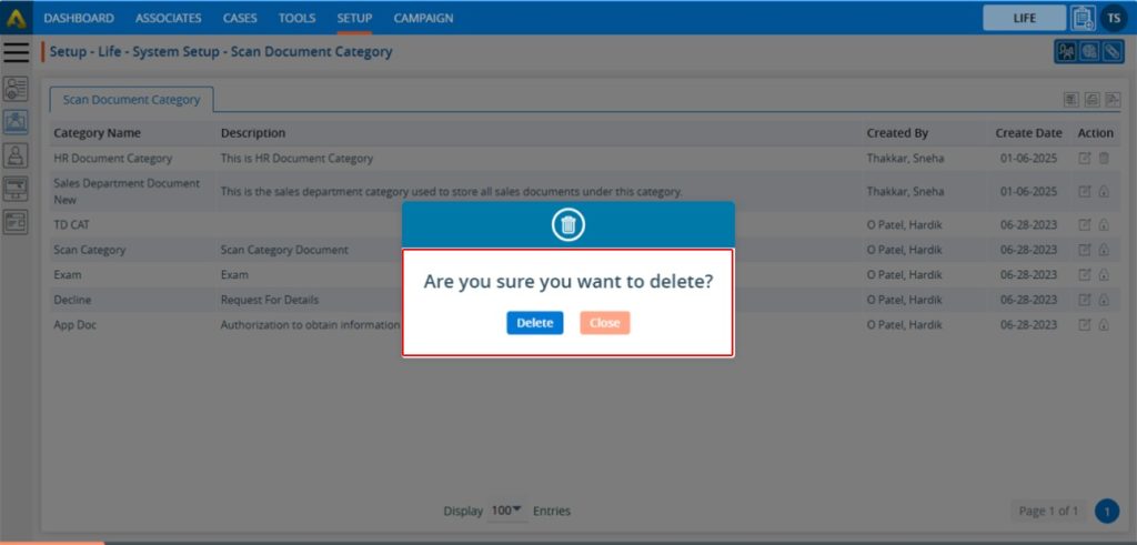
19. After Clicking on Delete, the system will generate a pop-up to confirm before deleting.
20. Click on delete to remove this Category.
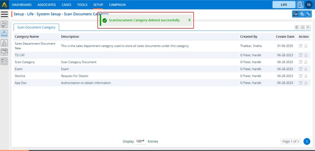
21. The system will generate a confirmation message “Documents Library Category deleted successfully,” and the Category will be removed from the list.
22. This Category will no longer be displayed in the CASES Tab > Case > Documents Library > Category Drop down.
23. To print the list of available categories, click on the Print icon.
24. By clicking on the Print icon, a new page will be displayed with the print window containing the list of available categories. The user can print the data using the desired options.
25. To export the list of available categories, click on the Export icon.
26. By clicking on the Export icon, a pop-up window will open with different period options. The user can export the data using the desired options. Select the required period and click on ‘Export’.
27. Records will be exported according to the selected option, and the CSV file will be saved in the designated location.
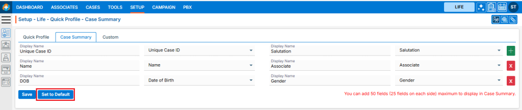
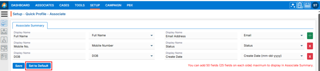
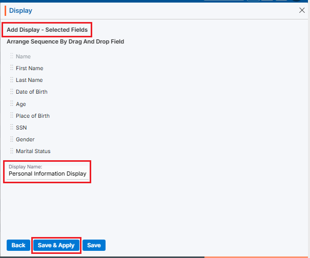
A Custom Group on a Quick Profile typically refers to a set of fields or data elements that you can group together and display on a user’s quick profile page within an application or system. It’s a way to organize specific information that can be customized according to user’s needs or business requirements.
Custom Group Setup
Sign in to AgentFront CRM
From the top menu, choose SETUP
Setup > Quick Profile > Cases Quick Profile setup page will open by default
Click on Custom
This page will display the default Case’s Custom setup, and this setup cannot be edited
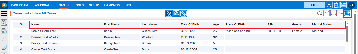
This custom setup will be reflected on the CASES > Individual Case > Quick Profile page, immediately below the quick profile fields and after the existing custom group
There is an ‘Add’ button on the top right corner
Add Custom Group on Quick Profile page
Click the ‘Add’ button at the top right of the page to add new Custom Group
It will open page to add new Custom Group
To add new Custom Group, enter the following details:
Select the type of value you want to add to the Quick Profile: select Fields/Modules or Multi entry Field Group
Custom Group Name: Enter the clear, descriptive name. This is what users will see as the custom group head title on the quick profile page
Click Add button
Group is created now and listed. (Multiple groups can be added)
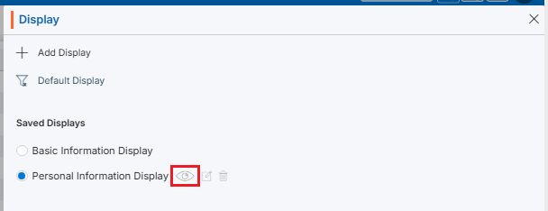
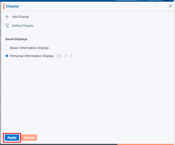
The options to Edit () and Delete () are enabled next to the group name
Clicking on the group name will enable the options to add fields to this group
Set Fields in Custom Group
The fields will now be enabled. The user can select the required fields from the dropdown to set on the quick profile page
Users can add the field by using the (+) sign to this group, which is displayed in green color
Users can remove the field by using the (x) sign from this group, which is displayed in red color
Once fields are set, click on Save
This custom group and its field setup will be reflected on the CASES > Individual Case > Quick Profile page, immediately below the quick profile fields and after the existing custom group Note: Until the fields are set for the group, the group will not be reflected anywhere
Edit Custom Group
To update the details of an existing Custom Group, click the ‘Edit’ icon for the group whose details need to be updated The first option, ‘Select the type of value you want to add to the Quick Profile,’ cannot be edited; only the custom group name can be edited
Delete Custom Group
To update the details of an existing Custom Group, click the ‘Delete’ icon for the group whose details need to be updated
The system will ask for confirmation. Click Delete to proceed
The Field Group provides a comprehensive way to manage and customize both Groups and fields in a member’s profile. It allows the user to easily add new Groups and fields, modify existing ones, and update information based on user’s specific requirements. This ensures that member profiles remain up-to-date and are tailored to capture the most relevant data, ultimately improving the overall management and organization of member information.
The following are the steps to manage the Field Group:
1. Navigate to the ‘SETUP’ tab and click on ‘System Setup’ from the left-side panel.
2. A pop-up bar will appear. Select the ‘Field Group’ option.
3. The Field Group page will load, displaying a list of existing Field Groups.
4. To create a new Field Group or add a new Field to an existing Field Group, click the ‘Add Field Group’ icon.
5. A new pop-up page will appear for adding a Field Group, with the ‘Group’ field selected by default.
6. The user can add a Group, Field or Form with the help of this page.
7. First, add a Group, which is selected by default.
8. Enter the Group Name. This field is mandatory, can contain up to 30 characters, and does not allow special characters.
9. Select an option from ‘Required Multiple Entry’. Choose ‘Yes’ if multiple entries are required for the form, or ‘No’ if only a single entry is needed.
10. Select the page where the form should be displayed. You have two options: ‘Default’ and ‘Custom’.
11. Select an option from ‘No’ for question ‘Would you like to display this group as read-only under information?’. Choose ‘Yes’, if this group need to be read-only.
12. Select an option from ‘No’ for question ‘Would you like to hide this group under information?’. Choose ‘Yes’, if this group need to be hidden.
13. Once all the details are entered, click the ‘Save’ button.
14. A confirmation message will appear, indicating that the custom group was created successfully, and the newly created Field Group will be displayed in the list.
15. To view the newly created Custom Group, go to CASES > Recent Case > Information. Then, navigate to the Custom tab, where the Custom Group was created. Since no fields have been added yet, you will see ‘No data found’ in the Custom Group.
16. The newly created Field Group has two available options: a. Edit b. Delete
17. To edit a Field Group, click the ‘Edit’ icon.
18. The Field Group will open in the edit pop-up page. After making the required changes, click the Save button. If no changes are needed, click the ‘Cancel’ button.
19. A confirmation message will appear, indicating that the Case Custom Group has been successfully updated.
20. If the Custom Group is no longer needed, it can be deleted using the delete functionality. The Delete button will only be available for Custom Groups that do not contain any fields. Once fields are added, the Custom Group cannot be deleted. In this case, only the newly created Custom Group will have the delete button, as it contains no fields. Click the Delete icon to remove the Custom Group.
21. A confirmation prompt will appear asking, ‘Are you sure you want to delete?’ Click the Delete button to proceed.
22. A confirmation message will appear, indicating that the Custom Group has been successfully deleted, and it will be removed from the list.
23. To view the custom fields in the Custom Group, click on the name of the Custom Group.
24. Since there are no fields in this Custom Group, a message saying ‘No data found’ will appear when you open it.
25. To create fields in the Custom Group, click on the ‘Add Field Group’ icon.
26. The ‘Add Field Group’ pop-up page will open with the ‘Group’ option selected by default. Select the ‘Field’ radio button.
27. A new pop-up page will open to add a new Custom Field for the Custom Group, featuring a checkbox for ‘Initial Group Field’ and fields for ‘Group’, ‘After’, ‘Name’, ‘Type’, ‘Maximum Length’, and ‘Require’, along with ‘Save’ and ‘Cancel’ buttons at the bottom.
28. Fill in all the required information to create a new field and click the ‘Save’ button: a. Initial Group Field Check box: If the field needs to be the first field of the group, select this checkbox. b. Group: Select the group to which this field belongs. c. After: Specify after which field this new field should appear. If the ‘Initial Group Field’ checkbox is selected, this option will be greyed out and unavailable. d. Name: Enter the name of the field. e. Type: Choose the type of field based on your needs (e.g., text box, text area, checkbox). f. Maximum Length: Define the maximum length of text allowed in this field. This will change based on the field type. If the type is a checkbox, it will change to ‘Default Values Separated by commas.’ g. Require: Choose whether the field is a compulsory field in the group. Select ‘Yes’ if it is a required field, or ‘No’ if it is not. h. Validation: Select the appropriate validation for the field (e.g., Alphanumeric, space, symbol (._’&), Alphabet, Dash, Underscores). If no validation is needed, select ‘No Validation’.
29. A confirmation message will appear saying, ‘Custom Field created successfully’, and the newly created Custom Field will be displayed under the Custom Group listing.
30. To view the Custom Field in the member’s profile that was just created, go to CASES > Recent Case > Information > Custom > Health Insurance Information.
31. Similarly, create other Custom Fields following the same process as outlined above.
32. Check the Custom Group and its custom fields in the Recent Case to ensure they have been added correctly.
33. There are 3 options for the Custom Field that appear when the mouse hovers over the fields: a. View b. Edit c. Delete
34. The Edit and Delete options will only be available for fields that do not have any data in them. If a member has data in the field, only the View button will be available, and the Edit and Delete options will be disabled.
35. Using View functionality, the user can view the Custom Field. Simply click on the ‘View’ icon.
36. The Custom Field will open in view mode, and the user will not be able to make any changes, as the fields will be read-only. After viewing the field, click on the ‘Cancel’ button at the bottom to exit the popup.
37. Using the Edit functionality, the user can modify the existing Custom Field. Click on the ‘Edit’ icon to begin.
38. The Custom Field will open in Edit mode, and all fields will be editable. Make the necessary changes and click the ‘Save’ button. If no changes are required, simply click the ‘Cancel’ button to exit this popup.
39. A confirmation message will appear saying, ‘Custom Field updated successfully’ once the changes are saved.
40. If the Custom Field is no longer needed, the user can remove it using Delete functionality. Click on the ‘Delete’ icon to remove the Custom Field from the form.
41. A confirmation prompt will appear with the message, ‘Are you sure you want to delete?’ Click on the ‘Delete’ option to confirm.
42. A confirmation message will appear saying, ‘Custom Field deleted successfully’, and the field will be removed from the list.
43. Check the member’s profile to ensure that the removed Custom Field is no longer available.
44. To create a Form, click on the ‘Add Field Group’ icon.
45. The ‘Group’ field will be selected by default. Select the ‘Form’ field radio button.
46. A new pop-up page will open for the Form field, displaying the message: ‘No Group available to add form.’ ‘Please create the Group first by selecting the Group radio button.’ This message appears because there is no Custom Group available that doesn’t already have Custom Fields. To resolve this, we need to create a Custom Group without adding any fields to it, following the same steps as above.
47. To create a new Custom Group, click on the ‘Add Field Group’ icon again.
48. The ‘Group’ field will be selected by default.
49. Add all the necessary details for the new Custom Group and click the ‘Save’ button.
50. The new Custom Group is created successfully and will be available in the listing.
51. Once the Custom Group is created, click on ‘Add Field Group’ again.
52. Select Form from the Add Field Group pop-up page. The message will now change to: ‘No Form(s) are available to add.’ ‘Please create the form from System Setup > Form Creator.’ Since the Custom Group has been created but no form is available that hasn’t been used elsewhere, you will need to create a new form.
53. To create a new form, go to Setup > System Setup > Form Creator and click on Create Form.
54. A new pop-up page will open, allowing you to add a new form to the system.
55. Add all the required information and Click on Next button: • Form Title: Enter the title of the form in this field. • Description: Add the description of the form in this field. • From For: This field differentiates how the form will be used — add, edit, or view only. It has 3 options: o Add o Edit o View • (Select Edit, as “Add” forms are not available for Custom Fields. The user can use Edit and View options for custom fields.) • Form Status: Indicates whether the form is active or inactive. (Select Active.) • In Columns: Specify the number of columns in the form. You can add a minimum of 1 and a maximum of 3 columns. (Select 1.) • Form Type: Select the type of form. There are 2 options: o Full o Popup (Select Full.) • Show This Form: Select the page where this form should appear. (Select Information.)
56. A confirmation message will appear saying, ‘Form created successfully’, and the newly created form will be displayed in the listing. Additionally, the next pop-up page will open.
57. Select the required fields needed for the form and click on the ‘Next’ button.
58. The next page, ‘Set Sequence’, will open. Adjust the sequence of the fields as needed, select the checkbox if the field is required to be a compulsory field, and click on the ‘Next’ button.
59. The last page, ‘Add Separator’, will open. Add the separator if required. Since we are not adding a separator for this form, click on the ‘Close’ button.
60. Once the form is created successfully, go to Setup > System Setup > Field Group and click on ‘Add Field Group’ again to create the Custom Form.
61. The ‘Group’ field will be selected by default. Select ‘Form’.
62. The Form pop-up will open.
63. Select the Group Name from the dropdown that was created earlier.
64. Select the Form from the Form Name dropdown.
65. Click on the Save button.
66. A confirmation message will appear saying, ‘Form Module created successfully’.
67. The form will be available under the Custom Group.
68. Go to Cases > Recent Case > Custom > Policyholder Information to view the newly created form in the member’s profile. The fields in this form will be editable, as we created the form with the ‘Edit’ option.
69. If the requirement is to view the form only, select ‘View’ from the Form For option while adding the form.
70. The form will be opened as a read-only type in member’s profile.
71. If the form is no more of use, the user can delete it with the help of delete icon. Click on ‘Delete’ icon to delete the form.
72. There will be a confirmation prompt asking – ‘Are you sure you want to delete?’ Select option ‘Delete’.
73. A confirmation message will appear saying, ‘Form Module deleted successfully.’, and the form will be removed from the list.
The Assignment Rules functionality automatically assigns cases to specific associates. This occurs after a particular action is performed.
The following are the steps to manage the Assignment Rules:
1. Navigate to the ‘SETUP’ tab and click on ‘System Setup’ from the left-side panel.
2. A pop-up bar will appear. Select the ‘Assignment Rules’ option.
3. The user can search for the ‘Assignment Rules’ by typing keywords in the search area.
4. A new page titled ‘Setup – Life – Assignment Rules’ will open, displaying the existing Assignment Rules along with fields such as Create Date, Name, Create Rule For and Action.
5. Click on the ‘Add Assignment Rules’ icon on the right side of the window to add a new assignment rule.
6. A new pop-up window titled ‘Life – Add Assignment Rule’ will open, containing fields such as Name, Description and Create Rule For with Save and Close at the bottom. • Fields with an ‘*’ sign are mandatory. In this case, Name and Create Rule For are mandatory fields.
7. Fill all the fields and click on ‘Save’ button: • Name: Enter the desired Assignment Rule Name. Assignment Rule Name field allows alphabet and space, and limit is a maximum of 30 characters. • Description: A description for the Assignment Rule needs to be added in accordance with the Assignment Rule Action name. The limit is a maximum of 500 characters. • Create Rule For: Select the Associate Assigned from the drop down. There are 5 options in this drop down- SM Assigned(P), CSR Assigned(P), Associate Assigned, Policy Agent and ASU Agent.
8. The system will generate a confirmation message indicating that the Assignment Rule created successfully, and the newly created Assignment Rule will now be available on the list.
9. There are three options available for each Assignment Rule under the Action heading: Button for Disable and Enable, Delete and Manage. • Button for Disable and Enable: The newly added Assignment Rule will have a disabled status by default. Click the button to enable the Assignment Rule, and the color will change to green once it is enabled. Until the status is enabled, the Assignment Rule will not be executed. • Delete: By clicking on Delete, the user can remove the selected Assignment Rule. • Manage: By clicking on Manage, the user can manage the selected Assignment Rule.
10. Click the enable/disable button to enable the Assignemnt Rule.
11. The system will generate a confirmation message to enable this Assignment Rule. Click on Enable.
12. The system will generate a confirmation message indicating that the Assignment Rule is enabled successfully, and the color is changed to green for that Assignment Rule.
13. To remove the existing Assignment Rule, click the ‘Delete’ icon on the right-hand side of the window.
14. After clicking on Delete, the system will prompt for confirmation before deleting. Click Delete to remove the selected Assignment Rule.
15. The system will generate a confirmation message saying, ‘Assignment Rule deleted successfully,’ and the Assignment Rule will be removed from the list.
16. To manage the existing Assignment Rule, click the Manage icon on the right-hand side of the window.
17. A new page ‘Setup – Life – System Setup – Assignment Rule – Associate Assignment Rule’ will open with fields Craete Date, Name Description, Assigned Users and Action.
18. There are four options on the right-hand side top. • Back: The back icon is used to go back to the last page • Add Manage Rules: Add Manage Rules is used to create new manage rule.
19. Click on ‘Add Manage Rules’ to create new manage rules.
20. A new pop-up window titled ‘Life – Manage Rule’ will open, containing fields for ‘Name’ and ‘Description’, along with sections for ‘Criteria’ and ‘Action’. The Save and Cancel buttons are also available on the same page. • Fields with an ‘*’ sign are mandatory. In this case, Manage Rule Name, Description, all fields of Criteria section and all fields of Action section are mandatory fields.
21. All fields on this page are mandatory. Please fill in the details on this pop-up page and click on ‘Save $ Next’. • Name: Enter the desired Assignment Rule Action name. [Assignment Rule Name field allows alphabet, number, space and following symbol: -_’& only] and (Limit is a maximum of 50 characters) • Description: A description for the Assignment Rule Action needs to be added in accordance with the Assignment Rule Action name. (Limit is a maximum of 500 characters) • Criteria: Add the criteria as per the requirement. • Action: Add the criteria as per the requirement.
22. There will be a confirmation message that ‘Rule is created successfully.’ And the newly created rule will be seen in the list. The user will be moved to next page ‘Manage Limit’.
23. Add the limit of contacts for all the associates and click on ‘Save & Next’.
24. There will be confirmation message ‘Assignment Rule updated successfully.’ The user will be moved to next page ‘Sort Sequence’.
25. The user can change the sequence as per the requirement.
26. The Assignment rule is updated successfully and shown in the list.
27. There are four options available for each Manage Rule under the Action heading: Button for Disable and Enable, Edit, View, and Delete. • Button for Disable and Enable: The newly added Manage Rule will have a disabled status by default. Click the button to enable the Manage Rule, and the color will change to green once it is enabled. Until the status is enabled, the Manage Rule will not be executed. • Edit: By clicking on the Edit button, the user can update the existing Manage Rule. • View: By clicking on the View button, the user can view the Manage Rule. • Delete: By clicking on Delete, the user can remove the selected Manage Rule.
28. Click the enable/disable button to enable the Manage Rule.
29. The system will generate a confirmation message to enable this Assignment Rule. Click on Enable.
30. The system will generate a confirmation message indicating that the Assignment Rule is enabled successfully, and the color is changed to green for that Assignment Rule.
31. Go to the ‘CASES’.
32. Select the cases for which the user needs to assign the associates. The action bar will open select the SFA and click on the OK button.
33. There will be a confirmation message ‘Cases data updated successfully.’ The cases are assigned as per the assignment rule setup.
34. Click on the ‘Edit’ icon to update the existing Manage Rule.
35. The pop-up window ‘Life – Manage Rule’ will open.
36. The user can update the required field on the Add Rule page and click on Save & Next.
37. There will a confirmation message ‘Rule Details updated successfully.’ The user can update the required field on the Manage Limit page and click on Save & Next.
38. There will a confirmation message ‘Rule Details updated successfully.’ The user can update the required field on the Manage Limit page and click on Save & Next.
39. The user can update the required field on the Sor Sequence page and click on Save.
40. There will be a confirmation message ‘Assignment Rule updated successfully.’
41. To view the Manage Rule, the user need to click on the ‘View’ icon.
42. The user can view the Manage Rule and to view the other pages click on the Manage Limit.
43. The Manage Limit page will be opened. Click on Sor Sequence to view the sequence.
44. The Sort Sequence page will be opened. Click on the ‘Cancel’ button to close the window.
45. To remove the existing Manage Rule, click the Delete icon on the right-hand side of the window.
46. After clicking on Delete, the system will prompt for confirmation before deleting. Click Delete to remove the selected Manage Rule.
47. The system will generate a confirmation message saying, ‘Assignment Rule deleted successfully,’ and the Manage Rule will be removed from the list.
Quick Profile setup typically includes selecting and arranging predefined fields to create a basic yet functional profile layout. The goal of the Quick Profile Setup is to simplify the process of setting up profiles by providing default fields and allowing easy customization based on user needs, ensuring efficiency and consistency across cases or records.
Quick Profile Setup
Sign in to AgentFront CRM
From the top menu, choose SETUP
Setup > Quick Profile > Cases Quick Profile setup page will open by default
This page will display the default Cases Quick Profile setup, including the field display name and the selected field from the dropdown
This quick profile setup will be reflected in CASES > Individual Case > Quick Profile
Users can add a new field by using the (+) sign, which is displayed in green
Users can remove the existing field by using the (x) sign, which is displayed in red color
Users can also edit the existing field(s) that have already been set up
Once the add/edit action has been taken, click on ‘Save‘
This updated quick profile setup will be reflected in CASES > Individual Case > Quick Profile
Restore Quick Profile Setup
The ‘Set to Default‘ option will restore the default quick profile setup and will be reflected in CASES > Individual Case > Quick Profile
The Cases Quick Search Setup feature allows users to configure which Cases fields are searched for when specific characters are entered in the Quick Search bar. Users can select up to 10 fields and prioritize them to improve search efficiency.
Setup Cases Quick Search
Sign in to AgentFront CRM
From the top menu, choose Setup
In the left-side panel, select System Setup
Under System Setup, click Quick Search
Note: The user can also access this page by typing Quick Search in the Enter Text to Search bar
The Case Quick Search page opens by default
Configure Quick Search Fields
Click the Quick Search option to open the configuration window
When clicking on Quick Search, Change Cases Quick Search window will open
Click the drop-down arrow to view the available fields or use Enter Field Name to Search to quickly find a specific field
Click the drop-down arrow next to Personal Information to expand the list
Fields displayed in the list are selected by default
Select or deselect fields to configure which Personal Information fields are included in Cases Quick Search
Repeat the same process to select fields from other information categories, if required
The system allows the selection of a maximum of 10 fields
After selecting the required fields, click Save
Updated fields will now be displayed in the Cases Quick Search list
The ‘Set to Default’ button will now appear, allowing users to restore default settings if needed
Use Cases Quick Search
Navigate to the CASES tab
Click the Quick Search option
Enter at least 3 characters in the search box. Here, we have entered ‘FEM’ in the quick search box
Click the Search icon to view results
The search results will display a list of cases whose gender is Female
Reset to Default Settings
By clicking Set to Default, the settings will be restored to their default values
Once the Cases Quick Search settings are reset, the search will operate using the default field preferences defined in System Setup
Re-arrange Field Priority
Fields can be rearranged () to set their priority in the search results
Hover over the Re-arrange () icon at the beginning of a field name
Select and drag the Re-arrange () icon to move up or down the field to the desired position, then drop it to save the new order
Letter Templates let you store frequently used letters in a single, reusable format. Once created, the same letter template can be used in system to ensure consistent wording and style. You can use Letter Templates in (Base on the access rights):
Case > Print Letters
Case > Send Email
Create Letter Template:
Sign in to AgentFront CRM.
From the top menu, choose Tools.
In the left sidebar, select Template Creator.
It will open Template Creator with multiple tab (Based on the access rights)
Click on Letter tab
It displays the list of available/created Lettes.
Click on ‘Create Template Creator’ icon from the Top Right side of the list.
It will open page to create new letter template
To create new letter template, enter the following details:
Template Name: Enter clear, descriptive name. This is what users will see when they select a letter template from other places of the application.
Template Category: Choose from the drop-down list. (Categories can be managed in Setup → System Setup → Template Category.)
Usage: Option to select Public/Private. (Default will be Public).
Public: Visible to anyone with access.
Private: Visible only to the creator.
Description: Optional explanation of the template’s purpose.
Content: Write or paste the letter text. A rich-text editor appears when you click in the box. Use placeholders from the panel on the right to insert dynamic data—place the cursor where the value should appear, then click the required field.
Preview the letter: choose a sample person, then click Preview to verify that letter format and placeholders resolve correctly.
Click Save. The template is now listed and ready for use.
Update Letter Template:
Sign in to AgentFront CRM.
From the top menu, choose Tools.
In the left sidebar, select Template Creator.
It will open Template Creator with multiple tab (Based on the access rights)
Click on Letter tab
It displays the list of available/created Lettes.
From the list click on Edit () icon from the Action column for the letter you want to edit/change
It will open the selected letter in edit mode.
You can make the require edit in the below fields values of the open letter templates
Template Name: Enter clear, descriptive name. This is what users will see when they select a letter template from other places of the application.
Template Category: Choose from the drop-down list. (Categories can be managed in Setup → System Setup → Template Category.)
Usage: Option to select Public/Private. (Default will be Public).
Public: Visible to anyone with access.
Private: Visible only to the creator.
Description: Optional explanation of the template’s purpose.
Content: Write or paste the letter text. A rich-text editor appears when you click in the box. Use placeholders from the panel on the right to insert dynamic data—place the cursor where the value should appear, then click the required field.
Preview the letter: choose a sample person, then click Preview to verify that letter format and placeholders resolve correctly.
Click Save. The template is now updated and ready for use.
Delete Letter Template:
Sign in to AgentFront CRM.
From the top menu, choose Tools.
In the left sidebar, select Template Creator.
It will open Template Creator with multiple tab (Based on the access rights)
Click on Letter tab
It displays the list of available/created Lettes.
From the list click on Delete () icon from the Action column for the letter you want to delete.
It will ask for confirmation in popup, click on Delete button to delete letter otherwise click on Close button.
Important: If the template is referenced elsewhere (for example, in a Trigger), deletion is blocked until those references are removed.
Multi-product tip
If your login has access to multiple products, be sure to select the correct product from the product icons in the top-right corner before creating, editing, or deleting templates.
Template Category > Letter – The Letter Template category is used to categorize letters such as business communications, sales support, customer support, updates, seasonal greetings, personal messages, and networking.
The following are the steps to manage the Letter Template Categories:
1. Navigate to the ‘SETUP’ tab.
2. Select ‘System Setup’ from the left-hand panel and a pop-up window will appear. 3. Select the ‘Template Category’ option.
4. The user can search for the ‘Template Category’ setup by entering keywords in the search field.
5. A new page titled ‘Setup – System Setup – Template Category’ will open, displaying the Email Template Category by default. Click on the Letter tab.
6. A new page will open showing Letter Template Categories. This page will show fields including Category Name, Description, Created By, Creation Date, and Action.
7. Click the ‘Add Letter Template Category’ icon on the right side of the window to add a new Letter template category.
8. A pop-up window titled ‘Add Letter Template Category’ will open, containing fields such as ‘Name’, ‘Description’, and ‘Do you want to add an unsubscribe link to the end of the Letters in this category?’ along with ‘Save’ and ‘Close’ options at the bottom.
Fields marked with an *asterisk* are mandatory. ‘Name’ and ‘Description’ are required fields.
9. Fill in the fields and click the ‘Save’ button:
Name: Enter the desired name for the Letter Template Category. The maximum length is 30 characters.
Description: Provide a description for the Letter Template Category that aligns with its name. The maximum length is 100 characters.
10. The system will display a confirmation message indicating that the Letter Template Category was created successfully, and the newly created category will appear in the list.
11. Under the ‘Action’ heading, three options are available for each Letter Template Category: Disable/Enable, Edit, and Delete.
View: By clicking ‘View’, the user can see the details of the selected Letter Template Category.
Edit: By clicking ‘Edit’, the user can modify the selected Letter Template Category.
Delete: By clicking ‘Delete’, the user can remove the selected Letter Template Category. The Delete option is only available for categories which are not used.
12. Click the ‘View’ icon to see the details of the selected Letter Template Category.
13. A pop-up window will appear where all the fields are read-only, allowing the user to view the details without making any changes. After viewing the information, click the ‘Cancel’ button to close the pop-up.
14. Click the ‘Edit’ icon, the second option in the Action column on the right side of the Letter Template Category (highlighted by a red box), to modify the details of the Letter Template Category.
15. A pop-up window titled ‘Edit Letter Template Category’ will appear, allowing the user to update the details of the Letter Template Category. 16. Update the details as needed. For example, change the ‘Description’ and click the ‘Save’ button.
17. A confirmation message will appear, indicating that the Letter Template Category has been updated successfully.
18. The user can remove the Letter Template Category by ‘Delete’ option. The Delete icon is only available for categories which are not used. Click the ‘Delete’ icon, the last option in the Action column on the right side of the Letter Template Category (highlighted by a red box), to remove the Letter Template Category from the list.
19. Click the ‘Delete’ option in the confirmation message to proceed with removing the Letter Template Category from the list.
20. A confirmation message will appear, indicating that the Letter Template Category has been deleted and is no longer available on the list.
The Email Template category is used to categorize emails including business communications, sales support, customer support, updates, seasonal greetings, personal messages, and networking.
The following are the steps to manage the Email Template Categories:
1. Navigate to the ‘SETUP’ tab.
2. Select ‘System Setup’ from the left-hand panel and a pop-up window will appear. Select the ‘Template Category’ option.
3. The user can search the ‘Template Category’ setup by entering keywords in the search field.
4. A new page ‘Setup – System Setup – Template Category’ will open, displaying the Email Template Categories by default. This page will show fields including Category Name, Description, Unsubscribe, Created By, Creation Date, and Action.
5. Click the ‘Add Email Template Category’ icon on the right side of the window to add a new email template category.
6. The pop-up window ‘Add Email Template Category’ will open, containing the fields ‘Name’, ‘Description’, and ‘Do you want to add an unsubscribe link to the end of the emails in this category?’ along with ‘Save’ and ‘Close’ options at the bottom.
Fields marked with an *asterisk* are mandatory. ‘Name’ and ‘Description’ are required fields.
The ‘Do you want to add an unsubscribe link to the end of the emails in this category?’ radial will be set to ‘No’ by default.
7. Fill in the fields and click the ‘Save’ button:
Name: Enter the desired name for the Email Template Category. The maximum length is 30 characters.
Description: Provide a description for the Email Template Category that aligns with its name. The maximum length is 100 characters.
Do you want to add an unsubscribe link to the end of the emails in this category?: Select either ‘Yes’ or ‘No’.
8. The system will display a confirmation message that the Email Template Category was created successfully, and the newly created category will appear in the list.
9. Under the ‘Action’ heading, three options are available for each Email Template Category: Disable/Enable, Edit, and Delete.
View: By clicking ‘View’, the user can see the details of the selected Email Template Category.
Edit: By clicking ‘Edit’, the user can modify the selected Email Template Category.
Delete: By clicking ‘Delete’, the user can remove the selected Email Template Category. The ‘Delete’ option will appear only for those categories which are not used.
10. Click the ‘View’ icon to see the details of the selected Email Template Category.
11. A pop-up window will appear where the fields are read-only, allowing the user to view the details without making any changes. After viewing the information, click the ‘Cancel’ button to close the pop-up.
12. Click the ‘Edit’ icon, the second option in the Action column on the right side of the Email Template Category (highlighted by a red box), to modify the details of the Email Template Category.
13. A pop-up window titled ‘Edit Email Template Category’ will appear, allowing the user to update the details of the Email Template Category.
14. Update the details as needed. For example, change the ‘Do you want to add an unsubscribe link to the end of emails in this category?’ option from ‘Yes’ to ‘No’. After making the changes, click the ‘Save’ button.
15. A confirmation message will appear, indicating that the Email Template Category has been updated successfully.
16. Click the ‘Delete’ icon, the last option in the Action column on the right side of the Email Template Category (highlighted by a red box), to remove the Email Template Category from the list if it is no longer needed. Delete icon is available only for those categories which are not used.
17. Click the ‘Delete’ option in the confirmation message to proceed with removing the Email Template Category from the list.
18. A confirmation message will appear, indicating that the Email Template Category has been deleted and is no longer available on the list.
5. By clicking on the ‘Letter’ tab, a new list will open and display a list of existing letter templates, with details including Template Name, Category, Usage, Created By, Created Date and Action. Click to Expand
6. Click on the ‘Create Letter Template’ icon to create a new letter template. Click to Expand
7. A pop-up window will open with fields for Template Name, Template Category, Subject, Usage (default selected as Public), Description and Content. Click to Expand
8. Fill in the fields to create an Letter template. Also, on the right-hand side, there is a list of fields that will fetch details for the message. Search for field names to use in the templates. Double-clicking on the field will add it to the content area. For example, users can include fields such as FirstNameLastName and Date. Click to Expand
9. At the bottom, there is a dropdown menu with the names of associates and three buttons: Preview, Save, and Cancel. Click to Expand
10. Select an associate’s name from the dropdown menu. Click to Expand
14. A confirmation message will appear, and the user will find the newly created template in the list. Click to Expand
15. Click the ‘Edit’ option to modify the created template. Click to Expand
16. A pop-up window will open, allowing the user to update details of the template. Click to Expand
17. Click the ‘Edit’ option to modify the created template. Click to Expand
18. A pop-up window will open, allowing the user to update any details related to the template. Click to Expand
19. Update details to edit the template. For example, we have added ‘Salutation’. Click on ‘Save’ button. Click to Expand
20. A confirmation message will appear that the template has been updated, and the list will show the updated ‘Usage’ field value. Click to Expand
21. Select the ‘Delete’ option to remove the template from the list if it is no longer needed. Click to Expand
22. Select the ‘Delete’ option in the confirmation message to proceed with removing the template from the list. Click to Expand
23. After clicking on the Delete button, a confirmation message will appear, indicating that the template has been deleted and is no longer available in the list. Click to Expand
Import – Import files containing specific data in CSV format with delimiters, which will then be displayed in the CASES list.
The following are the steps to use the Import feature: 1. Check the total number of cases before importing the data in the ‘Specific SFA – Cases List’. For example, here we are importing data into “App Completed – Awaiting Signature” SFA.
2. Navigate to the ‘TOOLS’ tab.
3. The Tools tab will open, displaying the ‘Tools – Life – Template Creator’ with four tabs: Email, Letter, SMS, and WhatsApp.
4. Click on ‘Import’ in the left-side panel.
5. A new page titled ‘Tools – Life – Import’ will open, featuring the ‘Import’ tab with three steps to complete the process: Upload CSV, Map Fields, and Review & Import. 6. Fields marked with an asterisk (*) are mandatory to import data.
7. Click the ‘Choose File’ option to select and import the new file.
8. Import the file. For example, the import file named Awaiting Signature, which contains data for fifteen customers up for signature.
9. There will be a dropdown menu to select the delimiter used in the file format fields.
10. Select a delimiter. For example, select a comma (‘,’), which will use a comma delimiter between fields. 11. After that click the ‘Import’ button to proceed to the next step: ‘Map Field’.
12. The ‘Map Fields’ page will open, featuring fields to configure including Import Type, SFA Folder, Header Row, Trigger, and Field Mapping. 13. Fields marked with an asterisk (*) are mandatory to select.
14. Enter the details to map the fields. 15. Click Next to proceed to ‘Review & Import’. Click ‘Back’ if the user needs to update details from the previous step. 16. Users can uncheck the specific field(s) if they don’t want to import.
17. The ‘Review & Import’ page will open, displaying a message indicating how many records will be imported and how many records have issues if any. For example, if there are no issues with the selected file’s field mapping or format, this will be noted. 18. Click ‘Import Data’ to proceed. Click ‘Back’ if users need to update details from the previous steps.
19. A confirmation message will appear, indicating that the records have been imported. Users can view them in the ‘CASES’ tab.
20. Check the total number of cases in the ‘Cases List – App Completed – Awaiting Signature’, it should have increased by 45, totaling 31.
Create templates to streamline and expedite email sending. These email templates can be used when sending any email from the system.
The following are the steps for creating email templates:
1. Navigate to the ‘TOOLS’ tab. The Tools tab will open with the Template Creator tab displayed by default.
2. Users will see the ‘Tools – Template Creator’ with four different tabs: Email, Letter, SMS, and WhatsApp.
3. The ‘Email’ tab opens by default in the Template Creator, displaying a list of existing email templates with details including Template Name, Category, Usage, Created By, Create Date and Action.
4. Click on the ‘Create Email Template’ icon to begin creating a new email template.
5. Click on the ‘Create Email Template’ icon to begin creating a new email template.
6. Fill in the fields. Fields with an asterisk are mandatory.
7. On the right-hand side, there is a list of fields that will fetch details for the selected user. Search for field names from the list to use in the templates. Double-clicking on the field will add them to the content. For example, users can include fields such as Date, Salutation, and FirstLast for mapping.
8. Users can apply formatting effects to specific text in the content editor, such as font styles, size, and headings. For example, use Bold for the Date, salutation, name fields, and the text ‘Good News!’ and phone number.
9. At the bottom, there is a dropdown menu with the names of the associates and three available buttons: Preview, Save, and Cancel.
10. Select an associate’s name from the ‘Name’ dropdown menu.
11. Click the ‘Preview’ button.
12. A pop-up window will open, showing the template details in preview mode. Click the ‘Cancel’ button to close it.
13. Click the ‘Save’ button.
14. A confirmation message will appear that the template is saved, and the user will find the newly created template and its details in the list.
15. Click on the ‘View’ icon to view the existing Template.
16. A pop-up window will open, where the user can view the details of the template in read-only.
17. Click the ‘Edit’ option to modify the created template.
18. A pop-up window will open, allowing the user to update details of the template.
19. For example, we have added ‘Last Name’. Click on the ‘Save’ button.
20. A confirmation message will appear showing Email Template updated successfully.
21. Select the ‘Delete’ option to remove the template from the list if it is no longer needed.
22. Select the ‘Delete’ option in the confirmation message to proceed with removing the template from the list.
23. After clicking on the Delete button, a confirmation message will appear, and the template is no longer available in the list.
Export – The Export feature is used to export files with specific data in CSV, XML, and JSON formats.
The following are the steps for Export data:
1. Navigate to the ‘Tools’ tab.
2. The Tools tab will open, displaying the ‘Tools – Life – Template Creator’ with four tabs: Email, Letter, SMS, and WhatsApp.
3. Click on ‘Export’ from the left-side menu.
4. A new page titled ‘Tools – Life – Export’ will open with the ‘Export’ tab, which has fields for exporting a file with dates, SFA Folder, and format selected. 5. Fields marked with an asterisk (*) are mandatory to select.
6. Select ‘From Date’ and ‘To Date’ for the date range. The range can only be a maximum of 31 days. For example, we have selected dates from 11/01/2024 to 11/30/2024.
7. Select the SFA Folder to export the file with data. For example, we have selected SFA as ‘Lead Received’.
8. Click on the three-dot button to select fields.
9. A pop-up window titled ‘Export – Select Fields’ will open.
10. Click on the down arrow to reveal the fields for selection. The fields will be listed in sections such as Personal Information, Contact Information, Employment Information, Policy Information, Other Policy Information, Medical History, Other Information, Disability, Health Policy, Owner & Payor, RSA Information, Horizon Agent Journey, and Health Policy Information. 11. Additionally, the user can search for field names based on their requirements, and the system will display the corresponding results.
12. Select the field names whose data the user needs to export in the file. For example, the user might choose First Name, Last Name, Date of Birth, Place of Birth, SSN, Gender, Marital Status and Driving License No from the Personal Information section. Additionally, the user could select Email, Address1, City, State and Zipcode from the Contact Information section. 13. Click ‘Next’ to proceed.
14. Clicking on ‘Next’ opens a new page listing the selected fields.
15. The user can change the sequence of the fields list using the six dots. For example, we have set Place of Birth and Gender after the Date of Birth field.
16. Click on the ‘Save’ button to proceed. If changes to the field selection are required, click on the ‘Back’ button.
17. There are three available formats for exporting the file: CSV, XML, and JSON. Select the desired format and click the ‘Export’ button to proceed. For example, you might choose the CSV format.
18. A confirmation message will appear, stating that the data has been exported. The file will be exported and saved in a temporary location.
Address Book –The Address Book feature consolidates general, business, and personal details of customers in one place.
The following are the steps to save data in the Address Book:
1. Navigate to the ‘Tools’ tab.
2. Click on ‘Address Book’ from the left-side menu.
3. A new page titled ‘Tools – Address Book’ will open, displaying the existing contacts under the ‘Address Book’ tab.
4. Click the ‘Add New Contact’ icon to add a new contact.
5. A pop-up window titled ‘Add New Contact’ will open, displaying fields including General Information, Business Information, and Personal Information. 6. Fields marked with an asterisk (*) are mandatory.
7. Fill in the details and click the ‘Save’ button to proceed.
8. A confirmation message will appear, and the newly added contact will be included in the list.
9. Click the ‘View’ icon to open the contact details.
10. A pop-up window will open the contact in view mode, displaying the contact’s General Information, Business Information, and Personal Information. Click the ‘Cancel’ button to close the window.
11. Click the ‘Edit’ icon to update the contact details.
12. A pop-up window will open, allowing you to update the information.
13. Make the necessary updates. For example, change the Availability field from Public to Private. Click the ‘Save’ button to proceed.
14. A confirmation message will appear, indicating that the Address Book has been updated for the selected contact.
15. Click the ‘Favorite’ icon to add the contact to your Favorites list.
16. A confirmation message will appear indicating that the Address Book has been updated for the selected contact.
17. The contact that was added to favorites will also appear in the favorites list.
18. Click the ‘Delete’ icon to remove the contact details.
19. A confirmation pop-up will appear, asking if you want to delete the contact. Click the ‘Delete’ button to confirm.
20. A confirmation message will appear indicating that the contact has been deleted.
21. Select an option from the Display Settings to change the number of contacts shown per page, based on the total number of contacts available. After selecting a Display option, the system will show contacts and pagination according to the chosen setting. For example, if you select 20 contacts per page, the system will display 20 contacts per page and paginate the data accordingly.
22. Click the ‘Quick Search’ icon to find a contact in the list.
23. Type the name or email of the contact you need to search for. For example, search for contacts with ‘Robin’ in their name or email address.
24. Click on a letter to find contacts whose names start with that letter.
25. Click on ‘D’ and contacts with names that start with ‘D’ will be displayed.
26. Click the favorite icon to view the contacts in your Favorites list.
Transactional History is a list of users’ tasks filtered by date and task type.
The following are the steps to generate the report for Transactional History:
1. Navigate to the ‘TOOLS’ tab..
2. Click on ‘Reports’ in the left-side menu, then select the ‘Transactional History’ option from the list of reports.
3. By clicking on Transactional History a new page titled ‘Tools – Life – Reports – Transactional History’ will open. This page will provide dropdown menus to select users and tasks by date.
4. Select a user from the dropdown menu to generate and view their ‘Transactional History’ details.
5. The ‘Tasks’ dropdown includes options such as Notes, Send Mail, Scanned Documents, and Flow History. Select the desired option from the dropdown menu. Users can choose either a single option to view or select ‘All’ to view the history for all categories together. For example, the ‘All’ option is selected from the dropdown menu.
6. Select the desired date range for the data to be listed, and then click on ‘View List’ to proceed.
7. It will display the transactional history details for the selected task(s) within the specified date range for the chosen user.
8. Click on the ‘View’ option next to the task for which the user wants to see details.
9. A new pop-up window will open to display the details of that selected transactional history. Click the ‘Close’ button to exit.
10. Choose an option from the display settings at the bottom to specify the number of records to show per page, based on the total number of available records. After selecting the Display option, the system will present the records and pagination based on the chosen setting. For example, if the user selects 50 cases per page, the system will display 50 web resources per page, with the data distributed accordingly.
The Web Resource feature allows users to create a comprehensive list of web resources and save important URLs in the system.
The following are the steps to manage Web Resources:
1. Navigate to the ‘Tools’ tab.
2. Click on ‘Web Resource’ in the left-side menu.
3. The ‘Tools – Web Resource’ page will open, displaying existing web resources with details such as Name, URL, Available, Created By, Create Date, Status and Action.
4. Click the ‘Add Web Resource’ icon to add a new web resource.
5. After clicking on the ‘Add Web Resource’ icon, a pop-up window ‘Add Web Resource’ will open.
6. Fill in the details for the Web Resource, including Name, URL, Availability and Status, then click the ‘Save’ button.
7. A confirmation message will be generated, and a new web resource will appear in the list.
8. Click on the URL of the newly created web resource to check if it is working properly. For example, click on the URL for the ‘AOLOSYS Associate Site’.
9. After clicking on the URL, the system will redirect the user to the URL of the selected web resource.
10. Navigate to the ‘Tools’ tab again and click on the ‘Web Resource’ option to go back to the web resources page.
11. Click on the ‘Print’ icon to print the web resources.
12. After clicking on Print, a popup page will open displaying the current page data and various print options. a. Select the print option from the ‘Destination’ field and click on the ‘Print’ button.
b. Select the ‘Save as PDF’ option from the ‘Destination’ field and click on the ‘Save’ button to save the file to the required location. The file will be saved at a temporary location.
13. Click on the ‘Export’ icon to export web resources.
14. Upon licking Export, export’s pop-up window will open, and you can select the ‘Period’ to export data from. There are four options available: a. Last 10 days – This option is used to export data from the last 10 days. b. Last 30 days – This option is used to export records from the past 30 days. c. Current month – This option is used to export records for the Current Month. d. Date Range – This option is used to export records for the selected date range within 90 days.
15. Select a period as per the requirement and click on ‘Export’ button.
16. Records will be exported according to the selected option, and the CSV file will be saved in the designated location.
17. To update the details of the web resources, click on the ‘Edit’ icon.
18. ‘Edit Web Resource’ pop-up window will open. Make the changes and click on the save button.
19. A confirmation message will appear indicating ‘Web Resource updated successfully.’
20. By using the ‘Delete’ icon, the user can remove the web resource. Select the ‘Delete’ button to remove them.
21. Select the ‘Delete’ option from the confirmation message asking to delete the web resources.
22. A confirmation message will appear confirming that the web resource has been deleted successfully, and it will be removed from the list.
23. Select the option from the Display settings to specify the number of records per page based on the total number of records available. After selecting the Display option, the system will present web resources and pagination based on the chosen setting. For example, if the user selects 10 web resources per page, the system will display 10 web resources per page, with the data distributed accordingly.
An “Unsuccessful Login” occurs when a user attempts to log in with incorrect credentials. This process generates error messages and may limit login attempts for security purposes.
Steps to Perform an Unsuccessful Login
Open Agentfront CRM link
Enter the username and click the ‘Continue’ button to proceed.
A prompt appears asking for the password.
Enter an incorrect password.
An error message is displayed stating: Invalid Password.
If an incorrect password is entered a second time, the same message is displayed: Invalid Password.
If an incorrect password is entered three times, the message changes to: Invalid Password. Please use the ‘Forgot Password’ link below to reset your password and avoid being locked out.
If an incorrect password is entered four times, the same message is displayed: Invalid Password. Please use the ‘Forgot Password’ link below to reset your password and avoid being locked out. This is your last attempt. If you fail again, your account will be locked.
If an incorrect password is entered five times, the account is locked, and the following message is displayed: “Your account has been locked. Please use the ‘Forgot Password’ link below to reset your password and regain access to your account.
Once the account is locked, the user cannot log in.
To access the account again, the user must use the “Forgot Password” option or contact the administrator for help.
The user can manage and update all company details within the system, including contact information, address, and any other data, ensuring that the information remains accurate and up-to-date for effective communication through the System Setup – Company page.
The following are the steps to manage a Company in the system: 1. Navigate to the ‘SETUP’ tab and click on ‘System Setup’ in the left-side panel.
2. Click on the ‘Company’ option in the System Setup menu.
3. Users can search for the Company option by typing in the search area.
4. The ‘Setup – Life – System Setup – Company’ page will open, displaying existing Companies along with fields including the Company name, First Name, Last Name, Email, Phone, Created By, Create Date and Action under the ‘Company’ tab. There are three available options: Add, Print, and Export.
5. Click the ‘Add Company’ icon to add a new Company.
6. The pop-up window ‘Life – Add Company’ will open, containing fields for Company details and ‘Save’ and ‘Cancel’ options at the bottom. Fields marked with an *asterisk* are mandatory.
*Company Name: Enter the Company Name.
Short Name: Enter any abbreviation of the company name if applicable.
*First Name: Enter the value for First Name.
Middle Name: Enter the value for Middle Name.
*Last Name: Enter the value for Last Name.
*Email: Enter the email address with email format only.
Phone: Enter the value of phone number in xxx-xxx-xxxx format only.
Alternative Phone: Enter the value of alternative phone number in xxx-xxx-xxxx format only.
Mobile Number: Enter the value of mobile number in xxx-xxx-xxxx format only.
Fax: Enter the value of fax number in xxx-xxx-xxxx format only.
Address 1: Enter the value of the Address field.
Address 2: Enter the value of the Address field.
Zip Code: Enter the value of zip code.
City: After entering the zip code, the system will fetch the corresponding City and State values.
State: After entering the zip code, the system will fetch the corresponding City and State values.
*Company Assign#: Enter the value of Company Assign number.
*Preferred Send Method: Select the value from the drop down.
From Email: Enter the email address with email format only.
*Quote code: Enter the value of Quote code.
*Agency Number#: Enter the value of Agency Number.
7. Fill in the details and click the ‘Save’ button to continue.
8. A confirmation message will appear, and the newly added Company will be available on the list. 9. There are two options available for each Company under the Action heading: Edit and Delete or Lock. For newly created companies, the Edit and Delete options will be available by default. – Edit: By clicking on the Edit icon, the user can edit the details of the selected Company. – Delete or Lock: By clicking on Delete, the user can remove the selected Company. However, once the Company is assigned to any profile, the option will change from Delete to Lock. The Delete option will remain available until the company is assigned to a profile.
10. This newly added Company will be available on the Cases > Profile > Information > Default > Life Policy > Insurance Company drop down.
11. The user can assign the newly added company to any profile.
12. Once the Company is assigned to any document, the option will change from Delete to Lock, and it can no longer be deleted.
13. Users can update the values for the created Company by clicking on the edit icon for the selected Company.
14. A pop-up window titled ‘ Life – Edit Company’ will open with the existing field values. Update the values for the Company details. In this case, we are updating the company name. Once the company name is updated, click on Save.
15. The system will generate a confirmation message saying that the ‘Company updated Successfully’ and the updated name will be displayed in the listing.
16. The updated company name will be displayed in the Cases > Profile > Information > Default > Life Policy > Insurance Company dropdown.
17. The updated company name will also display in the existing assigned profiles under Cases > Profile > Information > Default > Life Policy > Insurance Company.
18. To remove the existing Company, click on the Delete icon. (If a company is assigned to any profile, it cannot be deleted.) (To explain the delete function here another company has been created which is SBLI Life Insurance Company New and not assigned to any profile.)
19. After Clicking on Delete, the system will ask for confirmation before deleting. 20. Click on Delete to remove the Company.
21. The system will generate a confirmation message, and the Company will be removed from the list.
22. This Company will no longer be displayed in the Cases > Profile > Information > Default > Life Policy > Insurance Company drop down.
23. To print the list of available companies, click on the Print icon.
24. By clicking on the Print icon, a page will open with the print window containing the list of available companies. The user can print the data using the desired options.
25. To export the list of available companies, click on the Export icon.
26. By clicking on the Export icon, a pop-up window will open with different options. The user can export the data using the desired options.
Reset Password for Forgotten or Expired Passwords A user may use the password reset link in the following two scenarios:
The ‘Forgot Password’ option on the login page allows users to reset their password if they can’t remember it, by sending a recovery link to their email.
If the user has not logged in for more than 60 days, the system will redirect them to the reset password page upon login.
Reset Password for Forgotten Password
Open AgentFront CRM link.
Enter the username and click on continue.
It will redirect to the password page.
Click on Forget Password.
It will redirect to the “Forgot Password” page and ask you to enter your username again.
Enter your username and click on “Submit”.
A reset password link will be sent to the email associated with the entered username.
Check the associated email and navigate to “AgentFront” reset password email.
Click on Reset Password.
It will redirect you to the Reset Password page.
Enter a new password and confirm it, ensuring it meets the criteria mentioned.
After verifying that the passwords are identical, click “Submit”.
It will then redirect to the login page, where the user can log in with the new password.
Reset Password for Expired Password
Open AgentFront CRM link.
Enter the username and click on continue.
It will redirect to the password page.
Enter the password and click on Login.
If the password for the entered user has expired, a message will appear indicating that the password has expired and needs to be reset.
Enter a new password and confirm it, ensuring it meets the criteria mentioned.
After verifying that the passwords are identical, click “Submit”.
It will then redirect to the login page, where the user can log in with the new password.
The scanned document category helps organize and classify documents based on their content or purpose. The following are the steps to manage the Scan Document Category: 1. Navigate to the ‘SETUP’ tab and click on ‘System Setup’ in the left-side panel.
2. Click on the ‘Scan Document Category’ option in the System Setup menu.
3. Users can search for the Scan Document Category option by typing in the search area.
4. A new page titled ‘Setup – Life – System Setup – Scan Document Category’ will be opened, displaying the existing Scan Document Categories along with details of fields such as Category name, Description, Created By, Create Date and Action under the ‘Scan Document Category’ tab. There are three available options: Add, Print, and Export.
5. Click the ‘Add Scan Document Category’ icon to add a new Scan Document Category.
6. A new pop-up window titled ‘Life – Add Scan Document Category’ will be opened, containing fields for ‘Category Name’ and ‘Description’, additionally ‘Save’ and ‘Cancel’ options available at the bottom.
Fields with an ‘*’ sign are mandatory. In this case, Category Name is mandatory field. – Category Name: Enter the desired Category Name. (Limit is a maximum of 100 characters) (This field allows to enter alphabet, space and single quote only). – Description: A description for the Scan Document Category needs to be added in accordance with the Category name. (Limit is a maximum of 100 characters).
7. Fill in the details and click the ‘Save’ button to continue.
8. The system will generate a confirmation message saying, that ‘Scan Document Category created Successfully’ and the newly added Scan Document Category will now be available on the list.
9. There are two options available for each Category under the Action heading: Edit and Delete or Lock. For newly created categories, the Edit and Delete options will be available by default. – Edit: By clicking on the Edit icon, the user can edit the details of the selected Category. – Delete or Lock: By clicking on Delete, the user can remove the selected category. However, once the category is assigned to any document, the option will change from Delete to Lock. The Delete option will remain available until the category is assigned to any document.
10. This newly added Category will be available on the CASES tab > Case > Scanned Documents > Category Drop down.
11. The user can save a scan document under this newly added scanned document category.
12. Once the category is assigned to any document, the option will change from Delete to Lock, and it can no longer be deleted.
13. Users can update the values for created Category by clicking on edit icon for the selected Category.
14. A new pop-up window titled ‘ Life – Edit Scan Document Category’ will be opened with the existing fields value. Update the values for the Category as needed. For example, in this case, we are updating the category name. Once the category name is updated, click on Save.
15. The system will generate a confirmation message saying, that ‘Scan Document Category updated Successfully’. The updated name will be displayed in the listing.
16. Category names will be updated in the CASES Tab > Case > Scanned Documents > Category Drop down.
17. Category names will also be updated in the existing document listings under CASES Tab > Case > Scanned Documents > Scan Document List, where this category has already been assigned.
18. To remove the existing Category, click on the Delete icon. (If a category is assigned to any document, it cannot be deleted.) (To explain the delete function here another category is created which is HR Document Category and not assigned to any document).
19. After Clicking on Delete, the system will prompt confirmation before deleting. 20. Click on delete to remove this Category.
21. The system will generate a confirmation message saying, “Scan Document Category deleted successfully,” and the Category will be removed from the list.
22. This Category will no longer be displayed in the CASES Tab > Case > Scanned Documents > Category Drop down.
23. To print the list of available categories, click on the Print icon.
24. By clicking on the Print icon, a new page will be displayed with the print window containing the list of available categories. The user can print the data using the desired options.
25. To export the list of available categories, click on the Export icon.
26. By clicking on the Export icon, a new pop-up window will open with different period options. The user can export the data using the desired options.
Salutation is a field within the CRM where administrators can configure and store standard prefixes like “Mr.”, “Ms.”, “Dr.”, “Mrs.”, “Prof.”, etc., that are applied to contacts or leads based on their title. This ensures that automated communications are personalized and respectful, using the appropriate formal address for everyone.
Sign in to AgentFront CRM
From the top menu, choose Setup
In the left-side panel, select System Setup
Under System Setup, click Salutation
Note: The user can also access this page by typing Salutation in the “Enter Text to Search” bar
The Salutation page opens with a list of available existing salutations
There is an Add, Print and Export buttons above the Action Column on the right pane to add new Salutation
Also, there are options to Edit () and Delete () the existing Salutation under the Action Column on the right pane Note: If any salutation is used or implemented, the deleting options will be locked for that salutation, meaning it cannot be deleted
Add New Salutation:
Click the ‘Add’ button at the top right of the list to add new Salutation
It will open page to add new Salutation with title Add Salutation
Click on Save. The Salutation is now listed and ready for use
Print Salutation
Click the ‘Print’ button at the top right of the list to print the Salutation list
Clicking on ‘Print’ will open a new page and allow the user to print the Salutation listing
Export Salutation
Click the ‘Export’ button at the top right of the list to export the Salutation listing
Clicking on ‘Export‘ will open a new page and allow users to export the Salutation listing for the selected period
View Salutation in Cases tab
Navigate to the Cases tab from the top menu
Cases List – All Cases page will open by default
Open any case from all cases lists
The dashboard for the selected case will open by default
Click the ‘Information’ tab from the dashboard
Navigate to the ‘Default’ tab under the ‘Personal’ tab to view the drop-down of available Salutations
Update Salutation:
To update the existing Salutation from the available list, click on Edit() icon from the Action Column for the salutation you want to edit/change
Clicking the Edit () icon will open the selected Salutation in edit mode with title Edit Salutation
Update the required details and click Save
Delete Salutation
To delete the existing Salutation from the available list, click on Delete() icon from the Action Column for the Salutation you want to delete Note: Deletion is restricted if the salutation is referenced elsewhere, until those references are removed
It will ask for confirmation popup, click on Deleted button to delete Salutation otherwise click on Close button
The Associate Quick Search Setup feature allows users to configure which Associate fields are searched when specific characters are entered in the Quick Search bar. Users can select up to 10 fields and prioritize them to improve search efficiency.
Setup Associate Quick Search
Sign in to AgentFront CRM.
From the top menu, choose Setup.
In the left-side panel, select System Setup.
Under System Setup, click Quick Search.
Note: The user can also access this page by typing Quick Search in the Enter Text to Search bar.
Click on Associate Quick Search. (By default, Case Quick Search page will open.)
Configure Quick Search Fields:
Click the Quick Search option to open the configuration window.
When clicking on Quick Search, Change Associate Quick Search window will open.
Click the drop-down arrow to view the available fields or use Enter Field Name to Search to quickly find a specific field.
Click the drop-down arrow next to Personal Information to expand the list.
Fields displayed in the list are selected by default.
Select or deselect fields to configure which Personal Information fields are included in Associate Quick Search.
Repeat the same process to select fields from other information categories, if required.
The system allows the selection of a maximum of 10 fields.
After selecting the required fields, click Save.
Updated fields will now be displayed in the Associate Quick Search list.
The ‘Set to Default’ button will now appear, allowing users to restore default settings if needed.
Use Associate Quick Search
Navigate to the ASSOCIATE tab.
Click the Quick Search option.
Enter at least 3 characters in the search box. Here, we have entered ‘Ala’ in the quick search box.
Click the Search icon to view results.
The search results will display a list of associates whose state starts with ‘Ala’.
Reset to Default Settings
By clicking Set to Default, the settings will be restored to their default values.
Once the Associate Quick Search settings are reset, the search will operate using the default field preferences defined in System Setup.
Re-arrange Field Priority
Fields can be rearranged () to set their priority in the search results.
Hover over the Re-arrange () icon at the beginning of a field name.
Select and drag the Re-arrange () iconto move up or down the field to the desired position, then drop it to save the new order.
A Case Summary Fields under a quick profile typically refers to the key fields or sections in a case summary that capture important information about a case. These fields serve the purpose of providing a quick, organized summary of the case for easy reference.
Case Summary Setup
Sign in to AgentFront CRM
From the top menu, choose SETUP
Setup > Quick Profile > Cases Quick Profile setup page will open by default
Click on Case Summary
This page will display the default Case’s Case Summary setup, including the field display name and the selected field from the dropdown
This Case Summary setup will be reflected in CASES > Individual Case > Left Side of the page
Users can add a new field by using the (+) sign, which is displayed in green
Users can remove the existing field by using the (x) sign, which is displayed in red color
Users can also edit the existing field(s) that have already been set up
Once the add/edit action has been taken, click on ‘Save‘
This updated case summary setup will be reflected in CASES > Individual Case > Case Summary
Restore Case Summary Setup
The ‘Set to Default‘ option will restore the default case summary setup and will be reflected in CASES > Individual Case > Case Summary
An associate summary typically refers to the key fields or sections in an associate summary that capture essential information about the associate. These fields provide a concise, organized overview for quick and easy reference.
Associate Summary Setup
Sign in to AgentFront CRM
From the top menu, choose SETUP
Setup > Quick Profile > Cases Quick Profile setup page will open by default
Click on Quick Profile > Associate Summary
This page will display the default Associate’s Summary setup
This Associate Summary setup will be reflected under Associate > Individual Associate Window > Associate Summary, located on the left side of the page
Users can add the new field by using the (+) sign, which is displayed in green color
Users can remove the existing field by using the (x) sign, which is displayed in red color
Users can also edit the existing field(s) that have already been set up
Once the add/edit action has been taken, click on ‘Save‘
This updated Associate summary setup will be reflected in ASSOCIATE > Individual Associate Window > Associate Summary
Restore Associate Summary Setup
To restore the default Associate Summary setup, click on ‘Set to Default‘. The system will reset the setup, and the changes will be reflected in Associate > Individual Associate Window > Associate Summary
The Archive feature is used to temporarily move cases to Archive folder that are not currently needed.
The following are the steps to move Cases to the Archive: 1. Navigate to the ‘CASES’ tab where you’ll find the Cases List – All Cases.
2. Check the total number of cases in the All-Cases List; it shows 2774 cases available.
3. Before moving a case to the ‘Archive’ check the number of cases in the ‘Archive’ folder (located within the SFA folder). There are currently 70 cases in the Archive.
4. Select the cases from the ‘Cases List – All Cases’ list that is currently not needed. After clicking the check-box the Quick Action pop-up menu will be enabled.
5. Click on the ‘Archive’ option.
6. A validation message pop-up will appear to confirm your action to move the cases to the archive. Click on the ‘Archive’ button.
7. The selected cases will be removed from the ‘Cases List – All Cases’ list and moved to the ‘Archive’ folder. A confirmation message will be generated by the system.
8. Check the total number of cases available in the All-Cases list. It should have decreased by 2.
9. Check the total number of cases available in the Archive folder. It should have increased by 2.
10. Navigate to the ‘Archive’ folder, and you will find the cases moved there. You can also verify the total number of available cases here.
11. Any case from ‘Archive’ can be moved back to ‘Cases List – All Cases’. To move a case from the ‘Archive’ back, select the cases check box and the Quick Action pop-up menu will open. 12. Choose the SFA Folder or Pipeline or both, then click on the ‘Click To Submit’ option.
13. The selected cases will move from the ‘Archive’ folder, and a confirmation message will be generated by the system. The cases will disappear from the ‘Cases List – Archive’.
14. Check the total number of cases available in the ‘Cases List – Archive’. It should have decreased by 2
15. Navigate to the ‘CASES’ tab, and you will find the cases moved. Verify the total number of available cases in ‘Cases List – All Cases’. It should have increased by 2.
16. There is another way to move the case to the ‘Archive’. Open the case profile by clicking on it.
17. The profile’s ‘DASHBOARD’ will open. Click on the ‘ARCHIVE’ option.
18. A validation message pop-up will appear to confirm your action to move the case to the archive. Click on the ‘Archive’ button.
19. The case is moved to the Archive folder, and a confirmation message will be generated by the system. The case will disappear from the ‘Cases List – All Cases’ list.
20. Navigate to the ‘Archive’ folder, and you will find the case moved there. Verify the total number of available cases.
21. Update the number of records to display from the drop-down to specify the number of cases per page based on the total number of cases available in the Archive.
22. After updating the Display, the system will present cases and pagination based on the chosen setting. For example, if the user selects 10 cases per page, the system will display 10 cases per page, with the data distributed accordingly.
23. To view the cases in ascending or descending order, click on the field title. When the user clicks on the title, a downward arrow will appear next to it, indicating that the cases are arranged in descending order.
For example, this list displays State in descending order for the Archive List.
24. When the user clicks on the title again, an upward arrow will appear beside the title, indicating that the cases are now arranged in ascending order.
For example, this list displays Name in ascending order for the Archive List.
25. Click on the left search bar and enter the data you wish to search for from the Archive List. For example, select the option ‘Equals’, select the field as ‘State’ and keep the value as ‘Alabama,’ which will display the cases associated with cases from Alabama.
26. The result displays the list of cases in the Archive Folder where the cases are belongs to ‘Alabama’ state.
27. Click on the Quick Search and enter the data you want to search for from the Archive List. For example, entering ‘bimsym.com’ will display the cases with the email available with ‘bimsym.com’ domain.
28. Therefore, the result displays the list of cases in the Archive Folder where the email domain is available with ‘bimsym.com’.
29. Click on the ‘Print’ option to print the current page. The print feature will print the data based on the current display settings.
30. Filters, display options, and export functions will consistently operate on the entire Case List.
Display is used to create specific views of the Cases Listing. Users can set a maximum of 5 displays, choosing from the available fields and apply them to the listing as needed.
Sign in to AgentFront CRM
From the top menu, choose CASES
Cases list will open by default
Click the Display icon in the top right corner
A new pop-up window named ‘Display’ will open
Existing displays will be listed under Saved Displays
There is an Add Display link with (+) icon on top of the page
Also, there are options to View (), Edit () and Delete () the existing display for each one, to view those options hover over the display name; the system will display the View (), Edit (), and Delete () options
Add Display
Click on ‘Add Display‘ to add a new display to the system. (Maximum 5 displays can be created)
A new page will open, select the fields from group according to the requirements and click on Next. (Maximum 15 fields can be selected)
Next Page: Add Display – Selected Fields
Arrange Sequence: Arrange the fields sequence for display
Enter Display Name: Enter the clear, descriptive name. This is what users can identify the purpose of the Display
‘Save & Apply’ and ‘Save’ options are available. The Save option creates the display only, while Save & Apply saves the display and will apply it to the list
Click the Save & Apply
The new display will be saved in the system and applied to the listing
View Display
To view the existing display, select the display and click ‘View Display’ () from the available options
Apply Display
To apply the display from existing display, select the display and click ‘Apply’ button
Reset Display
If any display is already applied to the listing and user wants to reset the display (System Generated – Default Display) click the ‘Default Display’ link
Edit Display
To update the existing display, select the display and click ‘Edit Display’ () from the available options
Delete Display
To delete any existing display, select the display and click ‘Delete Display’ () from the available options
The system will ask for confirmation. Click Delete to proceed
 - Knowledge Base
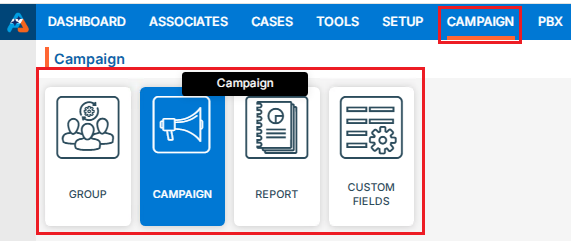
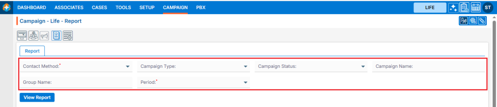
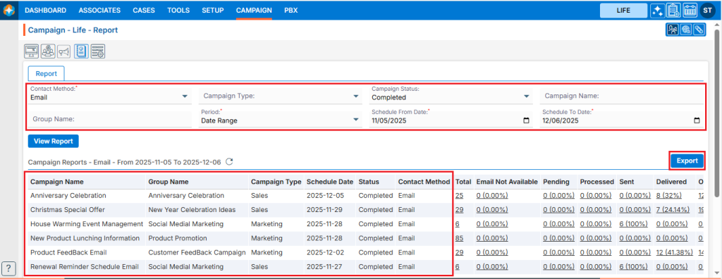
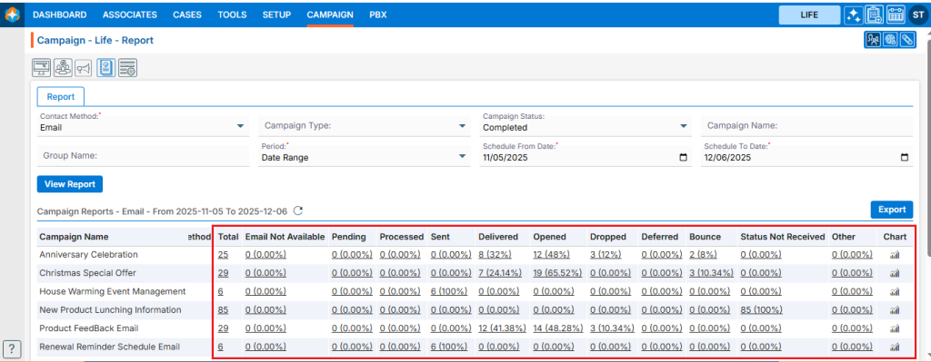
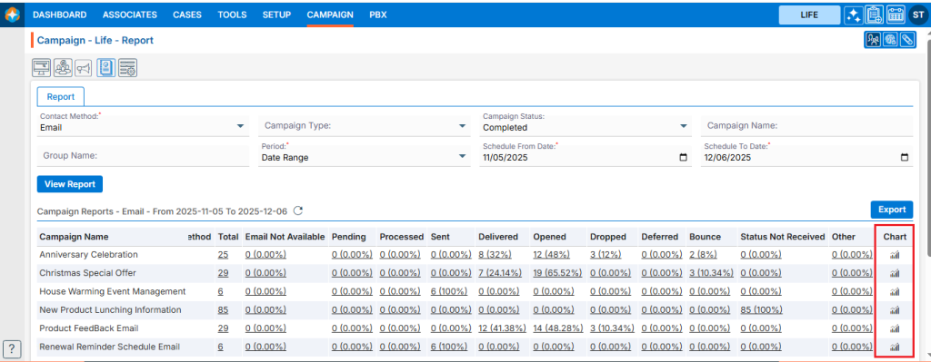
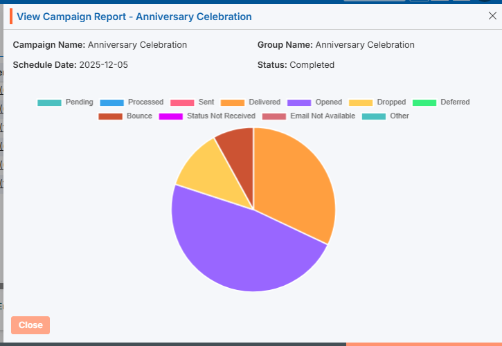
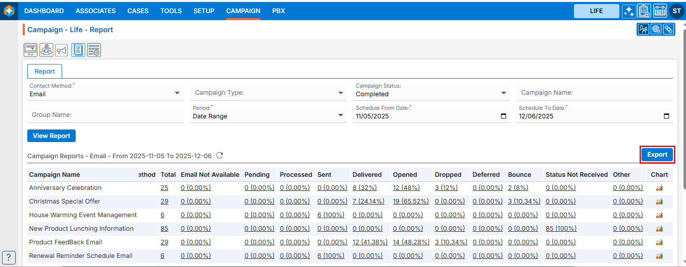
 0
0
 0
0
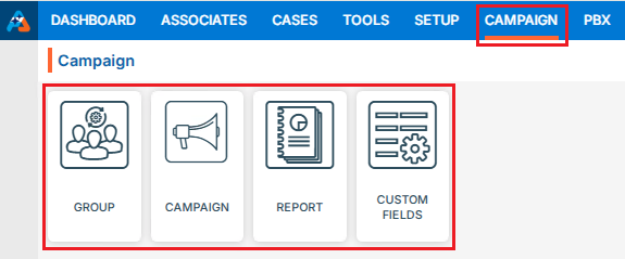
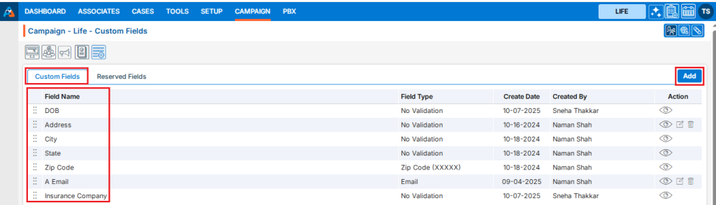
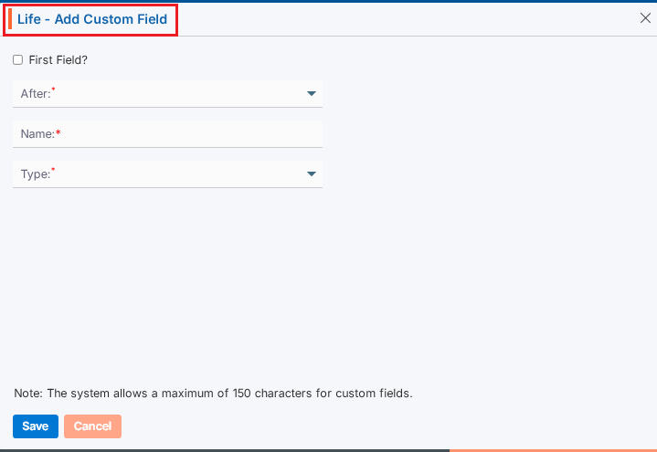
 ) icon from the Action Column for the field you want to edit/change.
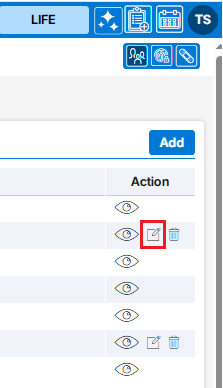
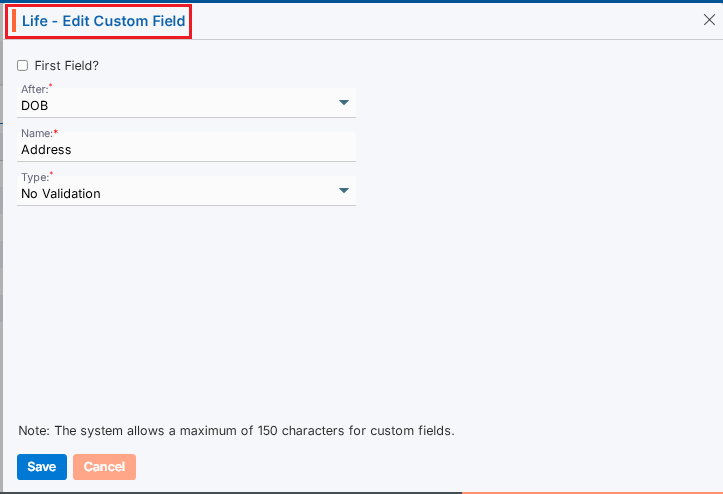
 ) icon from the Action Column for the filed you want to delete.
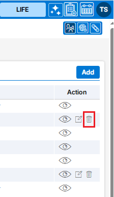
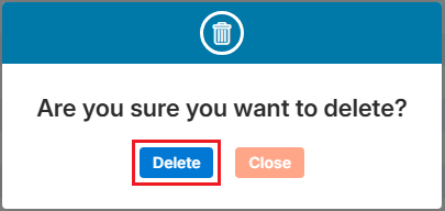
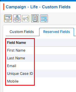
 ) the existing group and option to Import Contacts to the group under the Action Column on the right pane.
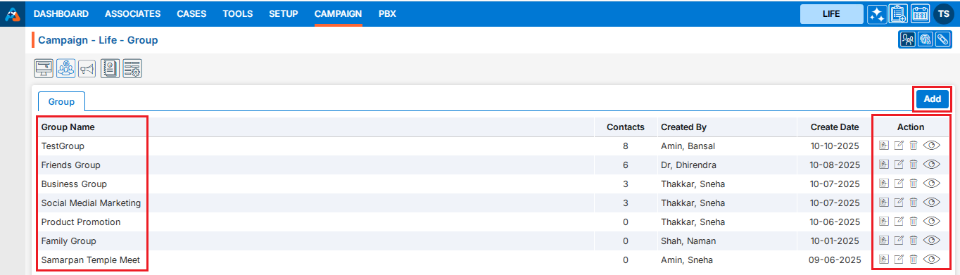
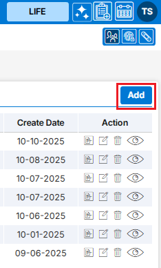
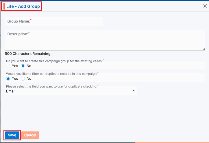

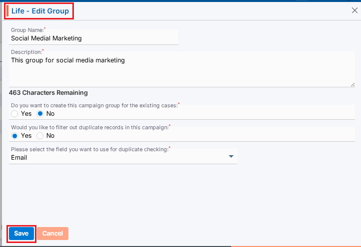
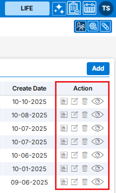
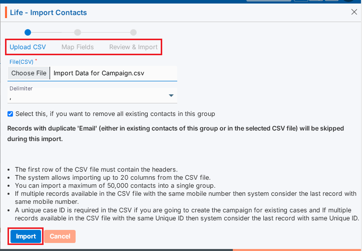
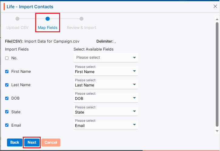
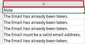
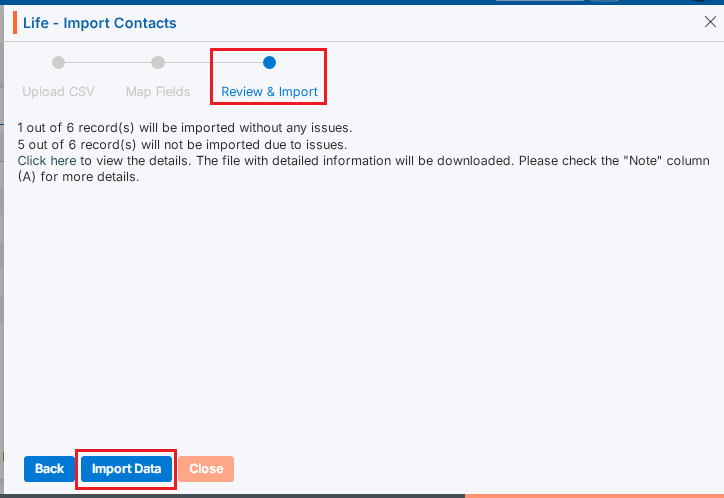
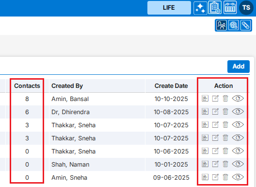
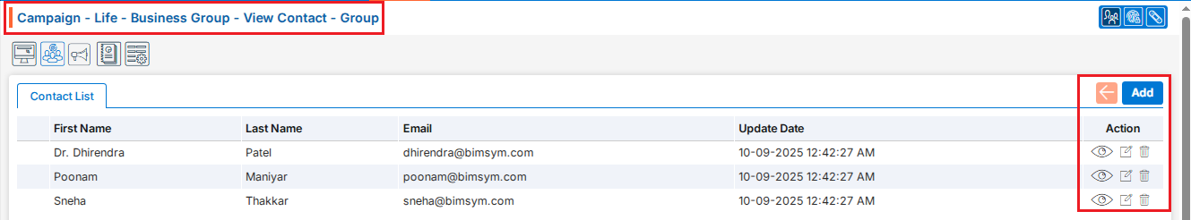


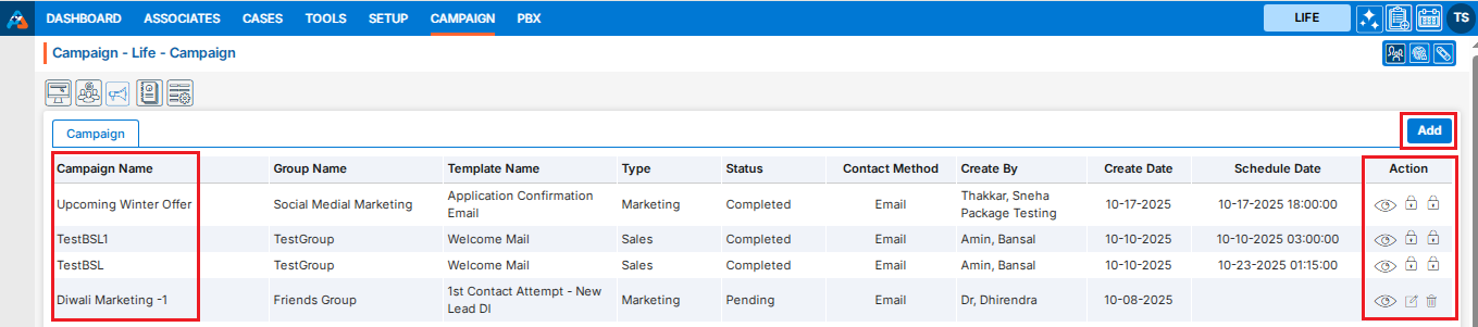
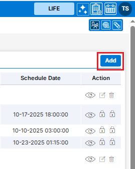
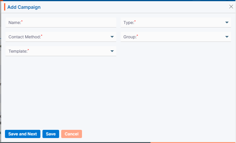
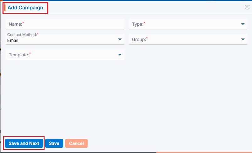
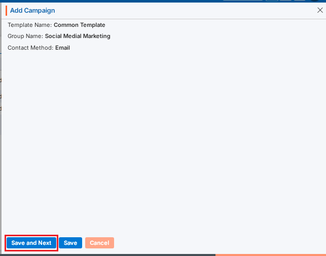
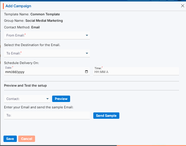
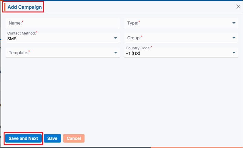
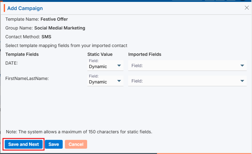
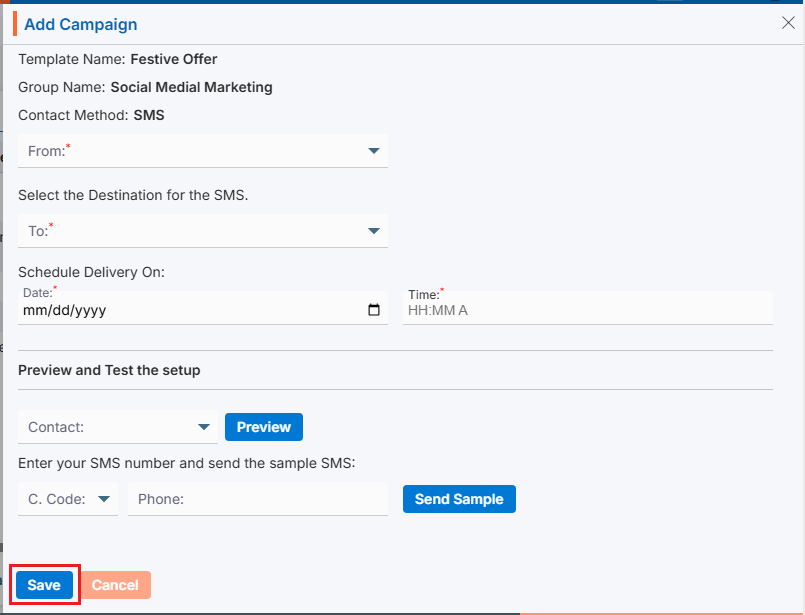
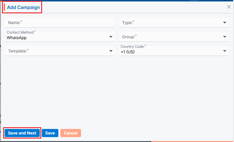
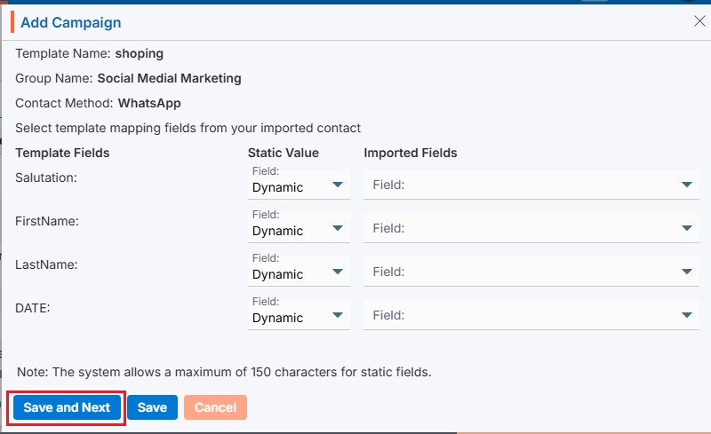
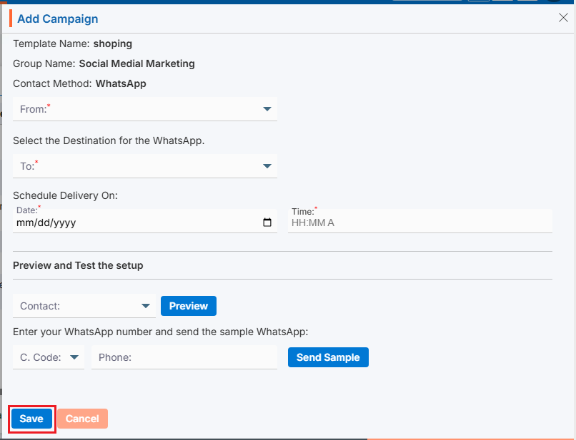
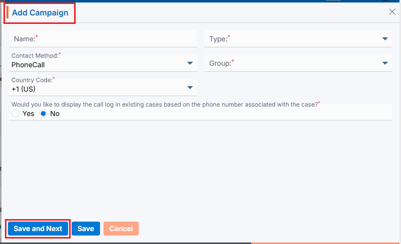
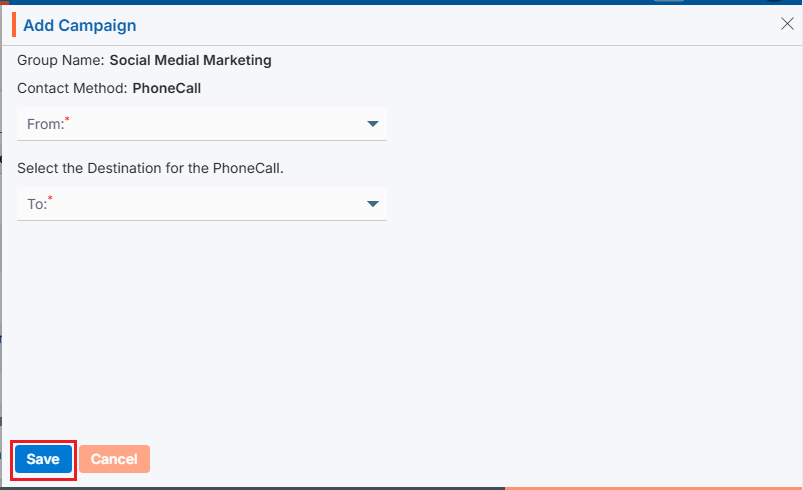
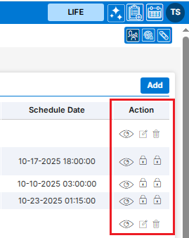
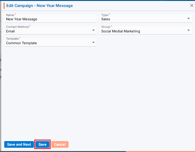

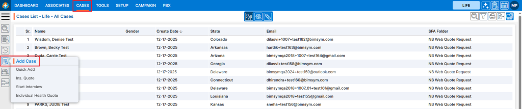
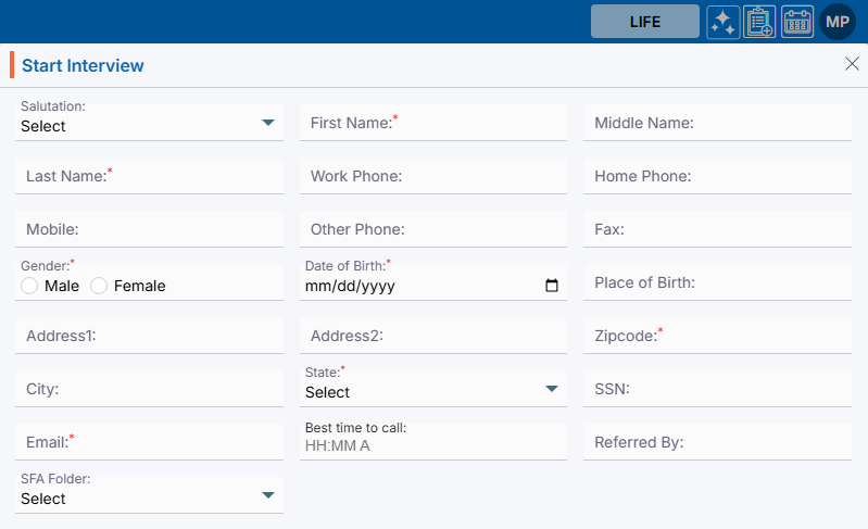
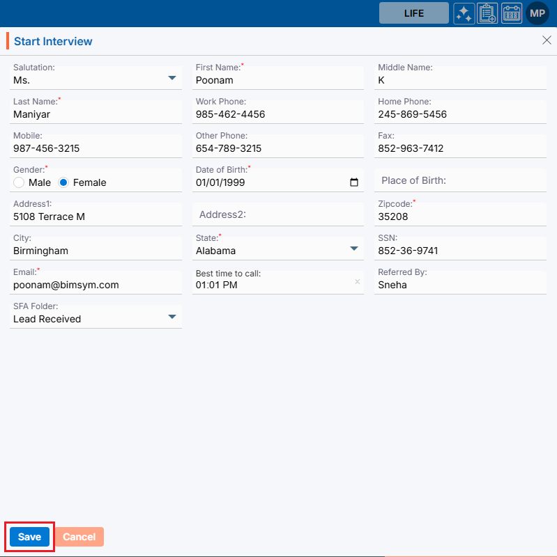
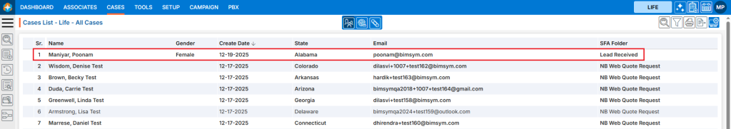
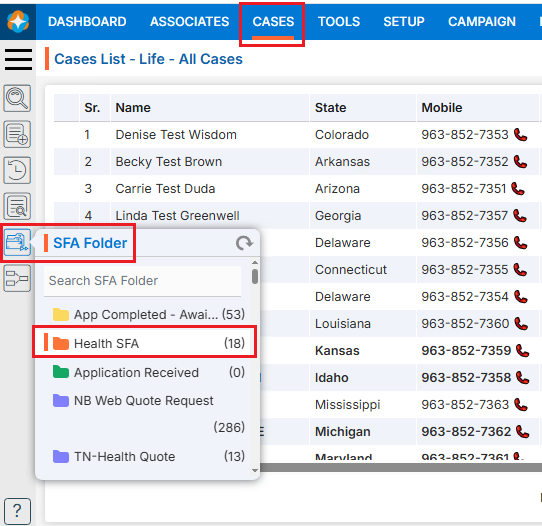
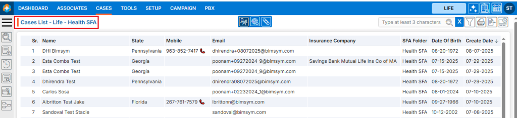
 ) icon
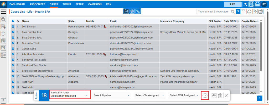
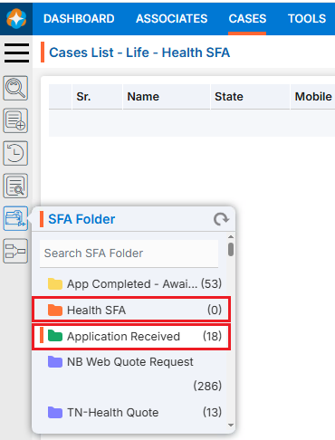
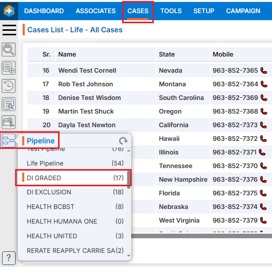
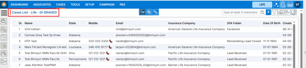
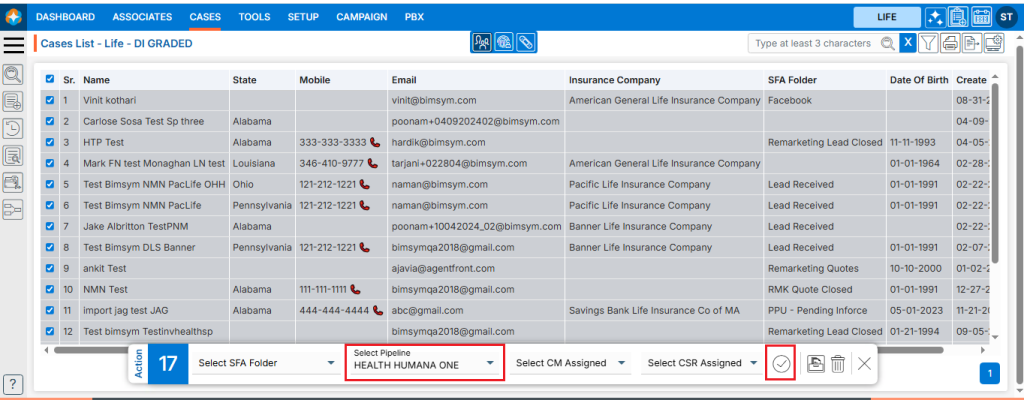
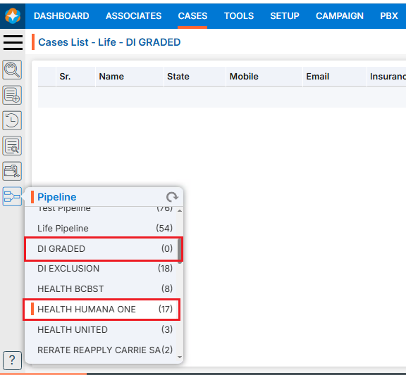
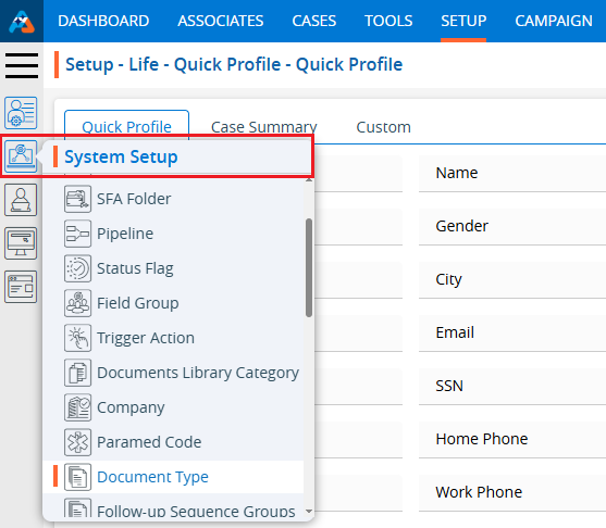
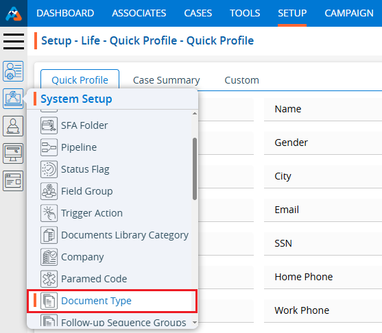
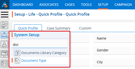
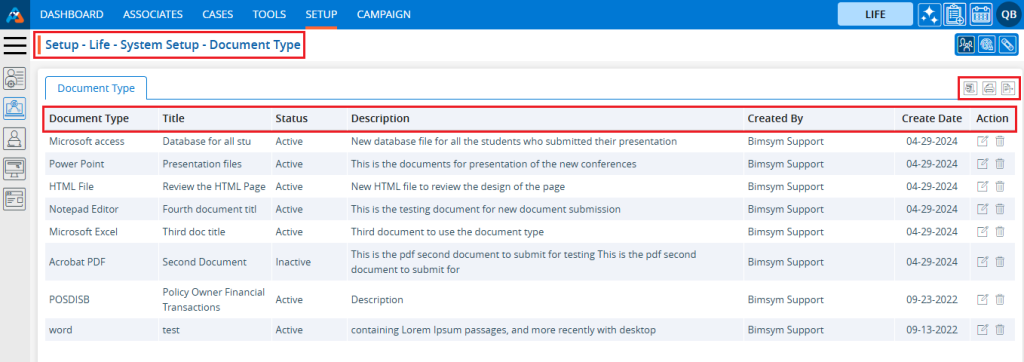
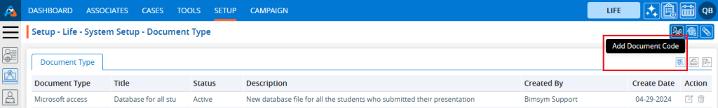
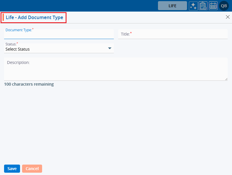
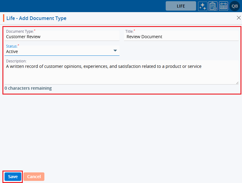
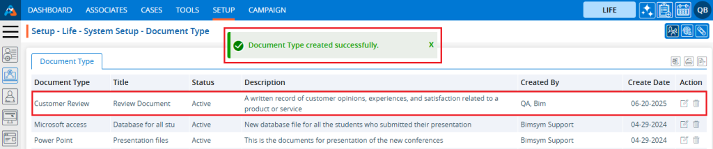
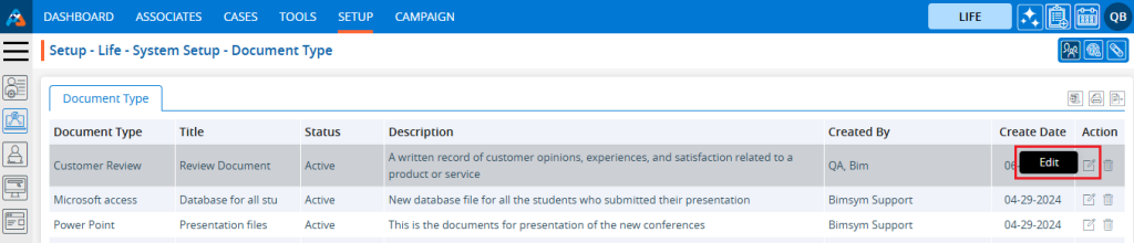
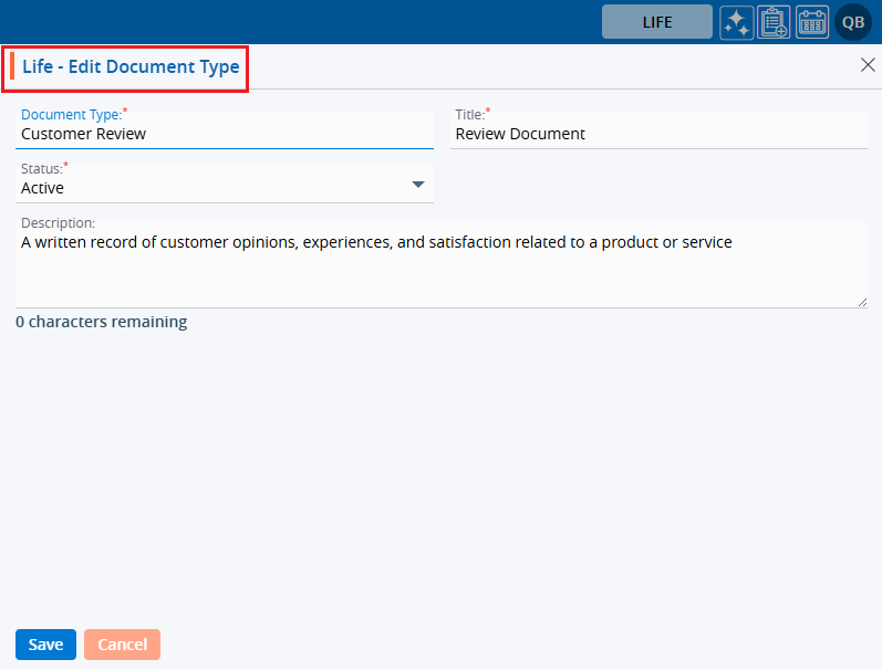
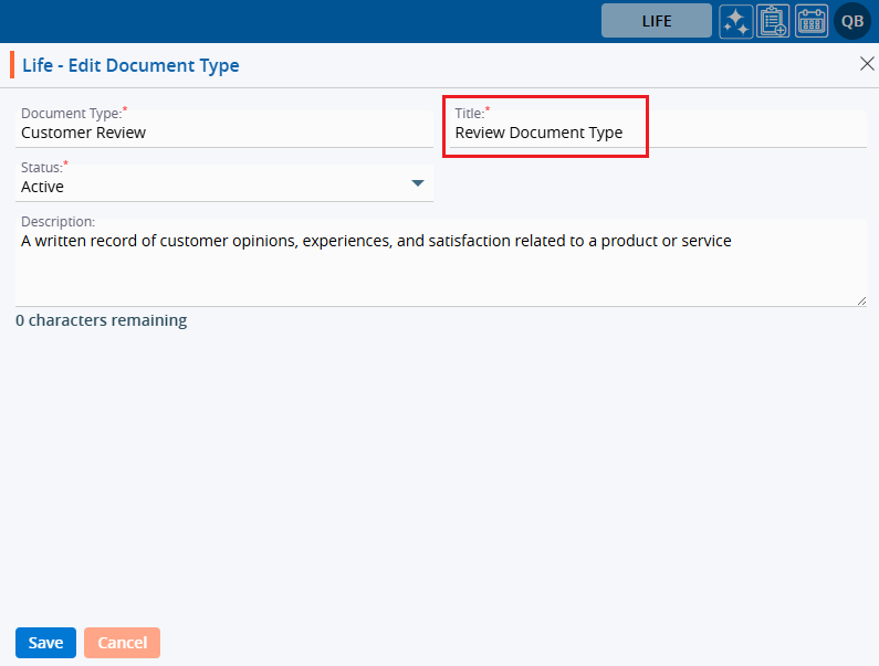
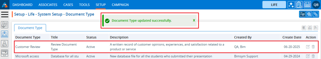
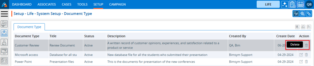
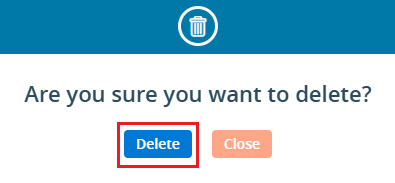
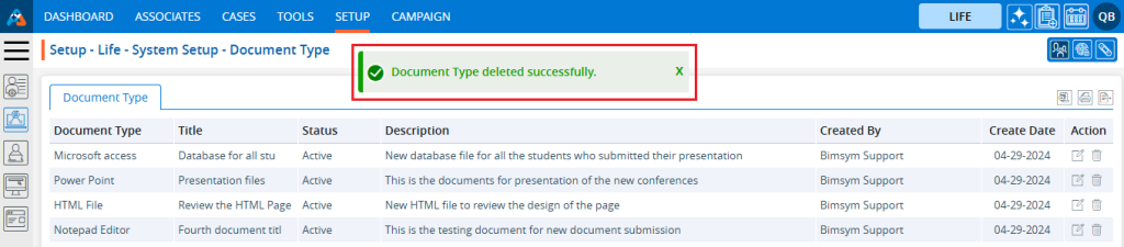
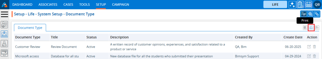
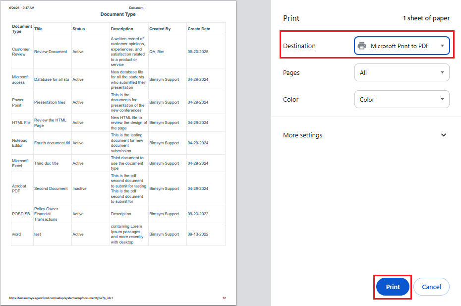
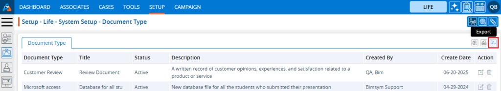
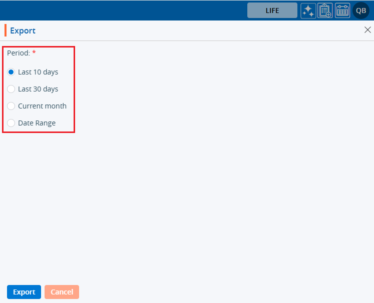
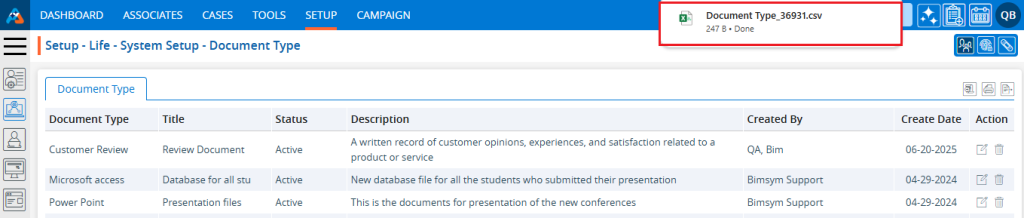

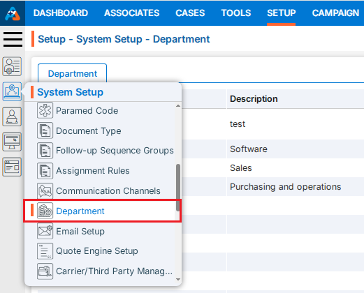
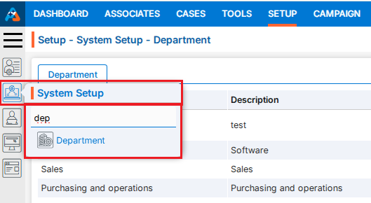
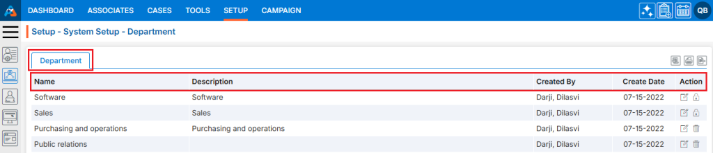
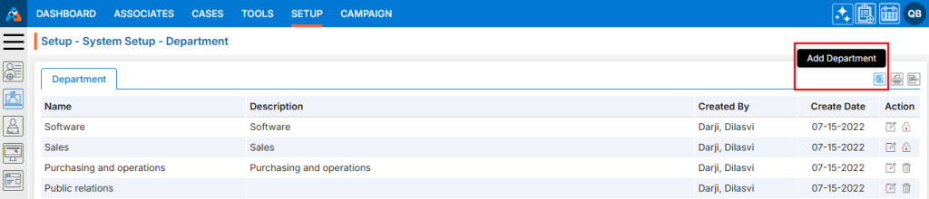
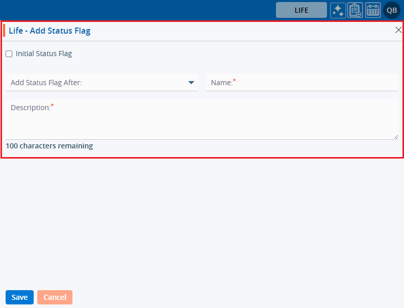
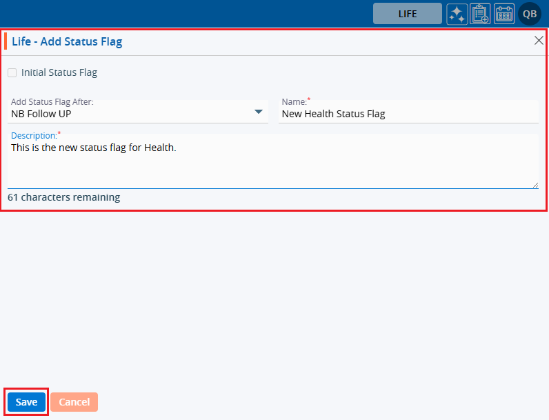
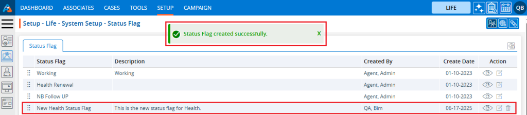
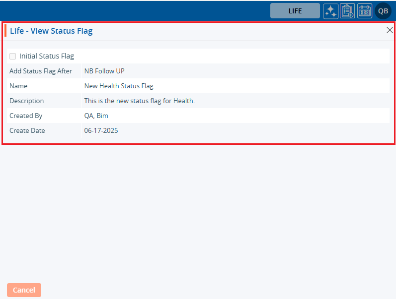
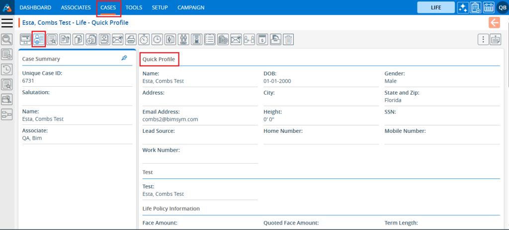
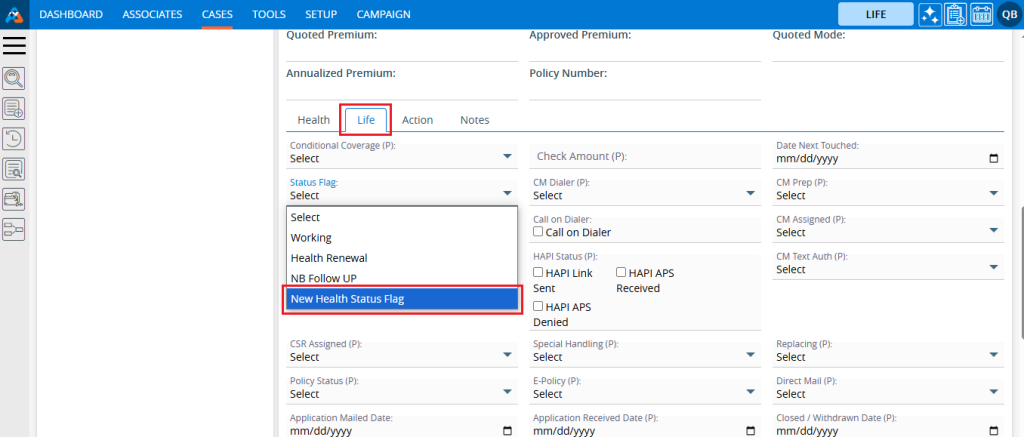
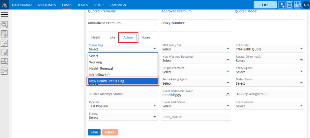
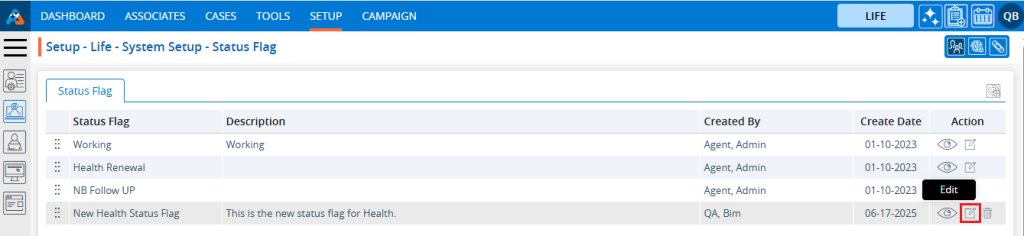
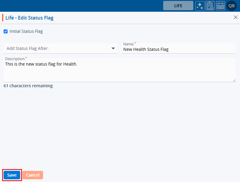
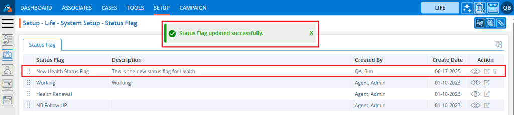
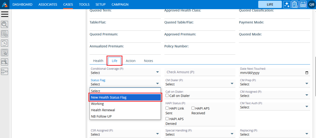
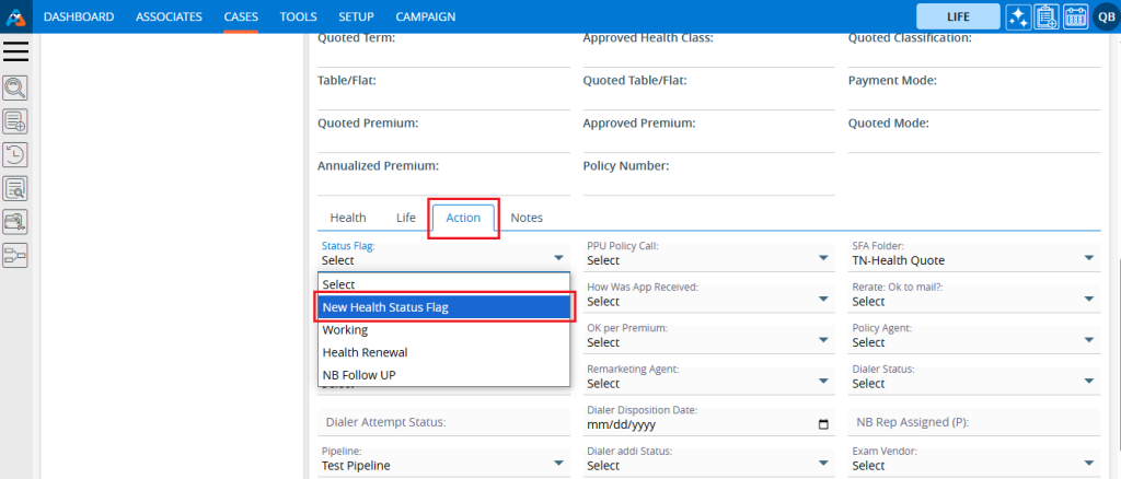
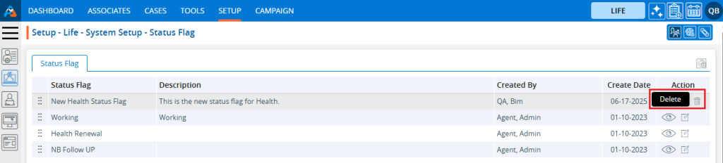
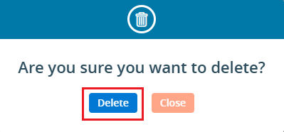
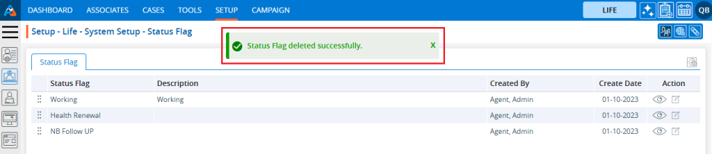
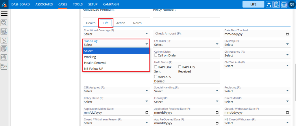
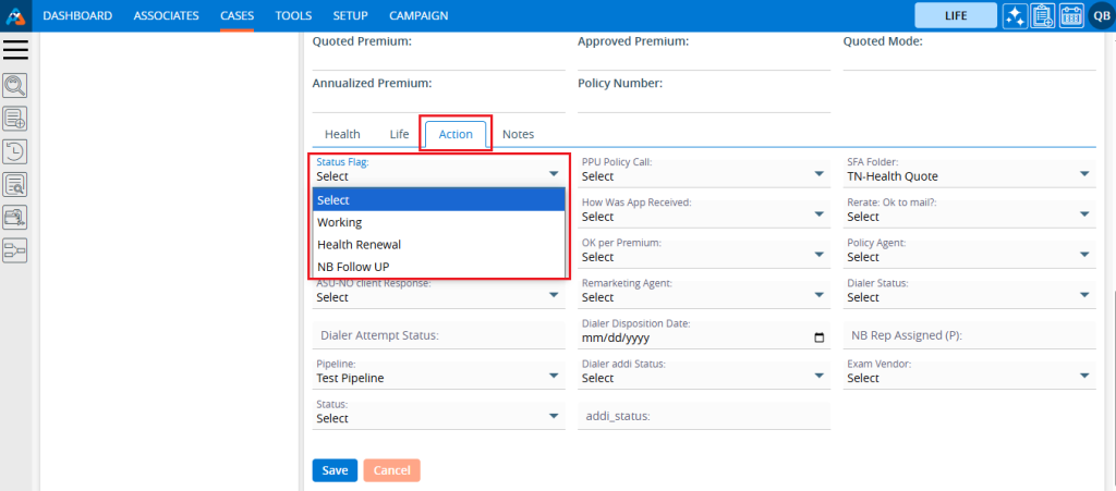
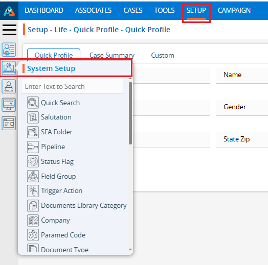
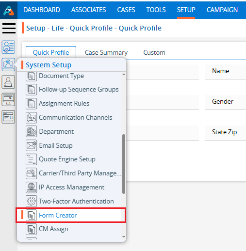
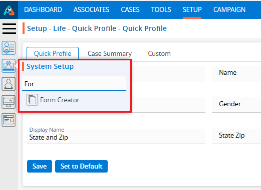
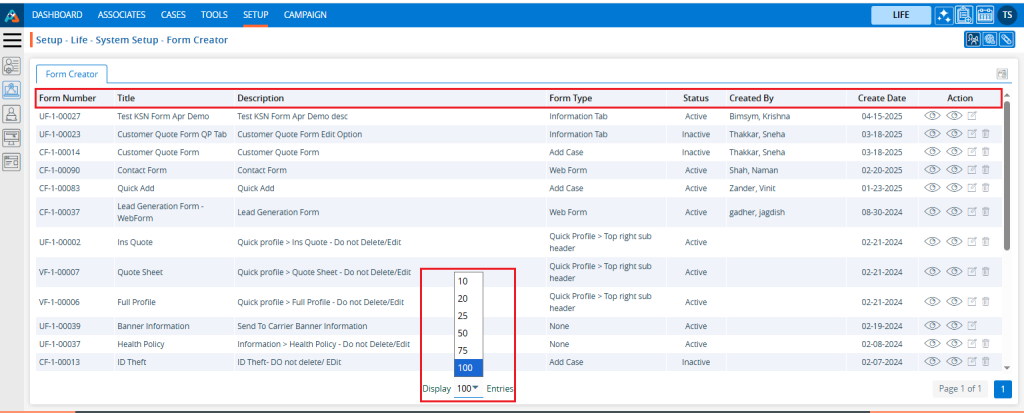

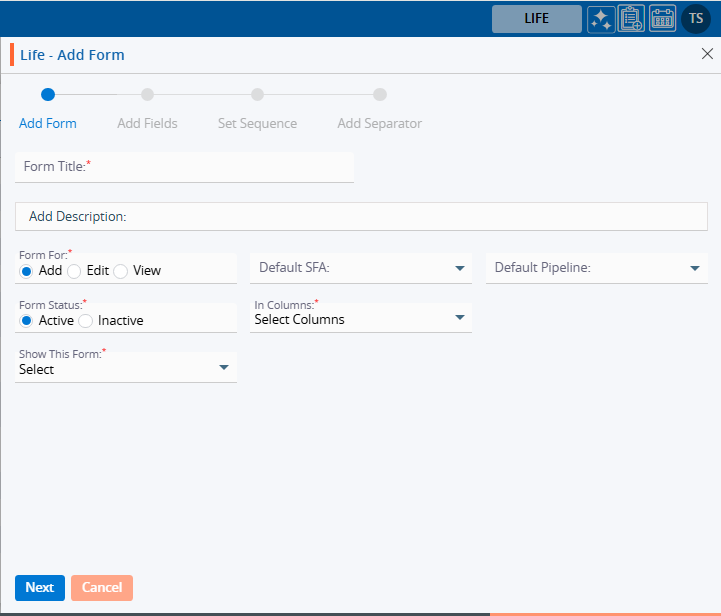
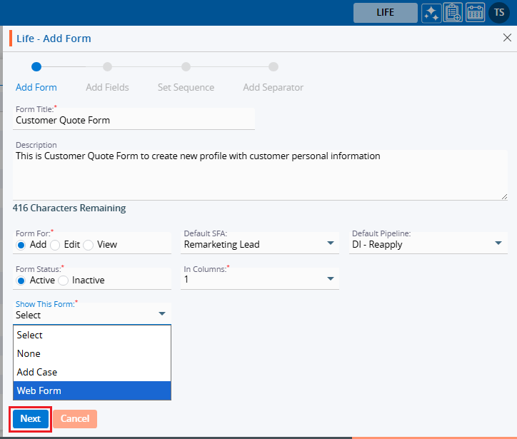
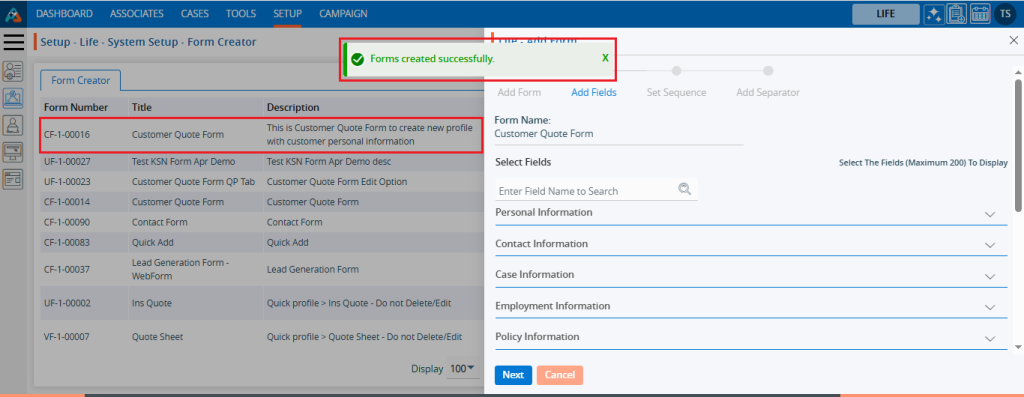
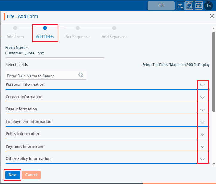
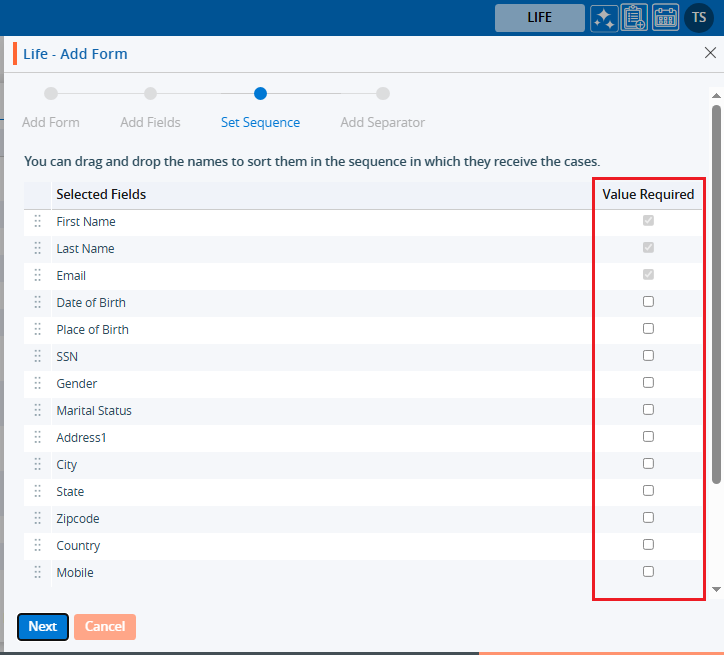
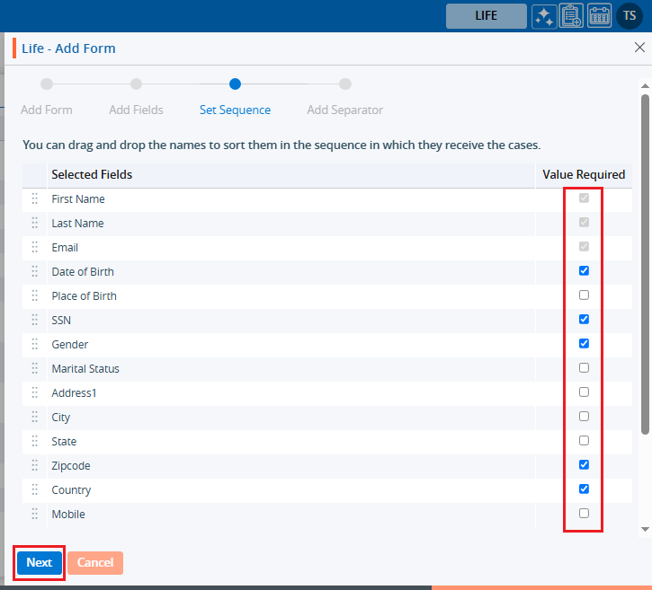
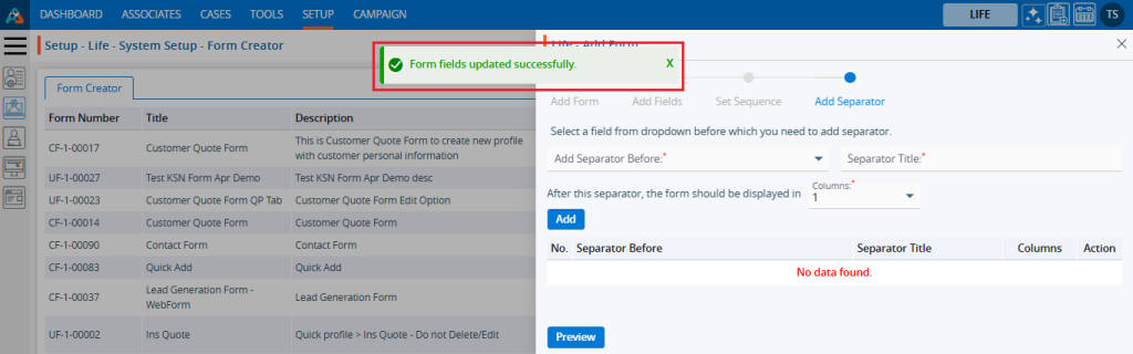
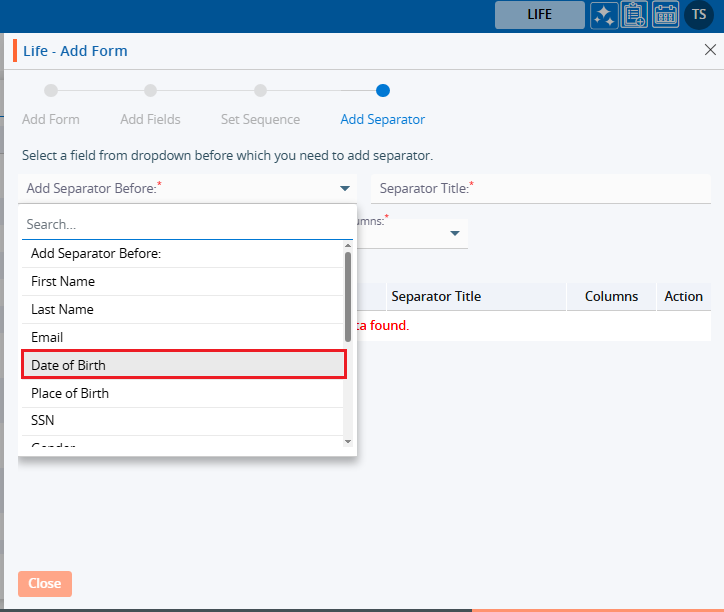
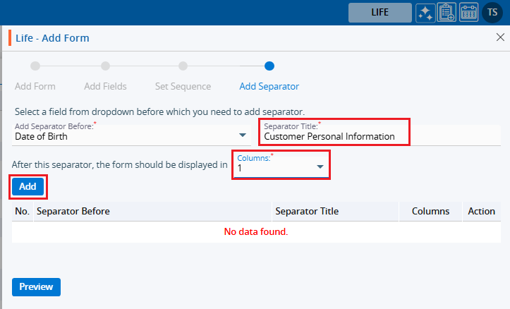
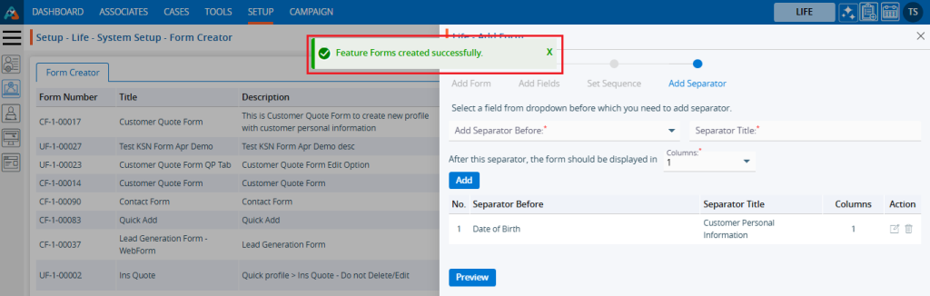
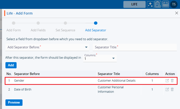
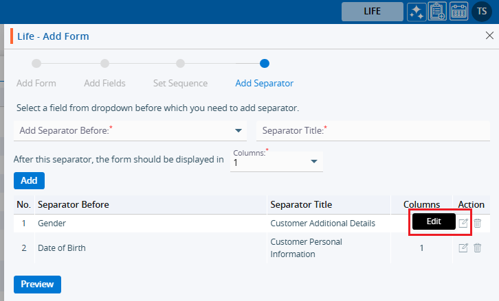
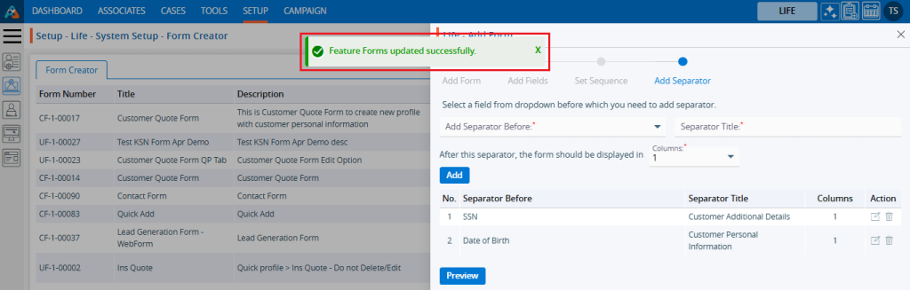
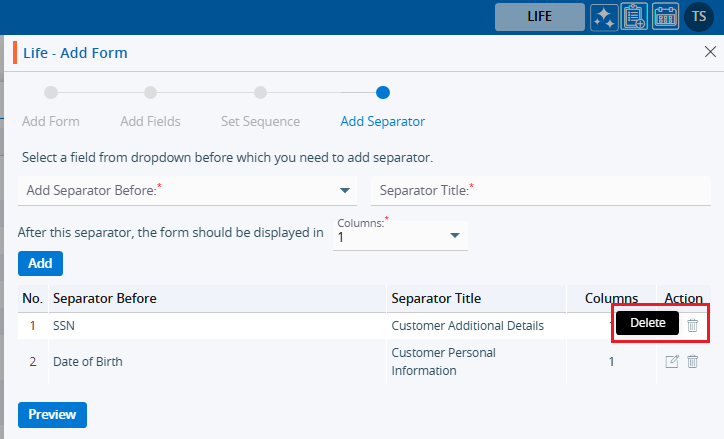
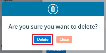

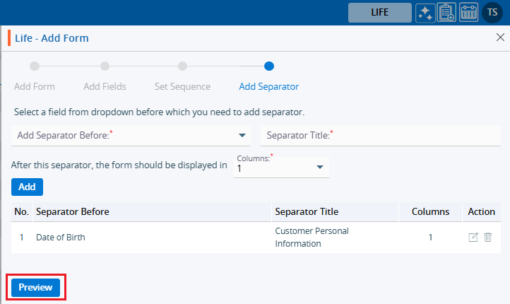
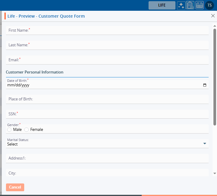
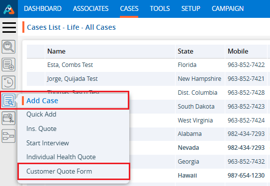
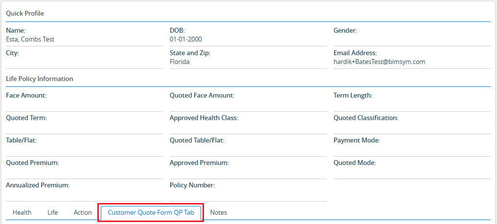
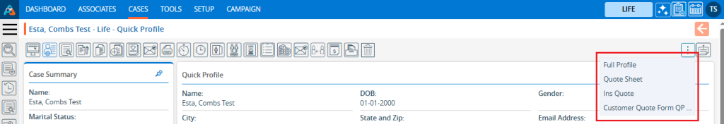
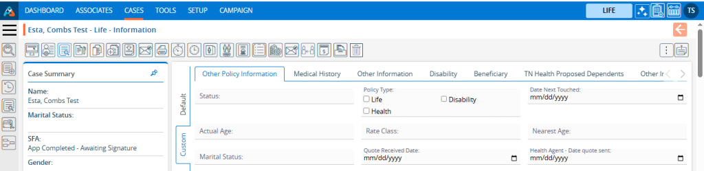
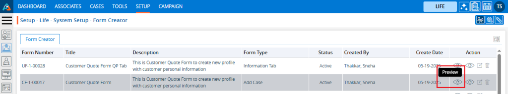
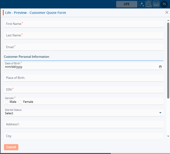
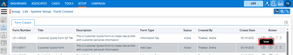
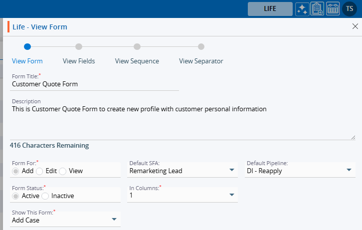
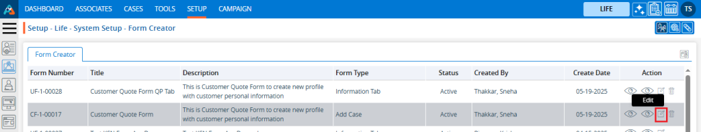
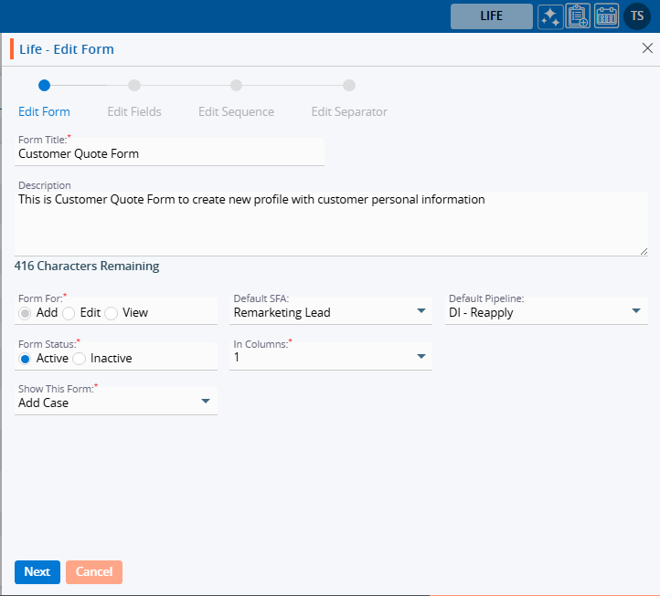
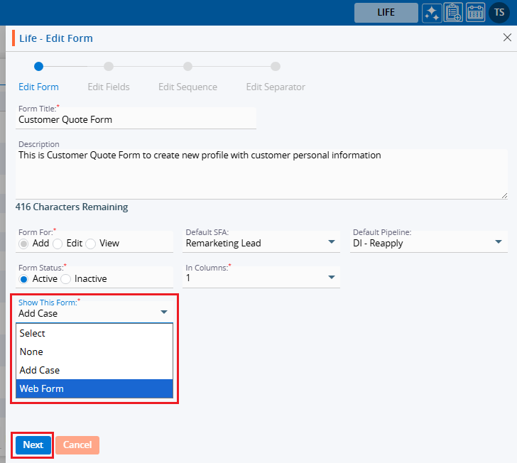
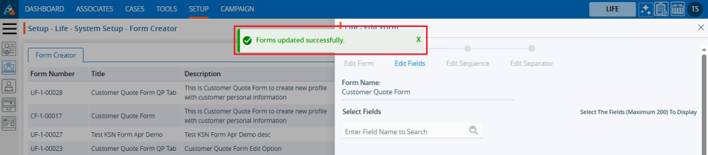
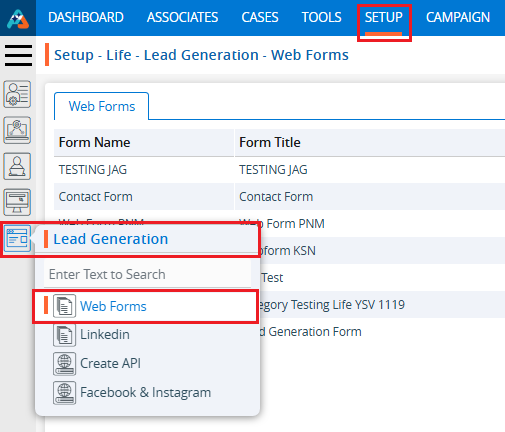
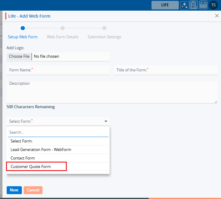
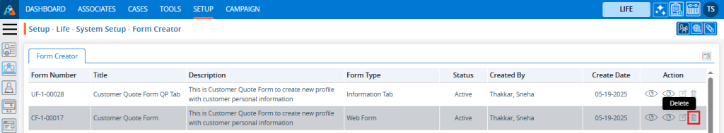
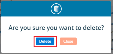
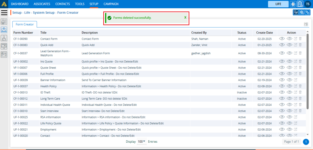
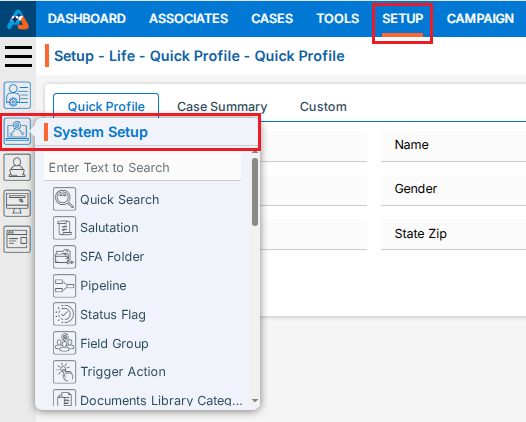
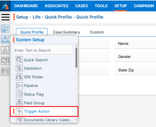
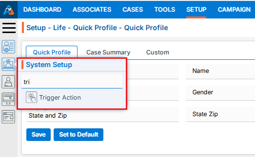
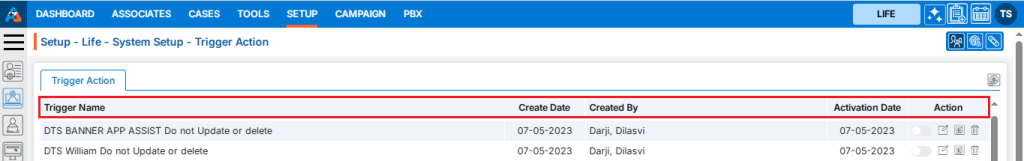
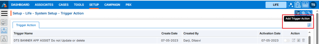
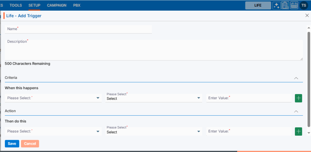
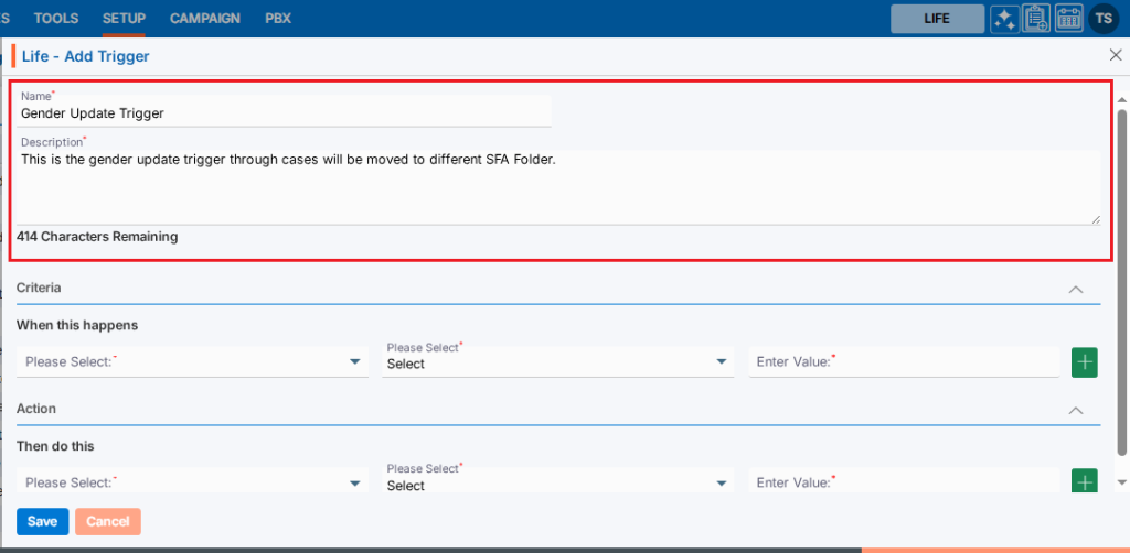
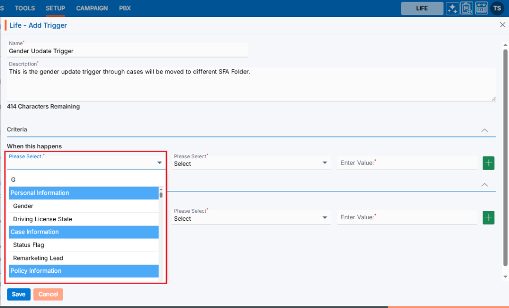
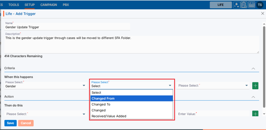
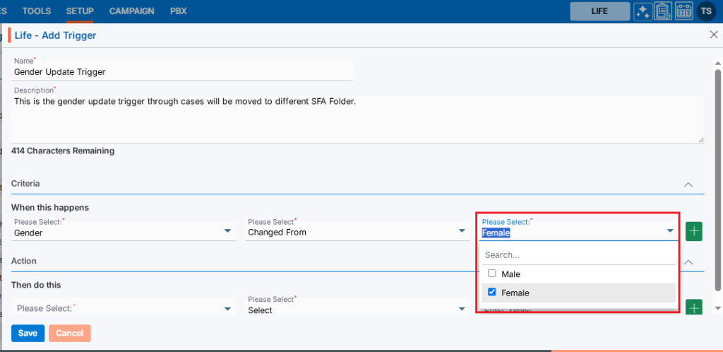
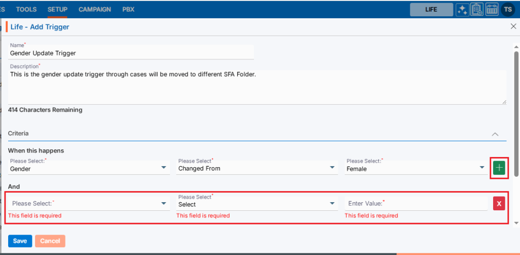
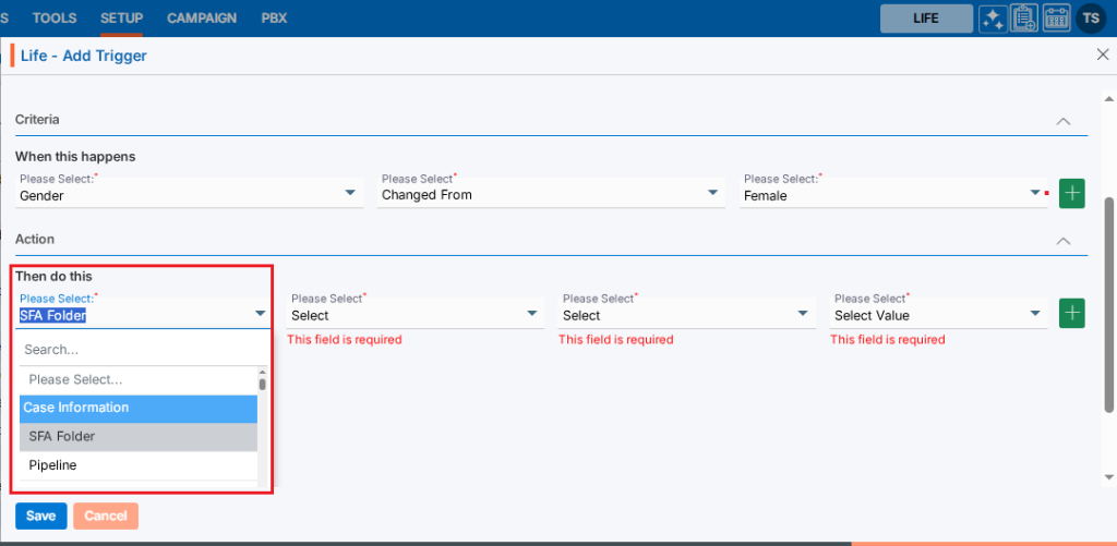
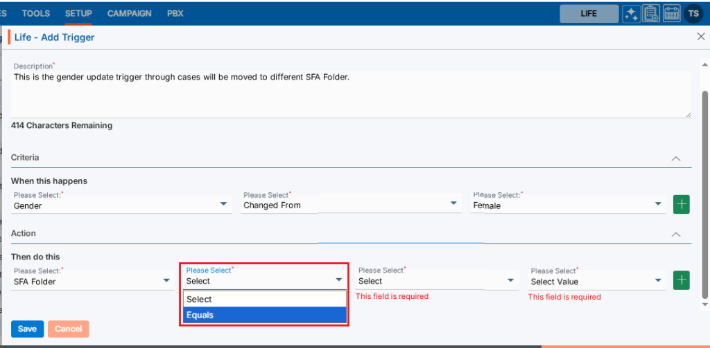
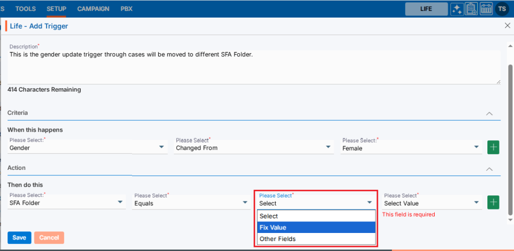
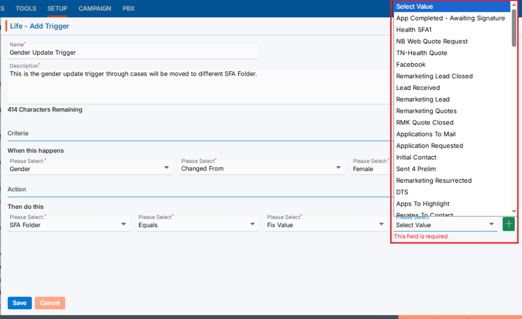
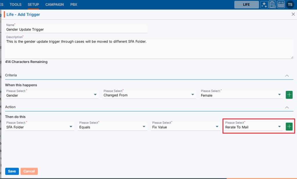
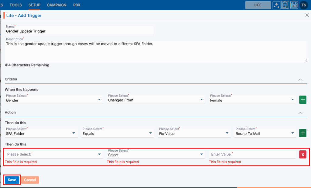
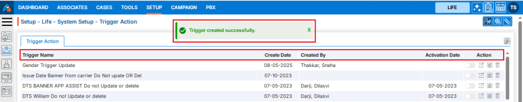
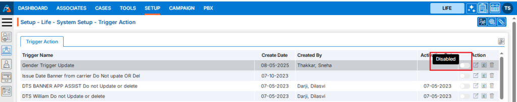
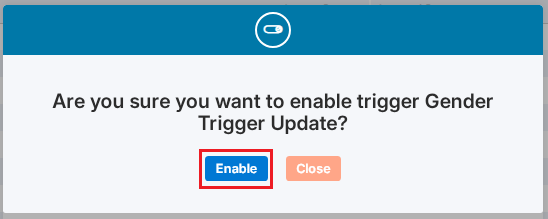
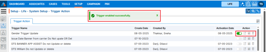
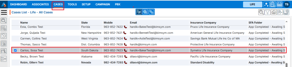
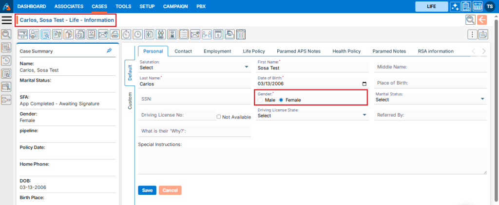
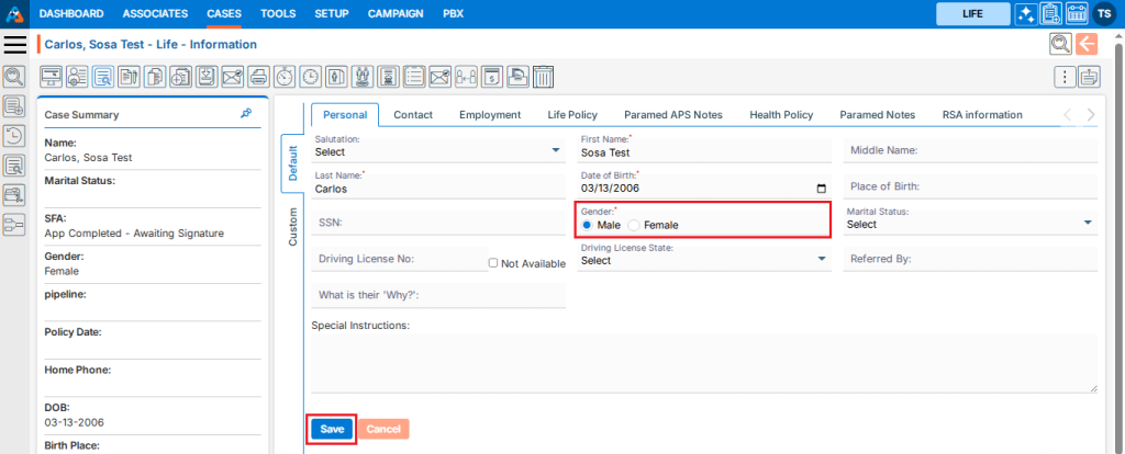
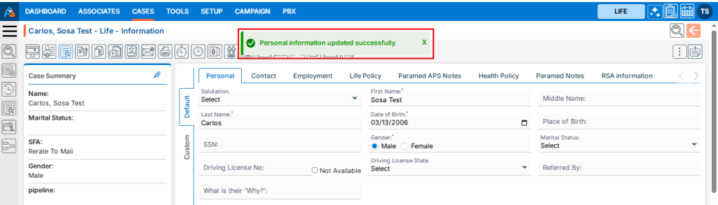
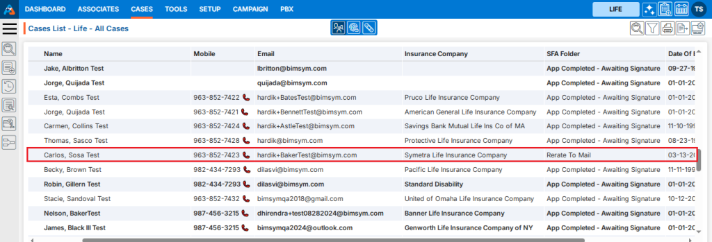
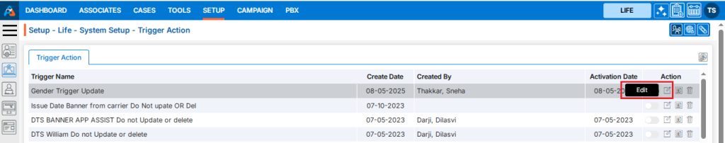
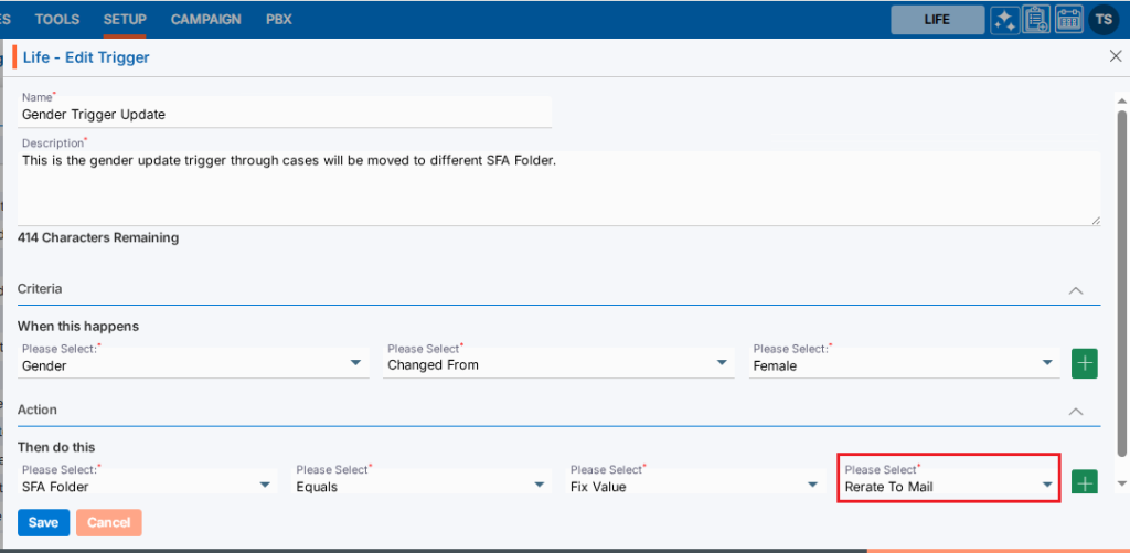
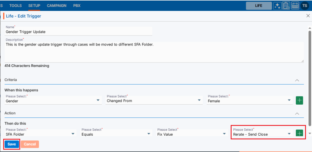
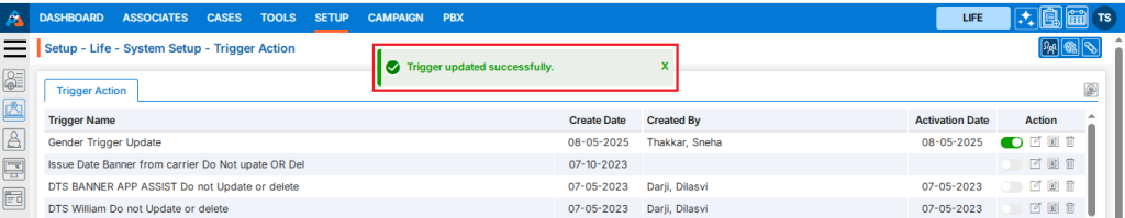
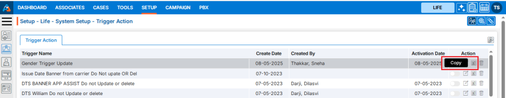
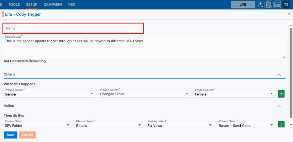
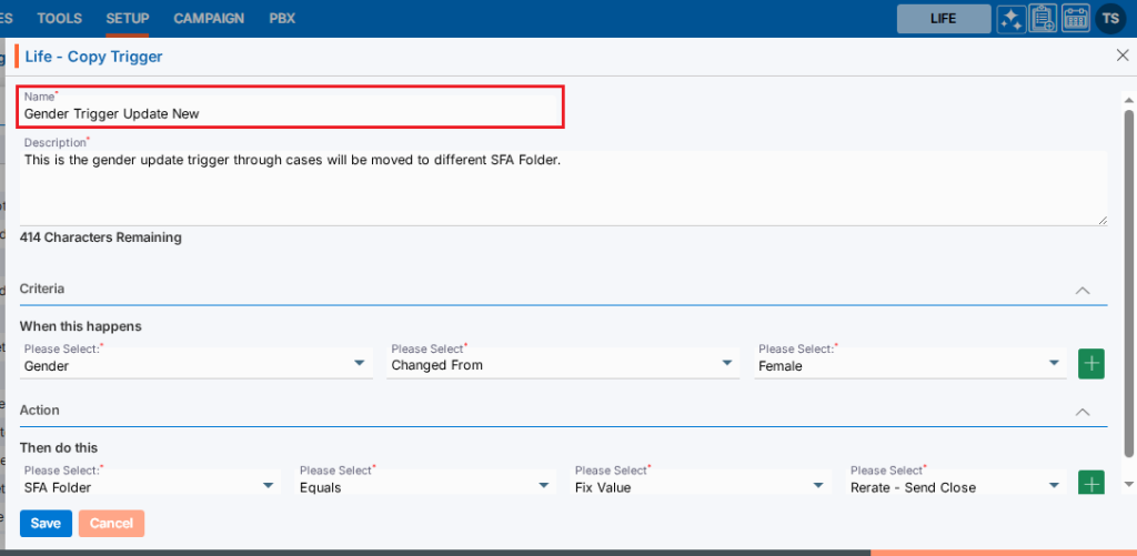
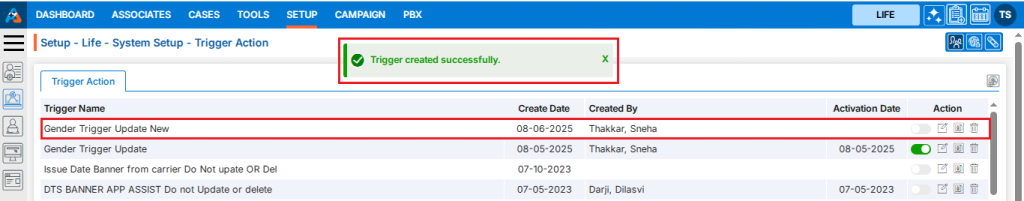
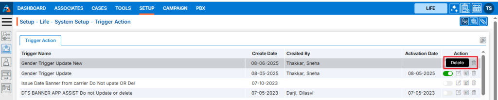
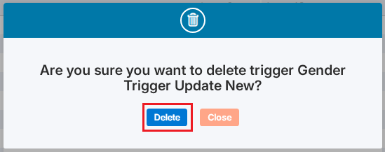
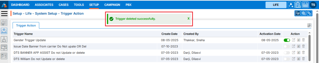
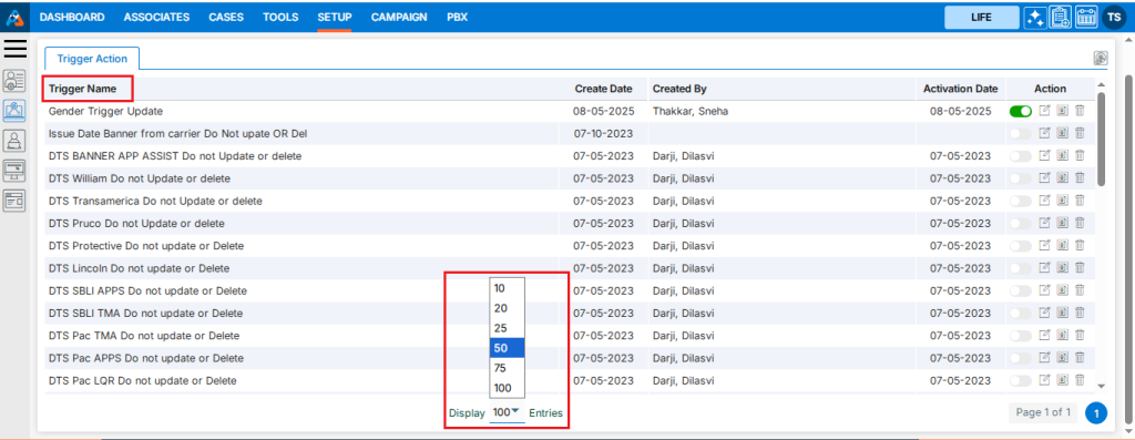
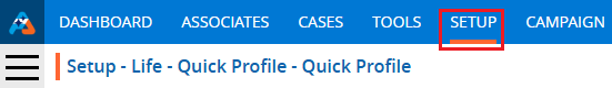
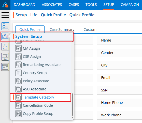
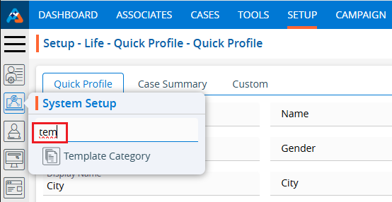
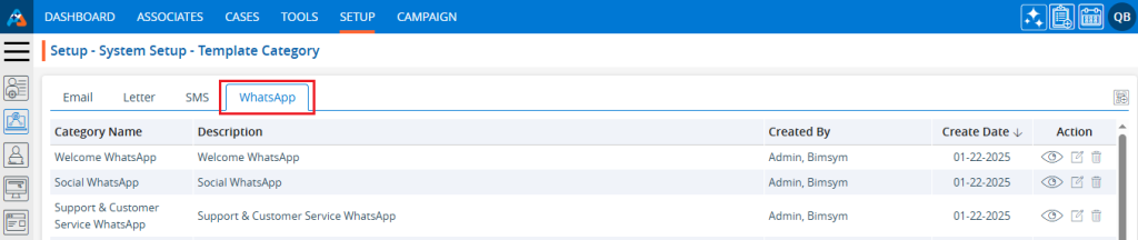
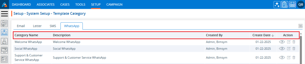
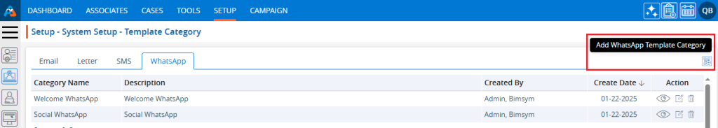
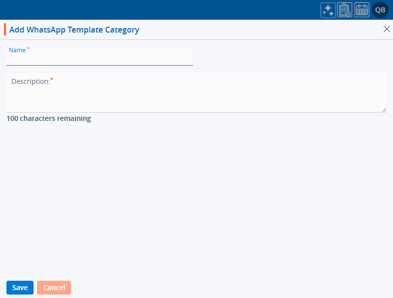
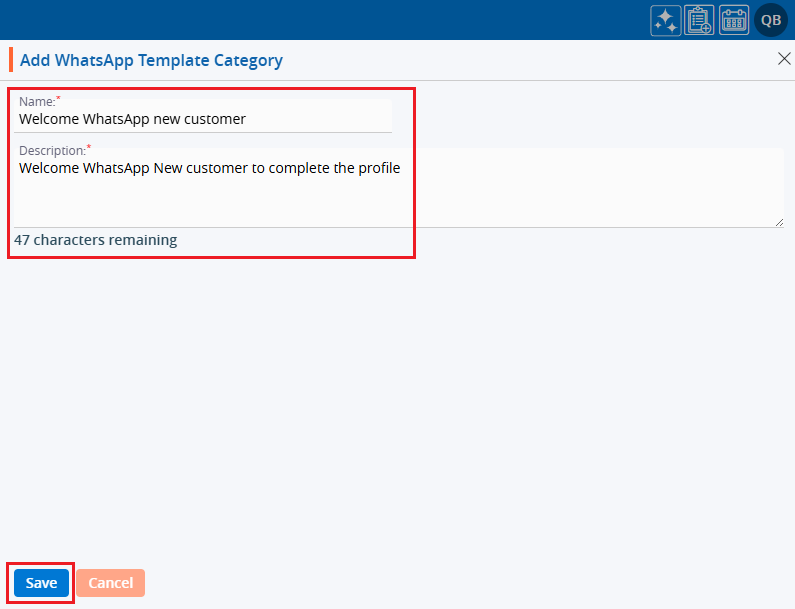
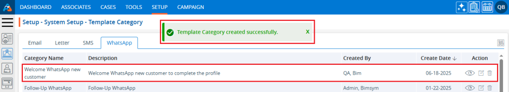
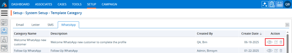
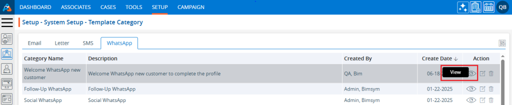
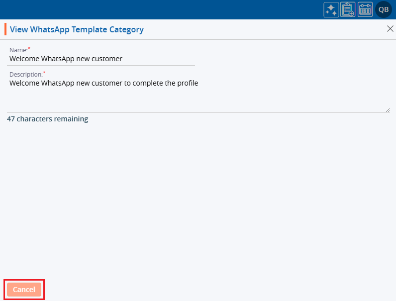
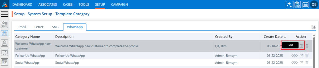
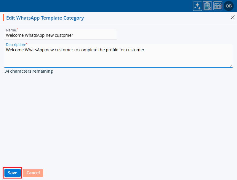
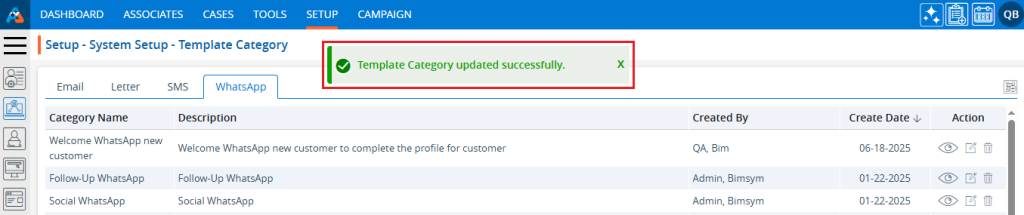
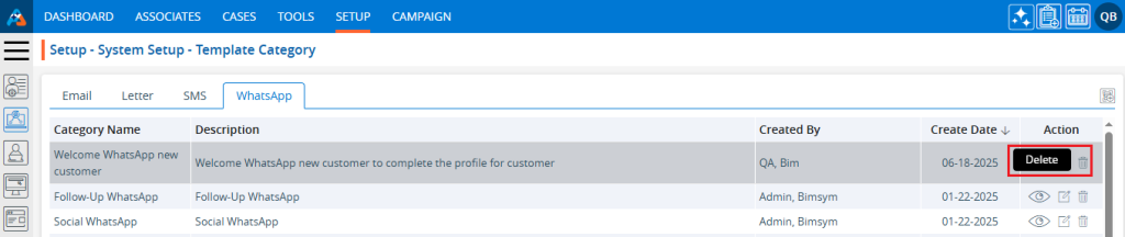
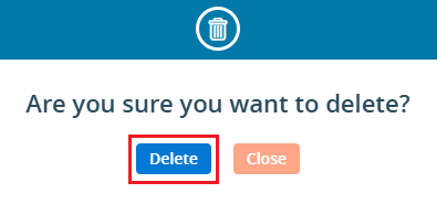
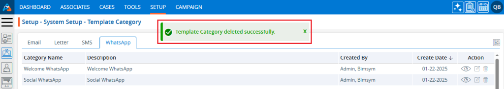
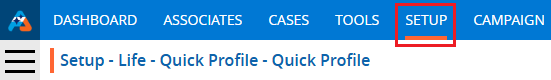
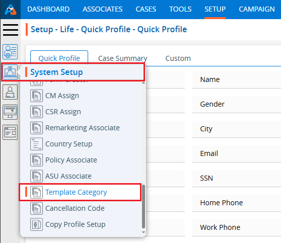
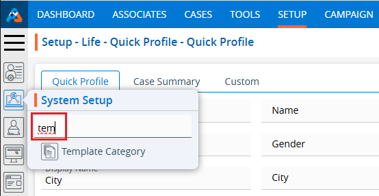
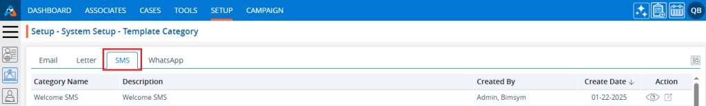
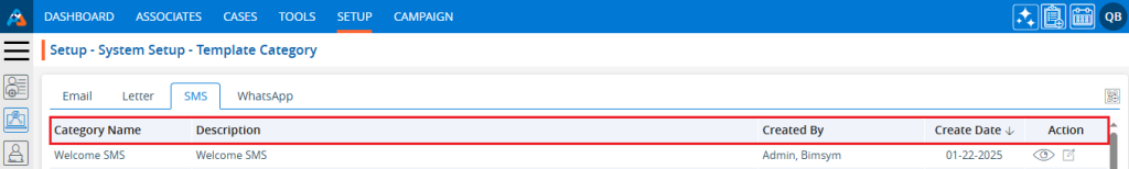
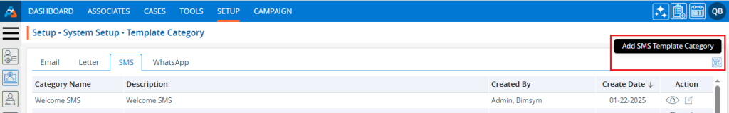
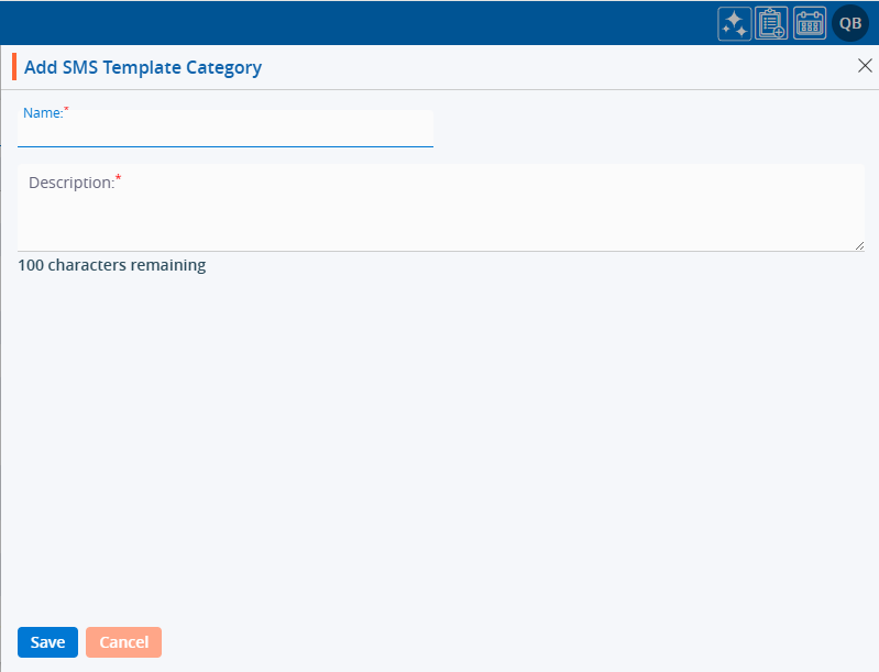
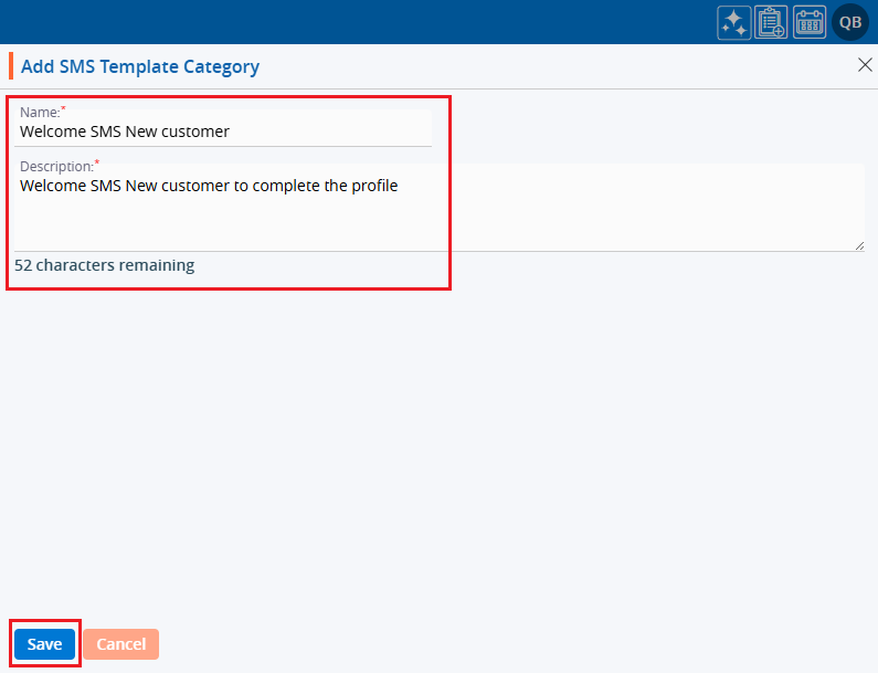
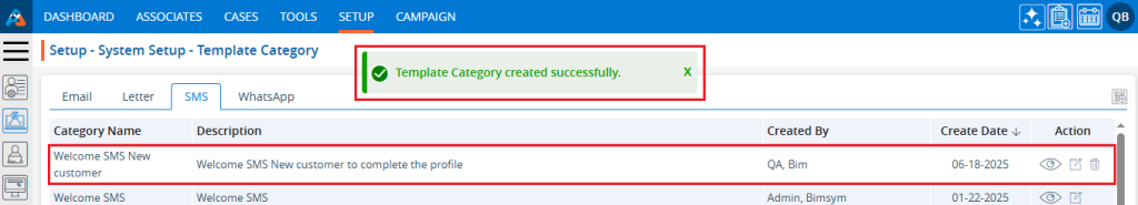
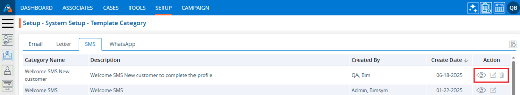
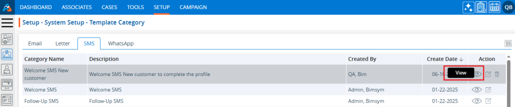
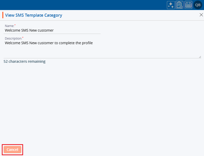
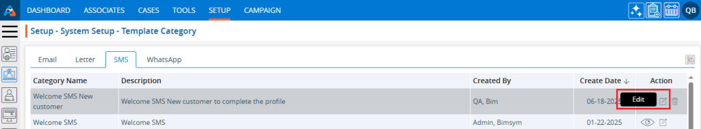
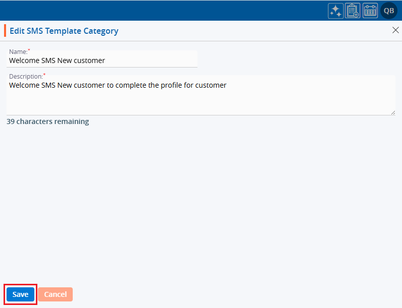
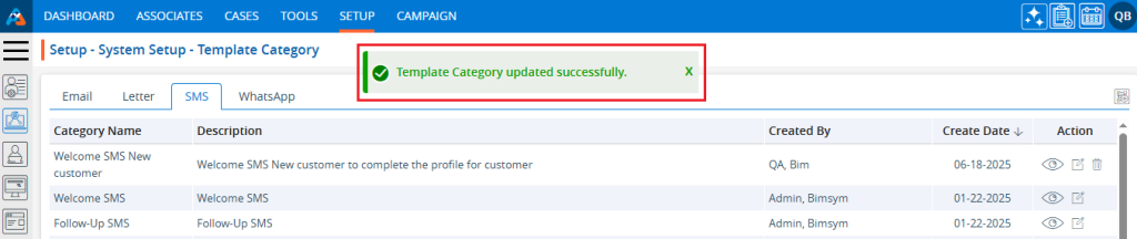
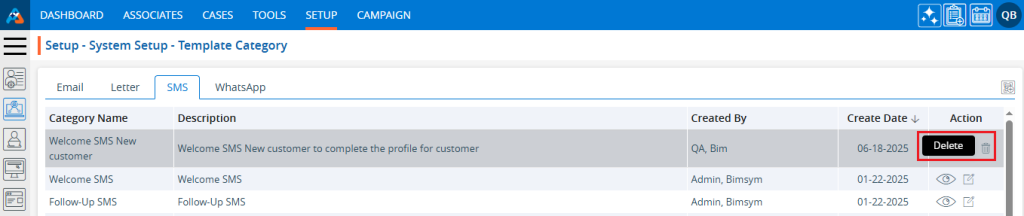

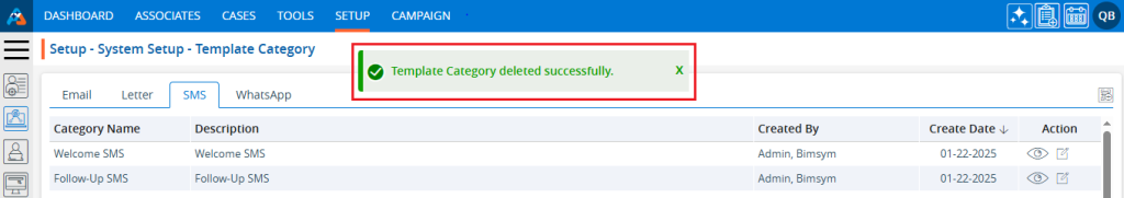
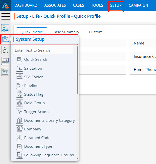
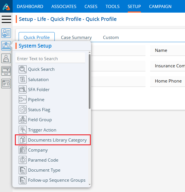
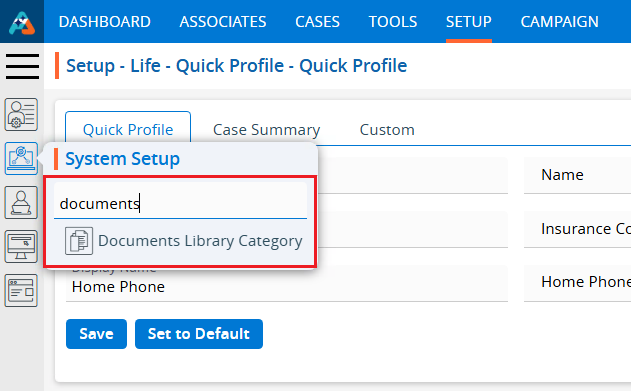
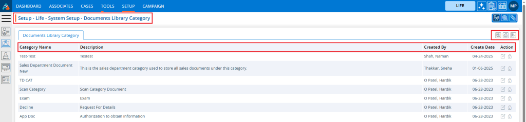
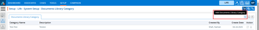
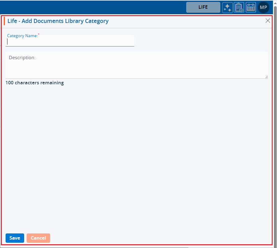
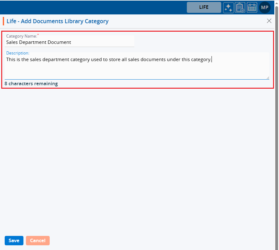
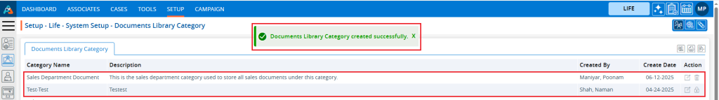

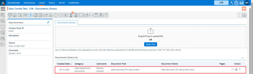
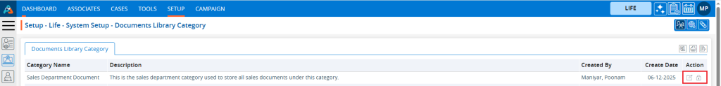

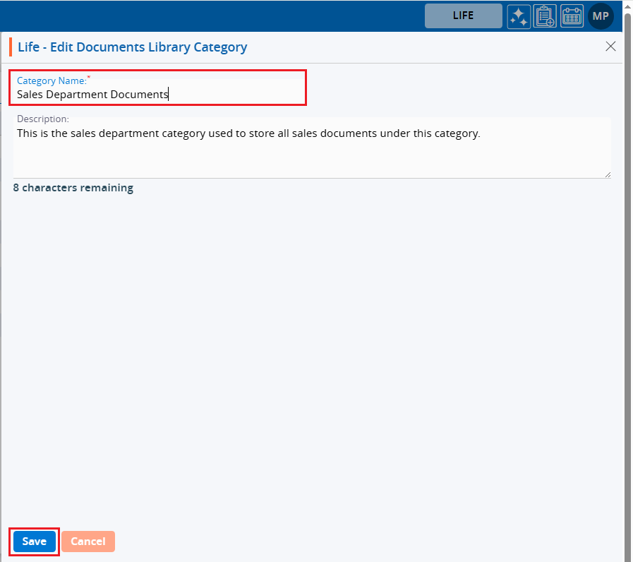
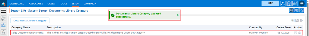

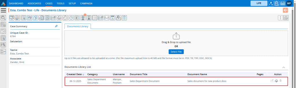
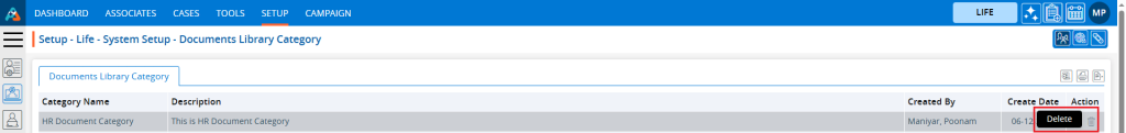

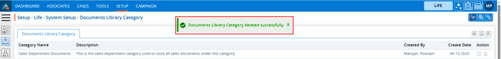
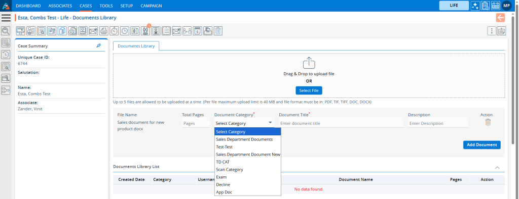
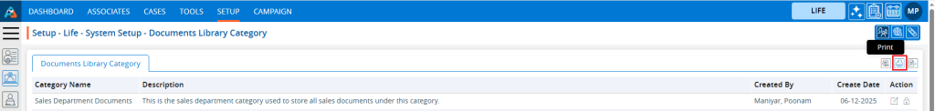
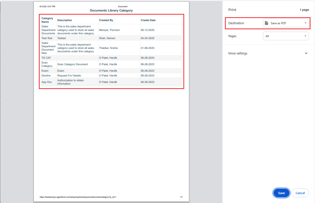
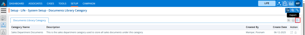
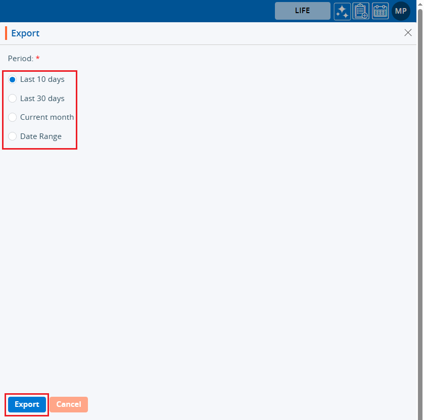
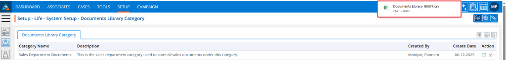
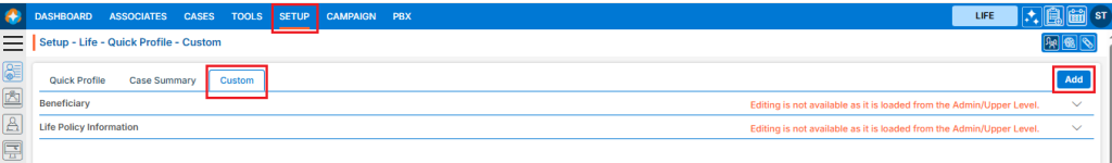
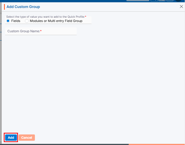

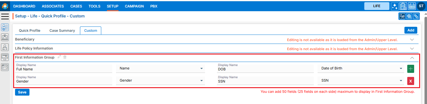
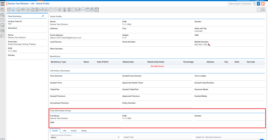
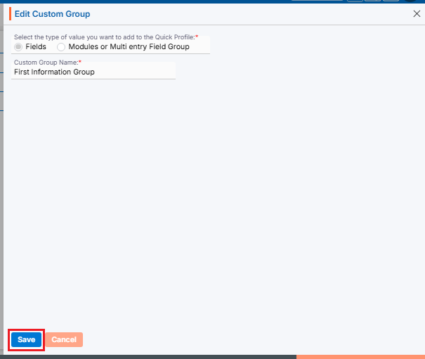
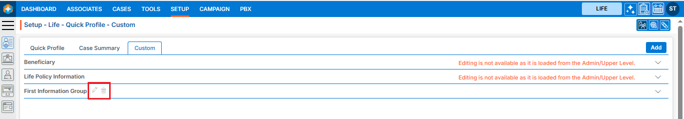

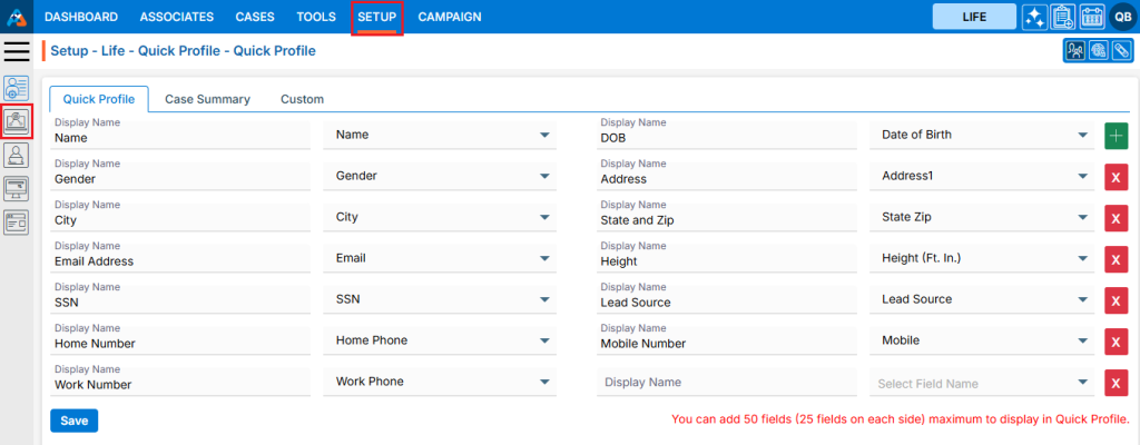
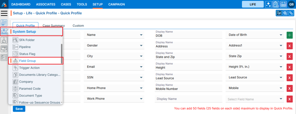
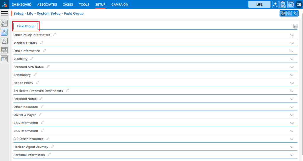
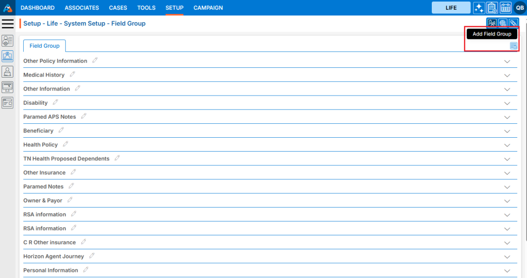
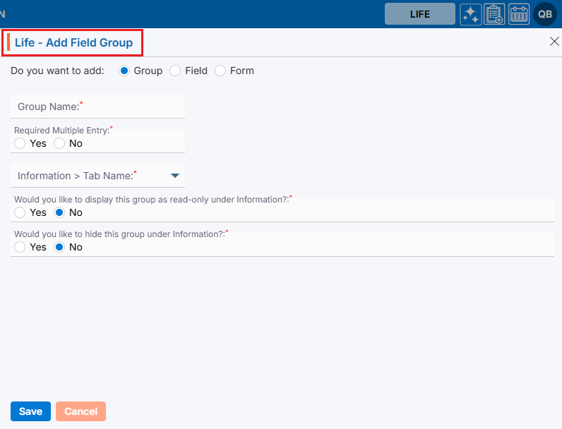
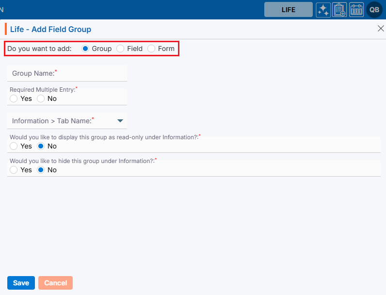
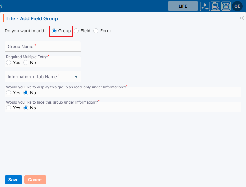
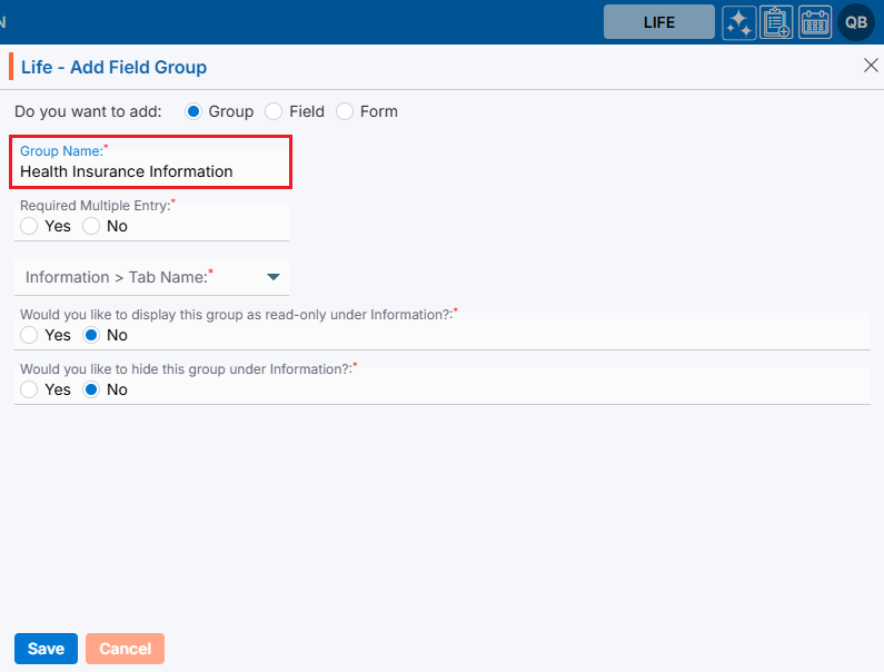
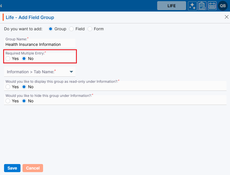
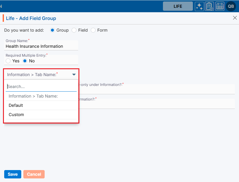
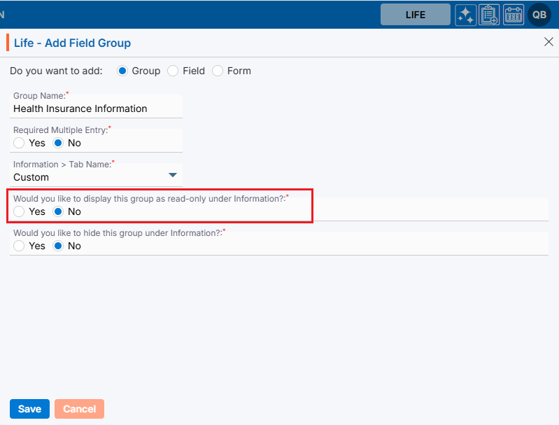
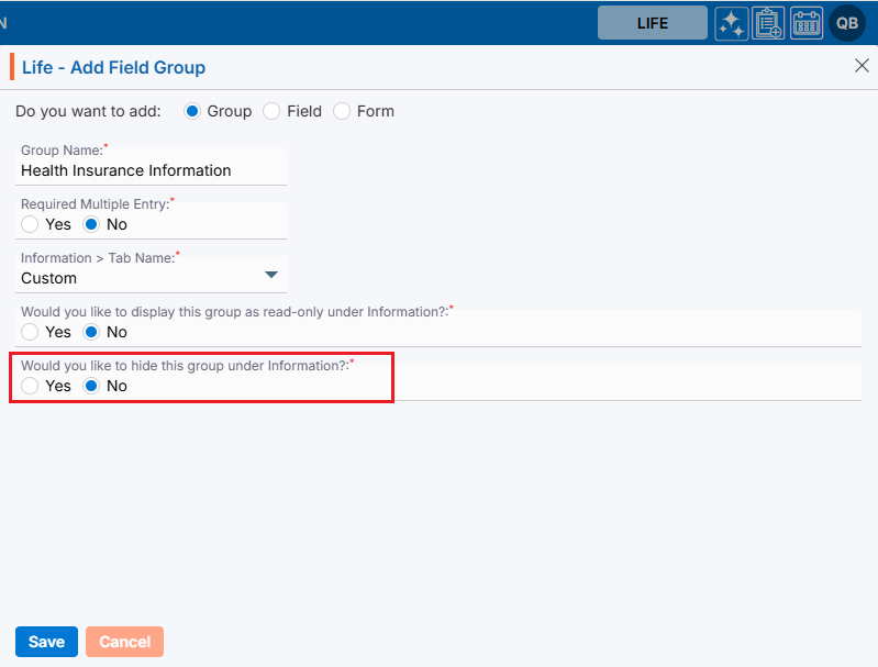
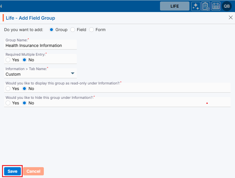
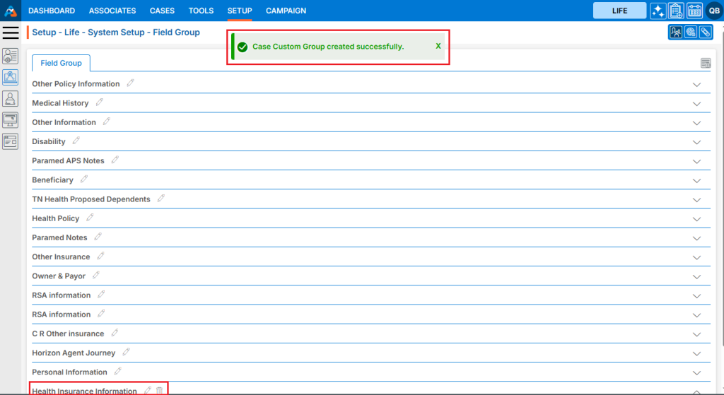
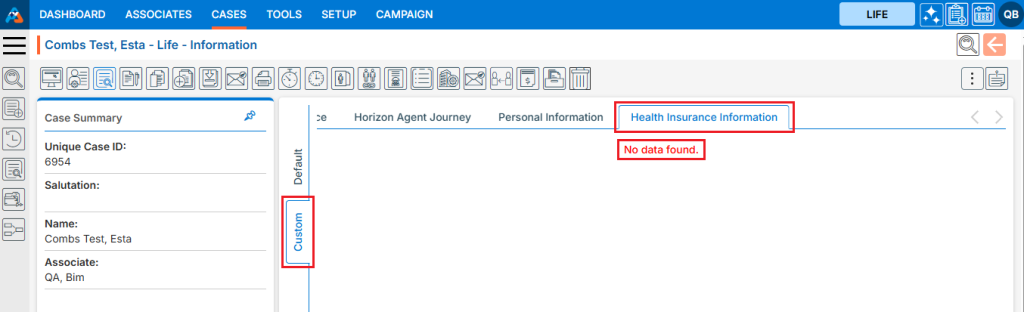

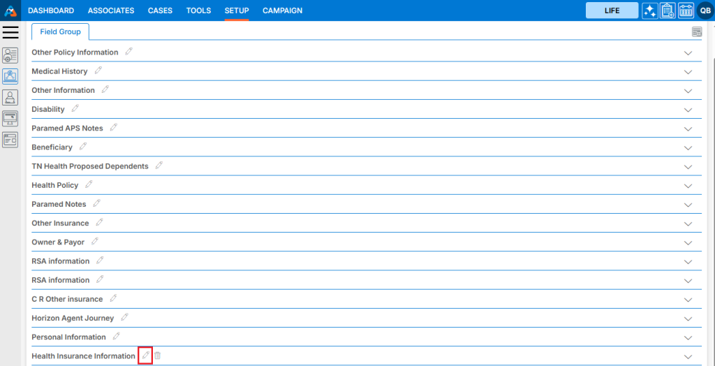
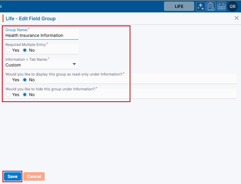
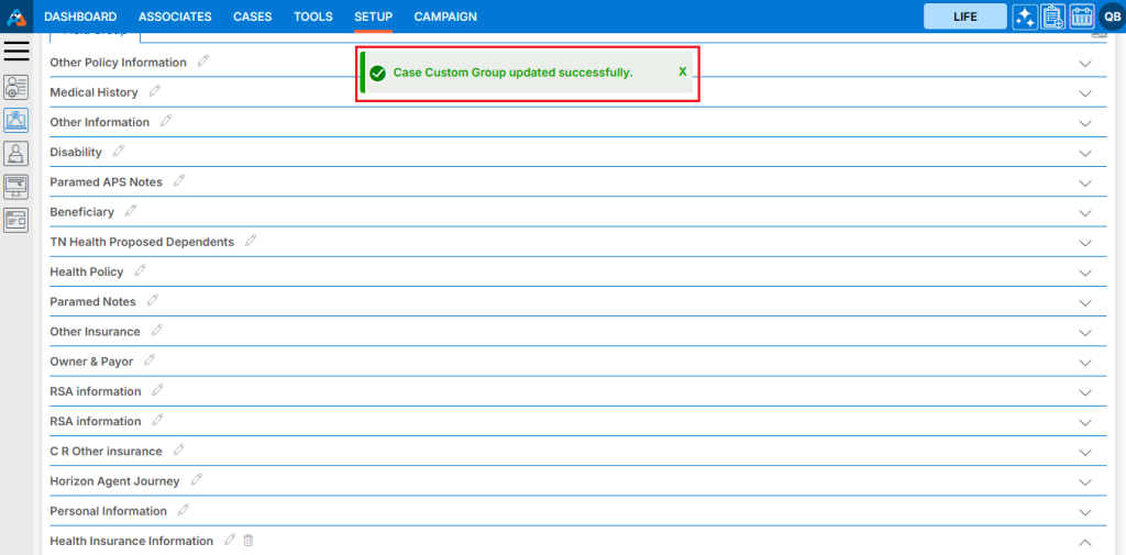

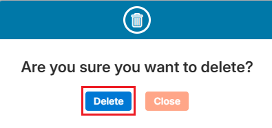
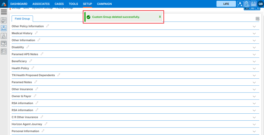
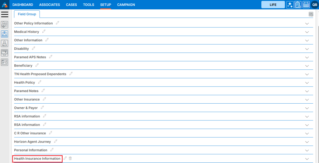
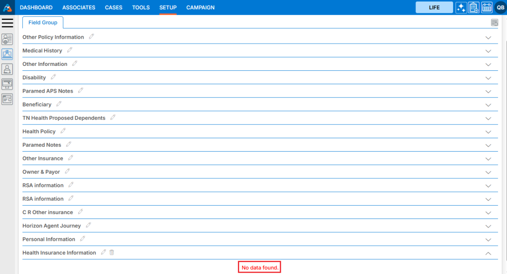
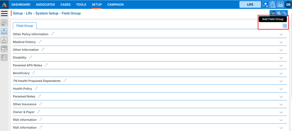
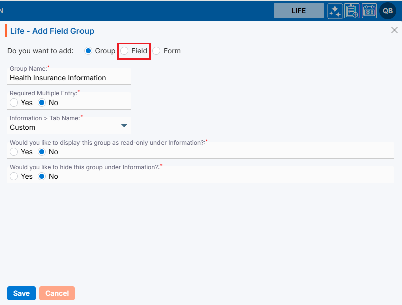
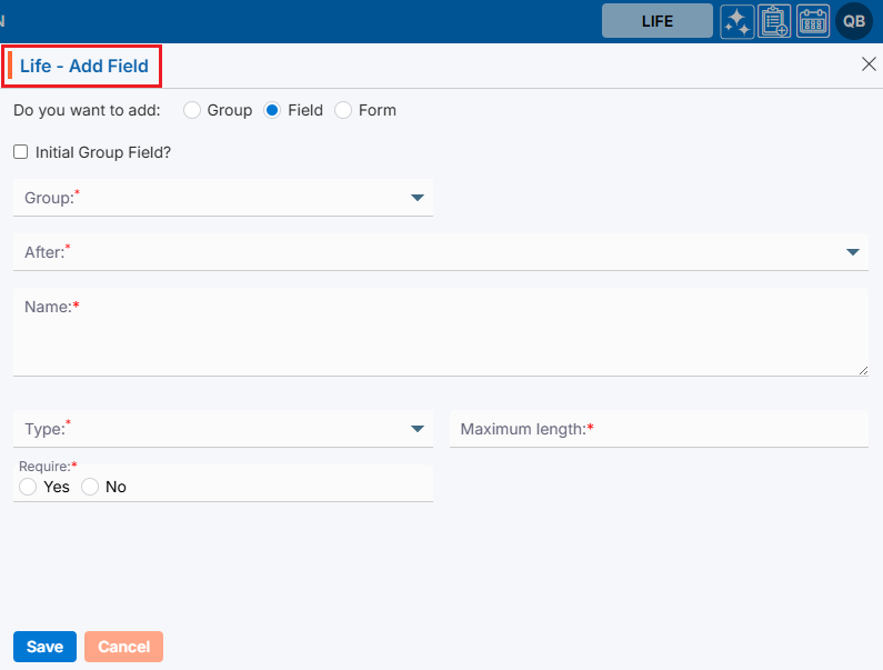
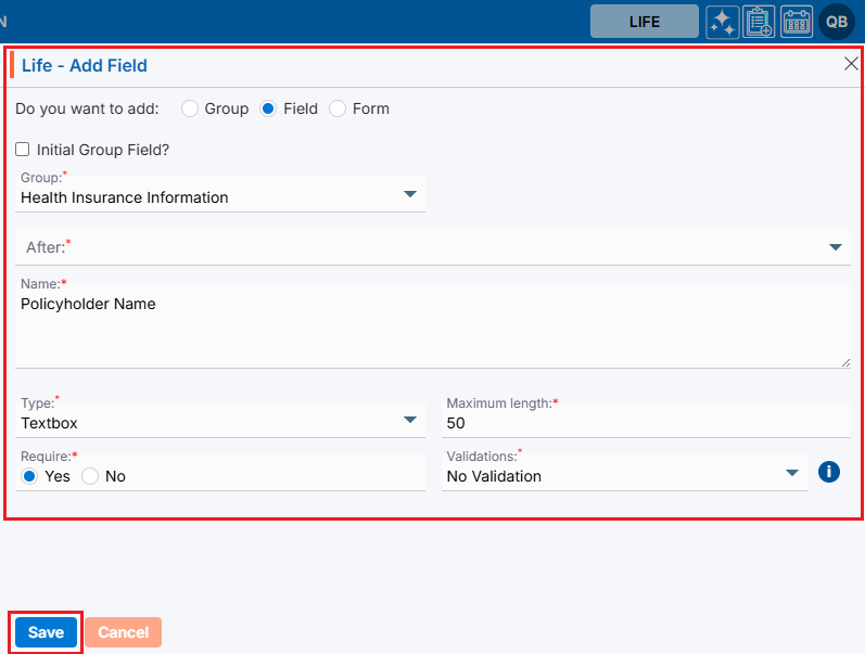
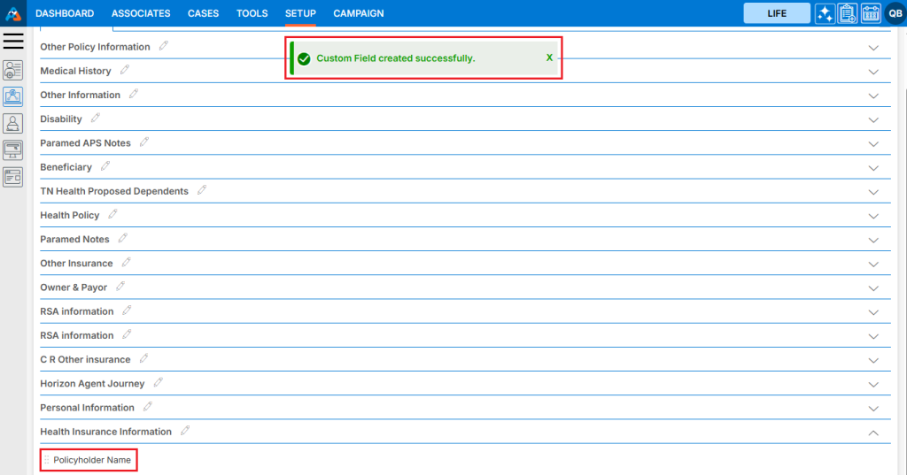
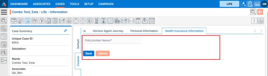
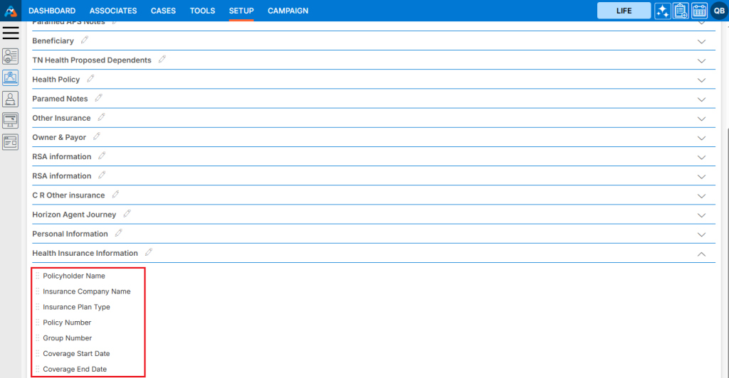
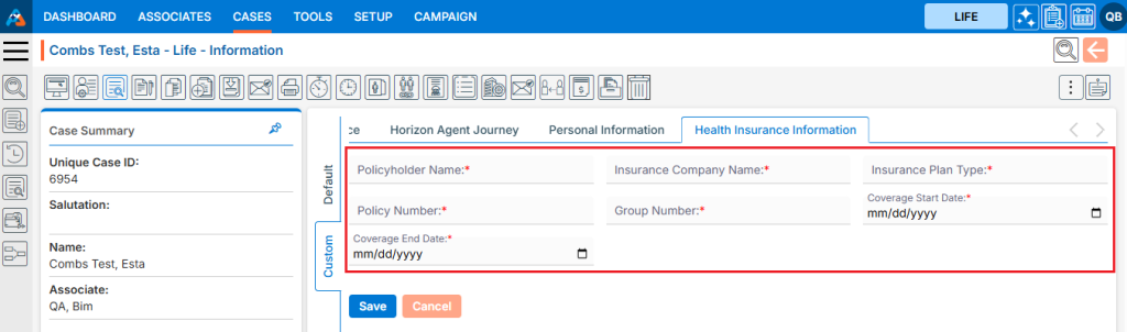
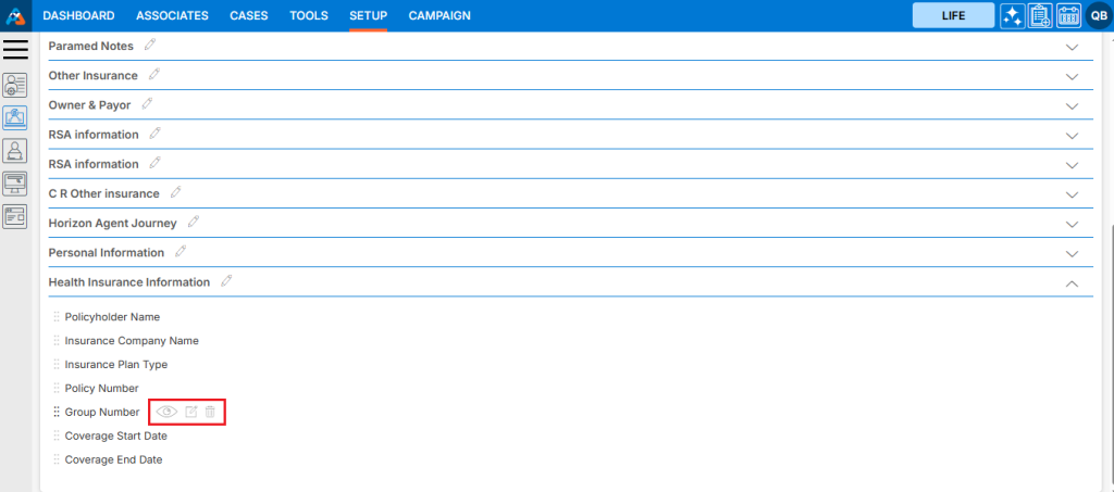
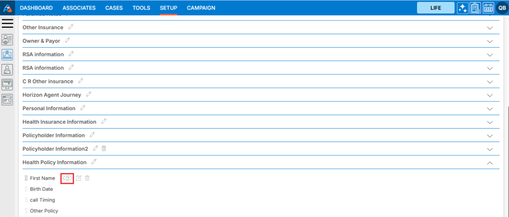
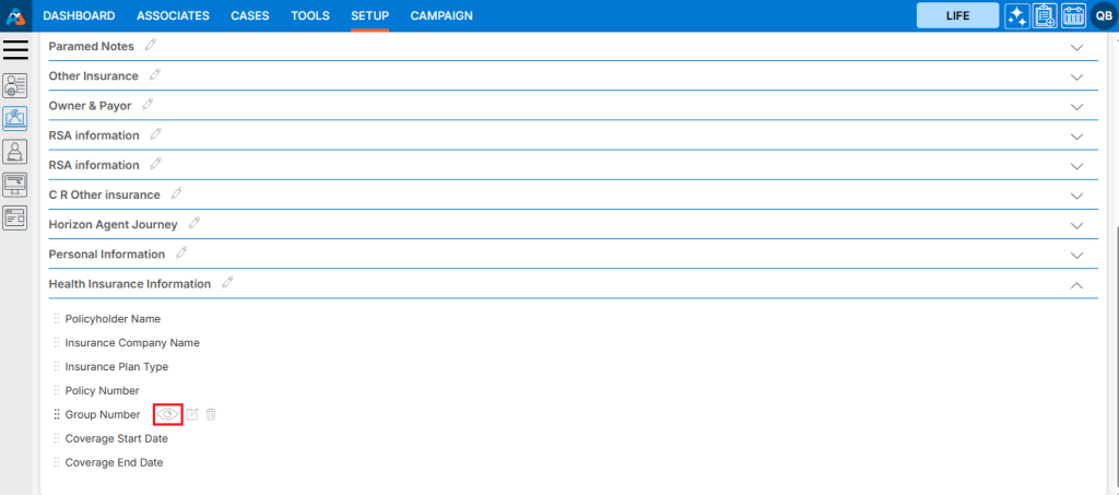
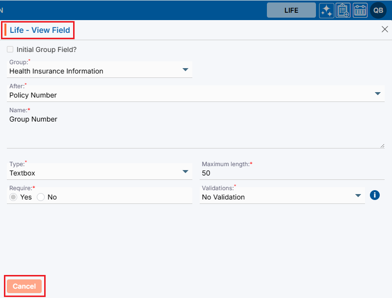

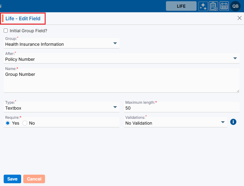
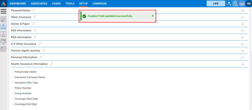

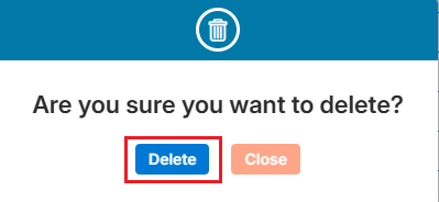
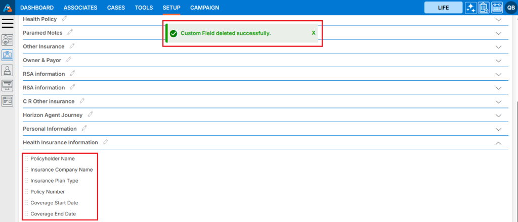
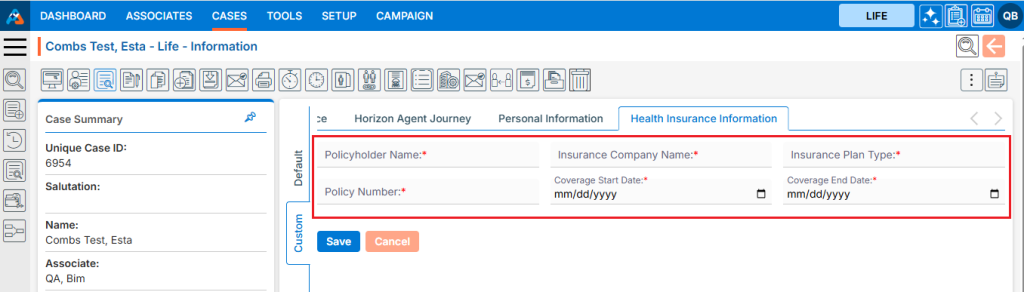
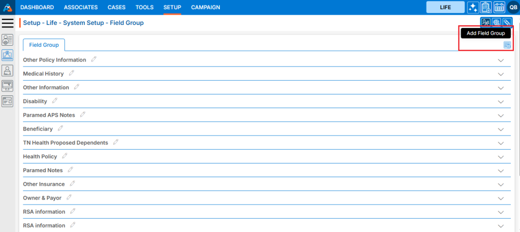

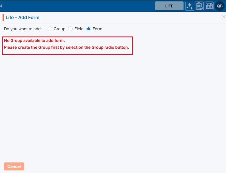

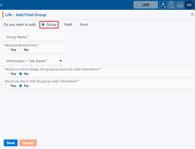
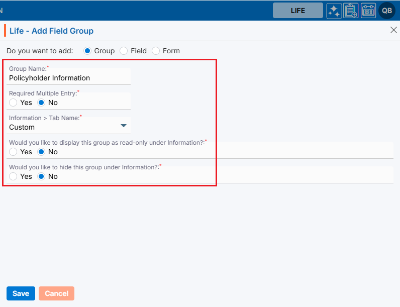
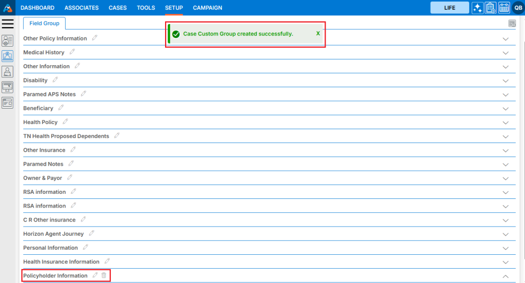
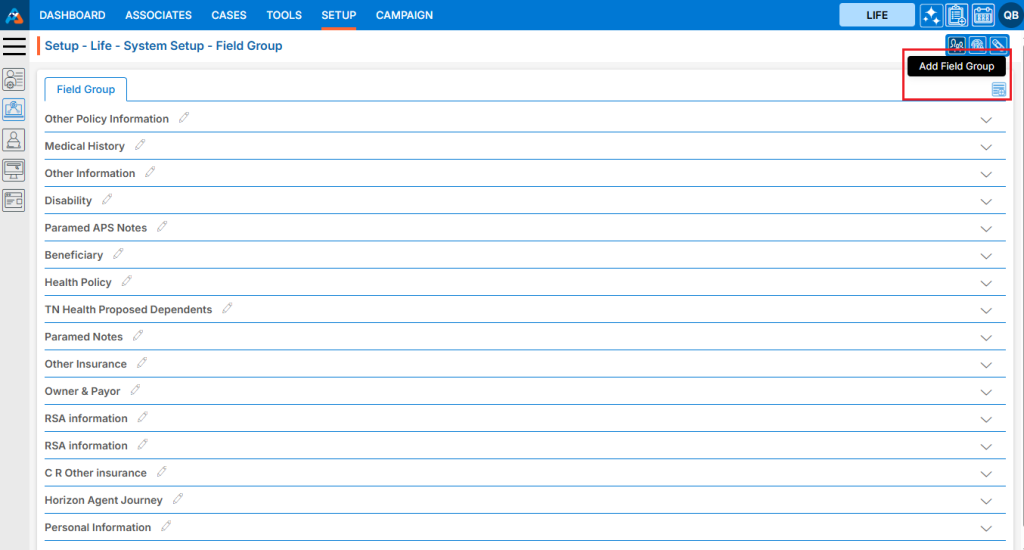
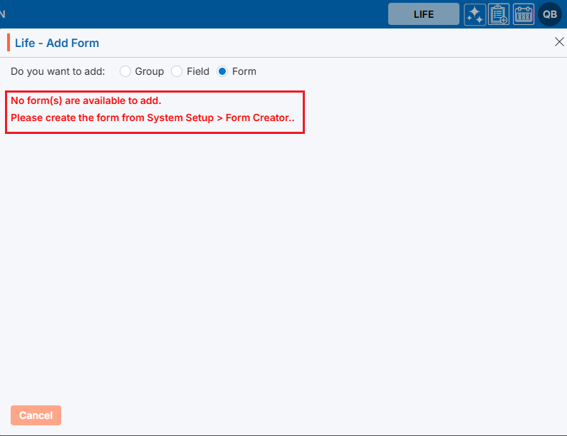
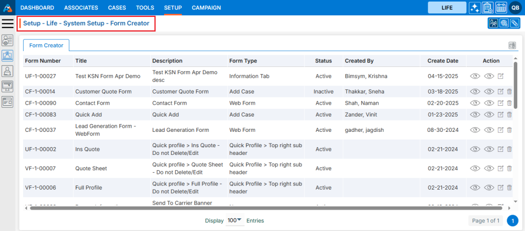
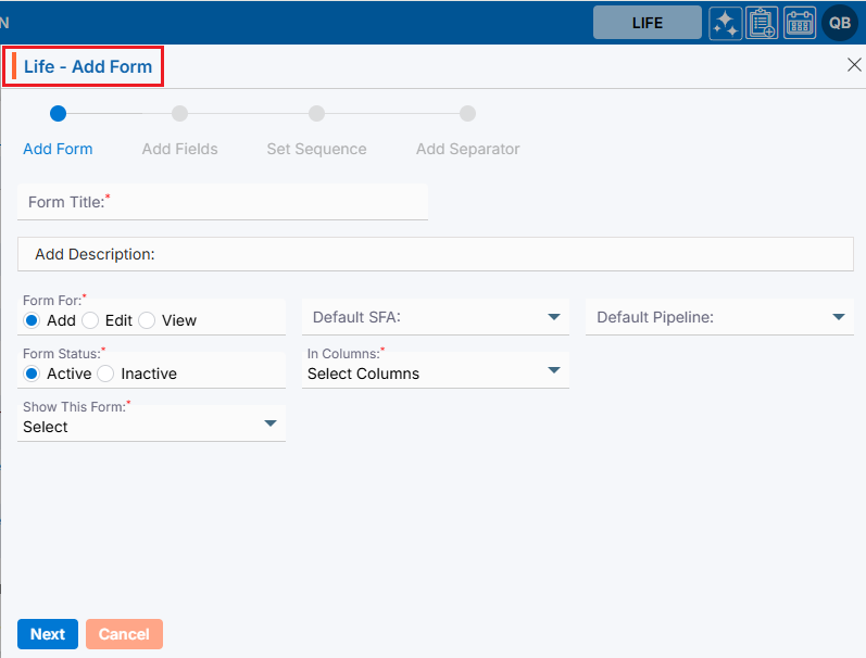
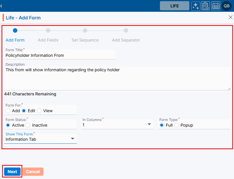
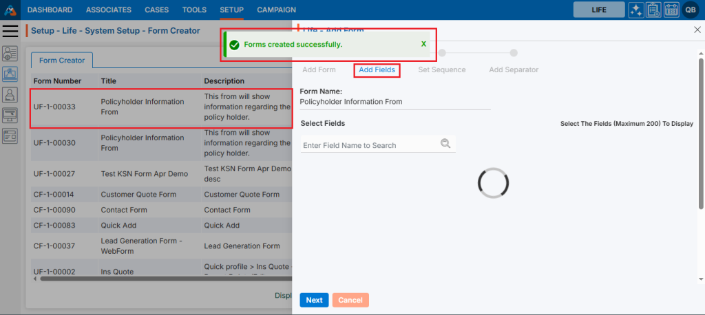
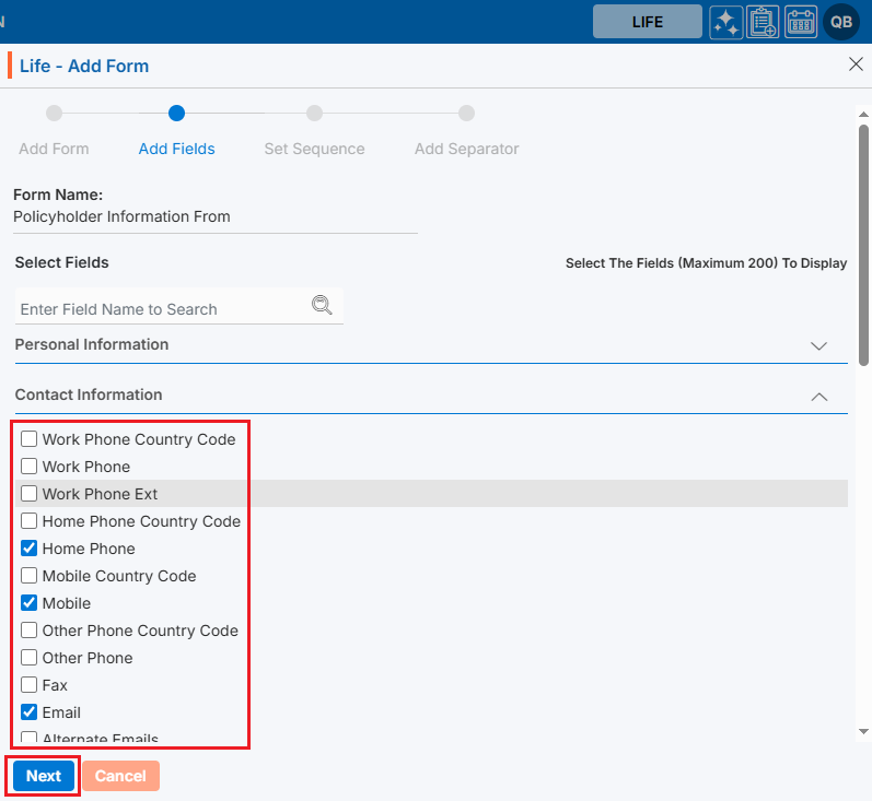
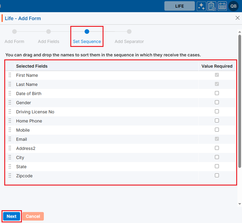
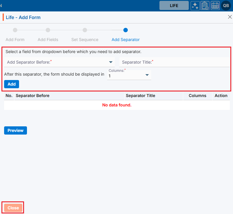
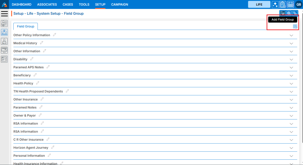
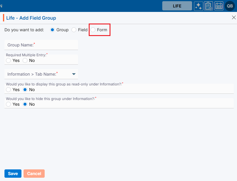
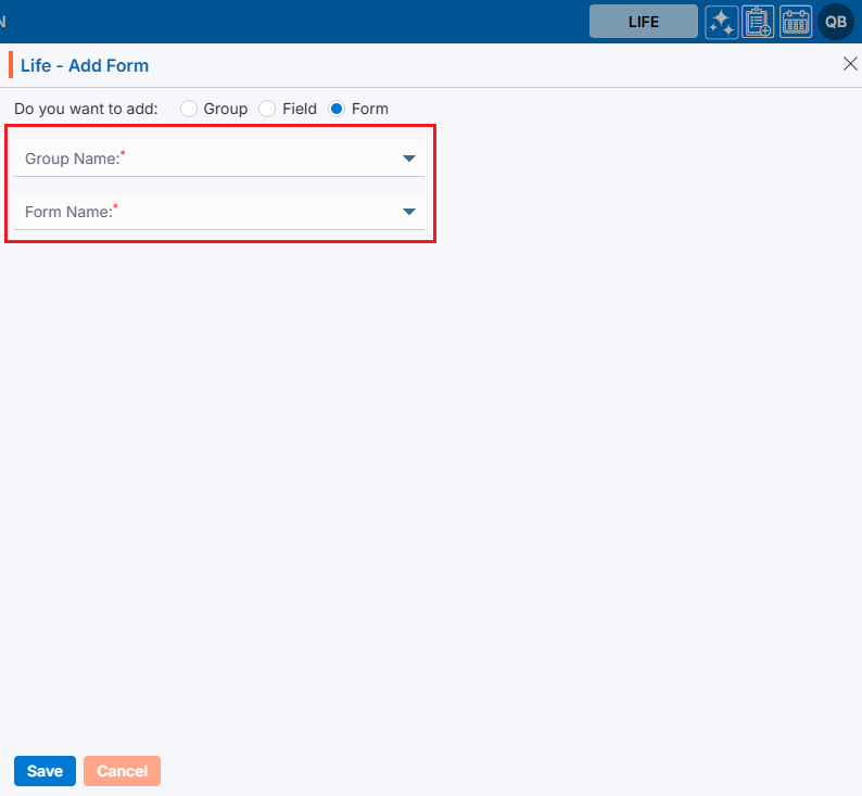
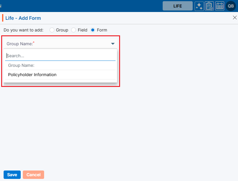
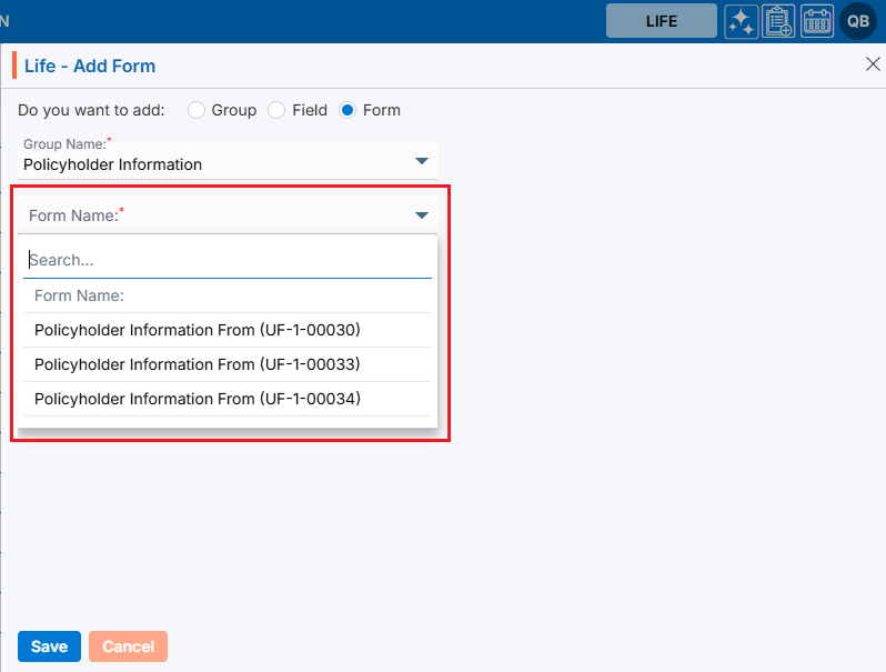
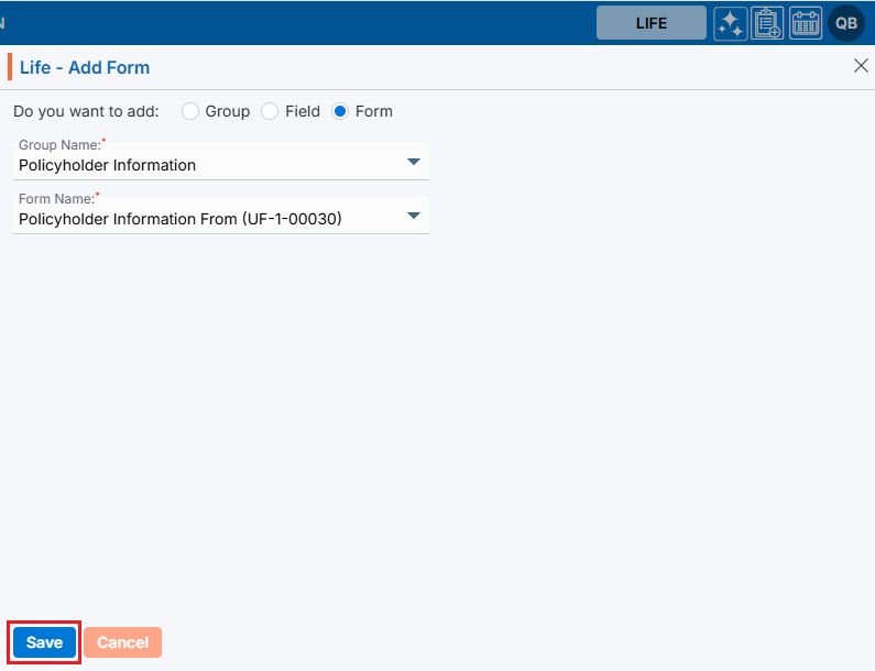
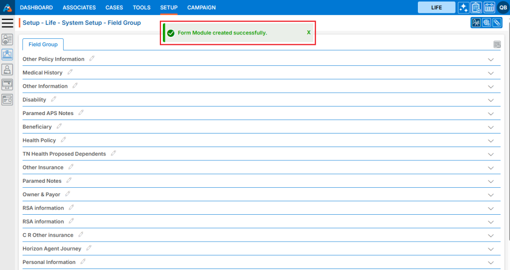
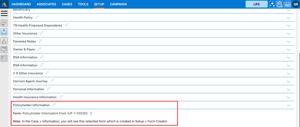

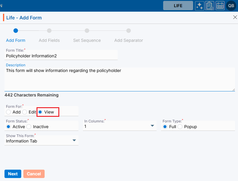
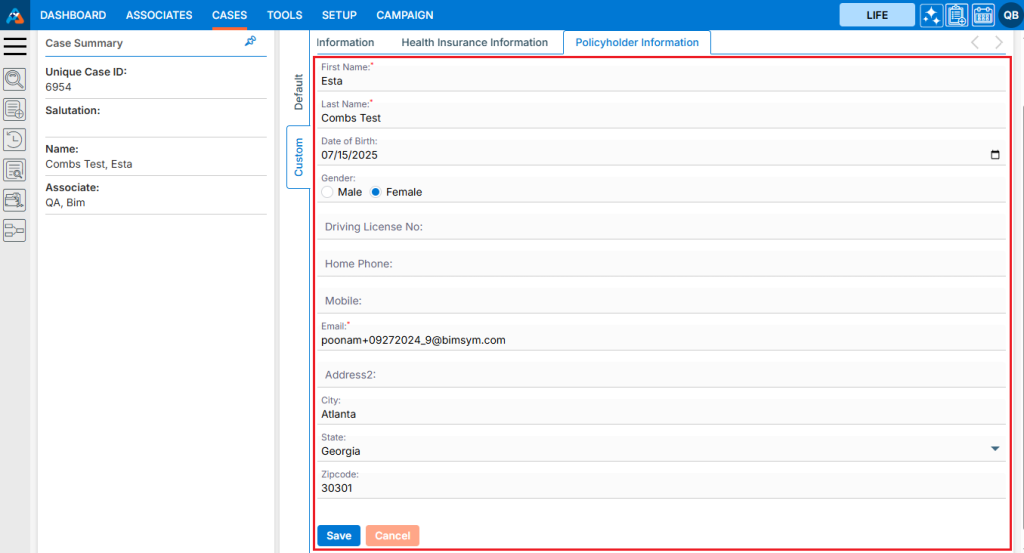
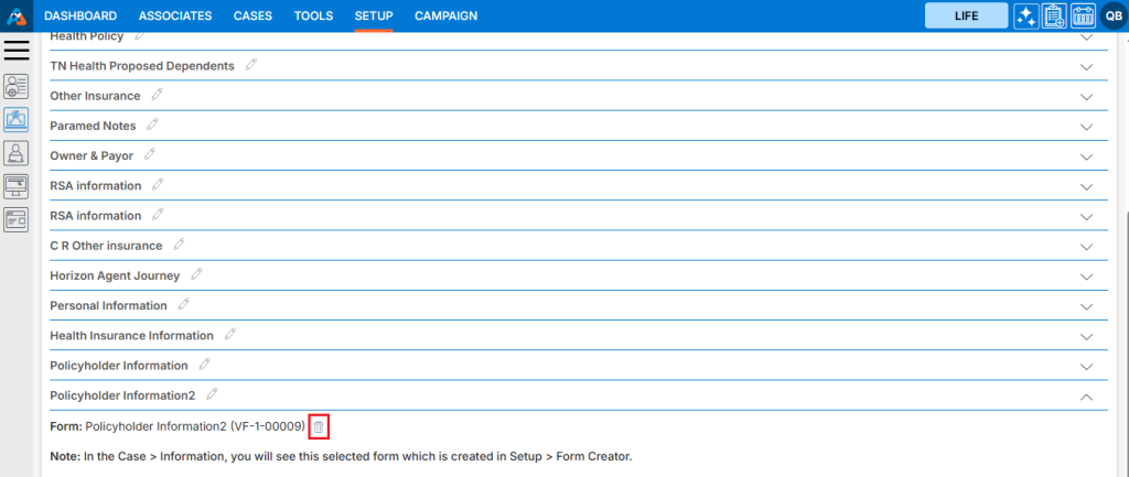
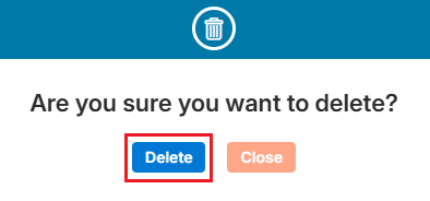
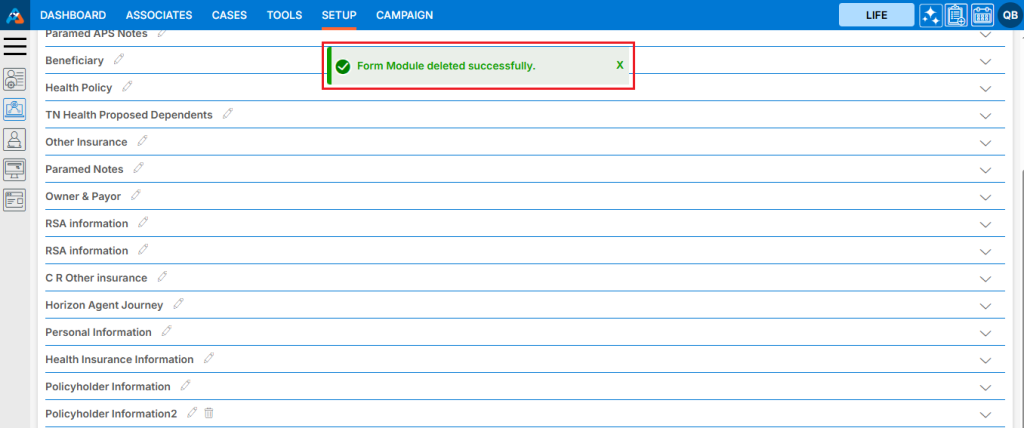
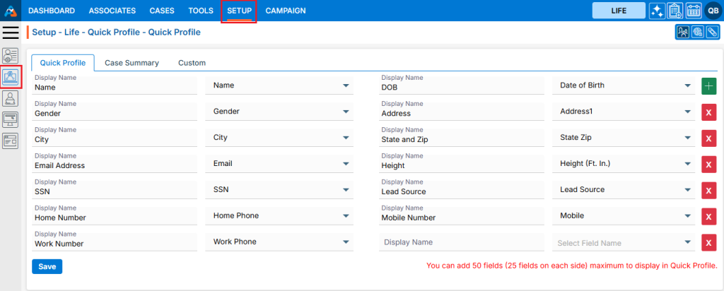
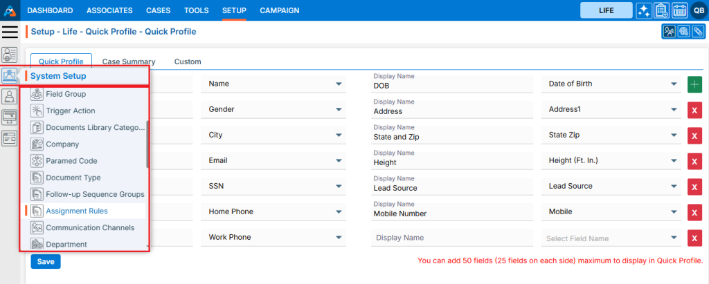
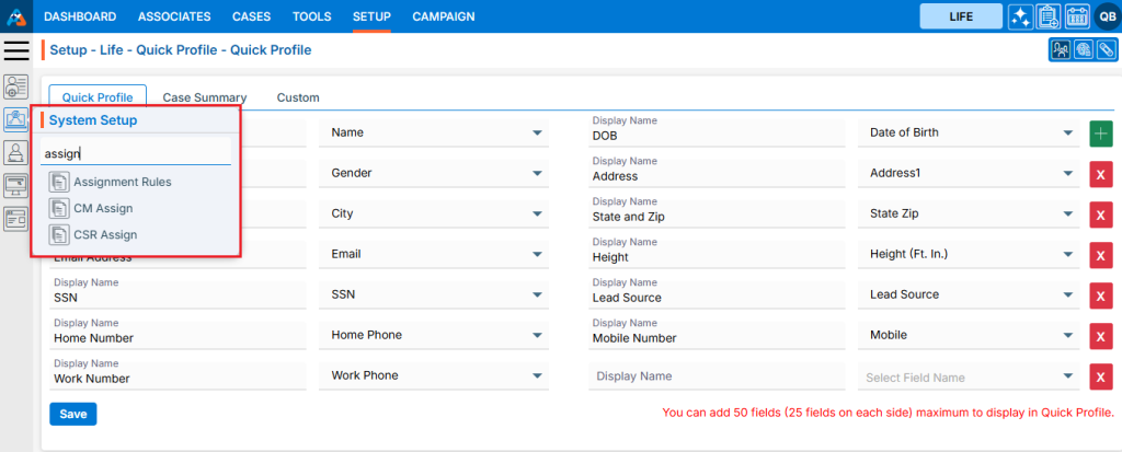
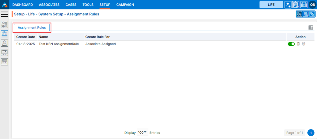
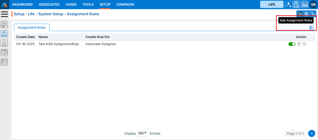
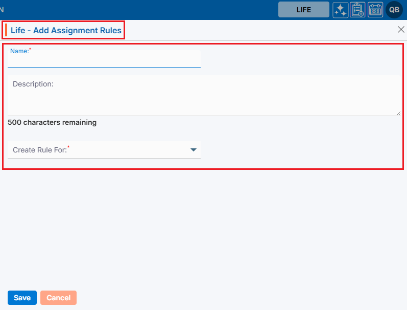
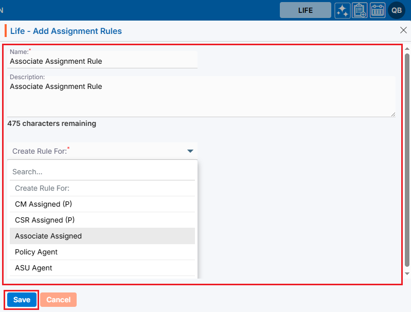
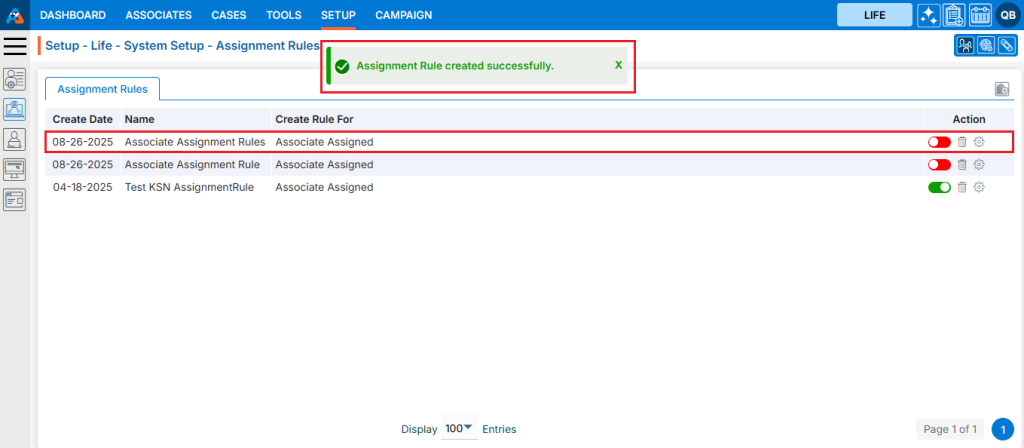
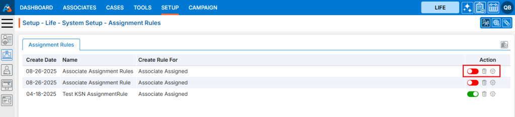
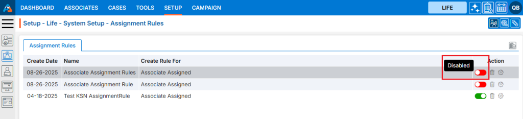
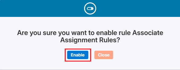
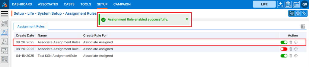
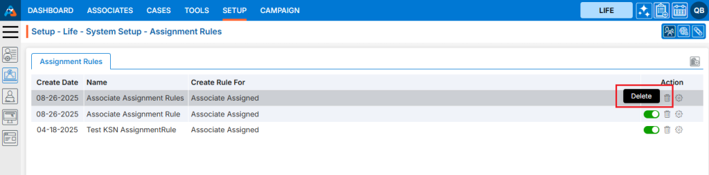
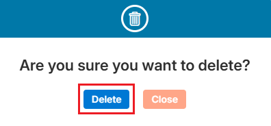
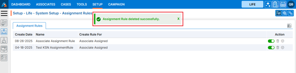
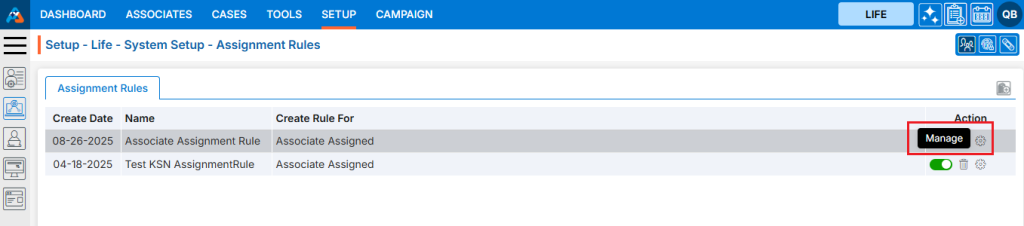
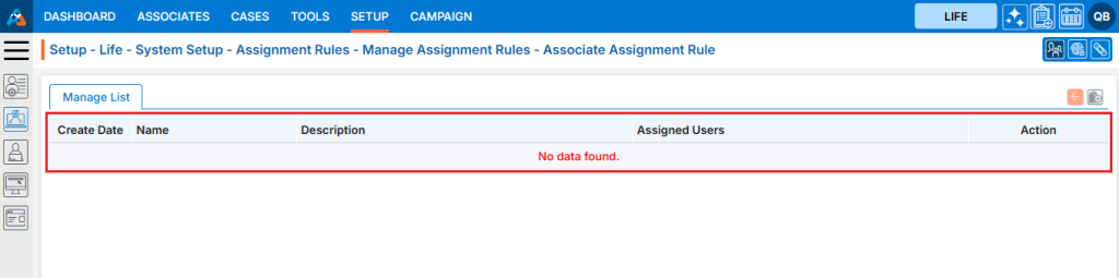
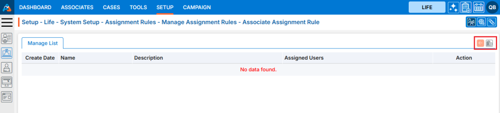
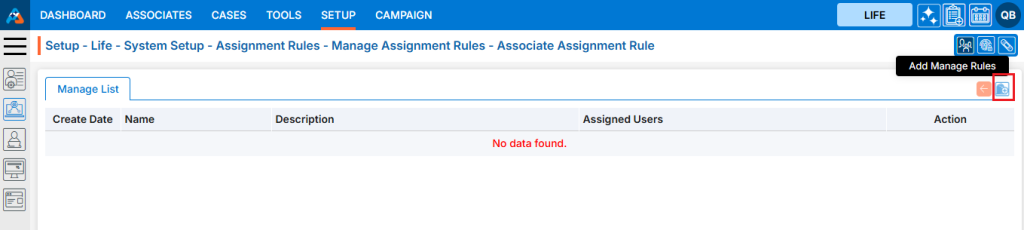
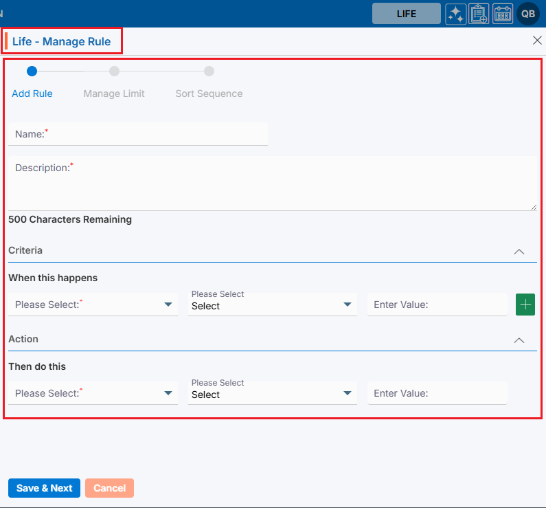
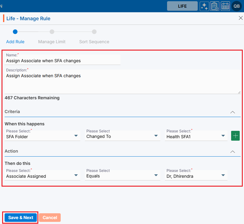
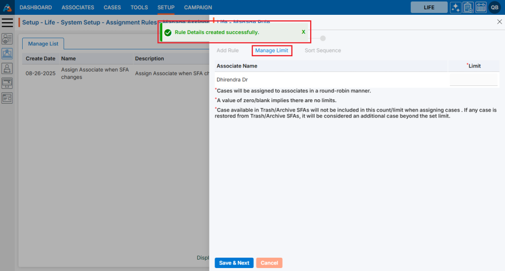
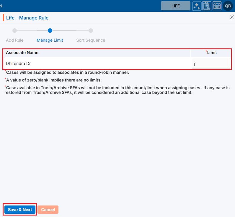
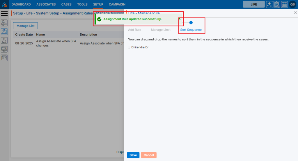
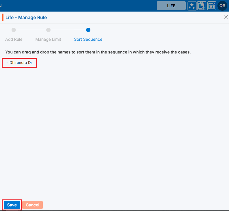
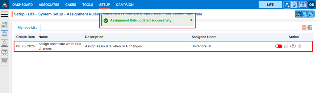
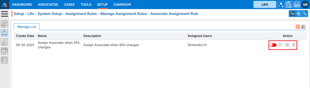
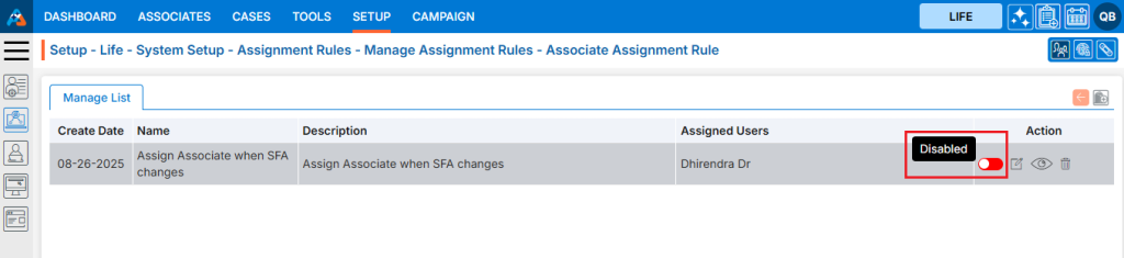
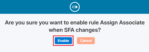
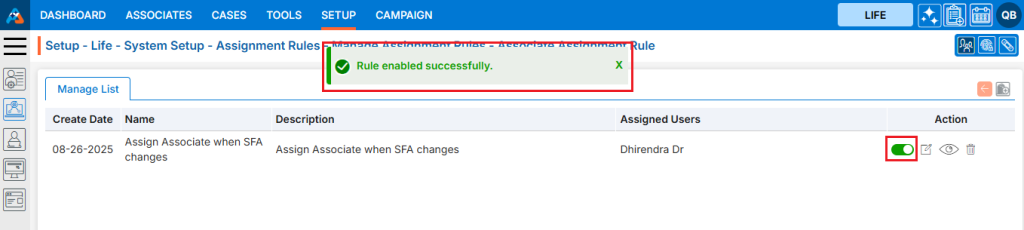
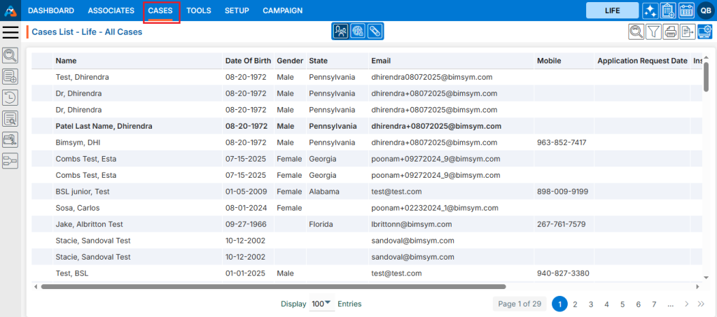
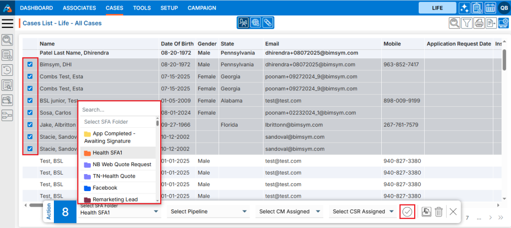
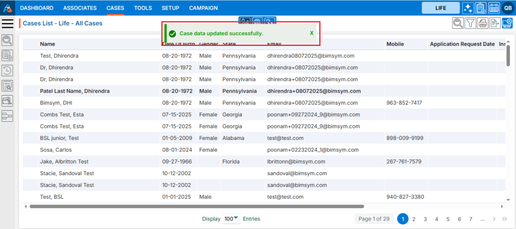
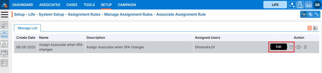
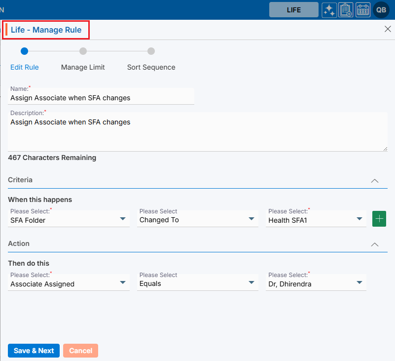
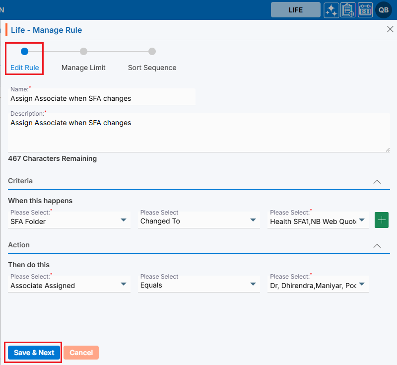
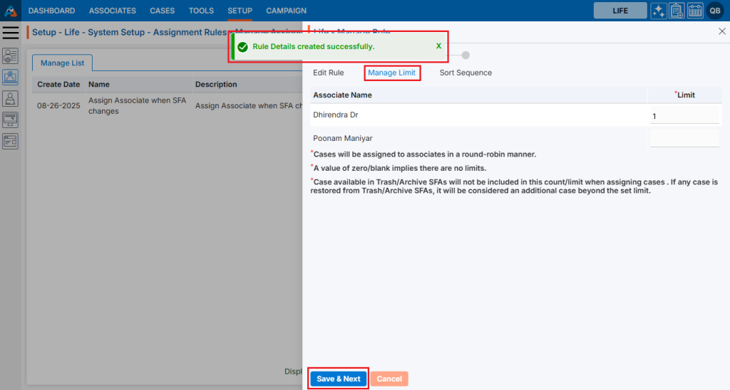
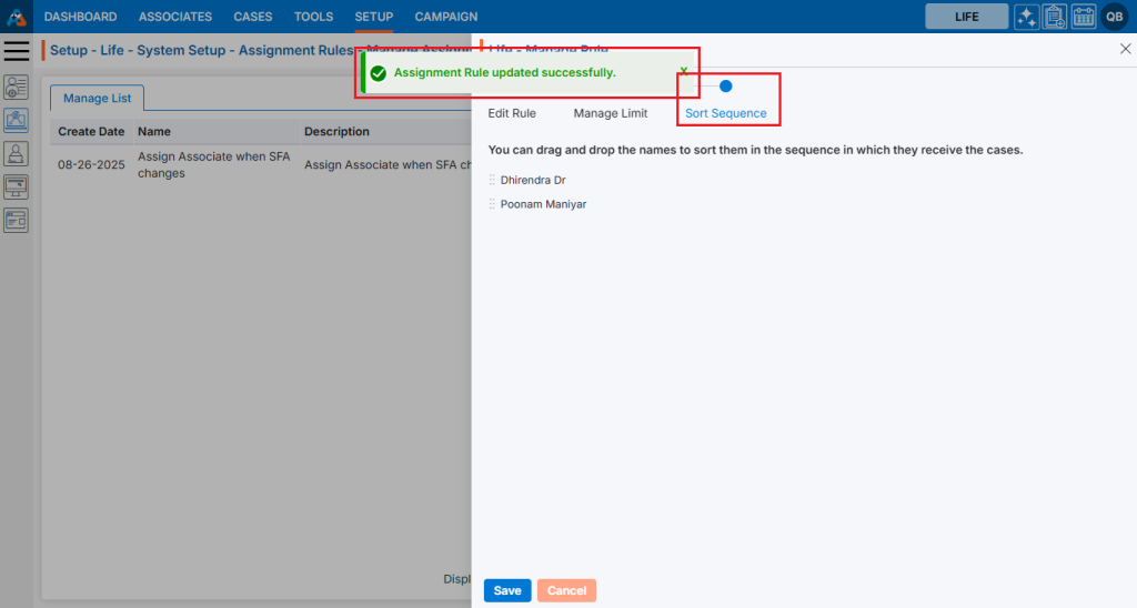
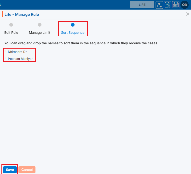
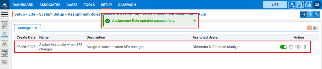
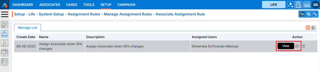
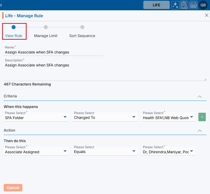
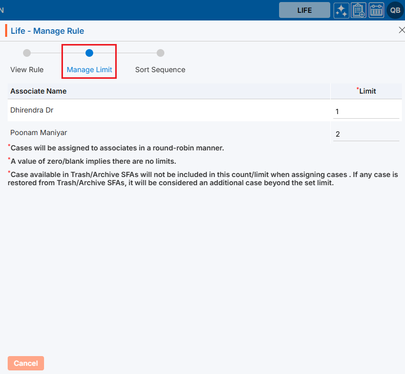
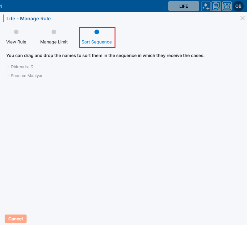
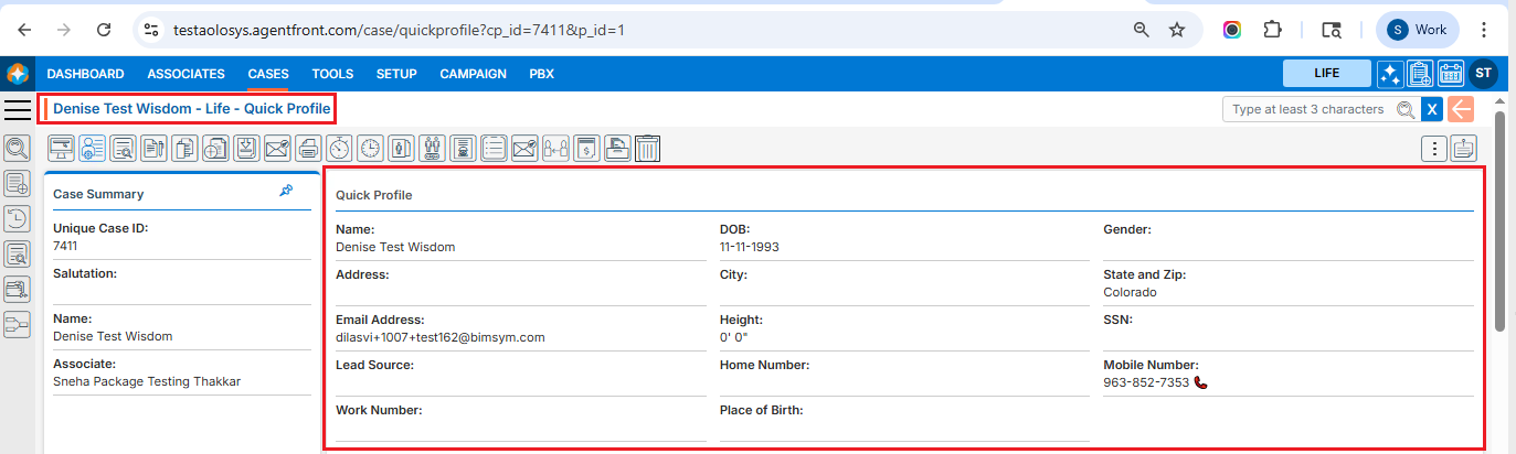
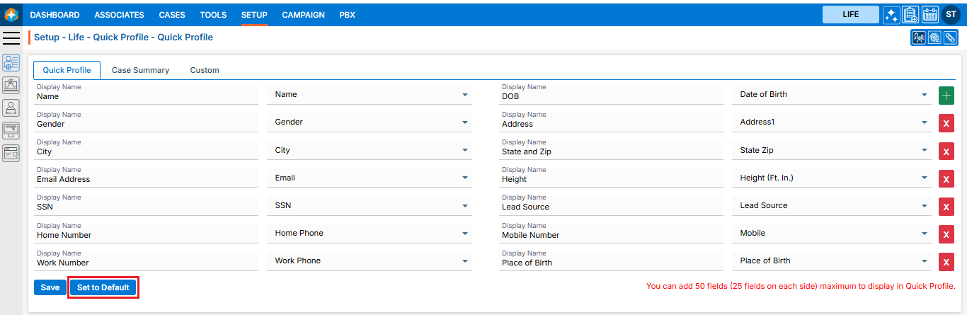
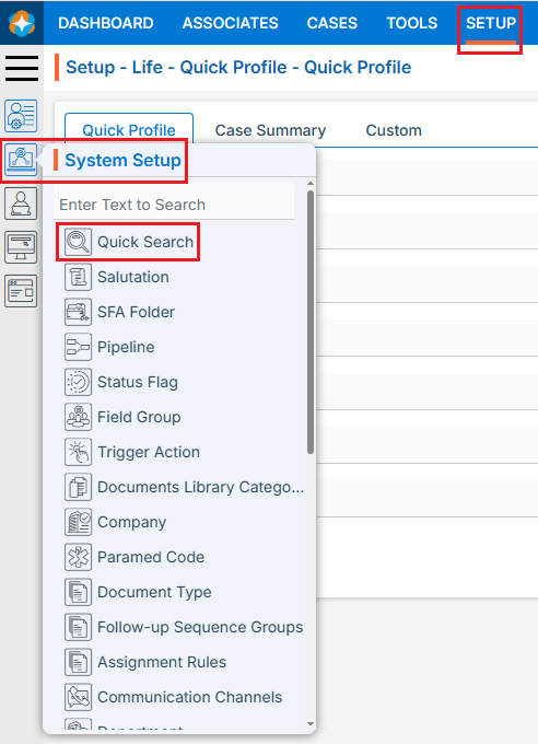
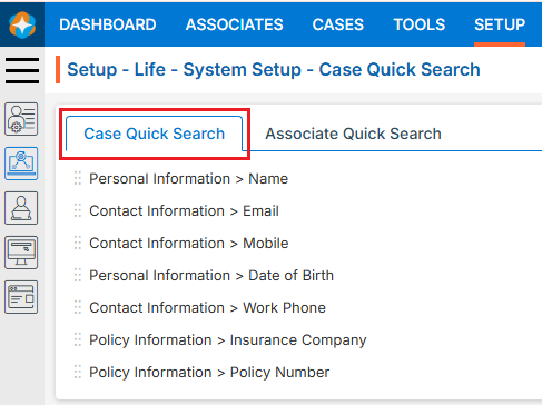
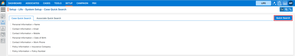
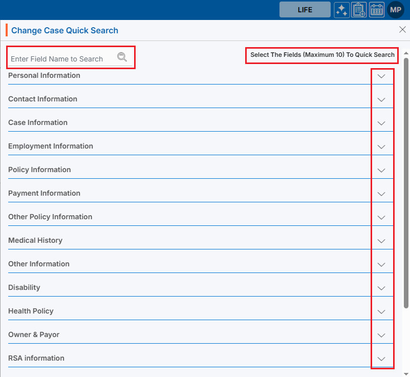
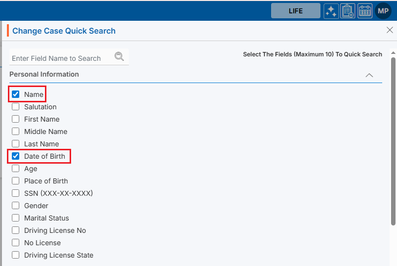
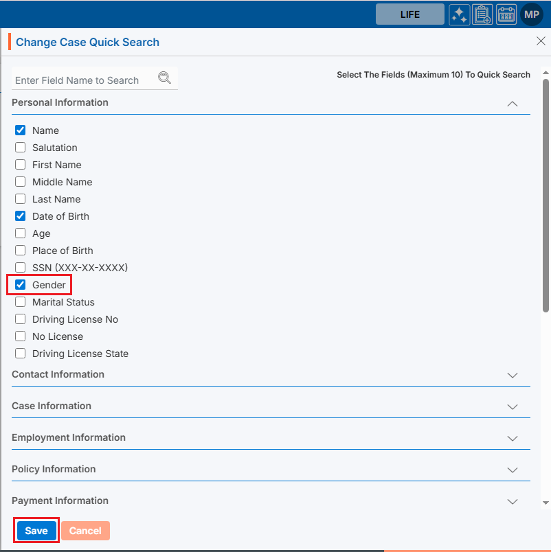
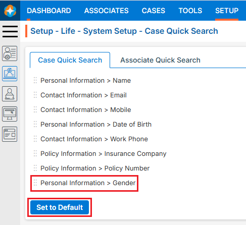
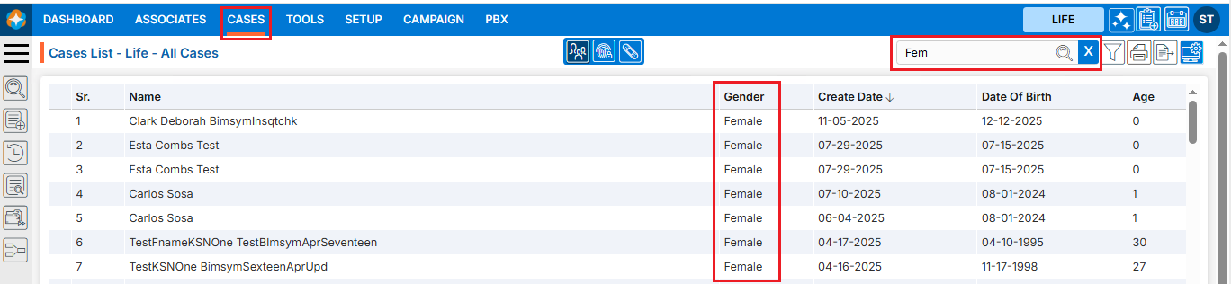
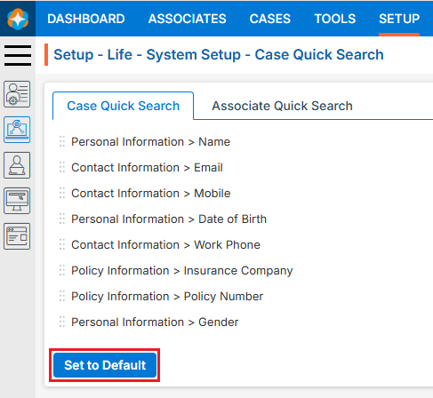
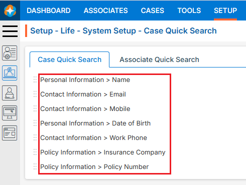
 ) to set their priority in the search results