 - Knowledge Base
 Form Creator is a feature that allows users to design and build custom forms. These forms are typically used by the sales or support teams to enter information into the CRM system manually.
The following are the steps to utilizing the Form Creator feature:
1. Navigate to the ‘SETUP’ tab and click on ‘System Setup’ in the left-side panel.
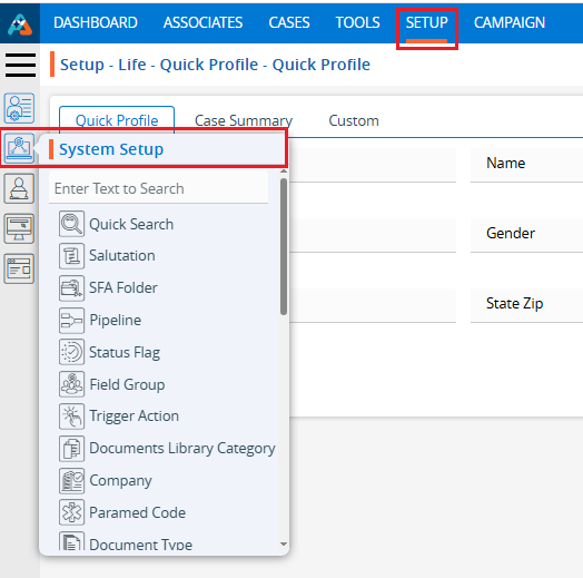
2. Click on the ‘Form Creator’ option in the System Setup menu.
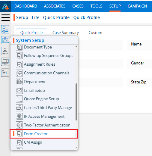
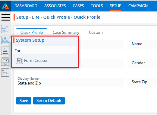
3. Users can also search for the ‘Form Creator’ option by typing in the search bar.
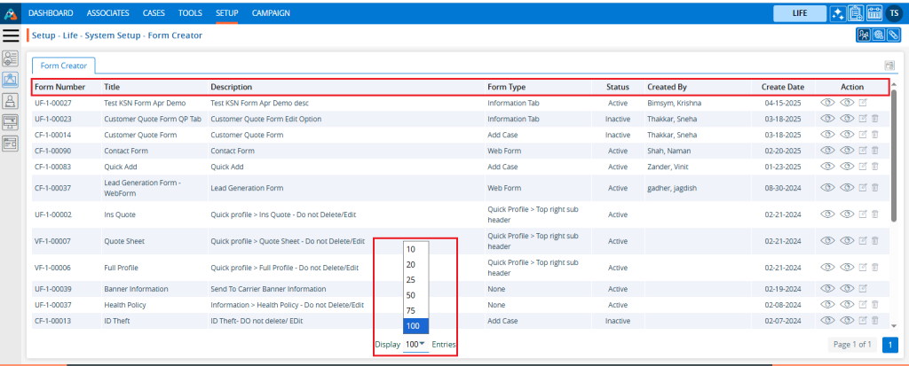
4. A new page ‘Setup – Life – System Setup – Form Creator’ displaying the existing Forms with field details including Form Name, Title, Description, Created By, Status, Create Date and Action under the ‘Form Creator’ tab will open.
5. Pagination and sorting features are available on this page.
● Users can set the view to display 10, 20, 25, 50, 75, or 100 forms per page, as needed.
● Sorting features are available on the Form Name, Title, Description, Created By and Created Date fields. Users can set the form listing in ascending or descending order by clicking on the field names. By default, this listing is sorted in ascending order by Create Date.
6. Click the ‘Create Form’ icon to add a new Form.

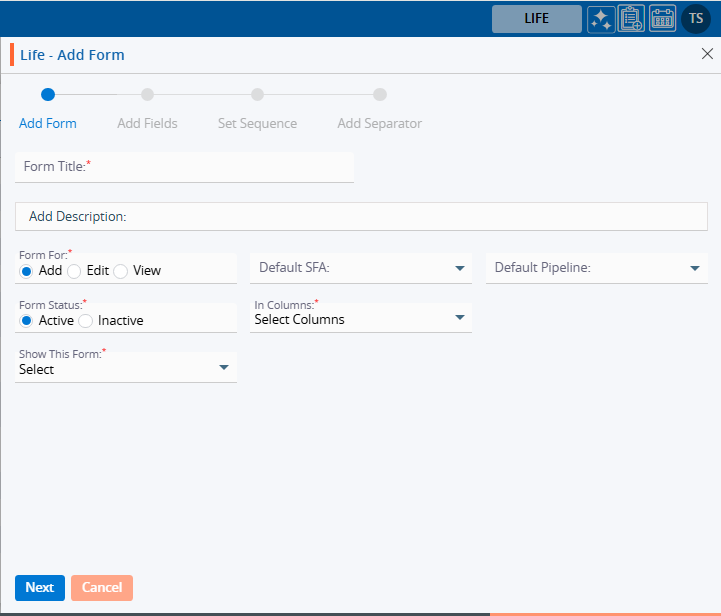
7. A pop-up window ‘Life – Add Form’ will open, containing four steps ‘Add Form’, ’Add Fields’, ‘Set Sequence’, and ‘Add Separator’.
● The first step of the ‘Add Form’ contains the following fields: Form Title, Description, Form For, Select Default SFA (dropdown), Select Default Pipeline (dropdown), Form Status, In Column, and Show This Form.
● Fields marked with an asterisk are mandatory. In this case, the mandatory fields are Form Title, Form For, Form Status, In Column, and Show This Form.
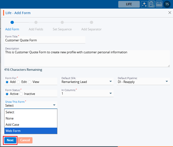
8. Complete the details on the pop-up page:
● Form Title: Enter the desired Form Title. This field allows alphabetical, numerical, spaces and special characters except html tags (< and >). (Limit is a maximum of 35 characters).
● Description: A description for the Form needs to be added in accordance with the Form Title. (Limit is a maximum of 500 characters)
● Form For: This field has three options—Add, Edit, and View. Each option functions separately. The Add option is selected by default and remains selected.
i. If the form is created using the ‘Add’ option, the Form Number will begin with ‘CF’. Additionally, once the form is created using this option, it will be placed according to the selection made in the ‘Show This Form’ drop-down menu.
ii. If the form is created using the ‘Edit’ option, the Form Number will begin with ‘UF’. Additionally, when the form is created using this option, the user can add and update details for the form, regardless of where it is placed, based on the selection made in the ‘Show This Form’ drop-down option.
iii. If the form is created using the ‘View’ option, the Form Number will begin with ‘VF’. Additionally, when the form is created using this option, the user can only view the details for the form, regardless of where it is placed, based on the selection made in the ‘Show This Form’ drop-down option.
● Default SFA: This field will only be enabled when the ‘Add’ option is selected for the ‘Form For’ field. Select the SFA name from the dropdown menu. When a profile is generated using the ‘Add Case’ or ‘Web Form’ option, that profile will be moved to the selected SFA folder.
● Default Pipeline: This field will only be enabled when the ‘Add’ option is selected for the ‘Form For’ field. Select the Pipeline name from the dropdown menu. When a profile is generated using the ‘Add Case’ or ‘Web Form’ option, that profile will be moved to the selected Pipeline.
● Form Status: This field has two options: Active and Inactive. When the Active option is selected, the form will be available in the locations as per the setup. With the Inactive option selected, the form will not be applicable anywhere. Select the desired option.
● In Columns: This field has three options: 1, 2, and 3. The form will be generated in the column corresponding to the selected option. Select the desired option.
● Show This Form:
i. If the ‘Add’ option is selected for the field ‘Form For’, the following three options will be enabled in this drop-down: None, Add Case, and Web Form.
a. With the None option, the form will not be applicable anywhere.
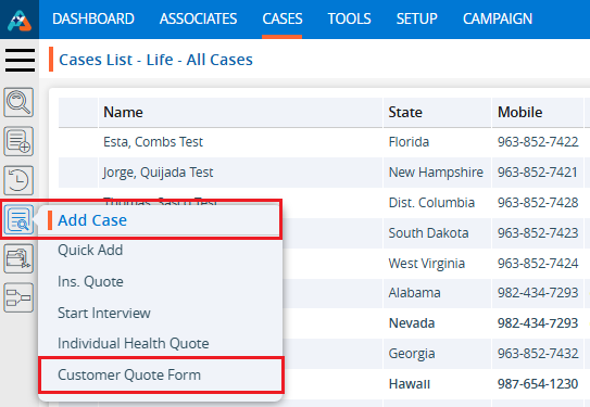
b. With the Add Case option, the form will be available under the CASES > Left side Add Case menu.
c. With the Web Form option, the form will be available under SETUP > Lead Generation > Web Forms > Add Web Form page.
ii. If the ‘Edit’ or ‘View’ option is selected for the field ‘Form For’, the following four options will be enabled in this drop-down: None, Quick Profile > Tabs, Quick Profile > Top right sub header and Information Tab. With the Edit option, the form will be editable, and with the View option, the form will not be editable.
a. With the None option, the form will not be applicable anywhere.
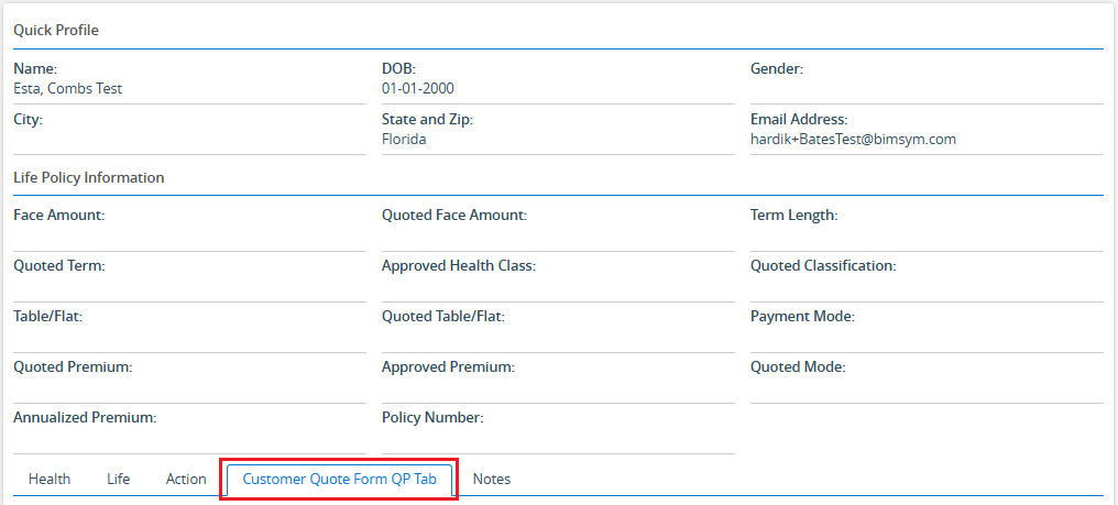
b. With Quick Profile > Tabs option the form will be available under the Cases > Any case’s Quick Profile.
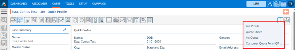
c. With Quick Profile > Top right sub header option the form will be available under the Cases > Any case’s Header Menu > Top right sub header
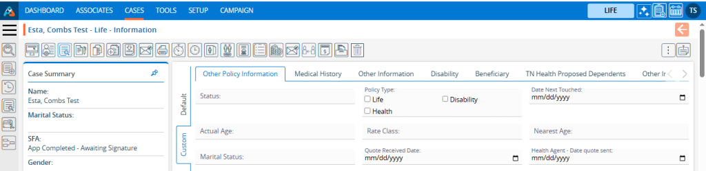
d. With Information Tab the form will be available under the Cases > Any case’s Information Tab.
For example, the form here is created with the following options:
● Form For with Add option
● Active Status
● 3 Columns
● Show this form with Add Case option
9. Once all details are entered and options selected from the dropdown, click on the Next button.
10. After clicking on Next, the system will generate a confirmation message that the form has created successfully. The form will then be available in the listing, and the system will redirect to the next step to add fields to the form.
● Here, the form is created using the ‘Add’ option, the Form Number starts with ‘CF’.
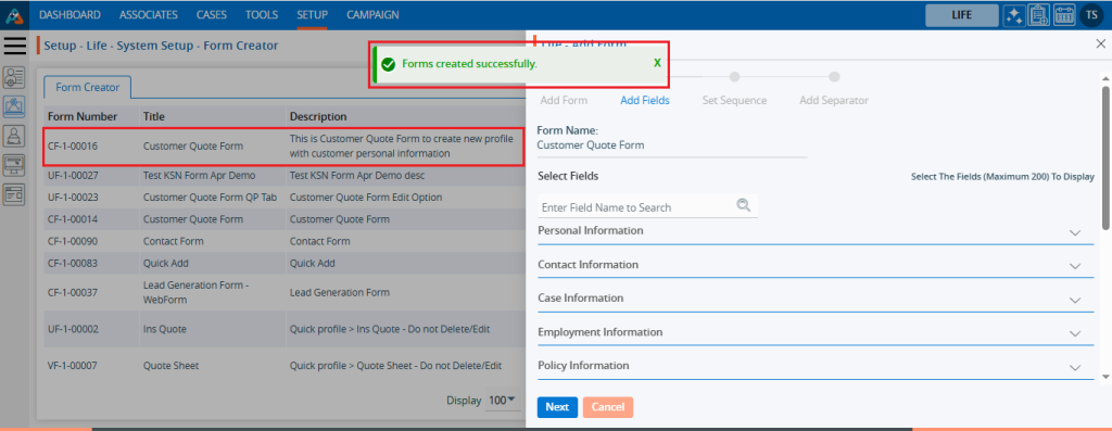
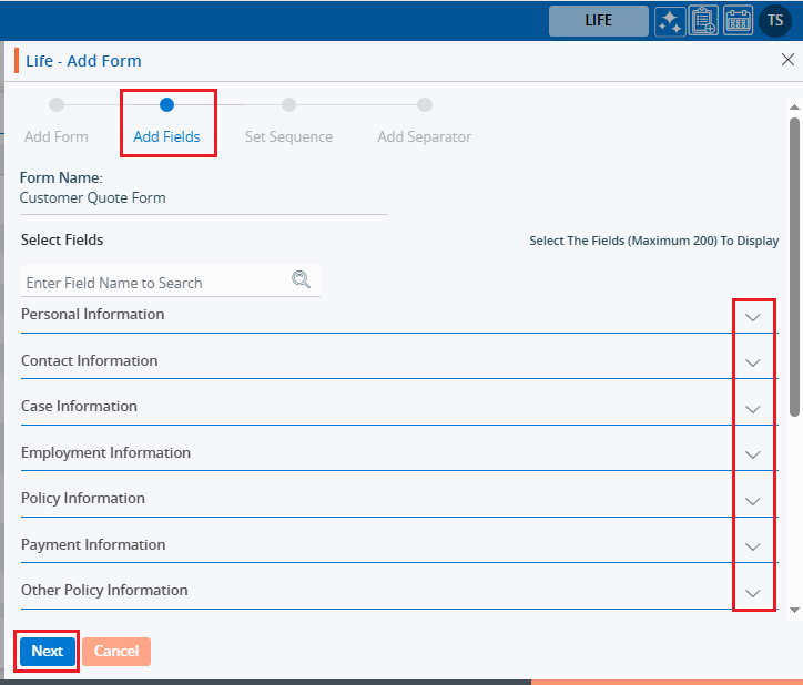
11. The system will display a list of available fields in the next step to add fields to the form. The user can view the list of fields by clicking on the down arrow for any field group. Click on the down arrow to reveal the fields for selection then select the required fields and click on the Next button.
12. After selecting the required fields and clicking the ‘Next’ button, the system will redirect to the next step to set the sequence of the fields. By selecting the six-dot icon before the field name, the user can rearrange the sequence of the fields as needed.
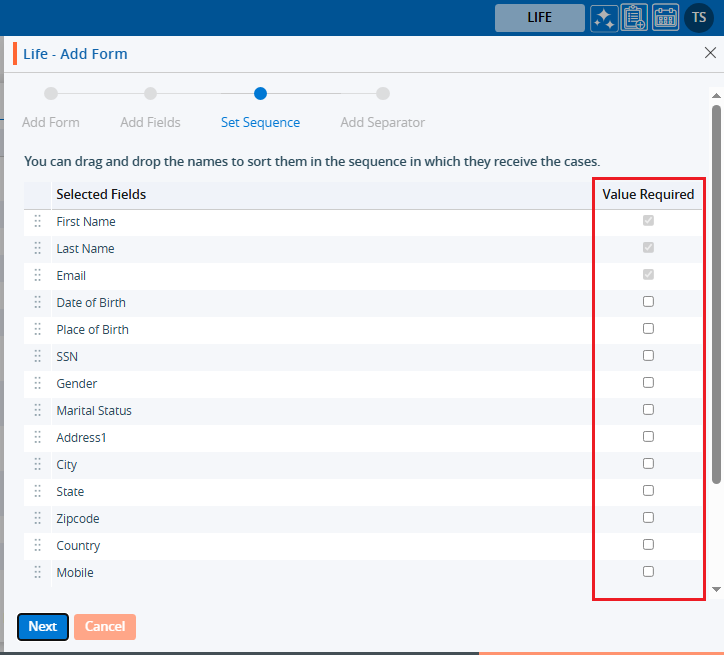
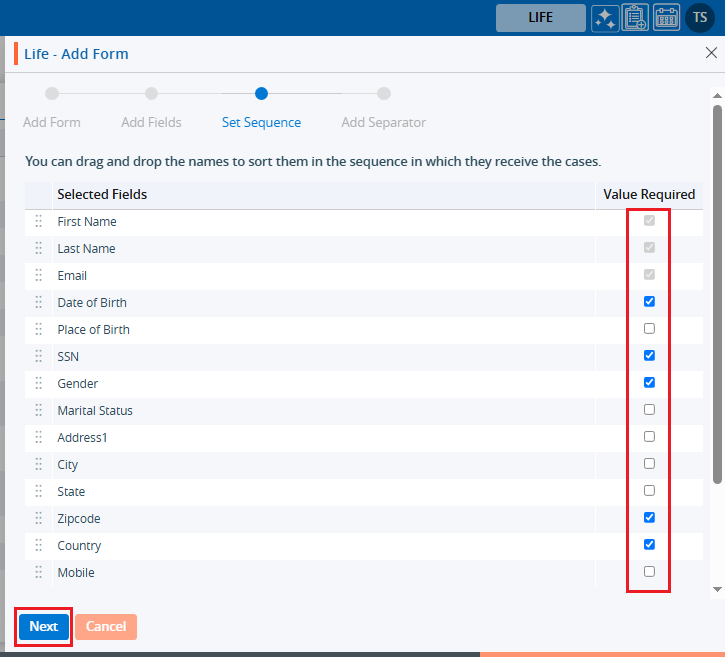
13. The user can set the mandatory fields at this step. By default, First Name, Last Name, and Email are required fields under the ‘Value Required’ section. These three fields cannot be changed to optional; therefore, the checkboxes for these fields are selected by default and are uneditable. The user can add more fields as mandatory from the remaining available fields.
● Here, the checkboxes for Date of Birth and Gender are selected under the ‘Value Required’ section, making both fields mandatory. This brings the total to 5 mandatory fields for the form. These two fields are optional to set as mandatory, and their checkboxes are blue and editable
14. After selecting the mandatory fields and arranging the sequence, click on the ‘Next’ button.
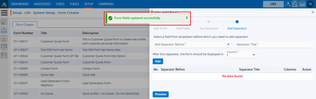
15. After clicking the ‘Next’ button, the system will display a confirmation message stating, ‘Form fields updated successfully,’ and the page will redirect to the next step to add a separator and review the form preview.
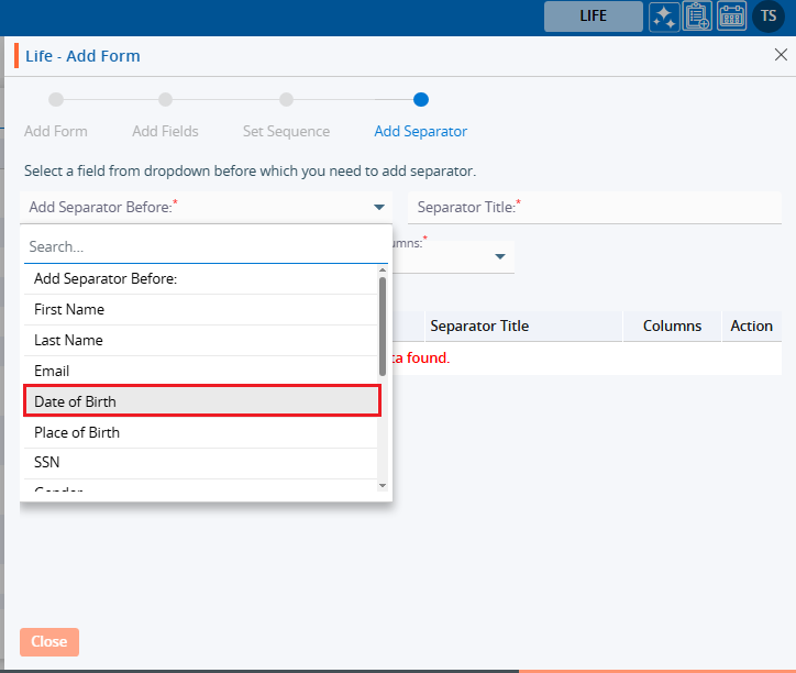
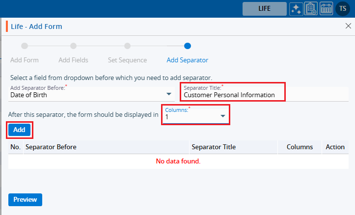
16. On this page, the user can create different sections of fields by selecting a field from the dropdown.
For example, if Date of Birth is selected from the Add Separator Before fields drop down, the system will divide the fields into two sections: the first section includes the fields before Date of Birth, and the second section includes the fields on or after Date of Birth.
17. After selecting the field to separate the sections, enter a separator name. The section of fields separated by the Date of Birth will display the header entered in the separator title field. Next, select the column in which the user wants to divide the next section. These selections will apply only to the next section that is separated by the Date of Birth. After completing the selection and adding values in the fields, click the ‘Add’ button.
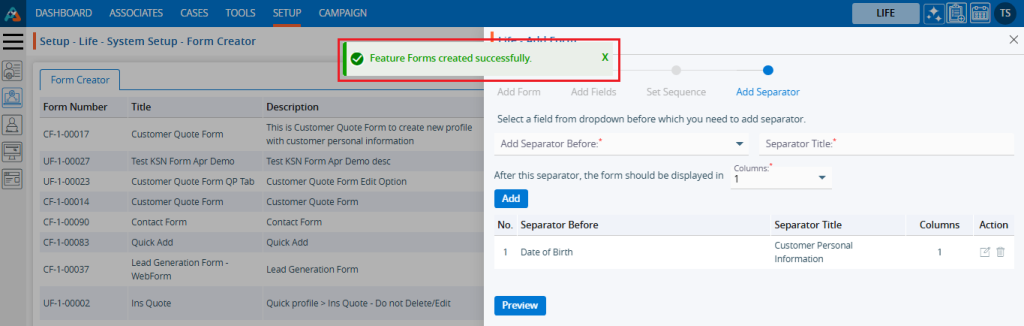
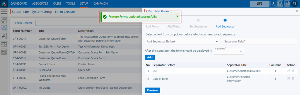
18. After clicking the ‘Add’ button, the system will display a confirmation message stating, ‘Feature Forms created successfully’. The form will then be added to the listing on the same page, with details including Separator Before, Separator Title, Columns, and Action.
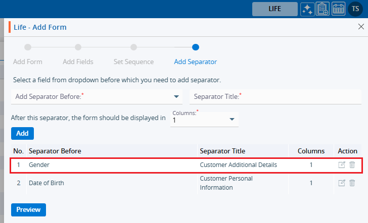
19. Users can add multiple separators for the same form. In this case, an additional separator is created with the ‘Gender’ field. As a result, the form will be divided into three sections based on the selections. The first section will begin with the ‘First Name’ field, the second section will start with the ‘Date of Birth’ field, and the third section will begin with the ‘Gender’ field.
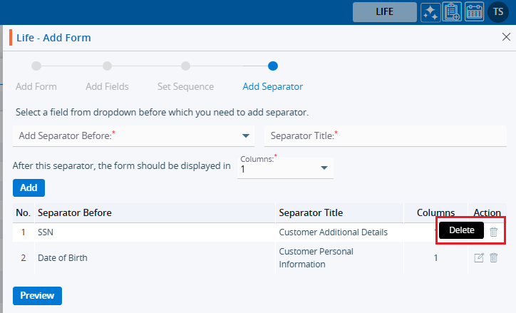
20. For each separator, there are two options under the ‘Action’ header: Edit and Delete. The user can update the separator details by using the ‘Edit’ button. Click on the ‘Edit’ button to update the separator details.
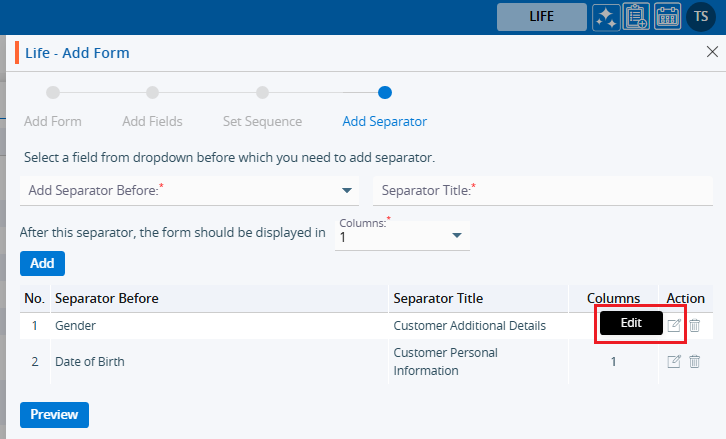
21. Once the separator details are updated, the system will generate a confirmation message stating that the Feature Forms have been updated successfully.
● In this case, we have updated the field from ‘Gender’ to ‘SSN’ for the second separator.
22. By clicking the Delete button, the user can remove the unwanted separator. Click the Delete button to delete the separator.
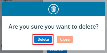
23. After clicking on Delete, the system will prompt for confirmation before deleting.
24. Click Delete to remove the selected separator.
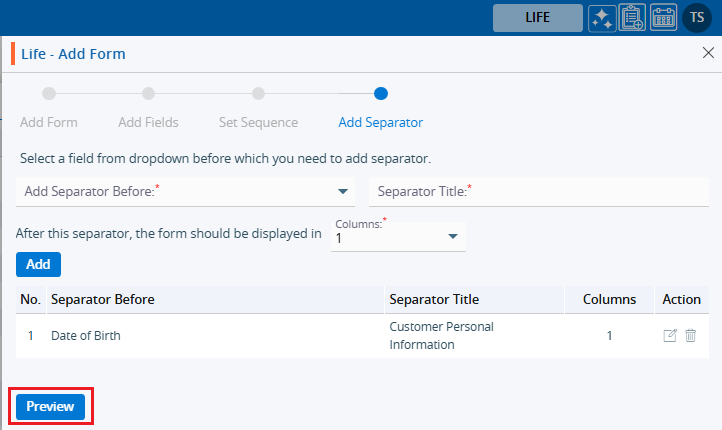
25. The system will generate a confirmation message stating that, ‘Feature Forms deleted successfully,’ and the separator will be removed from the list.

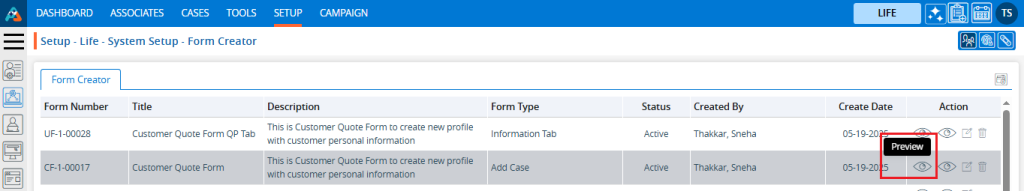
26. There is an option called ‘Preview’ on the same page. With this option, the user can review the created form and apply any required changes before finalizing it.
27. Click the Preview button to review the created form.
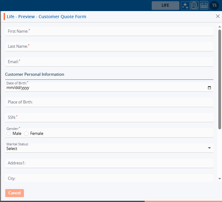
28. After clicking the Preview button, a new page will open, and the form will be displayed with all settings according to the user’s selection of fields, field sequence arrangement, and addition of separators.
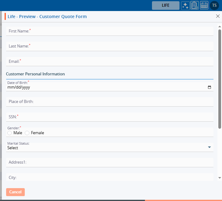
29. As per the criteria set during the form creation, the option ‘Add Case’ is selected from the ‘Show This Form’ dropdown, so this form is available under the CASES > Add Case menu.
30. If the ‘Edit’ or ‘View’ option is selected for the ‘Form For’ field, and ‘Quick Profile > Tabs option is selected from the ‘Show This Form’ dropdown, the form will be available under Cases > Any case’s Quick Profile.
31. If the ‘Edit’ or ‘View’ option is selected for the ‘Form For’ field, and ‘Quick Profile > Top right sub header’ option is selected from the ‘Show This Form’ dropdown, the form will be available under Cases > Any case’s Header Menu > Top right sub header.
32. If the ‘Edit’ or ‘View’ option is selected for the ‘Form For’ field, and ‘Information Tab’ option is selected from the ‘Show This Form’ dropdown, the form will be available under Cases > Any case’s Information Tab.
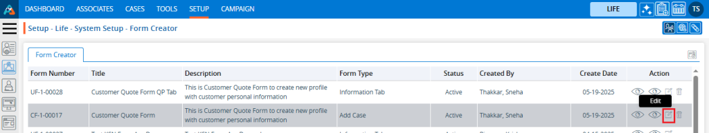
33. Once the form is created, it will be available under the ‘Form Creator’ tab. There will be four options available: Preview, View, Edit, and Delete. To preview the form, click on the Preview button.
34. After clicking the Preview button, a pop-up window will open, and the user can preview the created form view.
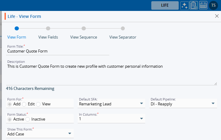
35. To view the setup of the form, click on the View button.
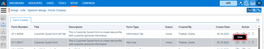
36. After clicking the View button, a pop-up window will open, and the user will only be able to view the setup of the created form for form details, fields, sequence and separator.
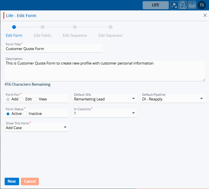
37. To edit the setup of an existing form, click on the Edit button.
38. After clicking the Edit button, a pop-up page will open, and the user can update the setup of the selected form. The user can update the form details, fields, sequence and separator also.
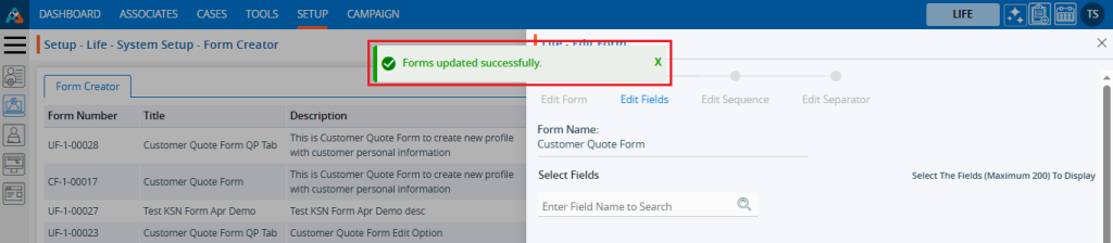
39. Update the value for any field. For example, here we have updated the place for this form by changing the value in the ‘Show this Form’ dropdown from ‘Add Case’ to ‘Web Form’. Then, click the Next button.
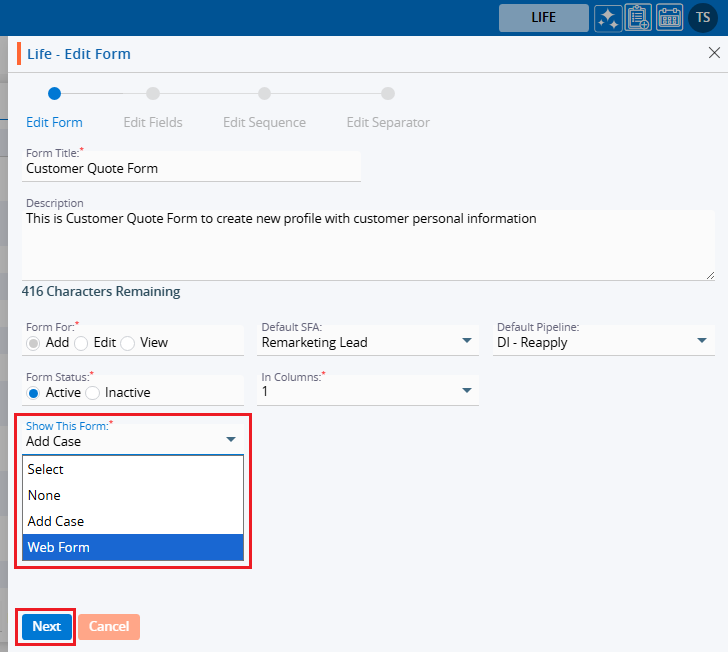
40. After clicking on the Next button, the system will generate a confirmation message stating that the Forms updated successfully, and the page will be redirected to the next step to edit the fields. The user can edit the fields, sequence, and separator as required and apply the necessary changes. Here, we have only changed the place for this form.
41. Now the place will be changed, and this form will be available under Setup > Lead Generation > Web Forms.
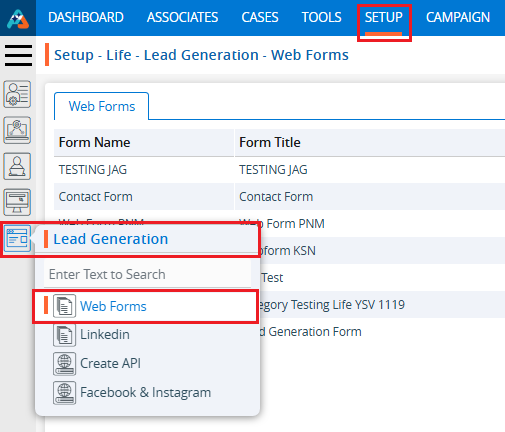
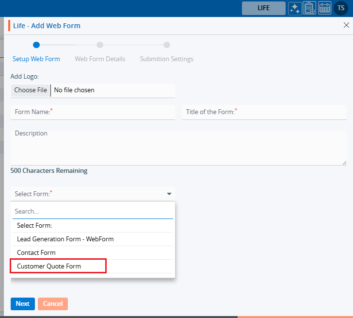
42. Locate the Setup > Lead Generation section and click on Web Form. The form will be available under the ‘From’ dropdown.
43. To remove the existing Form, click the Delete icon on the right hand side of the window.
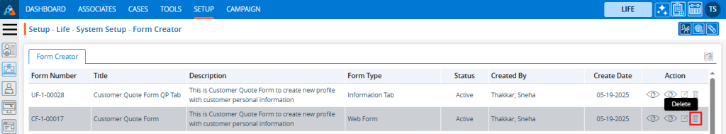
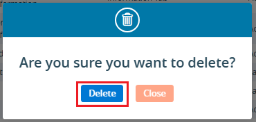
44. After clicking Delete, the system will prompt for confirmation before deleting.
45. Click Delete to remove the selected Form.
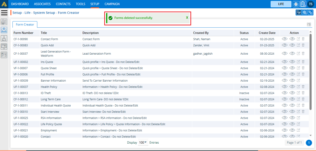
46. The system will generate the confirmation message ‘Forms deleted successfully,’ and the Form will be removed from the list.
 0
0
 0
0